When fall colors are given a clear job, a manicure can feel seasonal without becoming busy. A warm accent can wake up a pale base, a dark value can anchor a bright one, and a metallic line can connect colors that would otherwise pull apart. Once those relationships are clear, the design does not need an obvious symbol on every nail or a complicated palette to prove the point.
Start by noticing where the eye lands first, then trace what lets it rest: a neutral field, a repeated tone, a cool interruption, or a strip of light at the edge. That order matters more than whether the palette is classic or playful. If the surface is short, reduce competing colors; if the shape is long, leave enough open space for contrast to breathe. The result should keep its color logic after the scale changes.
Berry, blue, and brown dots on short nails
Short rounded-square nails begin with a mixed palette of berry, brown, pale blue, and nude, then repeat the colors through dots, small pale marks, and a green leaf accent. The relationship is not strictly warm or cool; the pale blue creates a cool pause between deeper autumn values, while the nude bases stop the darker dots from covering the whole surface. The compact shape keeps the varied palette contained.
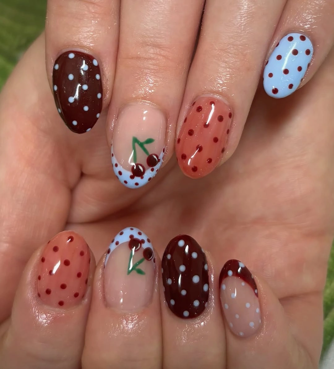
To make this color mix easier to wear, choose the brown and pale blue as the main pair, then use berry on one accent nail and the green mark once. A short square will keep the dots orderly, while a rounded oval will make the contrast softer. Cream, denim, chocolate, and muted green clothing can echo individual colors without requiring every shade to appear in the outfit.
Several colors need a clear repetition pattern or they start to look accidental. Repeat one dot color on at least two nails, leave the nude base visible, and remove the smallest marks if the surface is crowded. The design stays coherent because the pale bases separate the deeper values; adding more dots would reduce that useful contrast instead of strengthening it.
Pink base with burgundy and gold leaves
Medium almond nails place dark burgundy solids beside soft pink accents decorated with burgundy, black, and gold leaves. The pink lowers the visual weight of the wine color, while the gold adds a warm pinpoint that keeps the darker motif from reading as flat. Because the leaves sit on pale nails and the burgundy repeats as a solid, the palette has both a focal color and a resting color.
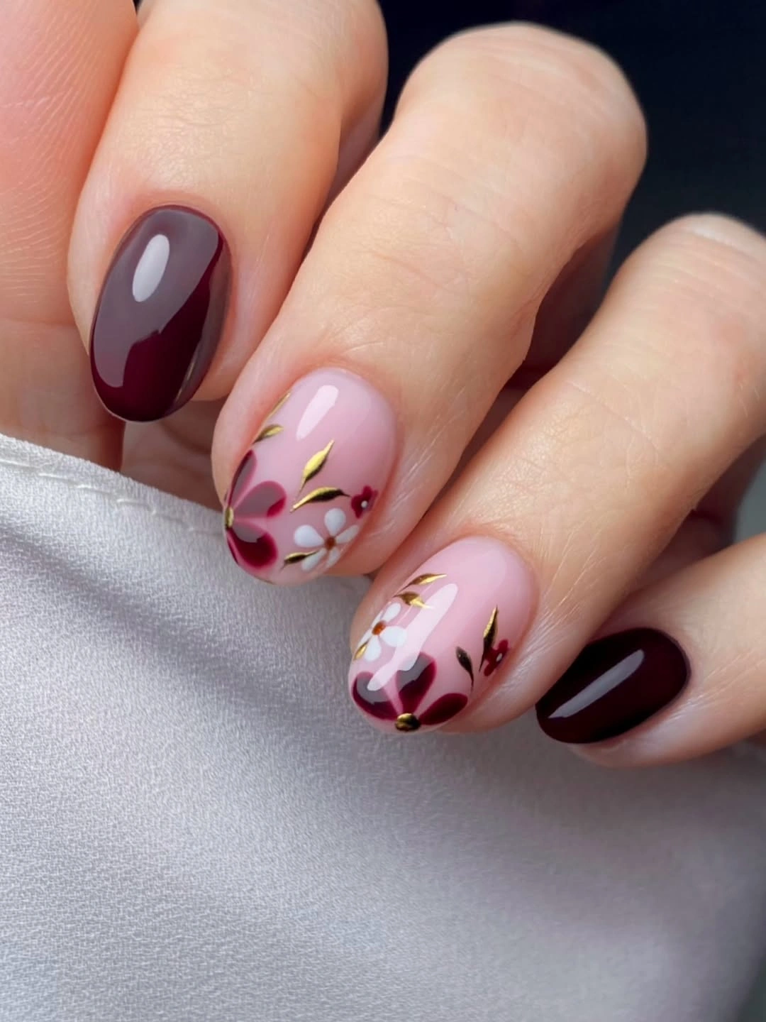
Use the burgundy on two nails and leave the floral detail on one pale accent for a smaller composition. A medium rounded square will make the color blocks more direct, while a softer almond keeps the leaves moving along the length. The palette works with cream, dusty rose, black, brown, and gold jewelry, and the pink base gives darker fall clothing a lighter counterpoint.
Gold should remain a fine punctuation mark rather than a third dominant color, especially on a narrow surface. If the leaves begin to merge, keep the burgundy and pink relationship and simplify the black lines first. The manicure is balanced by a deep value, a pale value, and a warm glint, so preserving those three levels matters more than reproducing every botanical mark.
Pastel patterning with red plaid accents
Short square nails mix pale blue and nude-pink areas with small white patterning and red plaid-like accents. The palette works through value contrast: the pale bases keep the set bright, while the red appears in concentrated checks that bring a warmer fall note without taking over every finger. Layered rings and the outdoor setting add context, but the manicure itself is organized by small color blocks.
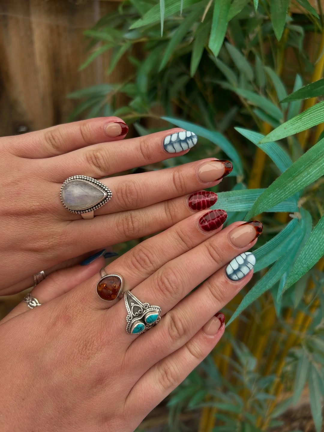
For a more controlled version, keep the pale blue on two fingers, use one red checked accent, and leave the rest nude. A rounded square would soften the pattern, while a longer square could support cleaner plaid spacing. Denim, white, tan, and red accessories can connect to the palette, but a neutral outfit will let the small checks remain the most noticeable warm detail.
Check patterns need enough room between lines to remain recognizable, so the design should be simplified before the base colors are darkened. On a shorter nail, use two crossing lines rather than a dense grid and keep the white space around them open. The contrast succeeds because red is concentrated against pale fields; spreading it across every nail would remove the visual reason the accent feels seasonal.
Neutral squares with slim gold curves
Medium square nails use a warm neutral base with gold curved French details that echo the surrounding chain and coffee-toned setting. The color relationship is quiet: the base sits close to the background, while the gold adds a narrow line of higher brightness and warmth. Because the curve follows the edge instead of filling the tip, the square silhouette remains visible and the manicure stays open.
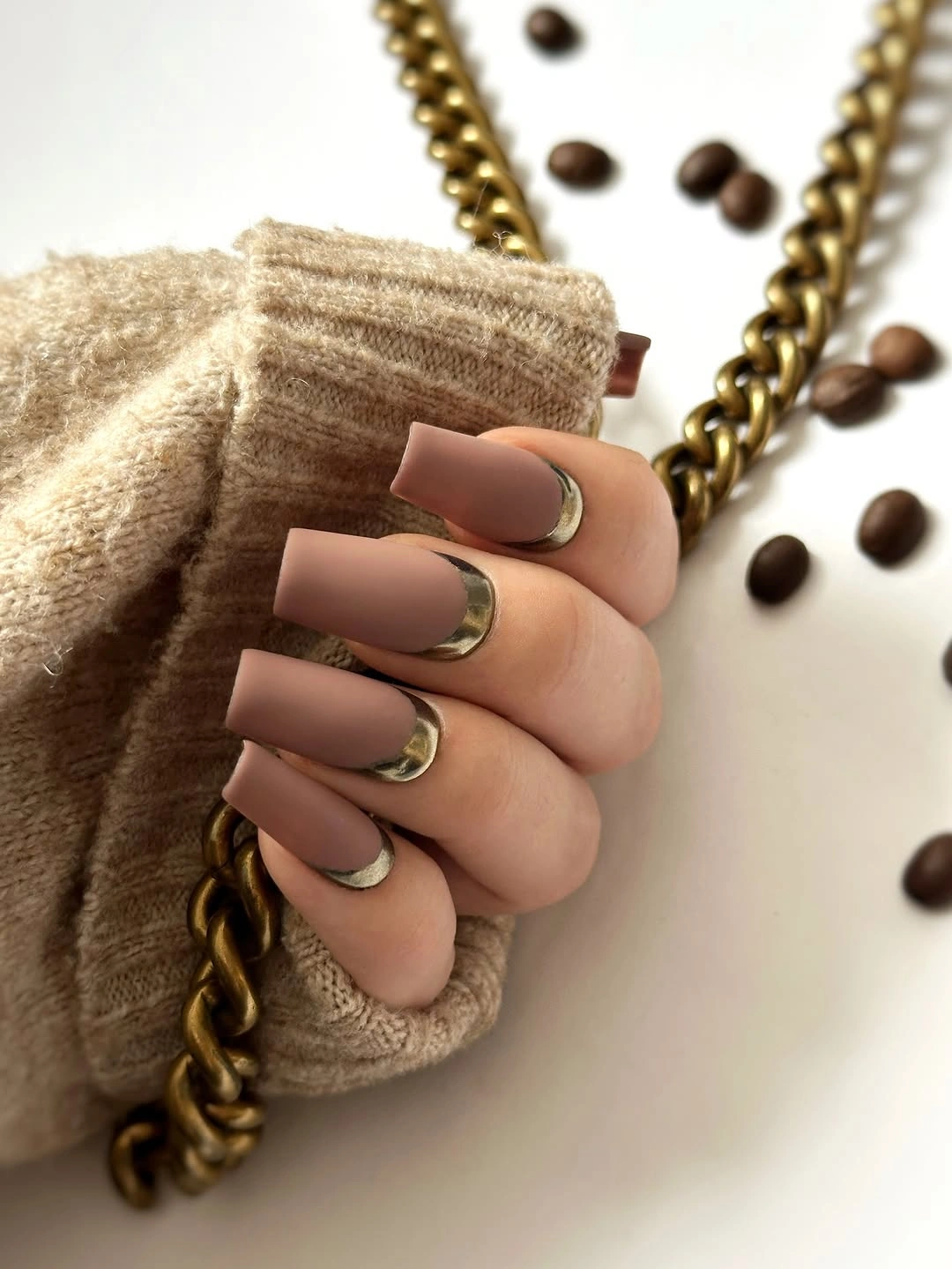
Keep the gold on two or three nails and use a plain neutral on the others if you want the design to feel more minimal. A rounded square will make the curves softer, while a longer square will show the line more clearly. Cream, camel, coffee brown, black, and denim all support the restrained palette, and the gold can quietly repeat jewelry without matching the whole accessory story.
Thin curves lose their purpose when they become too wide or too irregular, so leave a visible neutral field around each line. If the nail is short, use one arc near the tip rather than stacking several bands. The color balance depends on a calm base and a precise warm accent; adding more gold would make the line compete with the square shape instead of defining it.
Blue-gray squares with leafy contrast
Medium square nails use a glossy blue-gray as the main color, while pale accent nails carry black leafy branches over a sheer pink field. The cool blue-gray gives the set a grounded center, and the pink accents warm the palette just enough to prevent it from feeling monochrome. Black branches supply the strongest value contrast, but their placement on pale nails keeps the overall composition breathable.
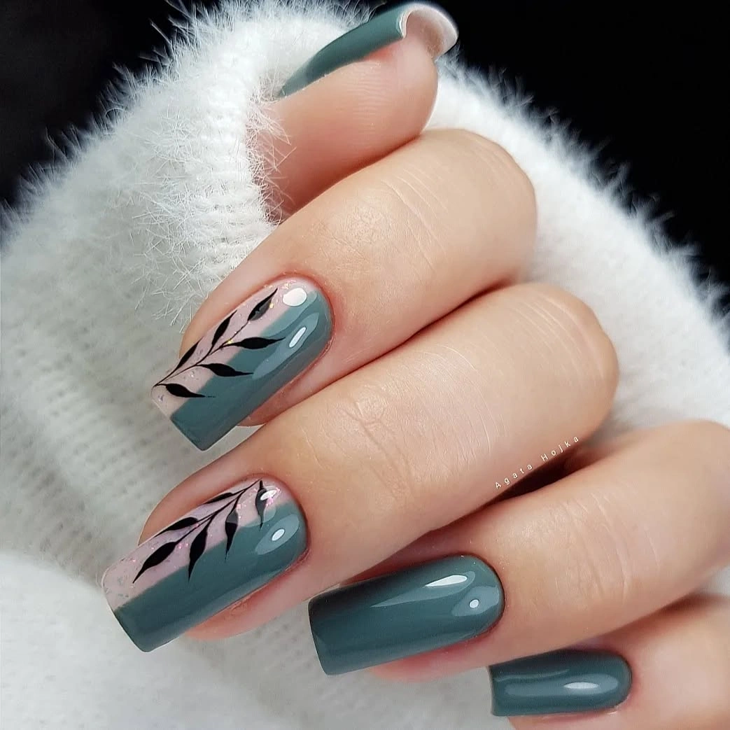
Use the blue-gray on three fingers and reserve one branch accent for a shorter square, or replace the pink base with a soft beige for a warmer version. A rounded square will reduce the graphic effect of the black stems, while a longer square will give the leaves more room to travel. The palette pairs with white, charcoal, denim, pale pink, and muted teal without requiring another bright color.
The black branches are most effective when their lines remain separate from the edge and from one another. If the surface is small, keep one longer stem instead of several short marks and let the blue-gray carry the repetition. The relationship works because the cool solid provides scale and the pale accent provides contrast, so the pattern should stay secondary to that color structure.
Uniform bronze on dramatic pointed nails
Very long pointed nails are a uniform metallic bronze-copper, allowing saturation and reflection to replace any decorative motif. The warm color appears concentrated across the whole surface, while the pointed shape creates a strong directional line that makes the metallic finish feel elongated. This is a useful example of a single-color manicure that looks complex because value changes as the surface catches light.
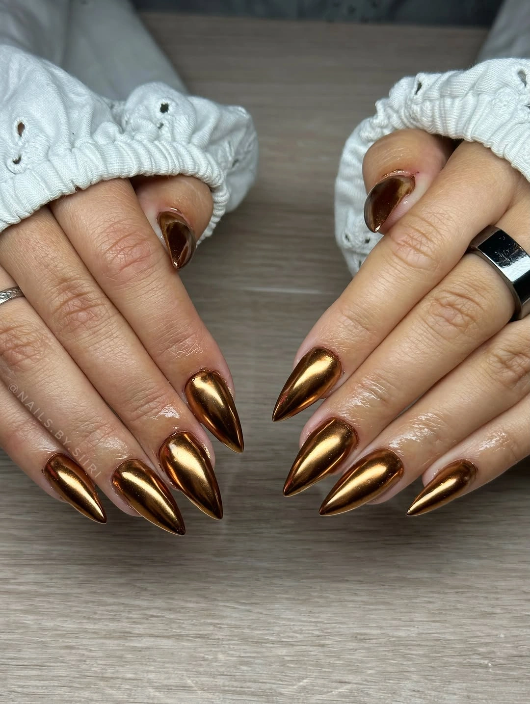
Move the bronze to a medium almond if the full length is impractical, or keep the metallic shade on two fingers and use a warm nude beside it. A rounded tip will make the reflection less sharp, while a short square will turn the color into a bolder block. Cream, chocolate, black, camel, and deep green can all sit with bronze, but a simple outfit will give the finish room to show.
Metallic color can become visually loud when the surface is long and fully covered, so shortening the nail is a more useful adjustment than adding another color. Keep the reflection uninterrupted and let the silhouette control the drama. The design is strongest when bronze remains the only saturated field and the shape supplies the contrast between a broad base and a narrow point.
Soft pink with sunny yellow flowers
Medium almond nails begin with a pale pink base, add small white dots, and place a bright yellow flower across one accent area. The yellow has high saturation and warm temperature, so the repeated pale pink and white details give it support without trying to match its intensity. The result feels seasonal through one concentrated sunlit accent rather than through a full orange or brown palette.
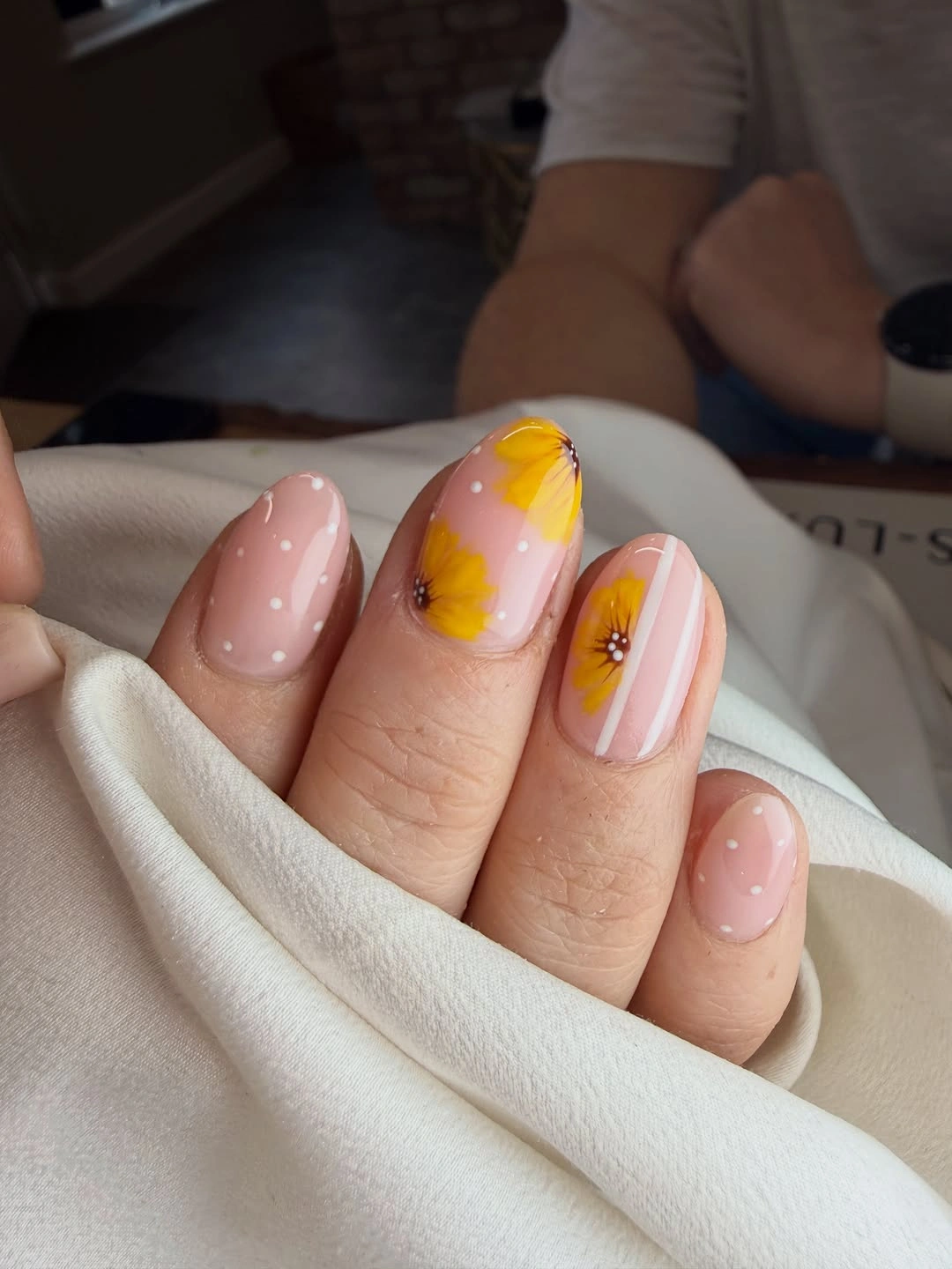
Use the yellow flower on one nail and keep the dots sparse if you want the same relationship in a shorter almond. A rounded shape will make the flower feel gentler, while a medium square will make the pale base more graphic. White, cream, denim, camel, and muted yellow clothing can connect to the design, but the manicure does not need a second bright shade to feel complete.
Yellow already carries strong emphasis, so adding more saturated accents would make the pale pink disappear. Let the dots remain small and separate, and leave a clear base around the flower. If the nail surface is shorter, keep the flower near the center and remove extra dots before reducing the pale field; the contrast works because the warm accent has space to breathe.
Orange blocks with tiny pumpkin details
Medium almond nails use bright orange solids alongside nude accents that hold small pumpkin-like and black seasonal marks. The orange is the dominant value and temperature, while the nude nails act as a neutral break that gives the tiny motifs somewhere to register. The almond shape lengthens the saturated blocks, but the open accent surfaces keep the collection from becoming uniformly bright.
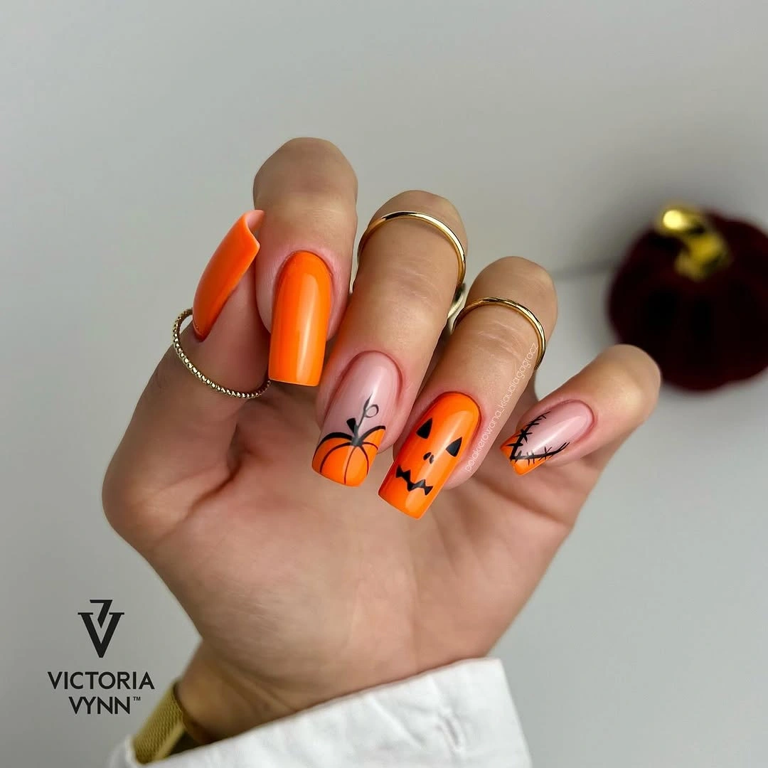
For a lower-contrast version, keep the orange on two nails and use a muted terracotta or rust on the others, with one nude accent carrying the small detail. A medium rounded square will make the orange feel more direct, while an oval softens it. Cream, brown, olive, denim, and black are useful companions because they repeat the warm relationship without competing with the bright center.
Seasonal marks become hard to read when they are placed on every nail beside a saturated solid, so concentrate them and keep the remaining nude space open. If the length is reduced, simplify the pumpkin-like shape to a curved stem or tiny dot cluster. The manicure works through a strong orange anchor and a pale explanatory accent; more decoration would flatten that conversation.
Purple solids with floral pink accents
Medium almond nails alternate glossy purple solids with pale pink nails carrying scattered purple, coral, and white floral strokes. Purple supplies the deepest repeated value, while the pink accents provide a lighter field where the warmer coral can appear without becoming too intense. The palette feels coordinated because the purple returns in both the solid nails and the fine details, giving the mixed colors a shared anchor.
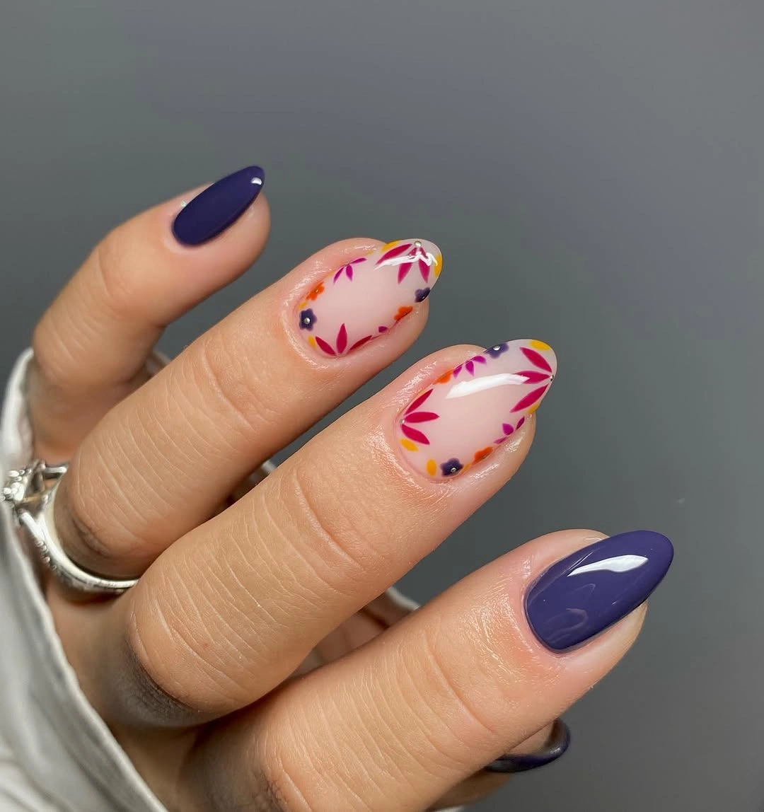
Keep two purple solids and one floral accent for a compact set, or swap the purple for a deep berry if you want a warmer fall reading. A rounded almond will make the scattered strokes softer, while a short square will make the solid color more graphic. White, gray, cream, denim, and muted coral clothing can echo the palette one shade at a time.
Scattered flowers need enough negative space to remain separate from the pink base and from one another. Remove the smallest coral marks first if the nail is short, because the purple relationship already provides the color structure. The design stays clear when purple is the repeat, pink is the open field, and coral is the small warm surprise rather than an equal third block.
Nude pink with black and white edge accents
Medium square nails use a nude-pink base with white and black curved French accents placed near the tips and sides. The pale base occupies most of the surface, while the dark and light lines create a controlled value contrast without covering the nail. The square shape gives the curves a firm frame, making the manicure feel graphic even though the center remains mostly open.
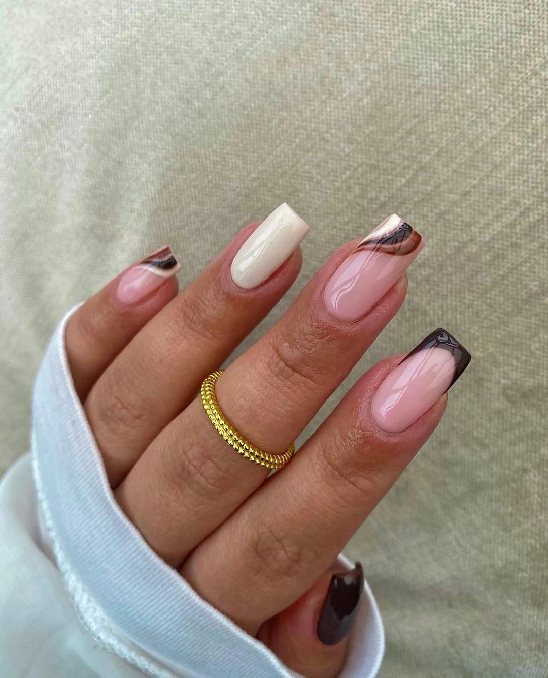
On a shorter square, use one black curve and one white curve rather than layering several edge details on every finger. A rounded square will make the lines more fluid, while a medium almond will turn them into directional arcs. The palette can sit beside black, white, gray, denim, or soft pink, and the open nude center makes it easy to pair with patterned clothing.
Black and white already create the highest contrast in the set, so line spacing matters more than the number of bands. Keep each curve distinct and allow the nude base to show between them. If a shorter nail cannot support both colors, retain the black edge and use white on one accent; the visual relationship survives when the dark detail remains the main frame.
Neutral nails with silver and gold framing
Short-to-medium almond nails use a sheer neutral base framed by silver and gold glitter curves that follow the cuticle and tip. The two metallic temperatures create variation, but the pale center keeps the set from becoming a solid reflective block. Because the lines wrap around the shape instead of sitting in one horizontal band, they make the almond outline more visible and add a jewelry-like rhythm.
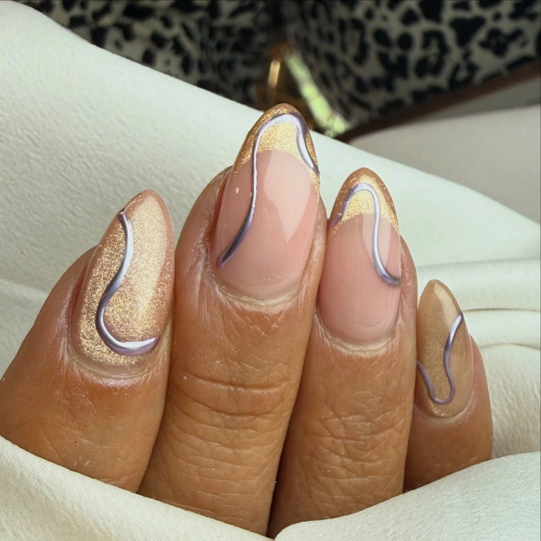
Choose one metallic color for a more restrained version, or keep the silver and gold only on two accent nails. A rounded almond will make the framing softer, while a short square will turn the curves into clearer corner details. The pale base works with cream, taupe, black, denim, and gold or silver accessories because it can accept either temperature without becoming busy.
Metallic curves need a clean gap between the cuticle line and the tip line, especially on a compact surface. If the nail is shorter, use one arc and leave the rest sheer rather than forcing two glitter borders into the same space. The design succeeds through a calm center and reflective edges, so the open area should remain the largest color field.
Chrome burgundy on long square nails
Long square nails are a saturated burgundy-red with a reflective chrome-like surface, so the color reads as both deep and bright depending on the angle. The square silhouette gives the red a firm edge, while the reflection keeps the full-coverage design from looking flat. There are no contrasting motifs; the entire idea comes from the relationship between one warm dark color and shifting light.
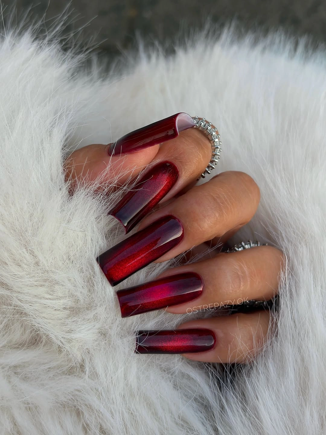
For a practical adaptation, move the burgundy to a medium square or keep the reflective finish on two fingers beside a smooth wine shade. A rounded square will soften the strong edge, while a longer almond will make the shine more directional. Cream, black, gray, denim, and soft pink can frame the color without needing another red detail in the outfit.
A full reflective surface reveals chips and uneven corners quickly, especially on a long square where the tip forms a strong horizontal line. Keep the shape even and allow the finish to remain the only visual event. If maintenance is limited, shortening the nail preserves more of the color relationship than adding a decorative accent to distract from wear.
Pink, burgundy, and fine gold glitter bands
Long almond nails alternate burgundy and pink, then add glittery gold panels divided by fine horizontal gold lines. The palette balances a deep warm value with a pale base, while the glitter supplies brightness in a concentrated middle section rather than across the whole nail. That placement creates a layered color rhythm: dark, light, reflective, then light again as the eye moves across the fingers.
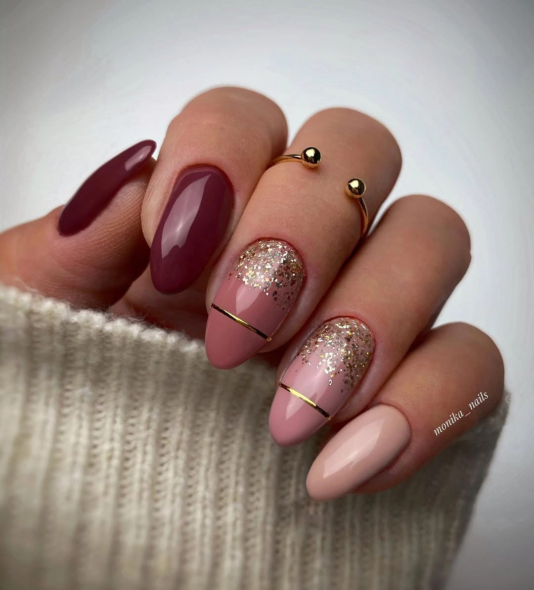
Use the gold panel on one or two nails and keep the burgundy and pink as the repeated colors for a cleaner version. A medium almond will reduce the length emphasis, while a rounded tip will make the horizontal bands feel less sharp. Cream, blush, burgundy, gray, and gold jewelry can echo the palette, but the outfit should stay quieter than the nail composition.
Several bands can compress on a shorter surface, so remove one divider before making the glitter section wider. The color story stays clear when the gold is a bright pause between pink and burgundy rather than a continuous third field. Leave enough base around the panel for the almond shape to remain visible, because the silhouette is what keeps the layered palette from looking square.
Sheer pink with black and white swooshes
Long almond nails use a sheer pink base with black and white abstract swooshes placed differently across the set. The pale ground carries most of the visual area, while the dark marks provide a strong value contrast and the white marks add a lighter echo inside that movement. Since the strokes are not identical, the manicure feels hand-drawn and varied rather than mechanically repeated.
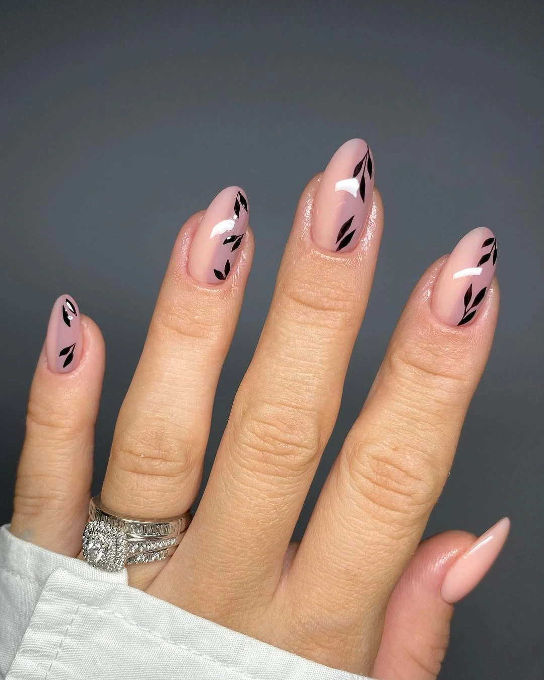
Keep the black stroke on two nails and use a single white accent for a shorter or simpler version. A medium almond will make the swooshes feel more contained, while a rounded shape will soften their direction. Black, white, blush, gray, and denim clothing can support the limited palette, and a plain outfit will make the varied placement easier to notice.
Abstract lines need enough open base around them to remain separate, especially when the nail is narrow. If the design is adapted to a shorter surface, keep one clear curve rather than squeezing several broken strokes together. The manicure stays coherent because pink is the shared field and black-white is the repeating contrast; adding another color would change the problem rather than solve it.
Blush short nails with soft coral marks
Short rounded-square nails are blush pink with soft orange and coral marks that resemble small abstract flowers or heart-like shapes. The colors stay close in value, so the design feels gentle rather than sharply graphic, and the compact shape keeps the marks from spreading into a busy pattern. The variation comes from placement and transparency of the warm strokes, not from a large palette.
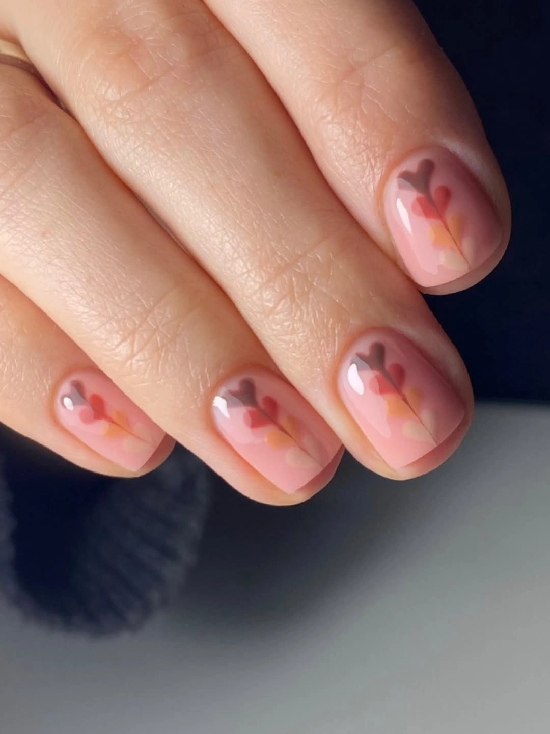
Keep the blush base on every nail and repeat the coral mark on only two fingers for a quieter result. A short oval would make the rounded shapes more natural, while a square would give them a cleaner frame. Cream, pale pink, warm gray, denim, and muted orange clothing can sit beside the set without forcing a stronger contrast.
Low-contrast accents can disappear if too many are layered together, so leave the blush field open and let each mark stay simple. If the nail is very short, use one coral stroke near the center instead of several tiny petals. The design succeeds through a soft temperature shift within a pale value range, and preserving that calm relationship matters more than increasing definition.
Lavender-pink nails with fine gold florals
Long almond nails use a pale lavender-pink base with delicate gold floral line drawings and small charm-like details. The cool pastel base keeps the warm metallic lines from feeling heavy, while the repeated gold provides continuity across several different motifs. Because the lines are thin and the background stays pale, the design reads as decorative but still leaves the almond length visible.
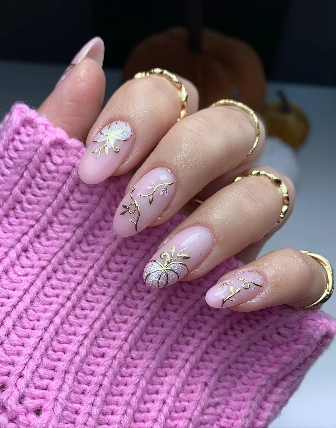
Use the gold drawing on two nails and leave the rest as a plain lavender-pink if you want a more controlled distribution. A medium almond will make the florals feel more compact, while a rounded shape will soften the fine lines. White, gray, blush, lavender, gold jewelry, and soft knitwear can repeat the palette without requiring another bright color.
Fine gold detail needs a calm field, especially when small charm-like points are also present. If the nail is shorter, preserve one main floral stem and remove the smallest dots or loops before changing the base color. The pale background is not empty space to fill; it is the contrast that makes the metallic line visible and keeps the design light.
Green French edges with amber tortoiseshell
Long square nails combine nude-pink bases, emerald green French edges, amber tortoiseshell panels, and dense gold bead details. The color relationship is intentionally layered: cool green sharpens the edges, warm amber supplies depth in the center, and gold adds a high-value punctuation mark. Nude-pink prevents these saturated accents from becoming one continuous block and gives the square shape room to show.
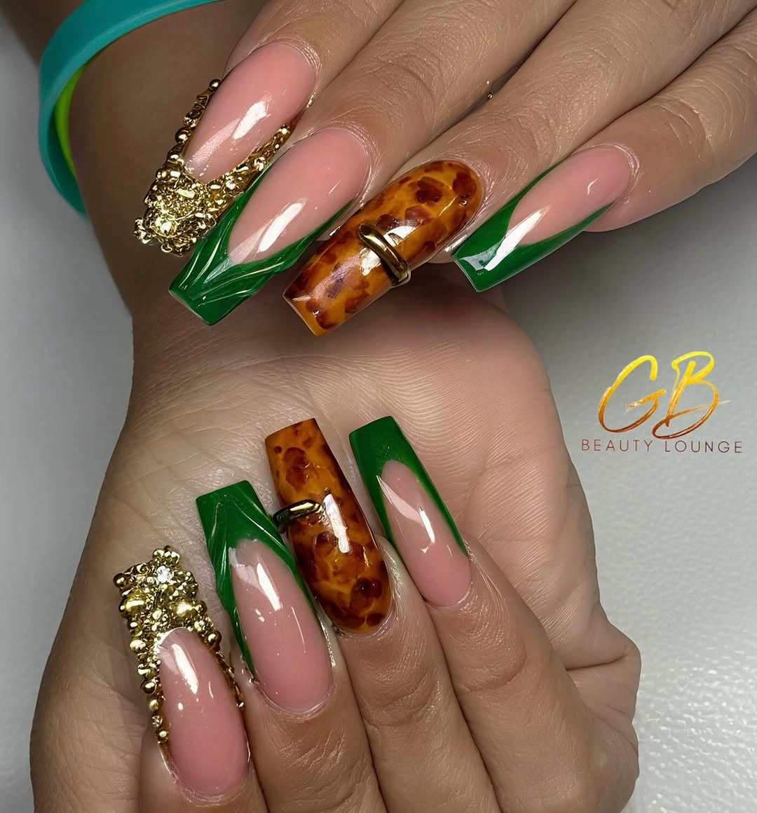
For a wearable adaptation, keep the green edge on two nails, use one amber accent, and replace the gold bead area with a single line. A medium square will reduce the visual density, while a rounded square will soften the corners. Cream, chocolate, olive, gold, and denim can work with the warm-cool contrast, but the clothing should avoid another competing print.
There are several focal colors here, so spacing is the practical control. Leave a nude area between green and amber, and keep the bead detail concentrated rather than repeating it everywhere. If the nail is shorter, remove the gold texture first; the green and amber relationship still carries the design, while too much ornament would hide the useful contrast between cool edge and warm center.
Milky white with blue leaf motifs
Short squoval nails use a milky white base with small blue leaf motifs and a few orange curved strokes. The white field has the highest brightness, so the blue provides the main contrast and the orange acts as a small warm interruption. Rounded corners keep the motifs friendly and compact, while the open base prevents the seasonal colors from becoming a dense illustrated surface.
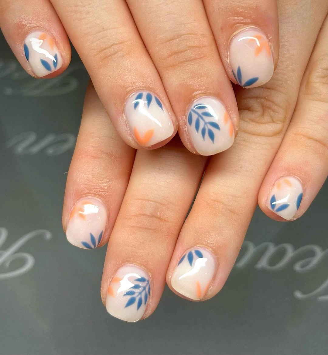
Use blue leaves on two nails and keep the orange to one small stroke if you want the palette to feel more minimal. A short square would make the blue marks more graphic, while a short oval would soften them. White clothing, denim, pale gray, orange accessories, and muted blue can connect to the colors one at a time without creating a matching set from head to hand.
Because white dominates the surface, the blue marks need consistent spacing to avoid looking scattered. Keep the leaves simple and let the orange remain secondary; adding more warm strokes would weaken the cool contrast that gives the set its identity. The design is easiest to maintain when the open white field remains larger than the pattern itself.
Orange-red solids with textured autumn accents
Long almond nails mix orange-red solids with a nude accent carrying a red botanical motif and a pale nail with visible ribbed texture. The orange-red is the most saturated color, while the nude and pale accents provide two different forms of relief: one through open space and one through surface change. That combination makes the set feel autumnal without relying on brown as the only grounding shade.
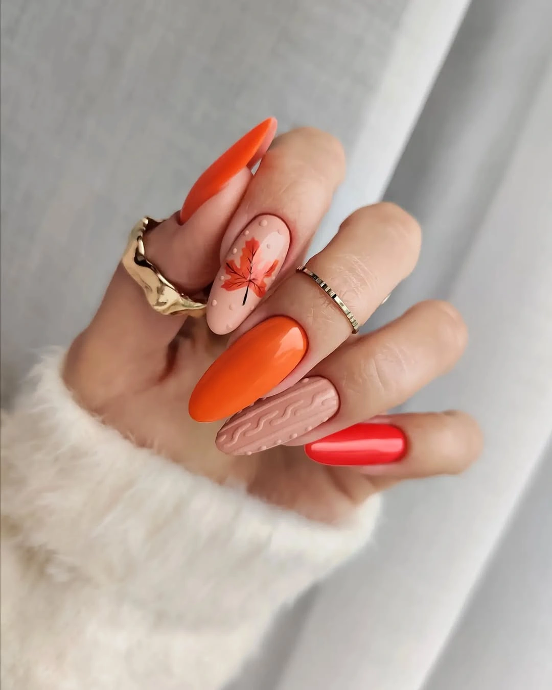
Keep the orange-red on two or three fingers and use the botanical accent once for a shorter version; the textured pale nail can become a plain neutral if needed. A medium almond will reduce the length statement, while a rounded shape will make the bright solids softer. Cream, brown, denim, white, and muted green clothing can balance the warm saturation.
Texture already creates a focal point, so adding glitter to the botanical nail would make the composition harder to read. Preserve the nude space around the red motif and let the pale textured finger remain a quiet change in surface. The manicure works through three roles – saturated color, open detail, and tactile relief – and each role should remain separate.
Matte burgundy with pale floral accents
Medium almond nails use matte burgundy solids with two pale accent nails decorated by small white, pink, and green flowers. The matte finish lowers the reflection of the deep color, while the pale accents restore brightness and make the floral marks easy to see. The result is a balanced value relationship rather than a uniform dark set: burgundy supplies depth, and the flower nails provide visual air.
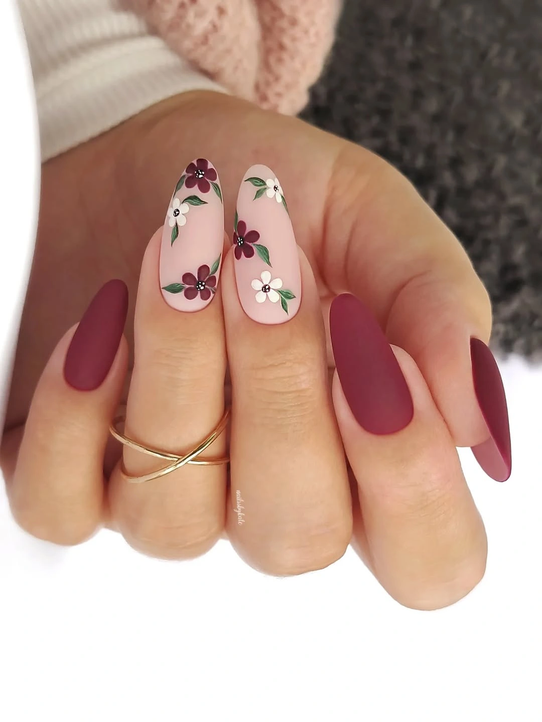
Use one floral accent beside several burgundy nails for a simpler interpretation, or change the base to a muted berry if the dark matte feels too strong. A rounded almond will soften the floral contrast, while a medium square will make the matte color more structured. Cream, dusty pink, olive, black, and gold jewelry can support the palette without adding another floral print.
Matte surfaces can make the shape look more graphic because reflected highlights are reduced, so consistent length matters. Keep the flowers small and spaced across the pale field, and avoid covering the burgundy with additional shine. The manicure is clearest when the matte depth and the pale floral relief remain visibly different rather than blending into one decorated color.
Navy, rose, glitter, and jeweled accents
Long almond nails combine a glossy navy finger, dusty rose glitter, pale accents, and a small cluster of colored stones. The navy provides the darkest value, the glitter introduces texture and brightness, and the jeweled accent concentrates several colors into one focal point. Pale space around the stones keeps the set from becoming uniformly reflective and lets the almond shape remain visible.
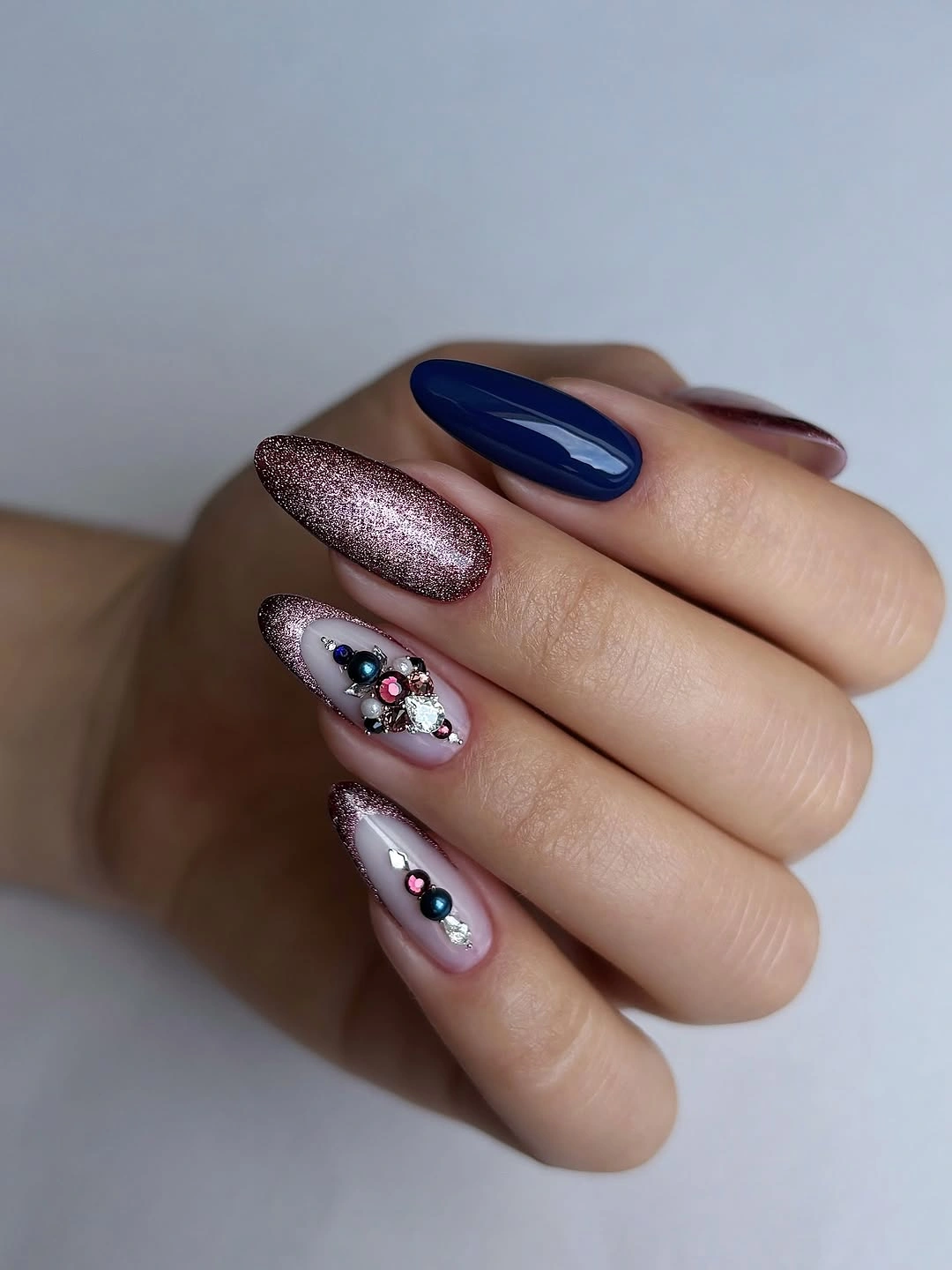
For a more wearable version, keep the navy on two fingers, use glitter on one, and reduce the stones to a small pair on a pale accent. A medium almond will make the focal cluster easier to manage, while a rounded shape softens the contrast. Cream, navy, gray, dusty rose, and silver accessories can repeat the palette without requiring a full jeweled outfit.
Several reflective points need a clear hierarchy, or the eye cannot tell whether the navy, glitter, or stones are meant to lead. Keep the jeweled area small and let the navy act as the visual anchor. If the nail is shorter, remove the smallest stones before changing the colors; the relationship between dark value, glitter texture, and pale relief will remain intact.
Autumn color collage on long square nails
Long square nails close the collection with a collage of coral, brown, sage, teal, pink, dots, lines, and gold details across different fingers. The palette is broad, but it stays seasonal because the colors share a muted, earthy relationship rather than competing at full saturation. The square shape gives the collage a grid-like structure, while repeated dots and bands help the unrelated blocks speak to one another.
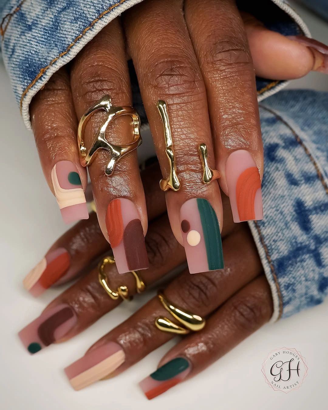
To adapt the collage, choose one warm pair such as coral and brown, then add sage or teal on one accent nail and keep the rest neutral. A medium square will reduce the amount of visual information, while a rounded square will make the blocks friendlier. Denim, cream, chocolate, olive, and gold jewelry can support the palette, but a simple outfit will keep the collage from feeling over-styled.
With many colors, the useful maintenance rule is to repeat shapes and limit the number of dominant values. Keep the dots or lines as a small connective detail, and remove one block before shrinking every element onto a short surface. The design remains coherent when the earthy palette carries the story and the gold acts as punctuation, not when every color is asked to be the focal point.