Fall long nails are rarely ruined by a lack of ideas; the harder problem is knowing when one detail has started competing with the hand itself. A narrow edge, an uneven gap, or a finish that changes on one finger can decide whether the result looks intentional at conversation distance. The eye notices placement before it rewards complexity, so the quietest part of a manicure often carries the most authority.
Before choosing a design, decide what should remain visible after the hand moves: the outline, the negative space, or one controlled interruption. Give that feature enough room to read, then remove any accent that repeats its job. On a long shape, this test protects proportion, reduces clutter, and leaves a statement that can survive real sleeves, jewelry, and ordinary grow-out without becoming fussy.
Burgundy Stiletto Nails Framed with Fine Gold
These long pointed nails build their mood from a sheer nude base, deep burgundy-red patches, and curved gold linework that follows the direction of the tips. The darker areas are not painted as one solid block; they sit inside open metallic framing, which lets the pale base interrupt the drama. That spacing is what keeps the ornate palette legible instead of making the whole hand read as one heavy color.
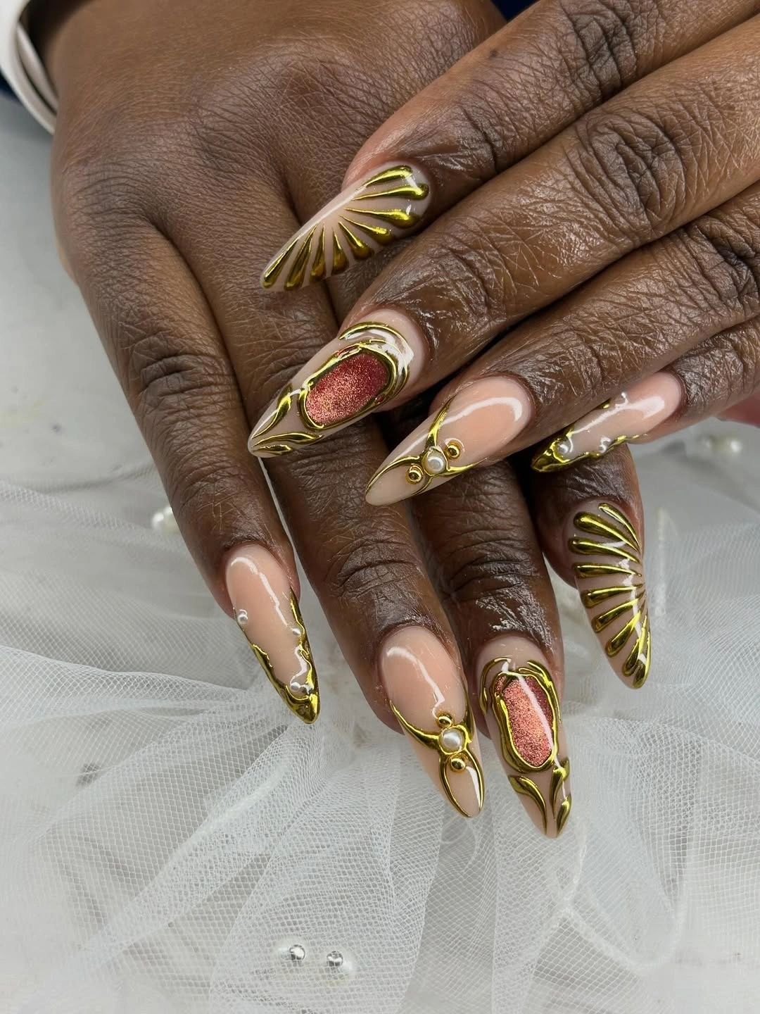
Gold works especially well here because it repeats the length of the silhouette rather than fighting it with a horizontal band. I would keep the red deepest on only a few nails and allow the gold arcs to vary slightly, since identical decoration on every finger would make the design feel more mechanical. A shorter almond version could keep the same burgundy center while trimming the longest gold points.
The tradeoff is practical as much as visual: sharp tips and raised-looking detail ask for more awareness around sweaters, hair, and delicate fabric. If you want the same fall feeling with less snagging, soften the point into a tapered almond and use one gold curve per nail instead of several. The important choice is the relationship between dark color and open space, not the exact amount of ornament.
Icy Jewel Tones with Silver-Edged Movement
This long almond manicure moves through teal, pale blue, deep plum, and reflective silver, with each nail carrying a slightly different color relationship. The surrounding rings intensify the jewelry mood, but the manicure itself stays central because the cool tones repeat across the hands. Its strength comes from variation that still shares one temperature: nothing looks accidentally warm or disconnected.
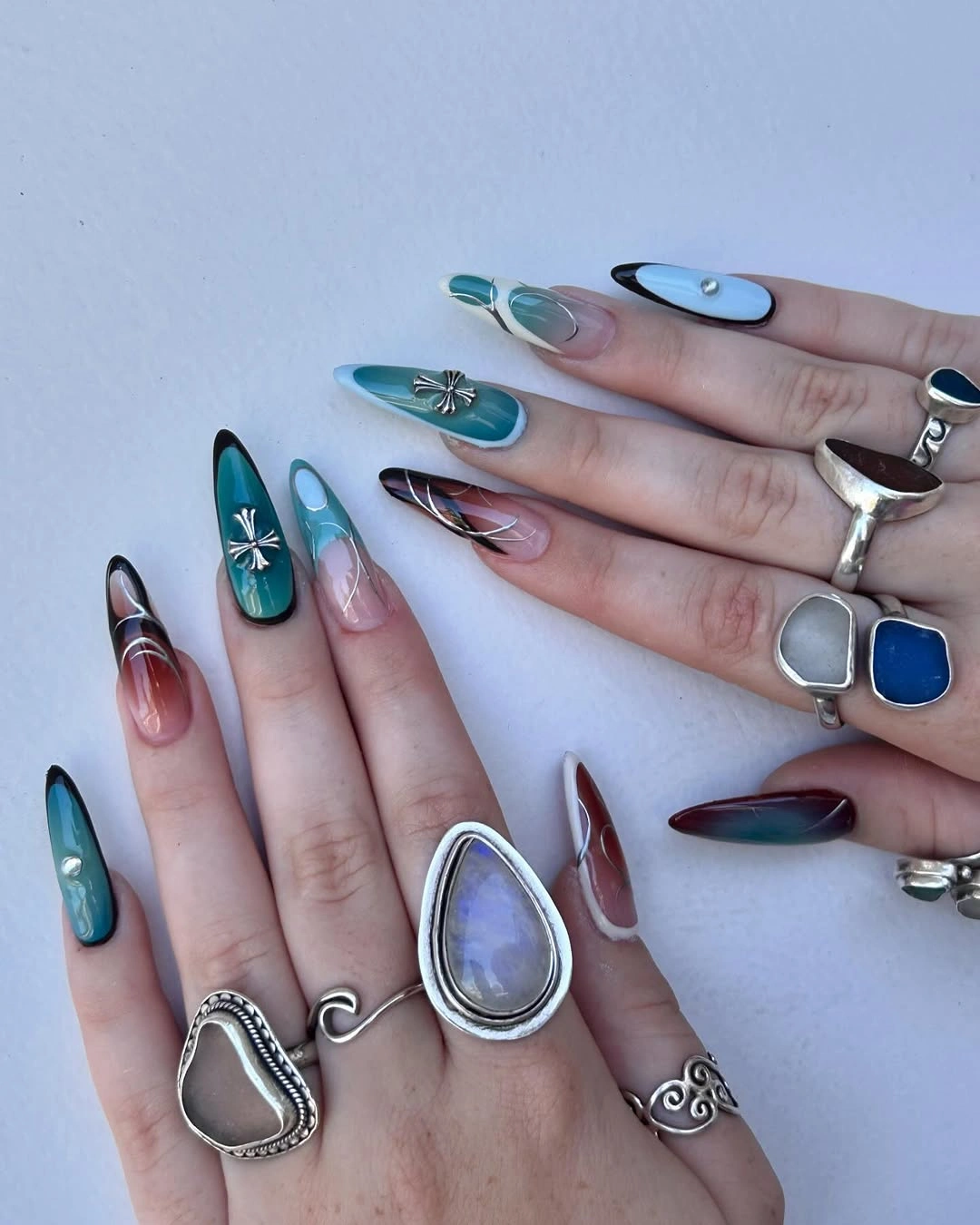
A mixed palette like this needs a quiet rule, and the visible rule is cool color plus a recurring metallic note. You could borrow the idea with two blues, one plum accent, and a narrow silver line rather than giving every nail a separate shade. That reduction would keep the hand interesting while making outfits, rings, and everyday color coordination much easier.
The length gives the abstract marks enough room to travel, yet the number of reflective surfaces can become busy under bright light. If the design is shortened, preserve the strongest teal or blue nail and move the plum to one accent rather than compressing every contrast into a smaller canvas. The result should still feel layered, but the eye should be able to find one dominant color first.
Sheer Peach Softens a Tapered Square Shape
A glossy sheer peach base makes these long softly squared nails feel polished without adding a visible motif. The translucent color leaves a natural-looking depth beneath the surface, while the rounded corners stop the length from reading as severe or overly sharp. It is a useful reminder that the shape can be the statement when the finish is clean and the color is allowed to stay quiet.
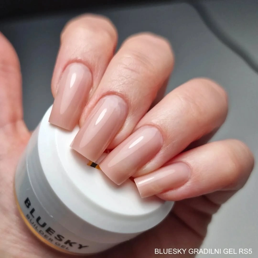
The warmth of the peach keeps the manicure from looking stark, so it can sit comfortably beside denim, cream knits, or darker autumn colors. I would ask for a sheer warm nude rather than an opaque beige if the goal is this light-catching softness, then let the free edge remain gently squared. For a more practical version, shorten the length first and keep the same translucent finish.
Sheer color has one honest limitation: uneven growth or an imperfect edge can show more clearly because there is no graphic detail to distract the eye. That makes careful shaping more important than adding decoration. Readers who prefer a restrained idea can also compare the proportions in these fall mid-length nails, then keep the peach tone while reducing the commitment.
Soft Pink with One Graphic Polka-Dot Accent
Long pale pink nails stay in control here because the black-and-white polka-dot accent is concentrated on one nail. The rest of the set reads as a glossy pink field with softly squared edges, while the spotted nail supplies a crisp graphic break that the eye can find immediately. The pattern feels playful without turning the whole hand into a print.
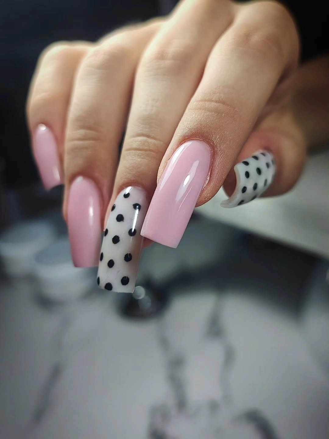
One patterned nail is enough when the base color already has a reflective presence and the length supplies drama. A good adaptation would keep the white ground and black dots on the ring finger, then use pale pink on every other nail so the accent remains intentional. If you prefer more contrast, repeat the dots on two nails but keep the scale irregular rather than making a rigid grid.
The pale base also makes the idea flexible for fall because it can sit beside burgundy, brown, or black clothing without adding another strong color family. The realistic limitation is that a large spot pattern can look crowded on a shorter nail, so reduce the dots before shrinking the base. Let the accent be a punctuation mark, not a second dominant palette.
Transparent Nude Nails with Jewelry-Like Gold Lines
These elongated nude nails use fine gold framing, tiny bright details, and one darker blue accent to create the impression of jewelry placed along the nail surface. The base remains visible through most of the design, so the metallic elements read as pathways and borders rather than a full covering. That open structure is what gives the set its delicate quality even though the length is unmistakable.
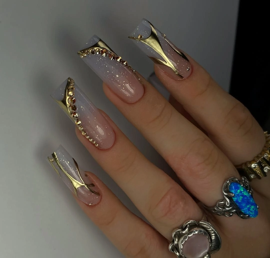
Gold linework benefits from long nails because it can travel from cuticle toward tip and make the silhouette feel even more intentional. I would keep the lines narrow and repeat their direction, then let only one nail carry the deeper blue note so the cool accent does not break the warm nude story. A small reflective detail near the center can replace the blue if you want a softer result.
This kind of design asks for consistent spacing: a line that becomes too thick or wanders too far can make the manicure look crowded quickly. Shorter nails can keep the concept by using a single gold edge on two accent fingers and leaving the rest sheer. The visual payoff comes from a controlled frame around the nude base, not from adding every tiny embellishment available.
Red French Tips with Loose Black Curves
Long almond nails feel graphic here because the pale pink base is interrupted by vivid red tips and loose black curves that move inward from the edge. The red stays concentrated at the point, while the black marks create an uneven drawn rhythm instead of a perfectly uniform border. That contrast gives the set energy without hiding the light center.
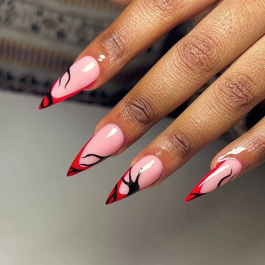
The most wearable way to borrow this design is to make the red the only repeated color and reserve the black for one or two flowing lines. Keeping the center pale helps the almond shape remain visible, especially when the tips are already sharp. If the length is reduced, widen the red edge slightly and simplify the curve so neither detail disappears into the smaller surface.
High contrast at the tips will be the first area to show wear, so this idea rewards neat edges more than extra decoration. It also reads as a confident choice beside a simple outfit because the linework creates movement on its own. Readers who like the graphic direction can soften the red to a deeper wine tone without changing the placement logic.
Vivid Green with Two Sparkling Accent Nails
Most of these long squared nails are a saturated vivid green, while two surfaces carry matching green sparkle that changes the way the light moves across the hand. Nothing competes with the hue because the accents stay inside the same color family. The manicure feels bold through saturation, then gains depth through finish rather than a second motif.
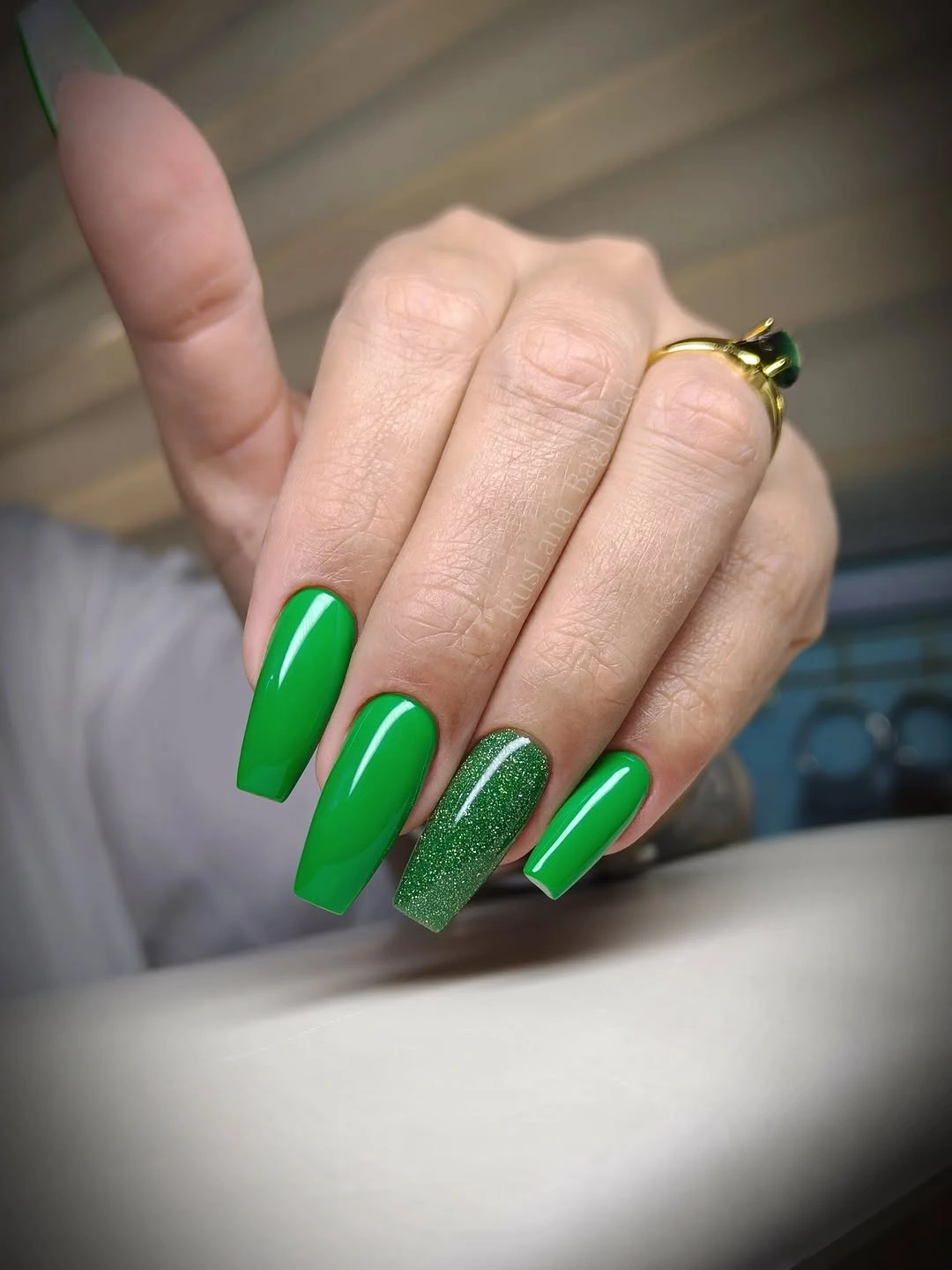
A monochrome green set is easier to style than a multicolor one because the nail color can act like a single accessory. I would place the sparkle on the middle and ring fingers or another pair that gives the hand a balanced rhythm, then keep the rest smooth and saturated. For a quieter version, use a fine shimmer over one nail instead of changing two complete surfaces.
The strong color makes the squared length visible from a distance, but it also means any uneven edge or chip will stand out. That is the honest maintenance cost of a bright solid manicure. If you shorten the nails, keep the color and lose only the extra glitter; the design will still work because the hue is doing most of the visual lifting.
Red and White Curves Across Long Pointed Nails
Broad red-and-white curves sweep across these long tapered nails, creating a sense of movement that is closer to painted ribbons than to small decorative dots. The red supplies the depth and the white opens it back up, while the pointed outline makes every curve travel toward a clear destination. The surrounding red flowers echo the palette, but the manicure remains readable because the bands have different widths.
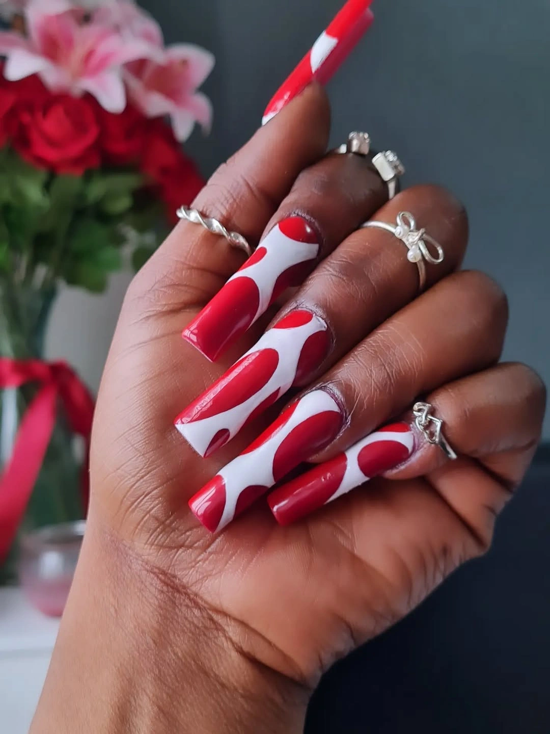
Large curves are a smart choice for long nails because they remain visible when the hand moves and do not depend on tiny precision marks. To adapt the idea, keep one wide white sweep over the red base and leave the remaining nails in a simpler red finish. That version keeps the movement while making the palette easier to wear with brown, black, or cream fall clothing.
The limitation is visual volume: several bold bands can feel occasion-specific, especially when paired with an already dramatic point. A shorter nail can carry the same contrast if the curve begins near the sidewall and ends before the tip rather than wrapping around the entire surface. Let the white act as a route for the eye, not as an equal block on every nail.
Spotted White Accents with Dark Blue and Silver
Long pointed nails combine irregular black spots on white with dark blue and silver reflective accents, creating a playful print-led set that still has a cool palette. The spotted nails are the easiest to recognize, but the silver keeps the design from feeling flat and the blue gives the eye a darker anchor. Each element has a separate job, which is why the mix does not collapse into random decoration.
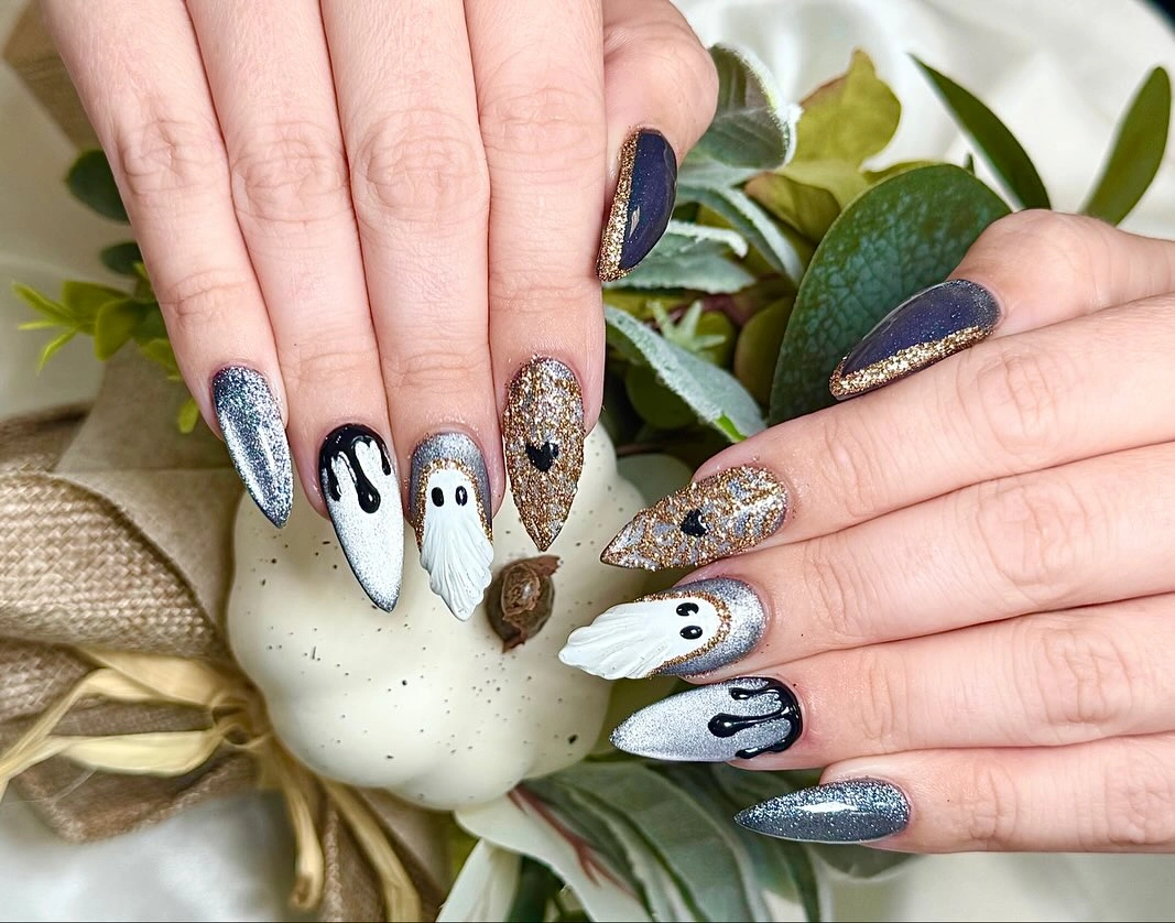
The cleanest adaptation would place the spotted print on two nails, use one deep blue solid, and let the remaining fingers carry a restrained silver finish. That distribution keeps the high-contrast pattern visible without asking every nail to compete for attention. On a shorter shape, reduce the size of the spots before reducing their number so the white ground stays open.
Because the print is strong, it works best with jewelry and clothing that do not introduce another competing pattern near the hands. The dark blue also makes the set feel more autumn-ready than a bright animal print would. Keep the points neat and the white areas clean, since any edge wear will be obvious against the deep accents.
Milky Blue-White Nails with a Quiet Green Edge
These long softly squared nails use a pale cool base that sits between milky white and light blue, with a faint green detail appearing near some edges. The color is quiet enough that the shape and gloss arrive first, then the eye finds the narrow green line as a second layer. That order gives the design freshness without making it feel decorated for decoration’s sake.
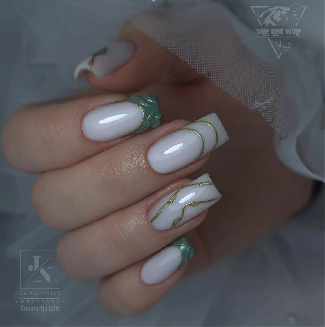
A cool milky base is especially useful when you want a clean manicure that still feels different from a standard nude. Keep the green to a slim side line or soft French edge, and let the rest of the nail remain open. If the length is shortened, simplify the green rather than making it thicker, because the restrained contrast is the point of the design.
The pale color will show uneven coverage more readily than a darker shade, so a smooth surface matters. It also pairs well with gray knitwear, blue denim, and muted green accessories without forcing the outfit into one seasonal palette. This is a good choice when you want the feeling of detail but prefer the hand to stay visually calm.
Deep Green French Tips with Small Gold Details
Long almond nails use a sheer nude-pink base and deep green tips, while small gold accents appear near the center or side of selected nails. The green edge gives the shape a clear autumn direction, but the base remains light enough to keep the hand open. Gold is used as a supporting glint rather than a second full design language, so the set feels considered rather than ornate.
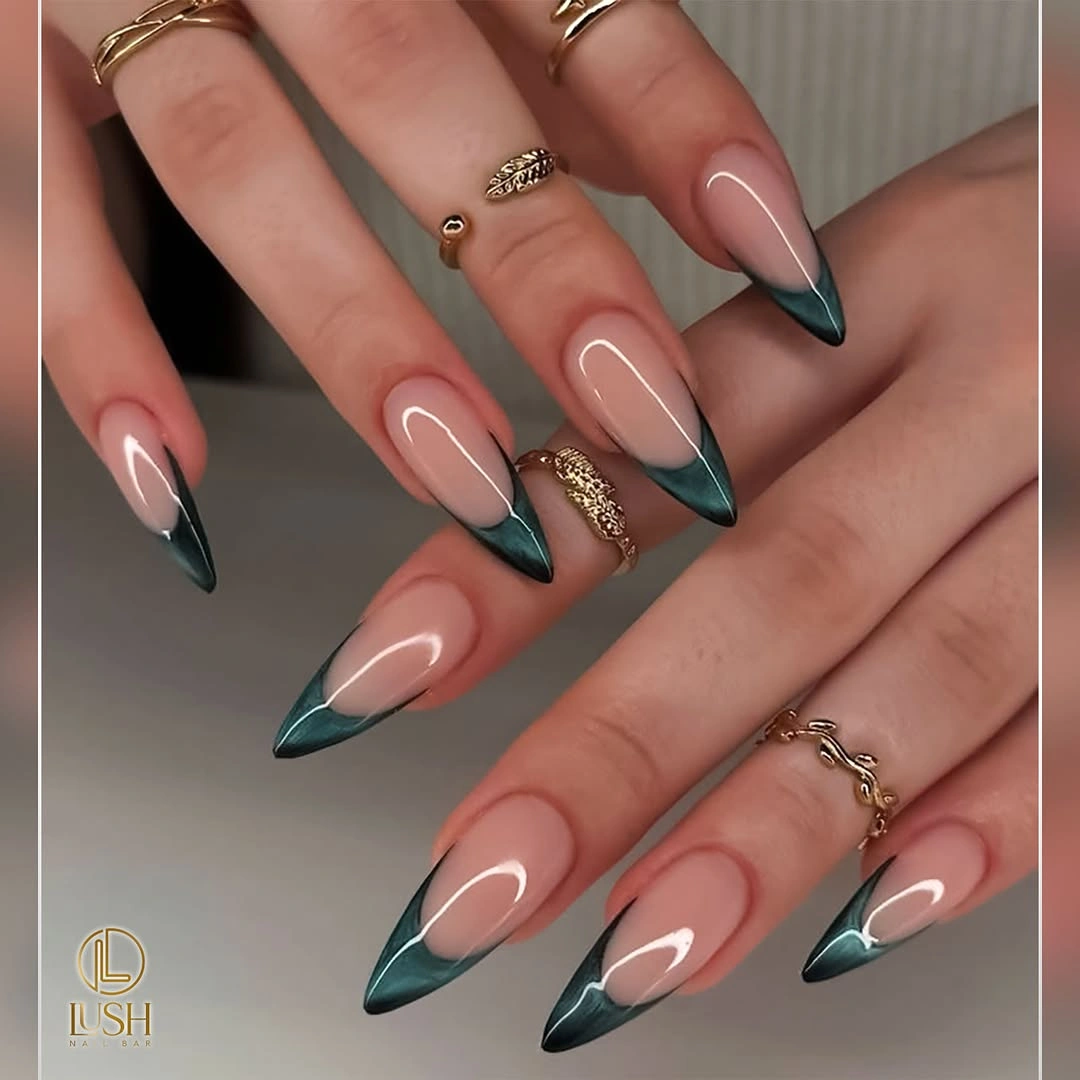
Dark tips visually extend the almond silhouette, which makes the idea effective even when the length is moderate. I would repeat the green edge consistently and place gold on only a few nails, then keep the line thin enough that it does not compete with the tip. For a shorter version, a narrow green smile line can replace a fuller edge while preserving the same color relationship.
The deep edge is the maintenance focal point because chips are easy to spot against the pale base. It is also the reason the look works with neutrals: green provides the seasonal note and nude provides relief. For another structured fall direction, the placement logic can sit beside these fall nail designs for office without needing to copy their exact color balance.
Warm Abstract Lines on a Nude Pointed Base
These long pointed nails use a translucent nude base as open space for red, orange, and green lines, with small gold-like glints and one spotted black-and-white accent. The colors do not form one repeated motif; they travel diagonally, break into patches, and leave the pale center visible. That makes the manicure lively without turning the whole surface opaque.
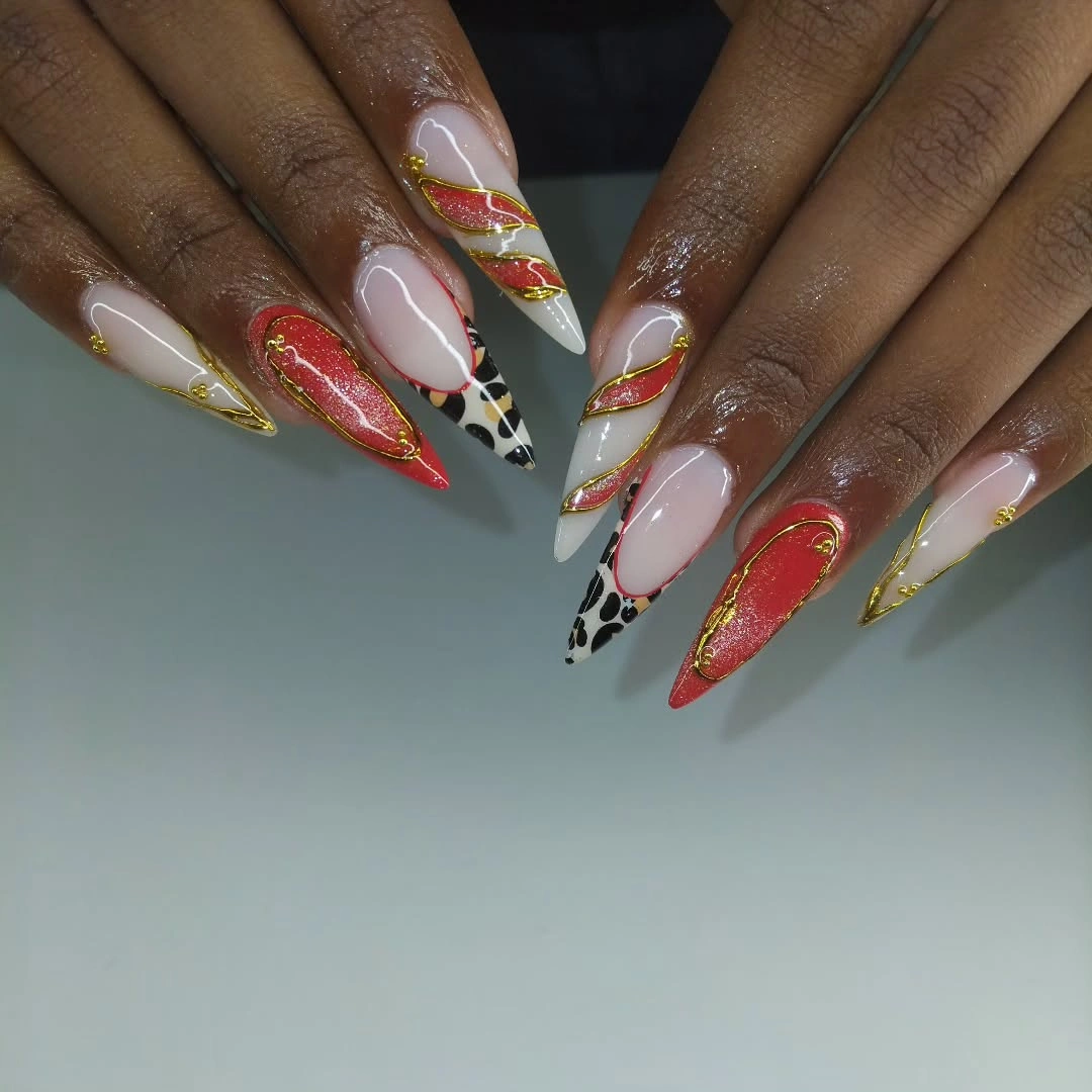
The visual rule is repetition through color rather than repetition through shape. Pick two warm accents for most nails, then let green or the spotted detail appear once so the set has a focal change. This approach works especially well for long length because the open spaces keep the points from becoming visually blunt.
There is a fine line between expressive and crowded when several colors meet, so a shorter adaptation should remove intersections before removing the palette. Keep one diagonal line, one small patch, and the nude center intact. The design will still feel playful, but the eye will have a clearer route from the base to the tip.
Pale Pink Almonds with Playful Green Dot Accents
Long almond nails combine a pale pink base with bright green tips and rounded green dots near the edges. The green is saturated enough to establish the seasonal accent, while the dots add a bouncy rhythm that keeps the French structure from feeling formal. Because the base is light, the manicure has room for play without becoming visually dense.
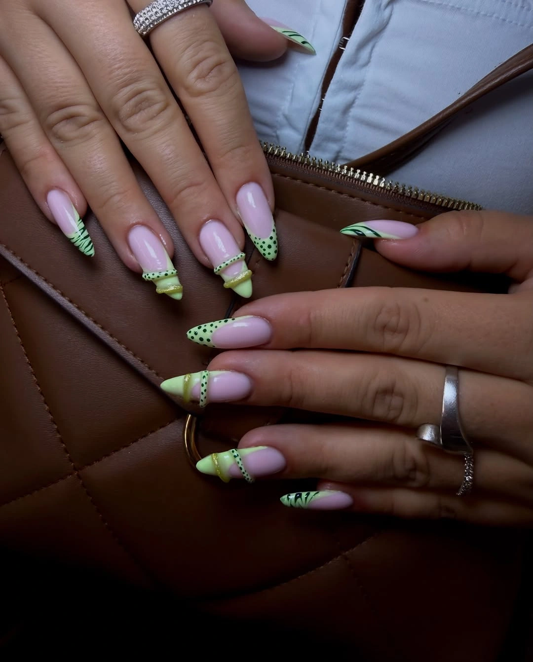
For a balanced version, keep the green tip consistent and place the dot detail on two nails rather than scattering it everywhere. The dots can be small and closely related in scale so they support the tip instead of becoming separate focal points. If the nail is shortened, retain the green edge and move the dots closer to the center where they have enough space to remain clear.
The extra detail may need more attention as the manicure grows out because the pale base makes placement changes visible. Still, the structure is practical: one light base, one bright accent, and one repeatable mark. That combination gives a long set personality without asking for a new color on every finger.
Green-Tipped Nude Nails with a Textured White Accent
These sharply tapered nude nails use green tips or lines on several fingers, then interrupt the palette with one white accent that appears ribbed or raised. The white detail is important because it changes the surface conversation rather than simply adding another color. Against the smooth nude and green, that texture becomes the point the eye returns to.
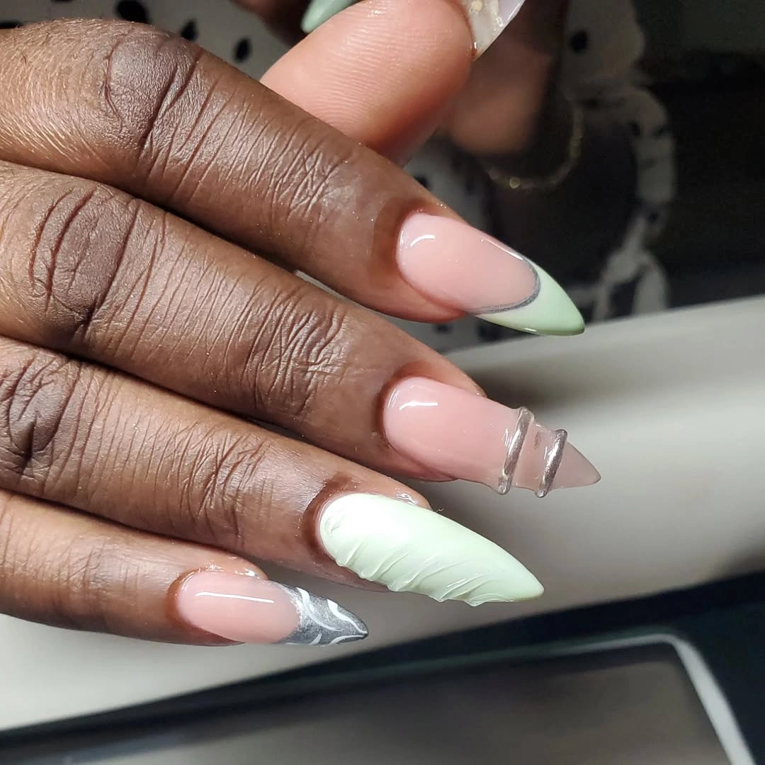
A single tactile-looking accent works because the rest of the manicure is visually smooth and restrained. I would keep the green narrow and let the white nail stand alone, especially if the hands will be near knitwear or other textured fabrics. For a lower-maintenance version, replace the raised-looking detail with a flat white line that keeps the contrast but removes the extra surface complexity.
The practical limitation is that a textured accent can catch on fabric more readily than a smooth polish surface, and its visual impact may fade if the detail wears down. The color story itself is easy to adapt: nude, green, and white can move from casual to dressier settings without much effort. Keep the texture intentional and isolated rather than adding it to every nail.
Neon Orange and Pink Bands over Sheer Pink
Long squared nails use a sheer pink base with open bands of neon orange, hot pink, and warm red-like color concentrated near the tips. The pale center remains visible between the lines, so the bright colors feel like graphic accents rather than a full opaque block. Repeating the band idea across both hands gives the set order even though the colors are energetic.
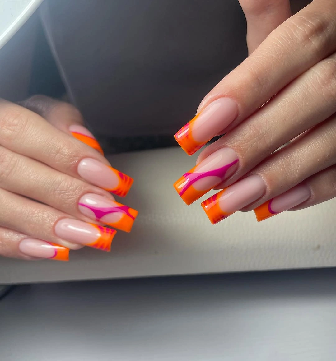
Negative space is doing the balancing work here. If you want to recreate the effect with less intensity, choose one neon shade for most tips and place the second bright color on only two nails. The open center should stay open, because filling it would remove the lightness that makes the bands look deliberate.
Bright tips can be surprisingly adaptable when the base is soft, but the saturated edges will show wear quickly. A shorter square can keep the design if the bands become slightly wider and fewer in number. Readers who prefer the idea of a clean color boundary can let the tip carry the emphasis without adding another pattern or color family.
Dark Pointed Nails with Multicolor Burst Details
Long pointed nails use a dark ground for tiny bursts of yellow, orange, pink, and green, creating a concentrated maximalist effect. The bright strokes look almost like small sparks or flame-like fragments, but their exact shapes stay abstract and varied. Because the base is dark, even a small amount of color becomes highly visible.
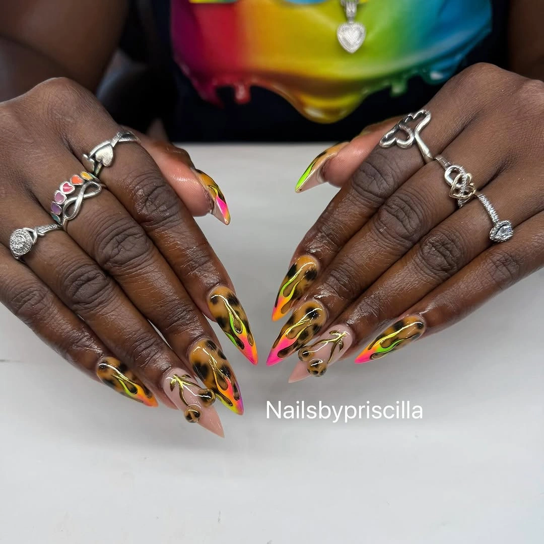
The best way to borrow this idea is to keep the dark base and reduce the bright palette to two accents on one or two nails. That lets the bursts remain the focal point without forcing every finger into a separate color conversation. The original scale depends on long points, but a shorter almond can still carry one concentrated graphic panel.
This is a high-contrast design that will influence the mood of an outfit, so quieter clothing and simple rings may make the manicure easier to appreciate. Dense detail also means grow-out is more noticeable because the dark base frames every change. Preserve the relationship between dark space and bright marks, since the exact number of strokes is less important than the contrast.
Pale Heart Tips on Extra-Long Almond Nails
Extra-long tapered nails use a pale pink-and-white base with layered heart shapes placed near the tips. The hearts are not floating on an otherwise ordinary nail; they use the extreme length as a clean stage, allowing the motif to sit at the end of each line and pull the eye toward the point. The effect feels romantic because the base remains soft while the outlines stay graphic.
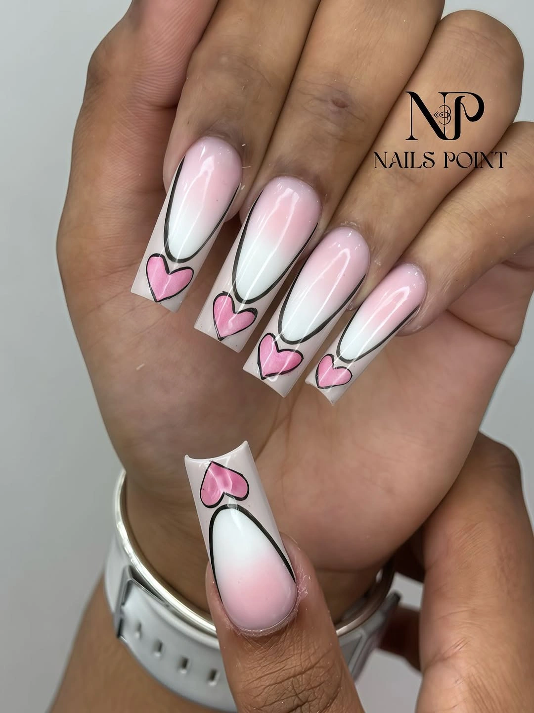
A shorter adaptation should move one heart closer to the free edge and widen it slightly so the motif does not disappear. Keeping the center pale is useful because it lets the shape of the nail remain visible, while a small dark outline gives the pink detail enough contrast. Repeating the heart on two or three nails may be more wearable than making every finger identical.
The honest tradeoff is the length itself: very long points affect typing, handling small objects, and the way the hand meets fabric. If that commitment is part of the appeal, let the tip motif stay clean and avoid extra embellishment near the cuticle. The strongest feature is the conversation between a long silhouette and a small, recognizable shape.
Solid Red Nails Mixed with Pink and Gold Lines
Long pointed nails alternate saturated red with lighter pink surfaces, narrow pale lines, and small gold-like details. The solid red nails give the set a firm visual anchor, while the pink accents soften the contrast and stop the manicure from reading as a single block of heat. The length keeps the red dramatic, but the alternating placement gives the eye a measured rhythm.
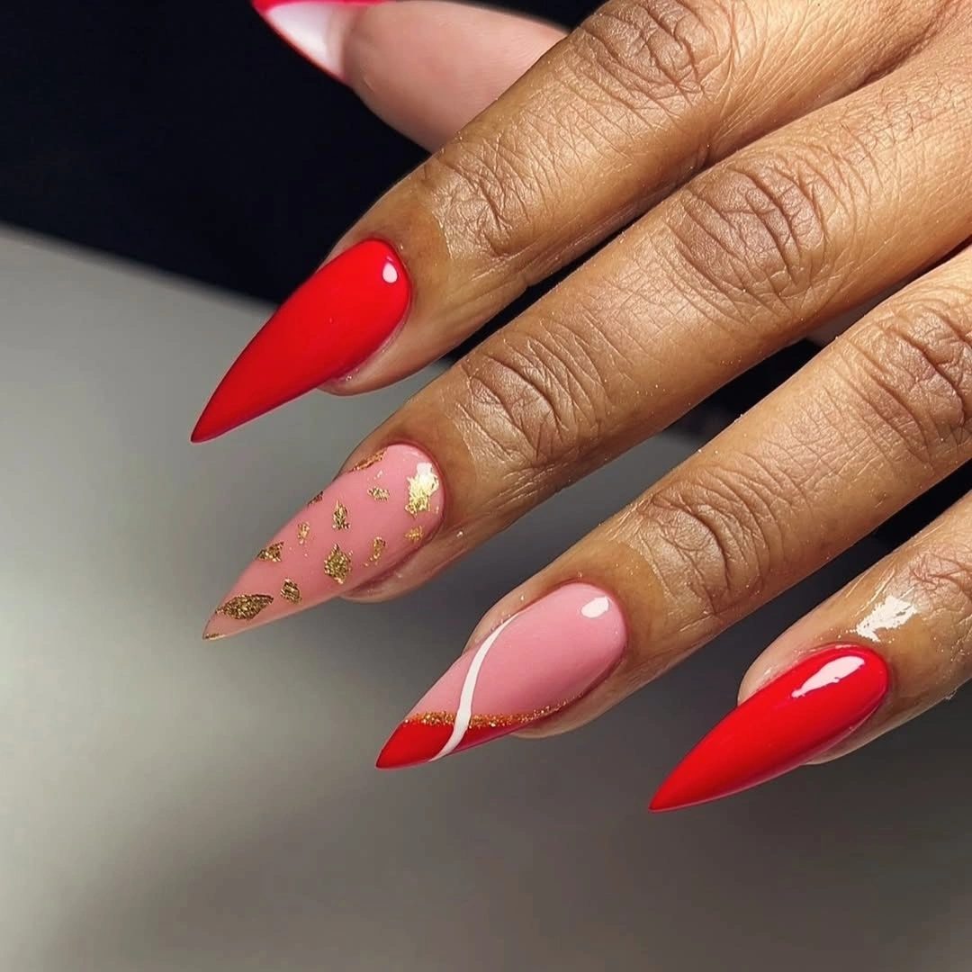
Alternating solid and decorated nails is a useful formula when you want color first and art second. I would keep the red on two or three nails, then use one thin line on the pink accents rather than filling every light surface. A shorter shape can use one red big accent and one pink line nail to preserve the same proportion with less visual commitment.
Red is easy to style but unforgiving around the edge, especially when the silhouette is pointed and the pale base makes contrast obvious. The design also benefits from restraint in jewelry because the small gold details already supply a glint. Let the solid red carry the seasonal message and allow the lighter nails to provide relief.
Chocolate and Cream Swirls on Long Square Nails
Long squared nails carry chocolate-brown and creamy nude swirls that move across the surface like soft ribbons. The curves overlap gently instead of forming hard geometric blocks, and the warm neutral palette keeps the design grounded even though the length is substantial. The manicure feels seasonal through depth and undertone rather than through an obvious autumn symbol.
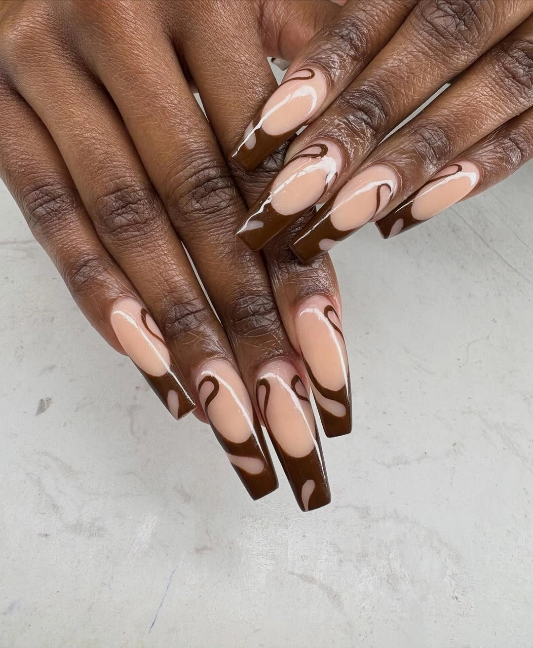
Swirls need room to travel, which is why the long shape helps the pattern stay readable. For a calmer version, use one broad brown ribbon over a pale base and leave two nails completely nude. That keeps the warm contrast while making the manicure easier to pair with printed clothing, leather accessories, or a busy ring stack.
When the nail is shortened, several overlapping curves may collapse into a muddy patch, so simplify the path before changing the colors. The dark brown will still provide the fall feeling, and the pale base will keep the set open. Readers who like more structure can compare the square emphasis in these fall nail designs for square shape, then keep the swirls as the softer detail.
Very Long Pink Stilettos with No Extra Art
Very long stiletto nails are covered in one even glossy pink, with no contrasting motif to interrupt the pointed outline. That simplicity is not an absence of design; it makes the length, taper, and reflective surface impossible to miss. The color stays cheerful, but the shape gives it a sharper and more assertive direction than a short rounded nail would have.
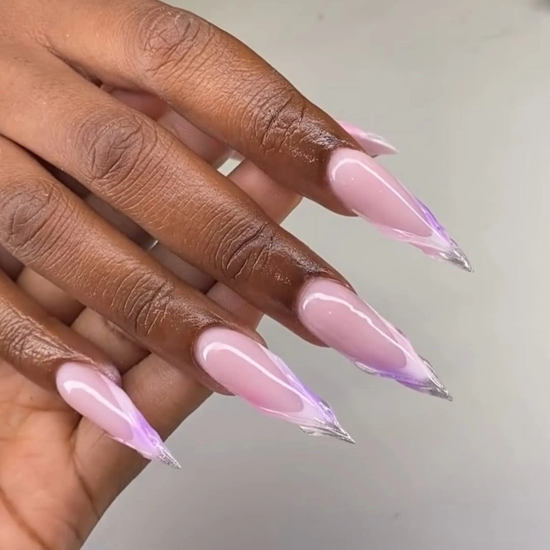
A single saturated color is a smart choice when the silhouette already supplies enough drama. I would keep the finish smooth and let the pink coordinate with neutral clothing, dark denim, or one colorful accessory rather than adding another nail-art element. If you want to make the idea more practical, shorten the point before changing the color; the concept survives easily.
The maintenance lesson is clear because there is nowhere for wear to hide. Edges, points, and uneven shine will all be visible, so a clean shape matters more than decorative complexity. This is the kind of long manicure that works for someone who wants a strong visual signature and does not need every finger to tell a different story.
Silver-Outlined Pale Pink with One Colorful Accent
Long pale pink nails use cool silver or gray linework around the edges, then place one small multicolor accent among the otherwise soft surfaces. The metallic outline adds a clean, slightly futuristic boundary without covering the base, while the colorful nail supplies a controlled change in temperature. The design feels detailed when examined closely but remains light from a distance.
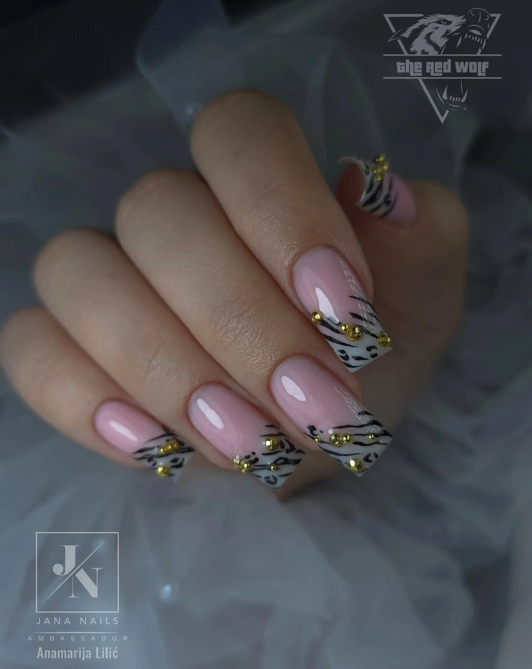
Keep the silver near the perimeter if you want the shape to stay the main visual fact. One colorful accent is enough because it creates contrast against the cool outline; repeating it across every nail would remove the quiet hierarchy. On a shorter nail, a single silver side line can carry the same idea more clearly than a complete border.
Fine edging depends on spacing and can look crowded if combined with large interior motifs, so the design rewards a light hand. It also pairs well with both warm and cool clothing because the pale pink is neutralized by the silver. Preserve the calm base and use color only where you want the eye to pause.
Gold-Tipped Coffin Nails with Ornate Pink Details
Extra-long coffin nails combine translucent pink centers with bright gold tips and small ornamental details that resemble floral or decorative flourishes. The square ends make the gold tip feel architectural, while the pale center keeps the length from becoming one continuous metallic block. This is the most overtly ornate look here because both placement and proportion announce the tip.
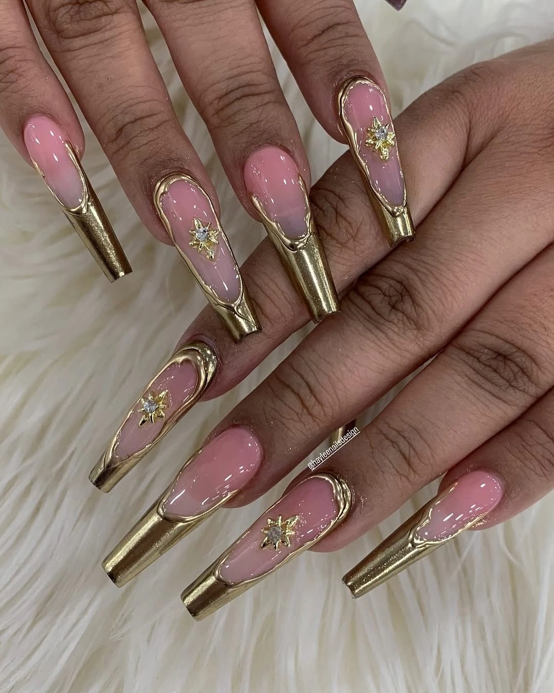
Gold is easiest to control when it has a defined territory, and the tips provide that boundary. A more wearable adaptation would shorten the coffin shape and keep the gold to one narrow edge, then reserve the ornamental detail for one nail. The pink center should remain visible because it is what makes the metallic finish feel framed rather than heavy.
The length and strong tip contrast create a real commitment around typing, snagging, and everyday handling, so this design suits someone who enjoys the statement as much as the maintenance. If the details begin to compete, remove ornament before removing the gold tip. The visual idea is clear: pale center, bright border, one deliberate flourish.
Pink Nail-Art Collage with Mixed Graphic Panels
This final manicure uses a pink base but lets each nail take a different graphic route, including black line art, pale geometric bands, checker-like squares, and small illustrated details. The set reads as a collage rather than a repeated pattern, yet the shared pink field keeps the individual panels connected. That balance gives the hand a playful finish without needing one literal motif across every finger.
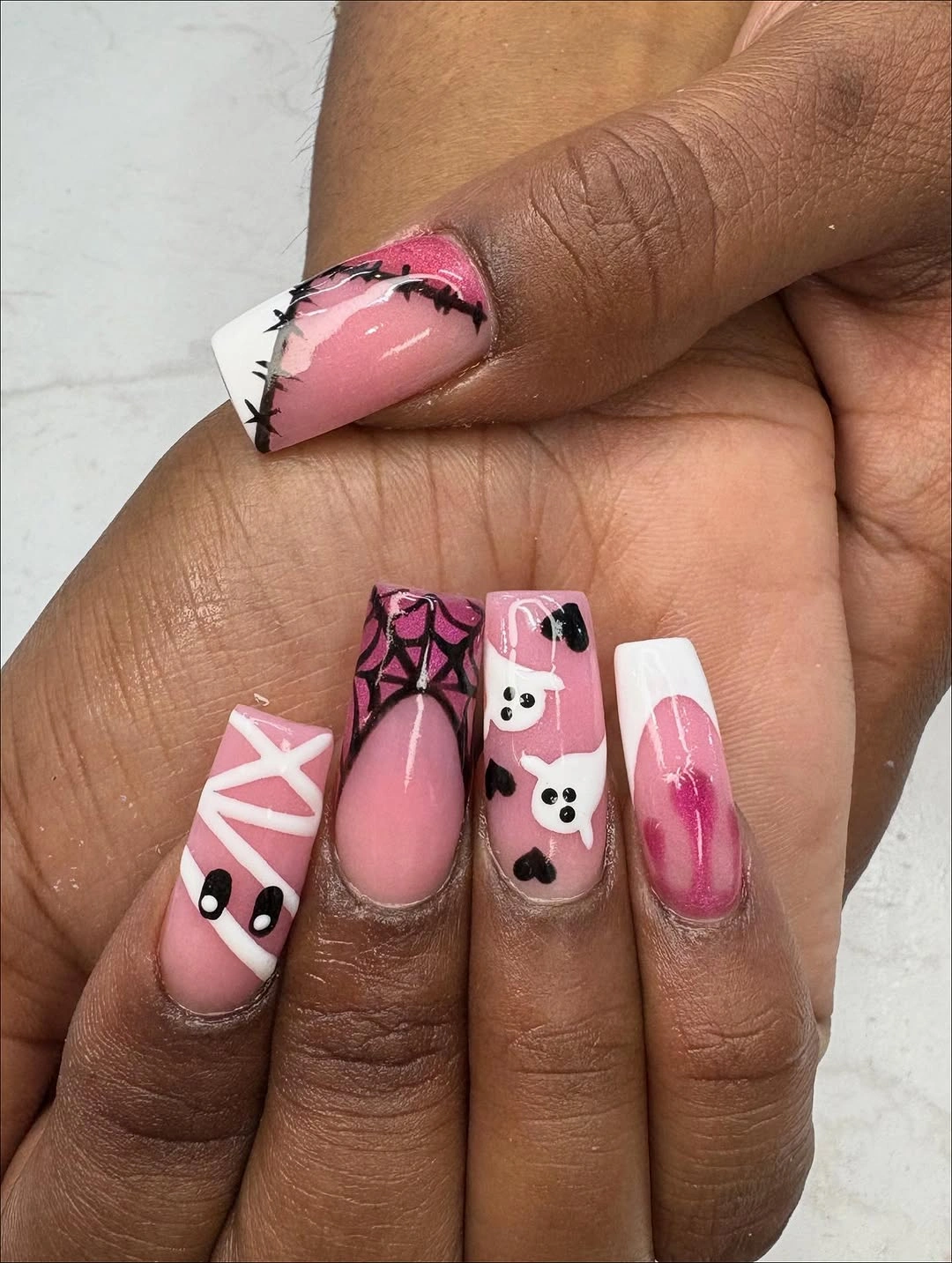
A collage works best when one color stays constant and only the supporting marks change. If you want to adapt it for a shorter shape, choose two motifs – perhaps a checker accent and one black line drawing – then repeat them selectively instead of shrinking every detail into a tiny space. The pink base will still make the design feel like one set.
The tradeoff is upkeep: different art on every nail makes a small repair more visible because the replacement has to match one specific panel. Still, this is a useful choice for anyone who enjoys variety more than perfect repetition. End with the graphic detail that feels most personal, but keep the pink ground consistent enough to give the collage a visual home.