Pale polish has a particular challenge: it can look beautifully quiet or simply unfinished, and the difference often comes down to one very small choice. A slight shift in depth, a fine edge, or an unexpected placement can give the hand definition without crowding it. That is the useful starting point for fall nails for pale skin – not more decoration, but a clearer reason for every detail that is present.
Use contrast sparingly and let scale decide how much is enough. A short square does not need the same amount of detail as a long almond, and a single mark often has more impact when the surrounding surface stays open. If you enjoy a nearly bare look, begin with a sheer base; if you want more presence, establish the shape or depth first, then add art only when it earns its place.
Pale Pink and White with Black Speckles
Soft pink and white nails give this medium almond set a light starting point, while sparse black speckles create enough contrast to define the design. The dots are irregular and limited, so they read as a small graphic texture rather than a full pattern. That restraint makes the pale colors remain the main impression, which is often the most useful balance when you want a lighter manicure with a little edge.
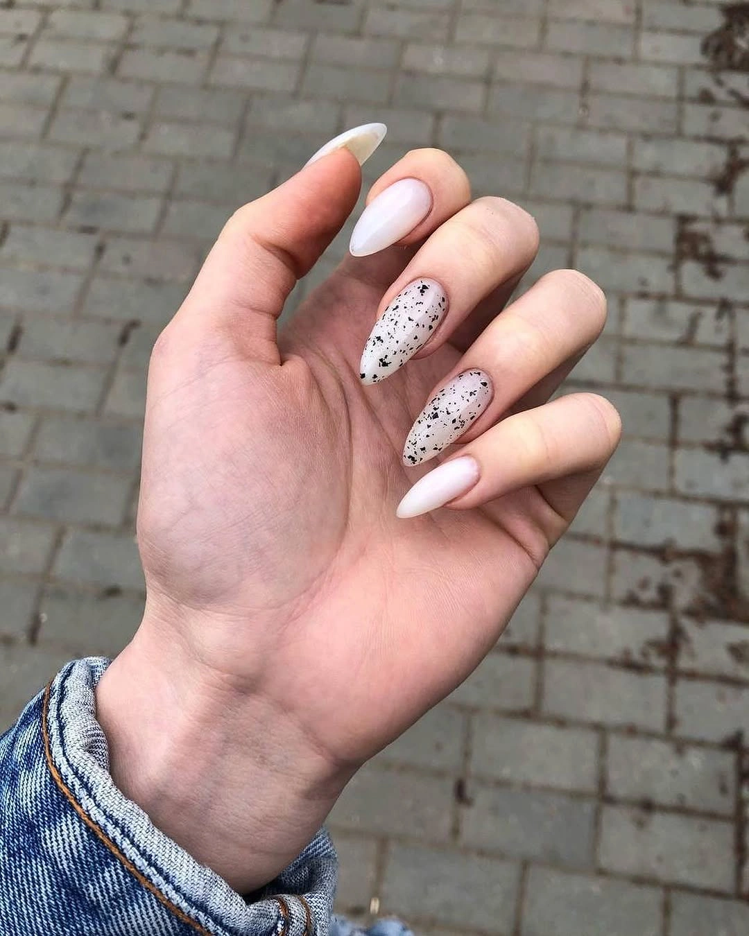
The alternating pink and white blocks stop the dark marks from looking repetitive, because each light surface offers a slightly different setting for the spots. If you prefer an even calmer version, keep the white and pale pink solids but use speckles on one accent nail only. The contrast will still be present, while the rest of the hand stays especially open and easy to style.
Fine dark dots are small but visible, so a clean glossy surface matters more than it would with a fully opaque dark color. The medium almond outline helps by giving the details enough room without making them look stretched. It is a gentle way to add personality to pale nails, with a clear limit that prevents the black from becoming heavier than the soft base.
Brown Squares with Delicate Dotted Borders
Deep brown square nails establish the weight in this design, while nude accents with curved white lines and tiny dark dots create a much lighter counterpoint. One angled brown tip sharpens the transition between the two values and makes the graphic placement feel intentional. The effect is strongest because the darker color remains solid on selected nails instead of appearing as another intricate surface.
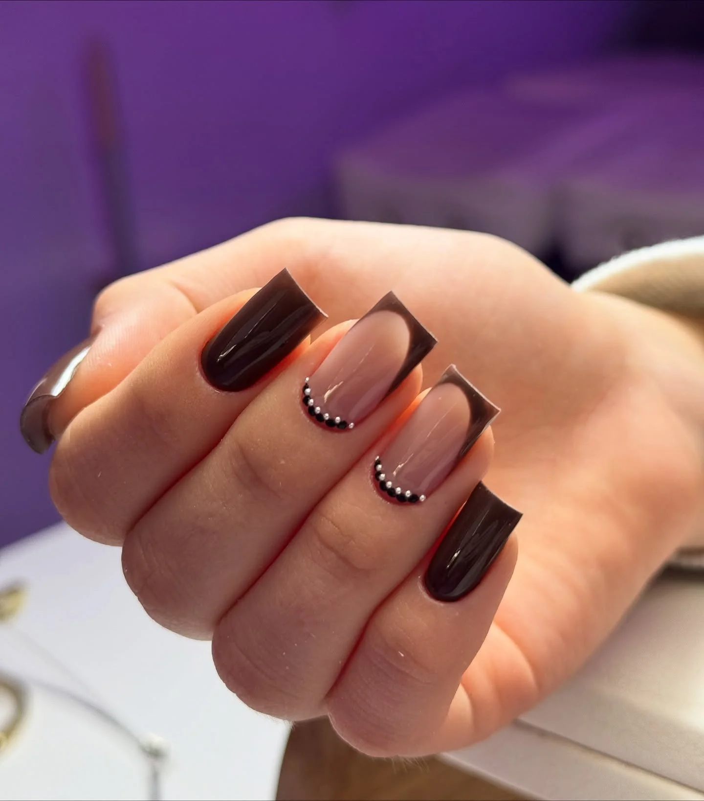
The fine dotted edges bring a tailored feeling to the nude nails without filling them with a dense pattern. A shorter version could simplify the composition by keeping only the angled tip and one dotted curve, leaving the other nails plain brown or nude. That edit would preserve the quiet contrast between a warm dark shade and a bare-looking light field.
Square nails make the brown color appear especially crisp, so consistent tip length is worth maintaining if you choose this idea. The pale details offer enough softness that the set does not feel severe, but the black dots and lines will be the first elements to show wear if the surface becomes uneven. Keep the decorative marks thin and spaced, and the design stays balanced rather than busy.
Peach Nudes with Warm Botanical Accents
A peach-nude base gives the warm rust leaves and tiny dark lines in this almond manicure a soft place to sit. The botanical details are confined to a few nails, leaving broad areas of unpainted-looking color around each small mark. That use of space is what keeps the warm palette gentle, even though the accents are visibly more detailed than a standard single-color set.
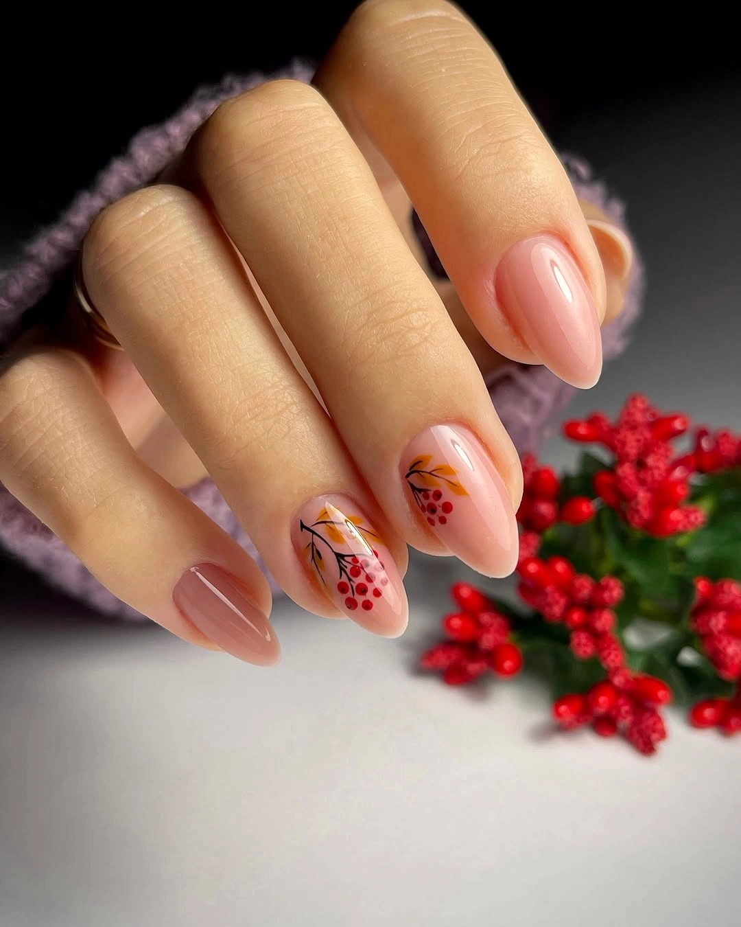
The warm accent colors work well because they are close to the peach base rather than sharply opposed to it. If you want a lower-detail interpretation, choose a single leaf motif in rust or brown and repeat it on only two nails. You will keep the same fall direction while making the design easier to refresh when fine lines or tiny dots begin to lose their crispness.
Longer almonds give a leaf design more room to follow the nail, but the medium shape here keeps the result wearable for everyday use. It does not need glitter or a second motif, since the little leaves already give the neutral ground a clear focal point. Pairing this kind of manicure with simple warm accessories lets the muted botanical work remain the main visual detail.
Long Nude Squares with Layered Leaf Art
Long square nude nails become a canvas for warm brown and rust leaf illustrations that follow the length of each nail. The base remains visible between the botanical shapes, which prevents the detailed artwork from becoming a solid wall of color. This is a more decorative fall nails for pale skin option, but it still feels organized because the leaf motifs share the same narrow warm palette.
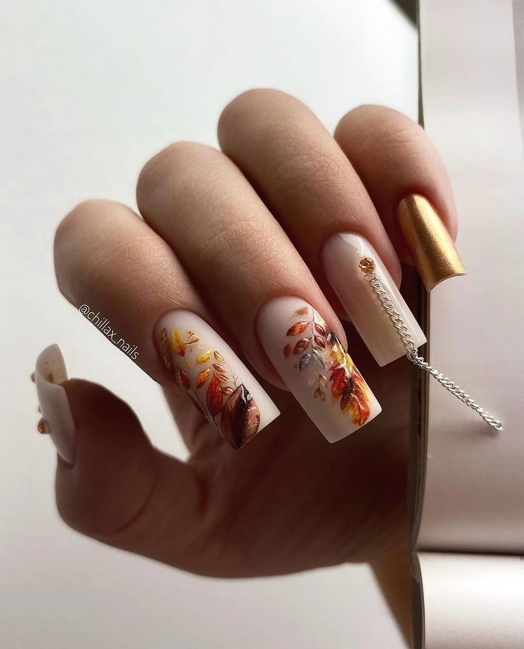
The square silhouette gives the elongated accents a straight, graphic framework, while the curved leaves introduce softness within that structure. If the full illustration feels too elaborate, reserve it for two nails and make the rest a warm nude or a single muted brown. The contrast between clean blocks and detailed leaves will keep the original idea recognizable without requiring every nail to carry a different drawing.
Fine art on a long surface deserves a simple supporting outfit, because patterned sleeves or bold jewelry can compete with the warm line work quickly. The design also benefits from careful edge maintenance, since the pointed leaf shapes rely on clarity. When the palette stays to brown, rust, nude, and a little cream, the multiple illustrated nails still read as one coherent thought instead of several unrelated seasonal symbols.
Black and White Web-Inspired Graphic Nails
Milky white nails with black web-like lines and a small black illustrated figure create the highest contrast in this set, while dark tips frame the details and keep them contained. The graphic treatment works because the white ground is generous and clean, giving every black line a clear edge. It is a distinctly expressive choice for someone who wants their nail art to feel sharp, theatrical, and visibly different from a neutral manicure.
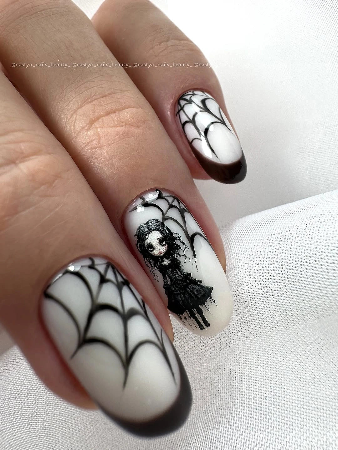
The design does not need extra colors to make an impact. White carries the open space, black supplies the drawing, and the dark edges add structure around the individual motifs. For a quieter version, use the web-like lines on one accent nail with simple black or white solids elsewhere; the same contrast remains, but the manicure becomes easier to pair with everyday clothes and accessories.
Because the black lines are so clear against white, small chips or blurred edges will be more noticeable than they would be in a mottled pattern. That makes this a set for someone who likes crisp detail and is happy to keep it fresh. The careful limitation to two main colors is what stops the illustrated elements from looking overloaded, even though their visual character is intentionally bold.
Sheer Nude with Isolated Leaf Outlines
Translucent nude nails stay almost bare around the individual black and white leaf outlines, allowing each small botanical mark to feel light rather than crowded. The long narrow shape gives the lines a clear direction, with the motifs placed separately instead of forming a continuous painted surface. This is an airy alternative when you want nail art but do not want to lose the soft, open quality of a pale base.
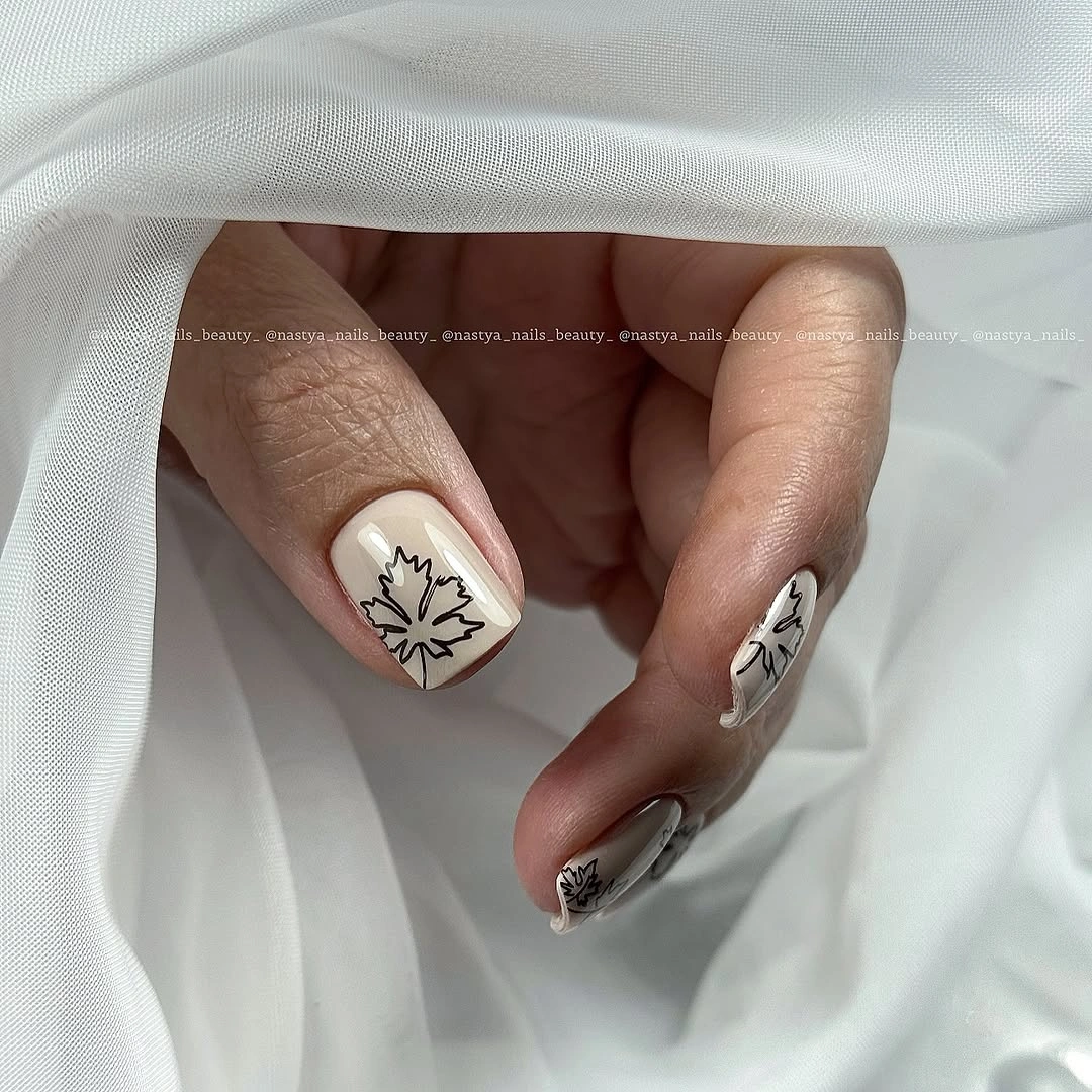
Using black and white within the same delicate design adds contrast without introducing a whole new color story. If you prefer less detail, select one line color and place a single leaf on two accent nails, letting the rest remain plain nude. The exposed base is important here, because it keeps the line art from becoming the only visual field and makes the long shape look less dense.
Very fine outlines call for a tidy finish, but their small scale makes them easier to enjoy with both simple and patterned clothing than a full illustrated nail would be. The design has a quiet movement as the fingers turn, yet it does not demand attention from every angle. Keep the stems and leaves narrow, and the contrast will remain delicate rather than becoming a heavy graphic overlay.
Bright Orange with One Botanical Accent
Saturated orange gives these medium almond nails immediate warmth, while one nude accent with curved leaf-like marks stops the set from becoming a simple all-over color. The solid orange nails remain clean and glossy, so the detailed accent has a clear job rather than competing with several other motifs. It is an effective approach when you enjoy a bold shade but want one small visual pause within the run of color.
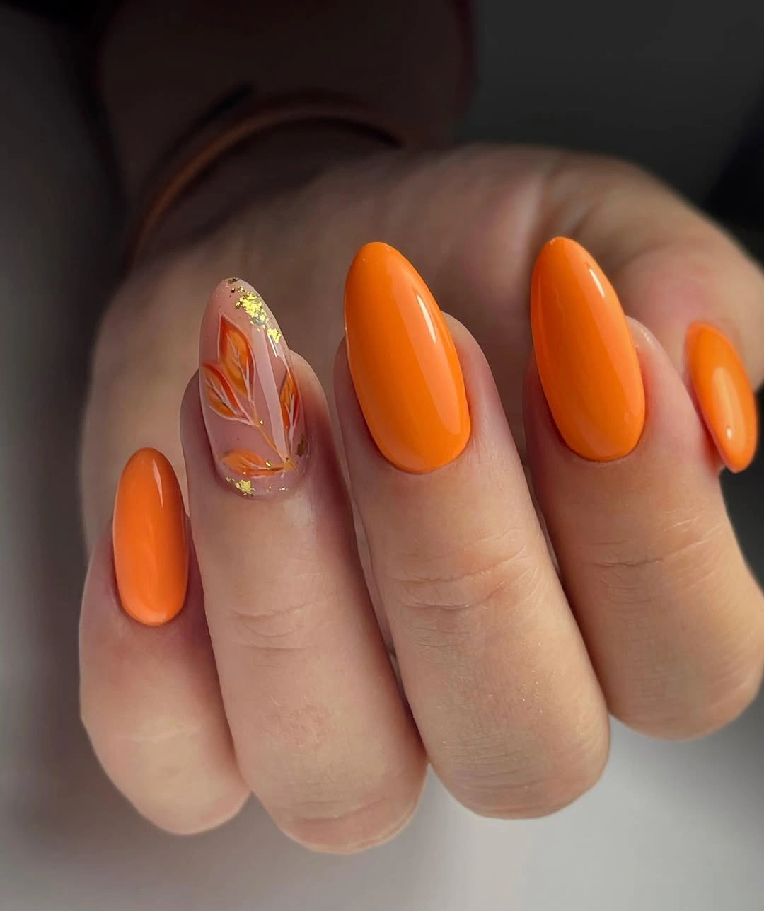
The medium almond shape softens the strength of the orange and gives it a smoother line than a sharp square would. To make the look more restrained, use a deeper burnt orange or shorten the nails, then keep the botanical accent in the same warm family. The connection between the orange solids and the small rust details is more important than copying every curved mark exactly.
A bright full-coverage color is naturally visible, so it works best when the accent stays limited and the surrounding styling is not equally saturated. The nude nail earns its place by providing contrast and room around the tiny design. This makes the orange feel considered rather than overwhelming, with one warm decorative moment that does not turn the whole manicure into a pattern.
Cream Animal Print with Bare Beige Space
Cream and beige almond nails leave plenty of light background around the irregular black animal-inspired spots and sweeping marks. The print changes from nail to nail, yet the limited cream, beige, and black palette makes those variations feel connected. This is a useful middle ground between a plain neutral set and a very dark full pattern, because the pale base still carries most of the visual weight.
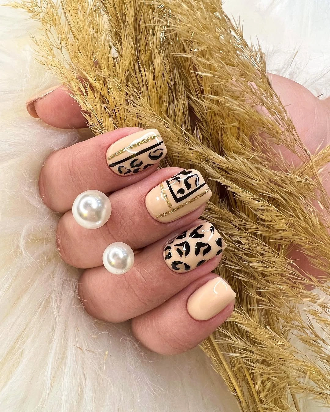
The light base is doing more than softening the contrast; it gives each black mark space to look intentional. If you want a simpler version, put the pattern on two cream accent nails and use a warm beige solid for the rest. That keeps the same tonal relationship while reducing the amount of irregular detail you need to maintain across the whole hand.
Animal-inspired marks are most successful when they are allowed to vary slightly rather than being forced into identical shapes. The almond silhouette offers enough room for that variation without making the print feel too large. Avoid adding another bright color or metallic detail, since the pale ground and black pattern already create a complete contrast that can stand on its own.
Short Pink Nails with Tiny Warm Marks
Pale pink short nails become more interesting through small warm-colored marks and one reflective accent, yet the open pink surfaces remain the dominant feature. The decorative details are modest in scale, which suits the compact rounded shape and keeps the set from looking crowded. It is a gentle choice for someone who likes a light manicure but wants a little more visual movement than a single nude shade provides.
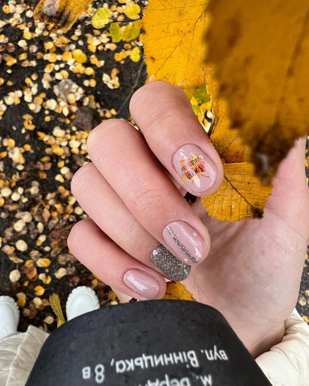
The reflective nail changes the finish without changing the palette too dramatically, while the small warm marks provide a second point of interest. You could simplify further by selecting either the tiny art or the reflective accent, depending on whether you prefer color detail or a surface that catches light. The pink base gives either approach enough calm space to remain subtle and wearable.
Short nails keep the design practical, but they also make scale important: details need to stay small enough that the pink ground still shows. This set works best when the warm accents remain occasional rather than appearing on every finger. The result is not about a dramatic statement, but about adding a few quiet notes to a polished pale color without losing its easy, clean character.
Black Botanical Lines on Sheer Almonds
Fine black leaf outlines stretch along these sheer nude almond nails, giving the pale base definition while preserving its translucent appearance. The motifs are positioned vertically and separated by open space, so the eye follows the natural length of the shape instead of seeing a dense black print. That placement makes the manicure feel graphic yet still appropriately light for someone who prefers a mostly nude nail.
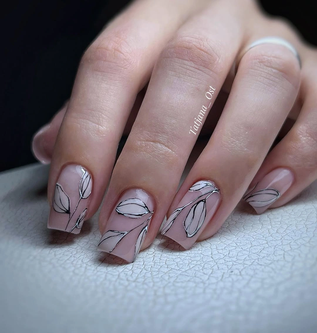
Black works here because it is used as a narrow outline rather than as a filled-in leaf or a full tip. A dark brown line could make the contrast softer, but the clear black gives the design its precise, contemporary edge. If you want to reduce the art, leave two nails sheer and plain, then place a single outlined leaf on the remaining accents for the same linear effect.
Longer wear may make the fine curves less crisp than an opaque solid color, so this is a good choice for someone who enjoys refreshing detailed nails regularly. The payoff is a set that looks different without relying on a heavy finish or a bright palette. Let the nude base remain visible between every mark, and the black lines will continue to feel like a deliberate sketch rather than visual clutter.
Coral Squares with Graphic Accent Panels
Bright coral square nails provide the strongest color blocks in this long set, while pale accent nails hold small graphic illustrations and dark lettering. The difference in value makes the illustrated panels stand out immediately, yet the coral prevents them from feeling too delicate or disconnected. It is a lively design that gives the artwork room to exist while keeping one bold color as the main thread across the hand.
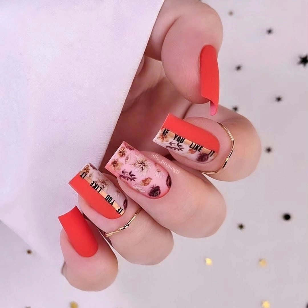
The long square surface is helpful because it gives the small graphics more room than a short nail would offer. If the lettering and illustration feel too detailed for your style, use coral solids with one pale accent carrying a single simple line or symbol. You will retain the original contrast between a vivid block of color and a lighter focal panel without needing every accent nail to tell its own story.
Coral is already a statement shade, so avoid adding another unrelated bright color around it. The pale accents work because they create a pause, and the black details stay small enough not to take over. The design is best for a day when your nails can be the expressive element of your look, with simple clothing and accessories giving the graphic panels enough space to remain readable.
Soft Pink with Airy White Linework
Long pink almond nails are softened further by thin white flower-like lines, tiny pale flecks, and restrained gold details. The delicate marks follow the length of the nails rather than filling their centers, which keeps the pale pink visible around every curve. This is a good example of ornament that feels controlled: the surface has detail, but the color field remains calm enough to be the first thing you notice.
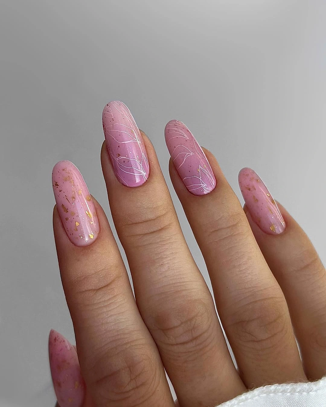
The white line work is most convincing because it stays narrow and leaves plenty of pink space between individual marks. For a shorter or more minimal version, keep the pale pink solids and add the white detail to one nail on each hand, then use gold only as a tiny point of light. That preserves the same soft contrast without making every nail depend on fine illustration.
Fine white lines and small metallic flecks will look their best when the glossy base remains smooth, so the design rewards a careful finish. It does not need a strong dark accent to feel complete, because the contrast is intentionally low and the almond shape provides enough elegance on its own. The quiet shimmer adds depth without changing the light, composed mood of the pink base.
Neutral Geometry with Small Gold Foil
Nude nails in this set are broken into cream and tan geometric patches, slim black lines, scattered gold foil, and one small leaf-like detail. The pieces differ from nail to nail, but the shared nude ground keeps the varied shapes in the same visual family. Gold brings a reflective interruption to the otherwise matte-looking palette, giving the design depth without requiring an entirely metallic nail or a bright color block.
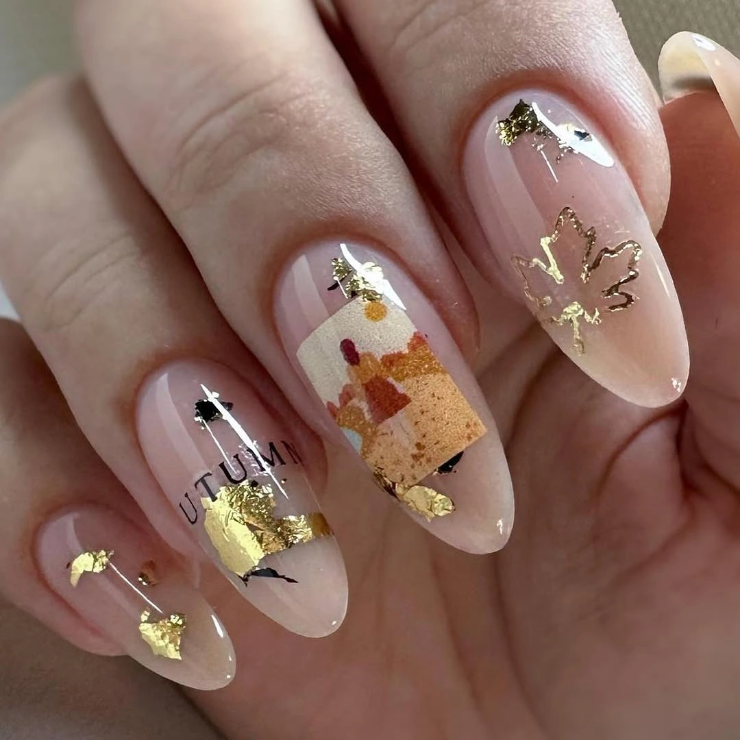
The mixed geometry works because the colors stay neutral and the black outlines are used only as fine separators. If you want to make the idea easier to wear, choose one cream patch, one narrow black line, and a small amount of gold foil on two accents, then keep the rest nude. The relationship between quiet base, crisp edge, and light-catching foil will remain without the visual density of several different motifs.
Gold foil is naturally noticeable against a pale ground, so it is important that the pieces remain scattered rather than forming a complete covering. The nude base gives the set room to breathe and prevents the varied shapes from looking like unrelated decorations. This is a good choice when you enjoy detail but prefer it organized through a limited color range, careful spacing, and a consistent glossy finish.
White Contour Lines over Quiet Neutrals
Short nails in pale nude and soft gray gain movement through white wavy contour lines that cross several light surfaces. The curves are organic rather than arranged as a strict grid, which makes the pattern feel calm and slightly fluid. A single gray solid nail gives the pale line work a deeper counterpoint, so the neutral palette has more dimension than a fully nude set without losing its restrained character.
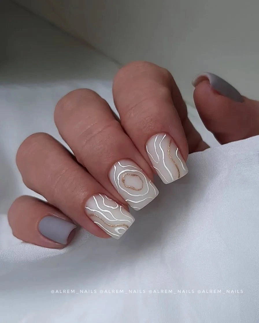
The short length is an advantage here because it keeps the wavy lines from becoming too elaborate. On a smaller surface, you can use fewer curves and let the white lines stay broad enough to read clearly, while the gray nail still provides contrast. If you choose more than one gray nail, keep the white pattern on the nude sections so the two values retain their separate visual jobs.
Unlike a tiny floral motif, contour lines do not need exact symmetry to look intentional, but they do need enough open base around them. That makes this design fairly forgiving in character while still looking polished when the glossy surface is even. It pairs easily with silver, denim, soft knits, or a simple dark sleeve, since the lines create interest without pushing the manicure toward a strong seasonal symbol.
Compact Blocks of Red Green and Black
Red, green, black, and beige appear as compact color panels across this short rounded manicure, giving it a lively graphic rhythm without requiring long nails. The shades are strong, but the small surface areas and repeated placement keep the set coherent. Each color is allowed to read as a clear block rather than blending into another, which is what makes the mixed palette feel deliberate rather than random.
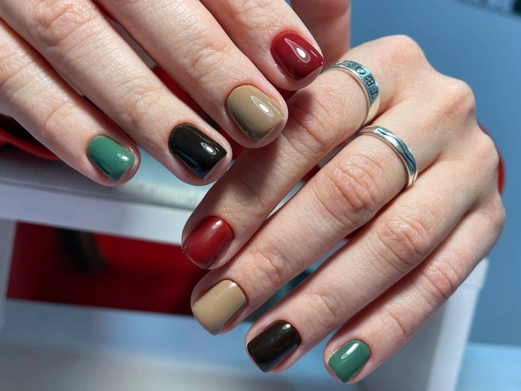
The short outline is especially useful for a multi-color idea because it contains the contrast and makes every panel appear tidy. To quiet the design, choose just red, beige, and one green, then reserve black for a slim edge or a single accent. You will keep the same clear color-block principle while making the finished look easier to pair with outfits that already have several visible colors.
Strong panels need clean boundaries, so this manicure depends more on neat color placement than on added decoration. That is also why it does not need glitter or illustrated art: the red, green, and black already provide enough visual tension. Let the beige areas remain simple, and they will work as pauses that make the darker and brighter blocks feel more considered on the compact rounded shape.
Black Frame with a Gold Leaf Center
A pale nude nail becomes a focused accent through an irregular black frame surrounding a small textured-looking gold leaf detail. The three-color contrast is concentrated in one area, leaving the rest of the light surface quiet and smooth. That limited placement is important: it lets the metallic center read as a deliberate focal point rather than as another layer in an already crowded mixed manicure.
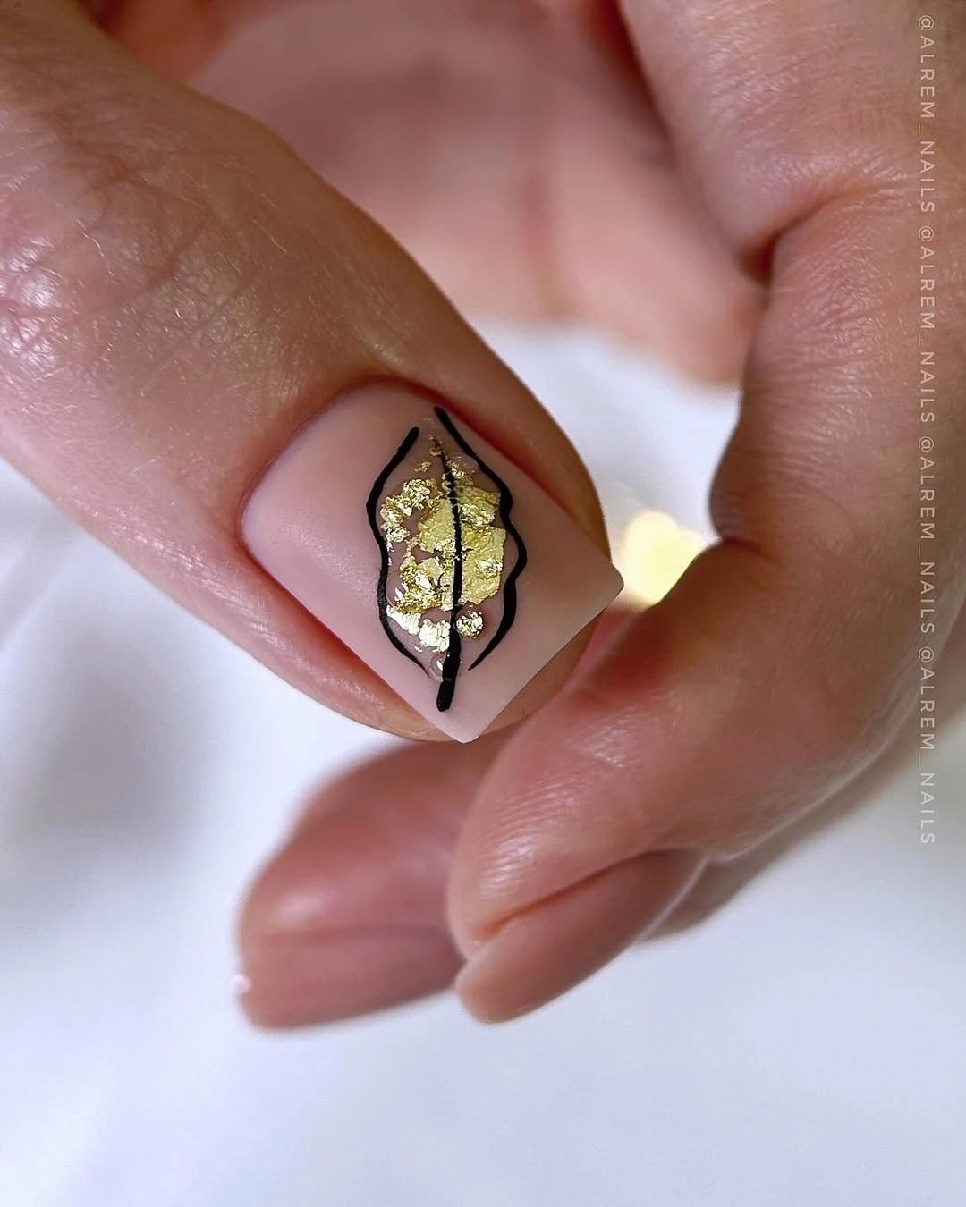
The black outline defines the gold without needing a full black nail, while the nude base keeps the high contrast from becoming too stark. For a simplified version, use a tiny gold mark without the full irregular frame, or place the framed accent on one nail and make the others solid nude. The same balance of pale ground and concentrated detail will remain, with less time required for precise small work.
Metallic fragments and fine dark outlines reward close attention, so this is better suited to someone who likes a small art detail that remains crisp. The rest of the manicure should stay restrained, because the little gold center already catches light and gives the eye a clear place to settle. Its appeal lies in scale: a tiny luminous element is made more visible by the clean space and dark border around it.
Pale Nails with Curved Red and Plum
Short pale nails are interrupted by uneven curved sections of red and plum near the tips, creating a subtle color shift instead of a full opaque French edge. The light base remains visible around the colored areas, which softens the contrast and makes the design feel more relaxed than a sharply divided color block. Outdoor light keeps the pale sections open, while the deeper accents add a small amount of fall depth.
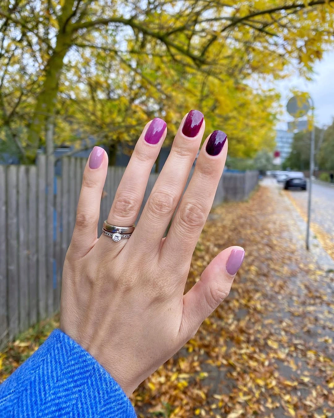
The irregular curves are what distinguish this from a classic tip. They look more organic and give the short shape a little movement without requiring a detailed motif. If you want a cleaner interpretation, choose only one accent color and repeat the curved placement on two nails, leaving the rest pale. That will keep the idea delicate while making the visual rhythm more straightforward and easier to maintain.
A pale base can make new growth less abrupt in appearance, and the small colored sections keep the focus away from the cuticle area. The darker red and plum are still visible enough to give the manicure character, particularly next to neutral clothing or a simple ring. Avoid expanding the accents too far down the nail, because the open light space is the feature that keeps this short set calm and balanced.
Cream Squares with Green Abstract Motifs
Cream long square nails create a clear background for olive and pale green stripes, broad blocks, and heart-like abstract shapes. The motifs vary from nail to nail, yet the repeated use of two greens keeps them connected. Because the cream remains visible between each shape, the design has a graphic clarity that would be harder to achieve if the colors were blended or if every surface were completely covered.
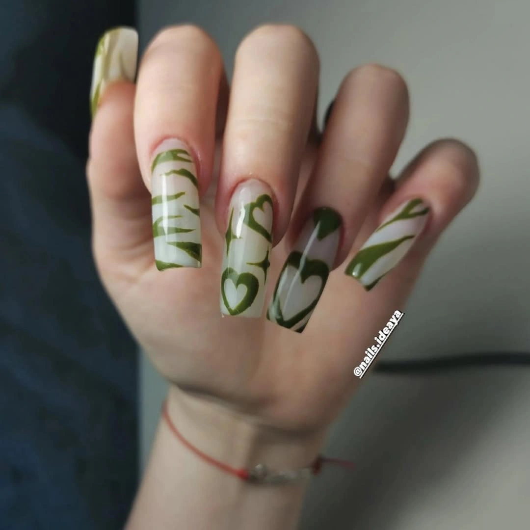
The long square shape gives the varied motifs enough room to remain distinct, especially where a stripe and a heart-like form appear near each other. For a less detailed version, select one green and use it as a single wavy line on two cream nails, then keep the others plain. You will preserve the crisp green-on-cream contrast while reducing the number of shapes competing for attention.
Abstract motifs feel most cohesive when they share a consistent palette, even if their outlines are not identical. That is why the two greens are more useful here than another accent color would be. The look already has enough energy from its long shape and bold graphic areas, so simple jewelry and unpatterned sleeves will let the cream ground and green forms remain the clear visual story.
Glossy Nude Squares without Extra Detail
A single soft nude-pink shade and a high-gloss finish give these short square nails their entire character. Bright reflections travel across the smooth surface, making the even length and tidy edge more noticeable than any painted motif would be. This is a valuable reminder that fall nails for pale skin do not need an added symbol or contrast color to look intentional when the base shade and silhouette are both well chosen.
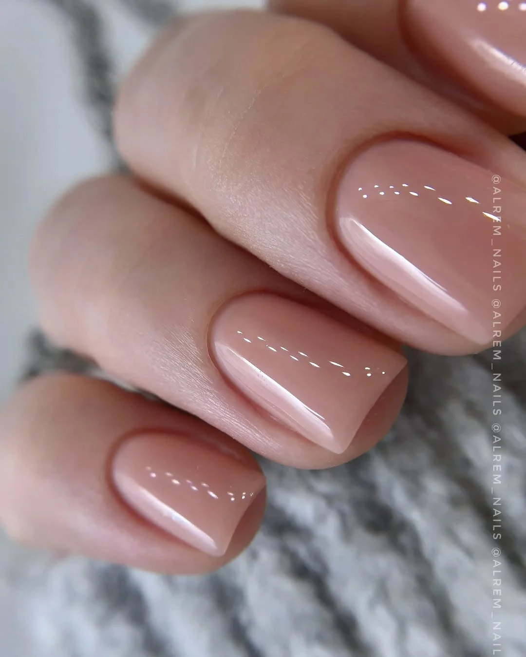
The short square outline makes the nude feel clean and graphic, while the light color keeps the result open and understated. If you prefer a slightly more dimensional version, choose a subtle shift in finish on one nail rather than adding a pattern. The strength of this set comes from its consistency, and a large accent could easily distract from the polished simplicity that makes the soft color work.
Neutral nails tend to reveal uneven application, so careful shaping and a smooth glossy surface are the practical priorities. The reward is flexibility: this kind of manicure can sit beside a detailed outfit, strong lipstick, or several rings without arguing for attention. It is especially useful when you want your hands to look finished but prefer the visual focus to remain on a precise shape and a quietly luminous color.
Milky French Tips with One Gold Accent
Soft milky nude nails end in broad white French-style tips, and one small gold leaf-like detail gives the otherwise clean square set a focused point of light. The white edges are gently blended at their base rather than sharply separated, which keeps the contrast softer than a traditional crisp French line. That makes the look feel light and polished while the gold accent adds just enough variation to prevent complete uniformity.
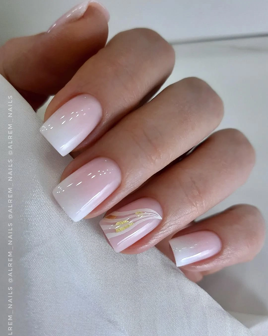
The square shape makes the white tips appear especially graphic, but the milky base keeps them from looking harsh against the rest of the hand. A simpler adaptation would remove the gold and leave the tips alone, or keep the gold on one nail while narrowing the white edge. The important element is the balance between a translucent-looking base and a clean bright tip, not the size of the metallic detail.
White tips will show chips at the free edge more readily than a full nude color, so a tidy finish matters if you want the fresh contrast to last. The single gold accent should remain small for the same reason: it works as a quiet interruption, not a competing ornament. This is a composed option when you want a familiar French structure with one restrained detail that catches light as your hand moves.
Long Nude Nails with Dark Leaf Motifs
Long nude almond nails give the sharply outlined black leaves enough room to stand apart, while a warm orange-brown accent near the tip brings a small change of color to the otherwise light base. The dark botanical forms create a direct focal contrast, yet the translucent nude space prevents the design from becoming as heavy as a full black manicure. It is expressive, but its palette remains disciplined and easy to read.
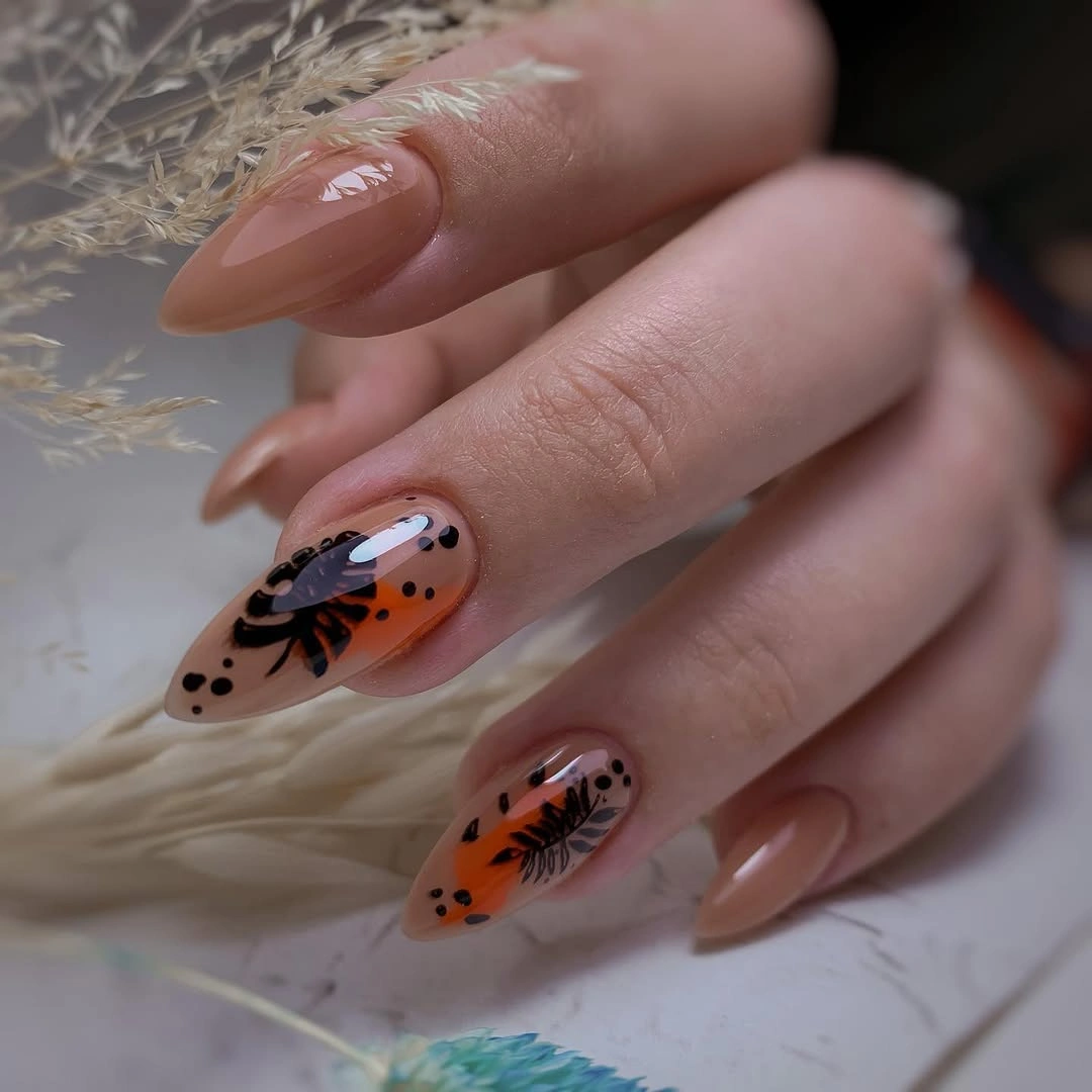
The orange-brown element works because it is small and sits beside the black art instead of trying to become another full color block. If you prefer a calmer version, select one black leaf on a nude accent nail and use the warm color only as a tiny curved mark. That preserves the connection between deep line work and warm fall color while making the overall look less detailed and easier to refresh.
Long nails can carry fine motifs well, but they also make every line more visible, so this design rewards a clear, smooth finish. The nail color ideas elsewhere on the site are useful if you want to compare this kind of warm accent with simpler solid options. Let the nude base remain generous, and the black leaves will stay distinct rather than merging into a dark all-over pattern.
Short White and Green Graphic Blocks
White, pale green, deep green, and small black sections create a compact graphic design on these short rounded nails. The blocks have crisp irregular boundaries, and the two greens bring variation without making the palette feel scattered. Because the shape is short, the different colors remain easy to read as individual panels, giving the manicure a strong visual finish without the scale of a long multicolor set.
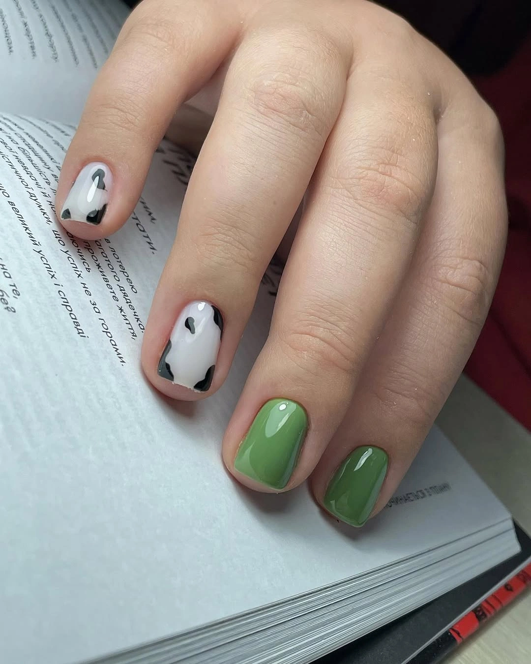
The dark green and black marks define the lighter areas, while the white ground keeps the composition from becoming too dense. For a less contrast-heavy version, choose one green and retain the white, using black only as a very small edge. The core idea will still work because the appeal comes from clean blocks and controlled placement, not from the total number of colors used.
Short graphic nails need especially neat boundaries, but they are also practical because the design stays contained and visible without a long tip. This final look is best when the color panels remain the only statement, with no extra glitter or illustrated motif added on top. The green-and-white contrast supplies enough energy, while the compact shape keeps the result tidy, modern, and comfortable for ordinary daily wear.