Fall short coffin nails designs are most convincing when the eye can tell what to notice first. On a compact nail, a dark edge, a narrow tip, or a single line has more influence than a crowded pattern because the shape cannot hide indecision. The goal is not to make the short silhouette look larger at any cost; it is to give it a clean rhythm that still feels personal when your hands are moving through an ordinary day.
Start with the relationship between the nail outline and the empty space around the detail. A design becomes easier to wear when its strongest mark follows the tip or sidewall, leaves a quiet center, and can be reduced without losing its identity. That test also tells you whether a look will age gracefully: if the idea depends on every line matching exactly, it asks for more upkeep than a simple shape-led manicure.
Pink Square Nails with Black Curved Corners
A sheer pink base keeps the short square silhouette open, while black gathers at the tips and side corners instead of covering the whole nail. The curved white swooshes cut through those dark panels, so the manicure reads as a set of small graphic frames rather than a standard French tip. That contrast gives the fall short coffin nails designs topic a sharper entry point without depending on length or a complicated motif.
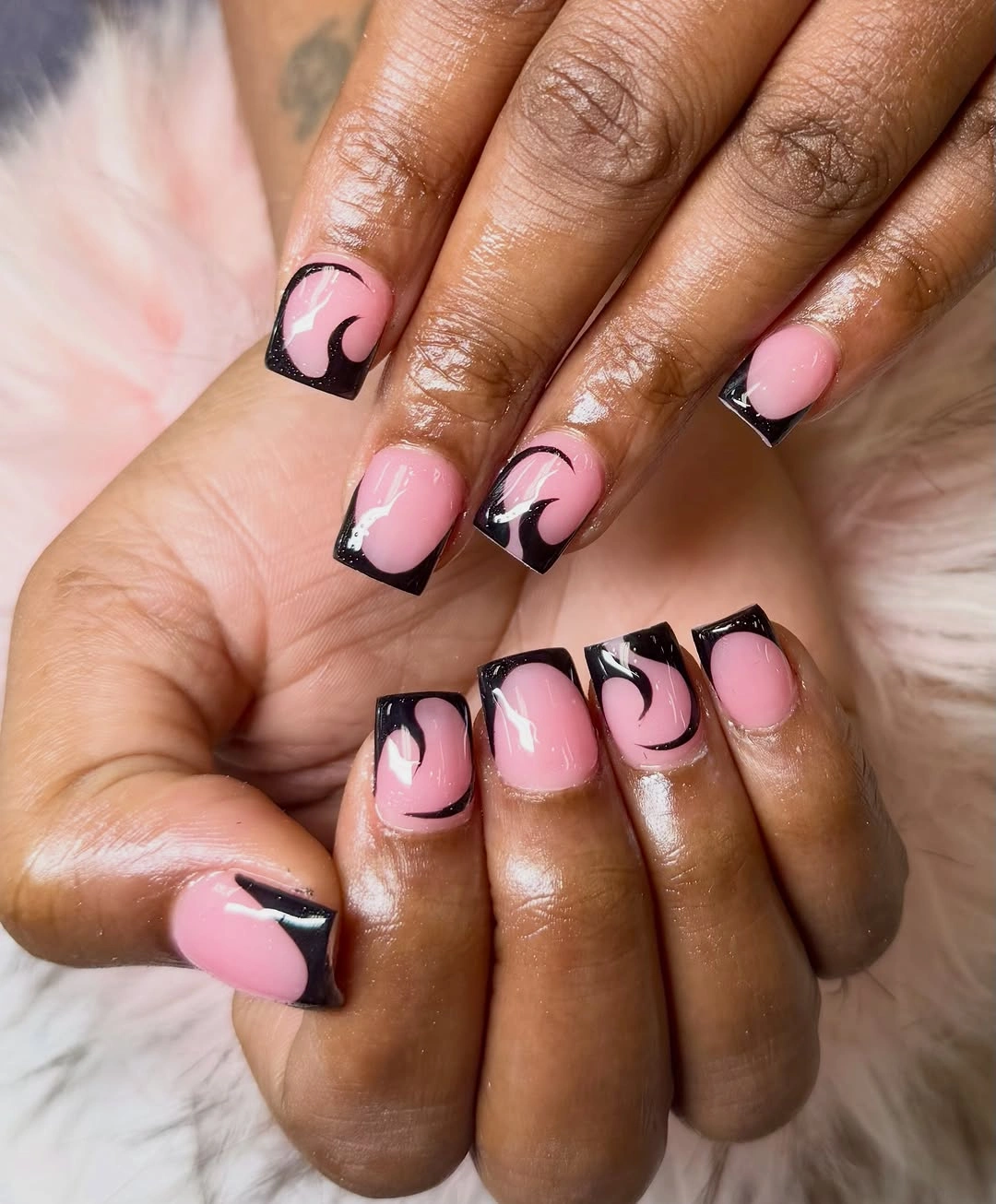
The strongest choice here is the amount of empty pink space left between the dark edge and the cuticle. That gap makes the black look intentional and keeps the rounded swoosh visible on a compact nail plate. A shorter version can keep one black corner on each nail and omit the second curve, which preserves the linear idea while making the border easier to keep even as the nail grows.
Black against pink has a clear graphic tradeoff: it is easy to recognize, but every uneven edge will show. Keep the dark section narrow if the natural square is very short, or use a softer charcoal when the contrast feels too stark for daytime. The design remains strongest when the accent stays at the perimeter and the glossy pink center is allowed to do some quiet work.
Playful Yellow and Burgundy Patchwork Tips
This short set treats every nail as a different little panel, combining yellow-and-black stripes, burgundy with pale dots, pink striping, and dotted yellow tips. The colors are varied, but the repeated use of narrow lines and small dots gives the collection a common scale. That shared scale matters on short square nails because a full-size motif would quickly make the fingers look crowded.

There is a useful editing lesson in the mix: keep the palette broad, then repeat one detail across several nails. A quieter adaptation could use yellow stripes on one hand, burgundy dots on the other, and plain pink nails to connect them. The result would still carry the playful fall mood while giving the eye a place to rest between the busier accents.
Patchwork designs are fun because they do not ask for exact symmetry, yet they need some discipline in color placement. Choose two dominant colors and let the third appear only as a small accent if you want the manicure to feel less costume-like. Short length helps the look stay wearable, but the more patterns you add, the more often a chipped tip or uneven dot will become part of the visual story.
Navy Angles on a Soft Pink Coffin Shape
Soft pink and deep navy create a cooler, more structured direction in this manicure. The navy sits in angled panels at the free edge, while thin white lines follow the geometry and a small cluster of stones appears close to one cuticle. Because the dark color is placed diagonally rather than straight across, it pulls the eye along the nail and gives the short coffin shape a little extra visual length.
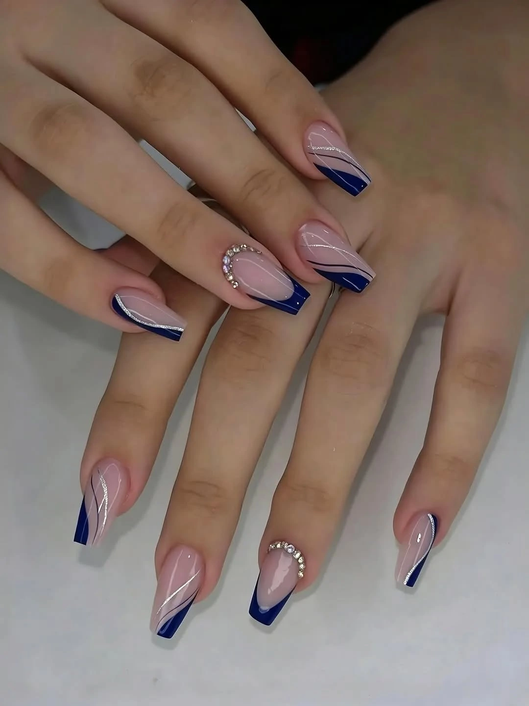
The open pink center is what keeps the design from feeling heavy. White curves interrupt the navy just enough to show the shape of each panel, and the isolated stone detail works as a pinpoint rather than another full layer. For a shorter adaptation, keep the navy wedge on two accent nails and use a slim navy side line on the rest, which protects the airy proportion.
Dark angular tips are crisp but less forgiving than a soft wash of color. They suit a neat square or the clean geometry of coffin nail designs, yet a very short nail may need a smaller wedge so the tip does not dominate the entire surface. The idea fits a polished work setting when the stones are omitted, and it becomes more noticeable for an evening look when the navy is kept glossy and the lines remain fine.
Clean Pink Nails with a White Micro-French
A pale pink base and narrow white tips give these short square nails their entire identity. The white edge is crisp and slightly angular in places, but most of each nail remains glossy and unmarked. That restraint is valuable in a collection full of pattern because it shows how a short shape can look finished through proportion, surface consistency, and a clean line at the free edge.
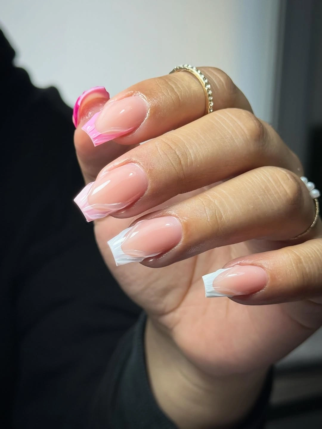
The micro-French works because the center stays visually quiet and the tip line does not try to change the nail into a longer shape. If the nails are even shorter, make the white edge very thin and let the pink base extend as far as possible. A slightly off-center white stroke on one or two accent nails can add personality without abandoning the simple structure.
Minimal does not mean maintenance-free, a point shared by current short nail design trends that rely on clean proportions. Pale color exposes uneven filing and the white tip makes small chips easy to notice, so the shape needs consistent edges. Still, the design has a practical advantage over dense art: refreshing one line can restore the whole look, and the same construction can move from an everyday manicure to a cleaner occasion style without adding extra decoration.
Blue Dotted French Tips on Pink Squares
Light blue tip panels bring a cooler note to the glossy pink base, while small blue dots sit inside or along the pale edges. The dots keep the French shape from becoming a plain block, but they remain small enough that the short square silhouette stays readable. It is a cheerful combination because the color contrast is clear without relying on a large illustration or a heavy dark outline.
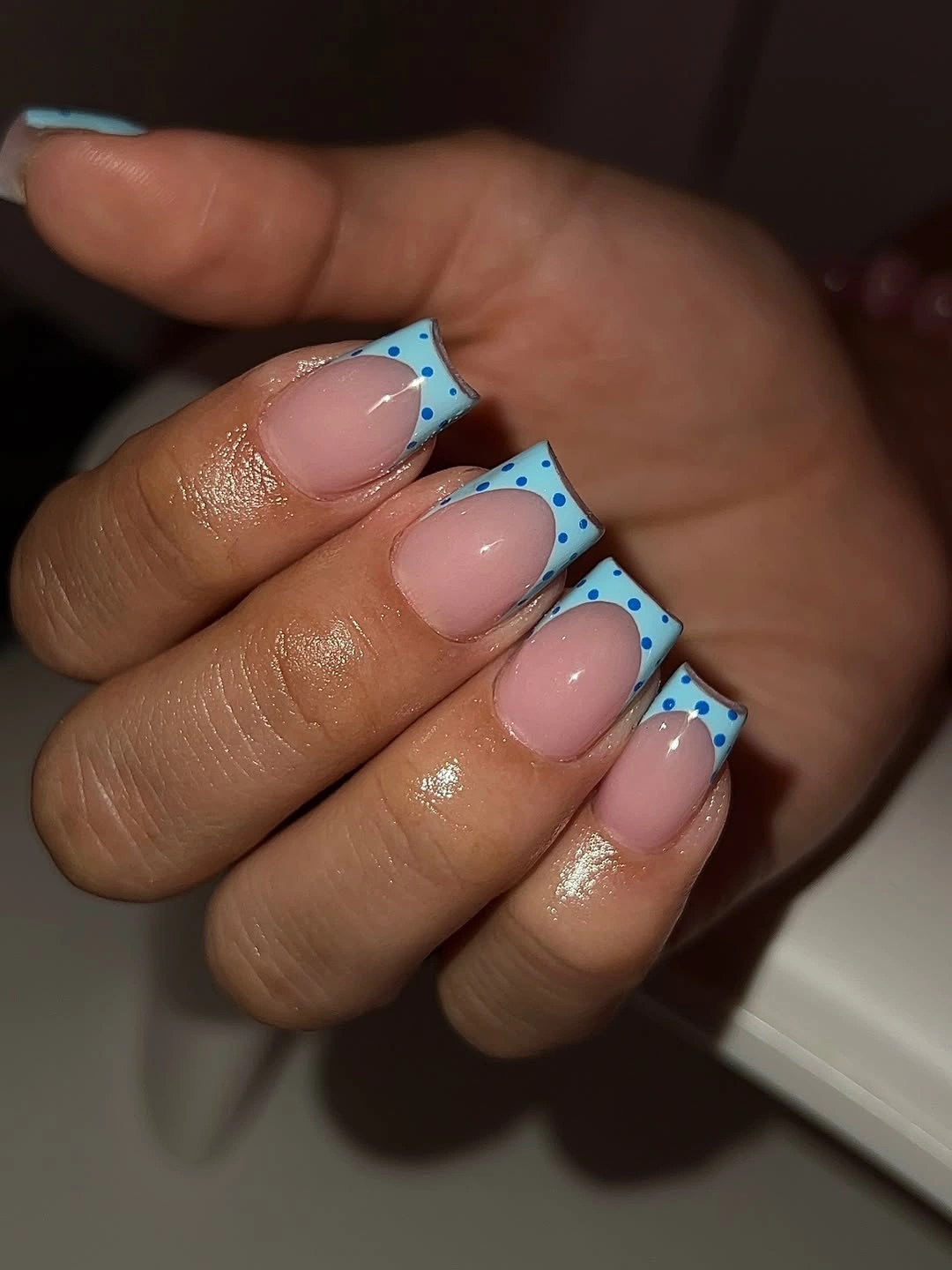
The placement of the dots is the useful part to copy. Keeping them near the border creates a visual bridge between the pink center and the blue tip, while spreading them over the whole nail would reduce the open feeling. Use fewer dots on the shortest nails, or leave two nails with a clean blue French so the pattern has a deliberate pause.
Pink and blue can read youthful or seasonal depending on the undertone and spacing. A muted blue with a warm blush base would feel softer for fall, while a brighter blue keeps the color moment more playful. The short length is a good match because the dots do not need a broad canvas, but a dense row of dots could make the tip appear wider than it is.
Neon Green Meets Translucent Brown Pattern
Electric green provides the first high-energy color hit, appearing on solid short square nails and around translucent brown panels with irregular mottling. The brown sections look spotted and layered rather than evenly striped, so they temper the brightness without becoming a neutral interruption. That relationship makes the manicure feel designed around contrast: one color is loud, the other supplies visual depth.
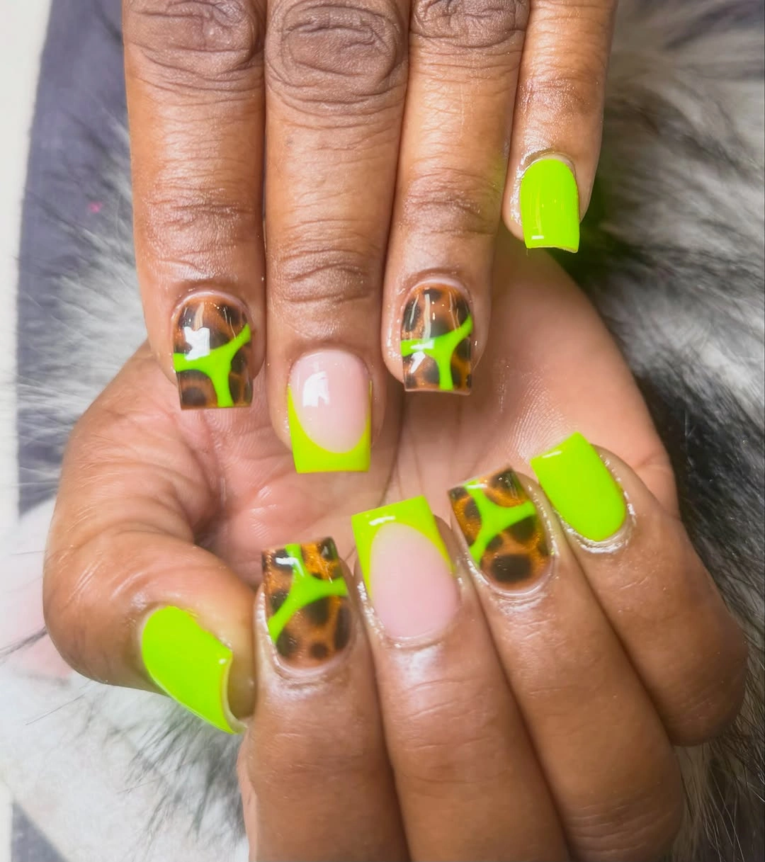
The strongest adaptation is to keep the neon on the border or on two solid nails and let the mottled pattern carry the accent role. Olive, moss, or acid-lime can shift the mood without changing the structure. On a very short nail, fewer brown patches will keep the center legible and stop the dark shapes from closing in on the bright green.
This is a confident color choice, so extra charms would compete with the surface contrast already present. The bright green will draw attention to the tips and any grow-out, while the irregular brown pattern is more forgiving about small variation. It works when the manicure is meant to be noticed, and it becomes easier to wear when the neon is limited to a thin edge rather than a full hand.
Coral Color with Small Cuticle Sparkle
Bright coral-orange covers these compact rounded-square nails in a smooth glossy finish, leaving two small curved rows of dark stones near the cuticle as the only interruption. The placement is low and restrained, so the color remains the main event. That is a useful way to add a jewelry-like point of detail without changing a simple solid manicure into a fully decorated set.
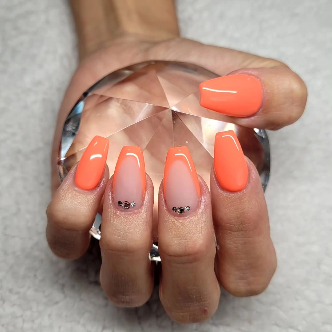
The accent works because it sits away from the free edge and follows the natural curve near the base. On shorter nails, that location leaves the tip clean and avoids making the plate look crowded. If dark stones feel too sharp against coral, tiny gold or neutral dots can keep the same punctuation while blending more gently with the warm color.
A bright solid shade is easy to understand but not invisible in daily life. Chips at the tip will stand out, and the small stones may catch attention if they are placed too high or repeated too densely. Keep the rest of the nail plain, and the manicure can move between casual clothes and a dressier setting without needing a second motif to explain the color.
Pale Lavender Pink in a Smooth Solid Finish
These short square nails use a pale lavender-pink color with a glossy, even surface and no visible art. The dark car interior behind the hand makes the light shade appear brighter, but the manicure itself stays calm and monochrome. That simplicity is not empty: the shape, consistent shine, and clean color distribution are doing the compositional work.
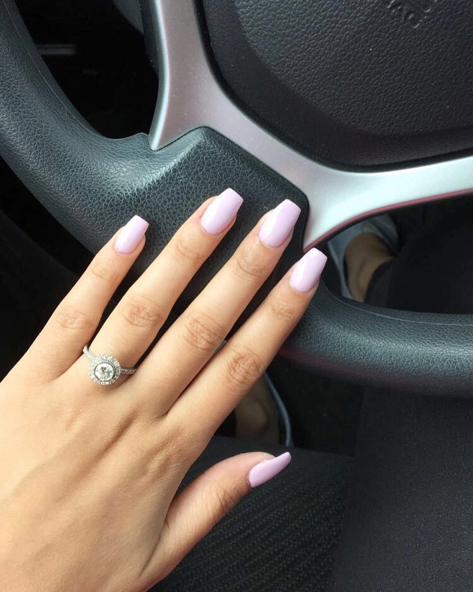
A solid pale color benefits from a balanced outline because there are no patterns to distract from uneven corners. Keep the square softened at the edges and let the base remain sheer enough to avoid a heavy block of color. If the plain surface feels too quiet, one thin white side line on an accent nail will add structure without changing the overall mood.
This option sits at the practical end of the collection, though light color can show tip wear quickly. It suits a simple fall wardrobe when the undertone leans cool and can be warmed with cream clothing or a muted berry accent elsewhere. The point is not to force seasonal symbols into the design, but to let a restrained shade feel considered through shape and finish.
Rose Pink with Fine Gold and Dark Curves
Glossy rose-pink nails gain definition from thin curved outlines placed near the side and tip areas. Some lines appear dark and are edged with gold, creating a narrow contour that frames the pink rather than replacing it. The short square shape keeps the curves contained, so the result feels more like a drawn border than a dense piece of nail art.
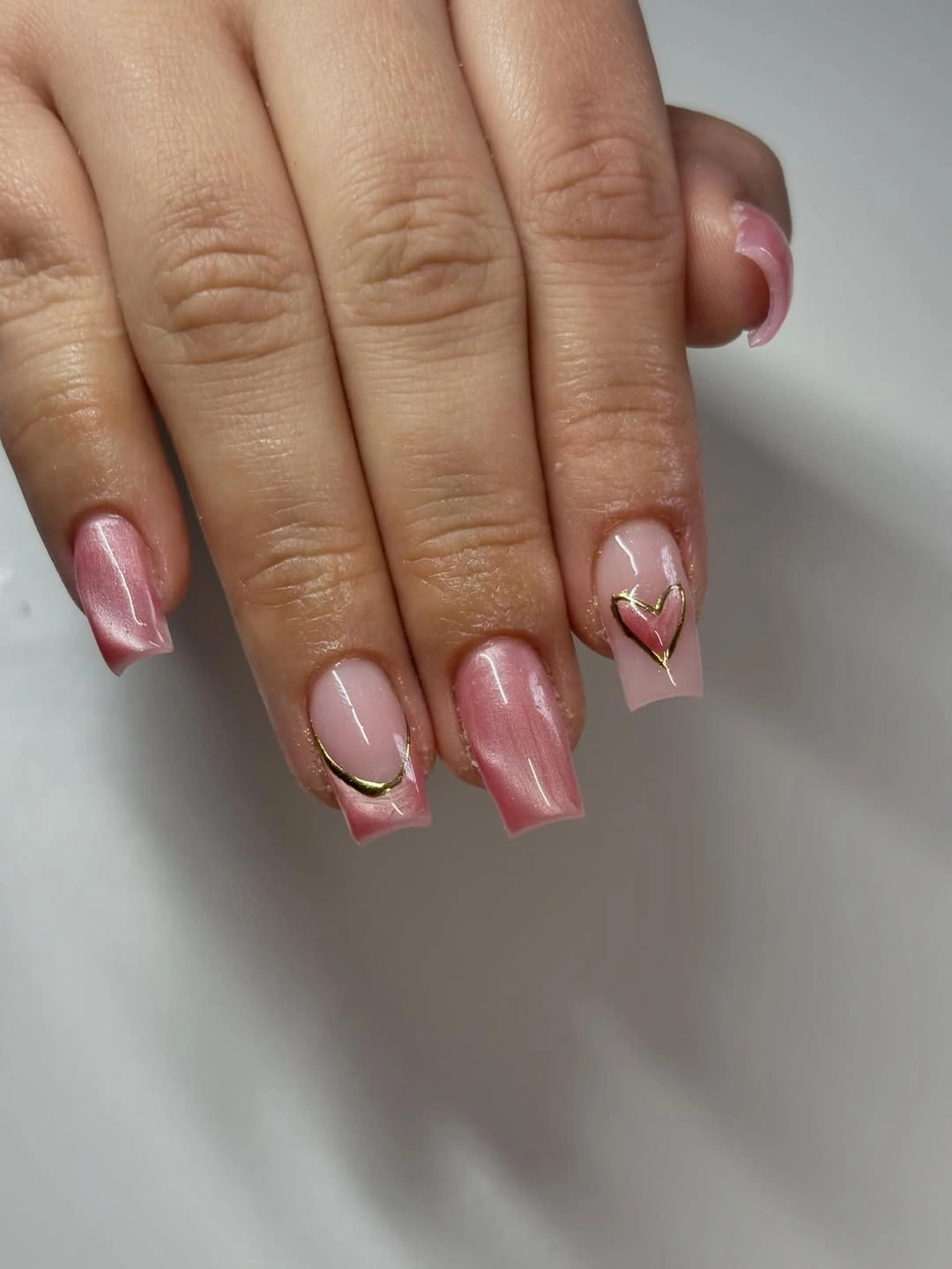
The open center is the reason the metallic detail remains light. Gold adds a warm glint, while the darker line gives the curve enough contrast to be seen against the pink. On a shorter plate, use one arc instead of several and place it along the sidewall or tip, where the design can follow the shape without crossing too much empty space.
Fine outlines are precise but not necessarily high-maintenance if the rest of the nail remains plain. Their limitation is visual: too many overlapping curves would turn the soft pink into a maze. Keep the line count low, and the look can work for a polished occasion or a quieter everyday manicure where the detail appears only when the hand moves.
Milky Pink White Nails with Nothing Extra
The uniform milky pink-white shade on these short rounded squares is a study in consistency. There are no accent nails, motifs, or visible color changes, so the reflective highlights reveal the shape and surface more than any decoration could. In the middle of a varied fall collection, that gives the eye a useful reset and shows how much a compact manicure can do with one controlled tone.
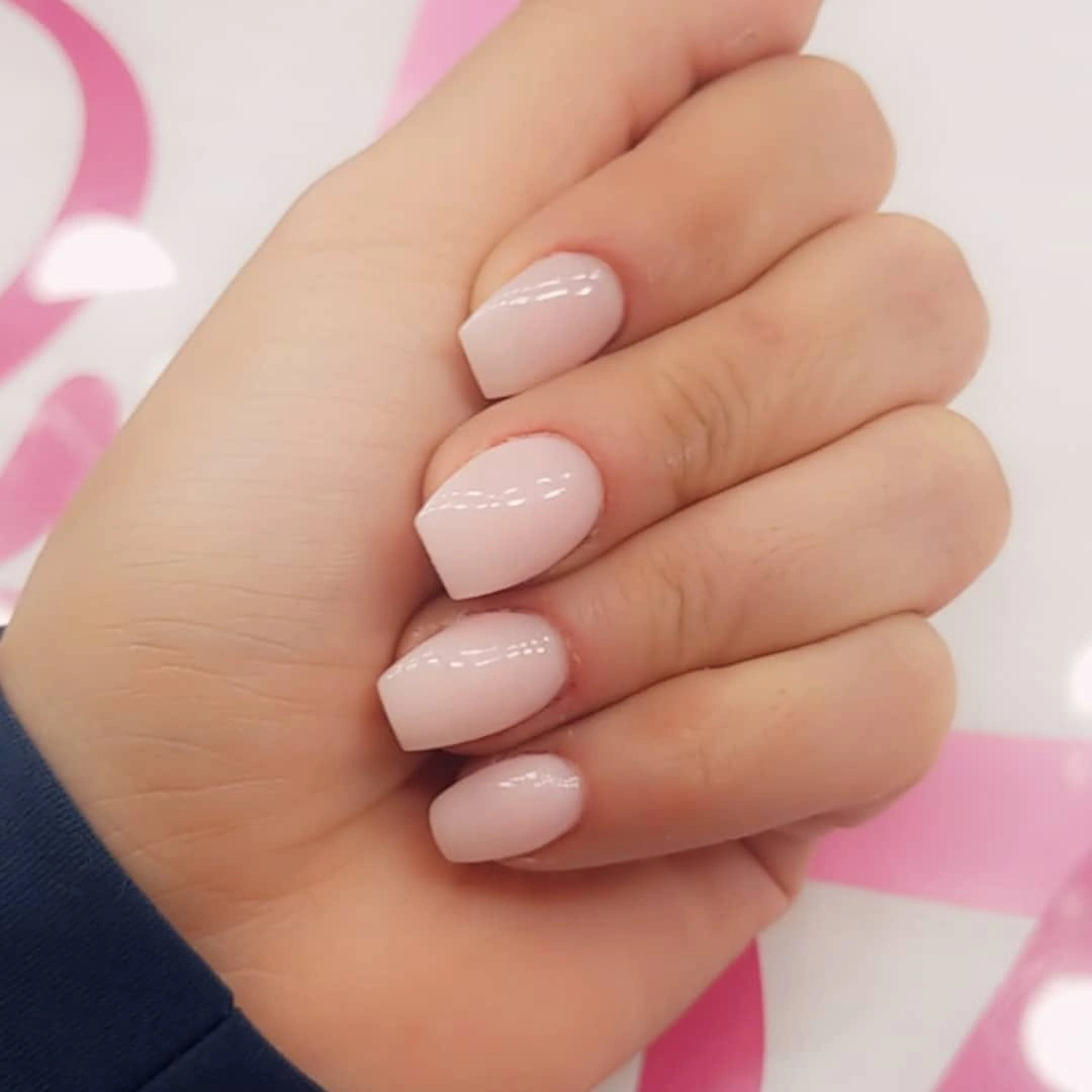
A soft square edge keeps the pale color from looking too stark, while the short length makes the look feel neat rather than formal. The same idea can be made warmer with a cream base or slightly more graphic with a single metallic side line. The change should stay small, because the appeal depends on the uninterrupted field of color.
Light solids are honest about upkeep: a chip, uneven tip, or dry cuticle will be easier to see. Their advantage is that there is no pattern to match when one nail needs attention, and the shape suits many outfits without a literal seasonal reference. When the surface is smooth and the corners agree, plain pale nails look deliberate rather than unfinished.
Pale Yellow Tips with Dotted Pink Centers
Pale yellow French tips warm the translucent pink base, while white dots and short curved lines decorate selected nails near the transition. The dots are not scattered randomly across the whole nail; they trace the area where yellow meets pink, which gives the design a gentle graphic rhythm. A checkerboard background reinforces the playful geometry, but the manicure remains the focus.
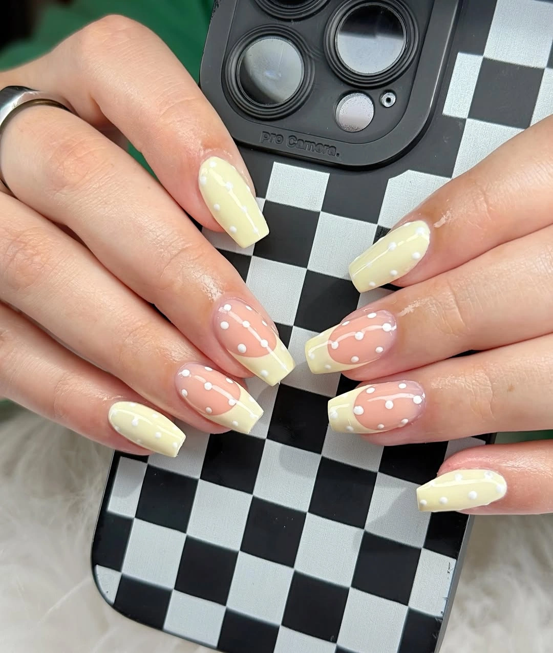
The warm tip works on a short square because the base remains open and the yellow does not extend too far toward the cuticle. Keep the dots small and spaced, or use them on only two nails when the nail plate is narrow. A soft cream tip would create a quieter variation, while a stronger mustard edge would make the same placement feel more autumnal.
Yellow can expand visually, so a thick band may make the tip appear wider than it is. The white accents help the transition feel intentional, but they are not necessary on every nail. Use the dotted path as the feature and leave a few tips clean; that edit keeps the manicure simple enough for regular wear while preserving its warm color idea.
Copper Shimmer Anchored by Dark Tips
Short rounded-square nails glow in a copper-orange shimmer, then shift into deep olive-brown tips that create a clear two-tone boundary. The metallic center catches a long highlight, while the darker edge keeps the color from floating without structure. It is a fall-friendly pairing because the brightness feels warm and the muted tip supplies depth rather than another competing color.
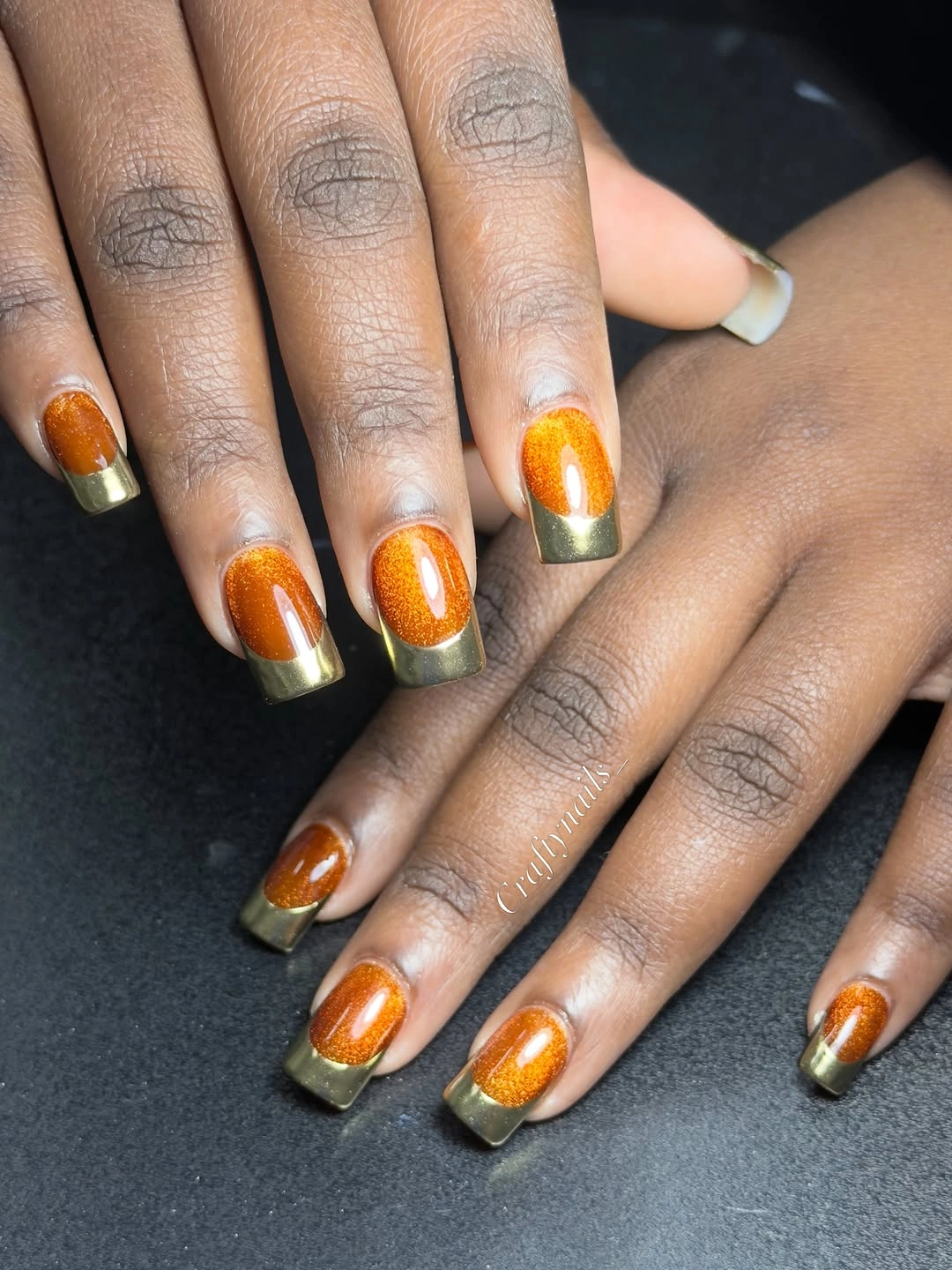
The proportion matters more than the exact shade. A narrow dark band will preserve the shine on a very short nail, while a wider band may turn the manicure into a heavy block. If the copper feels too bright, use a muted bronze center; if the olive feels too green, a deep brown edge will keep the same relationship with a softer transition.
Reflective color shows the shape of the nail clearly, so consistent rounding helps the finish look polished. The two-tone tip also creates a natural visual stopping point as the nail grows, although the contrast will reveal uneven edges. Keep the rest of the design free of charms or line work and the finish remains the quiet star.
Leopard French Tips on a Pink Base
Soft pink centers leave room for leopard-like black and pink spots gathered at the tips of these short square nails. A few tiny silver studs sit along the boundary, adding a pinpoint of shine without covering the spotted panels. Concentrating the print at the free edge makes the motif readable while keeping the manicure connected to a simple French construction.
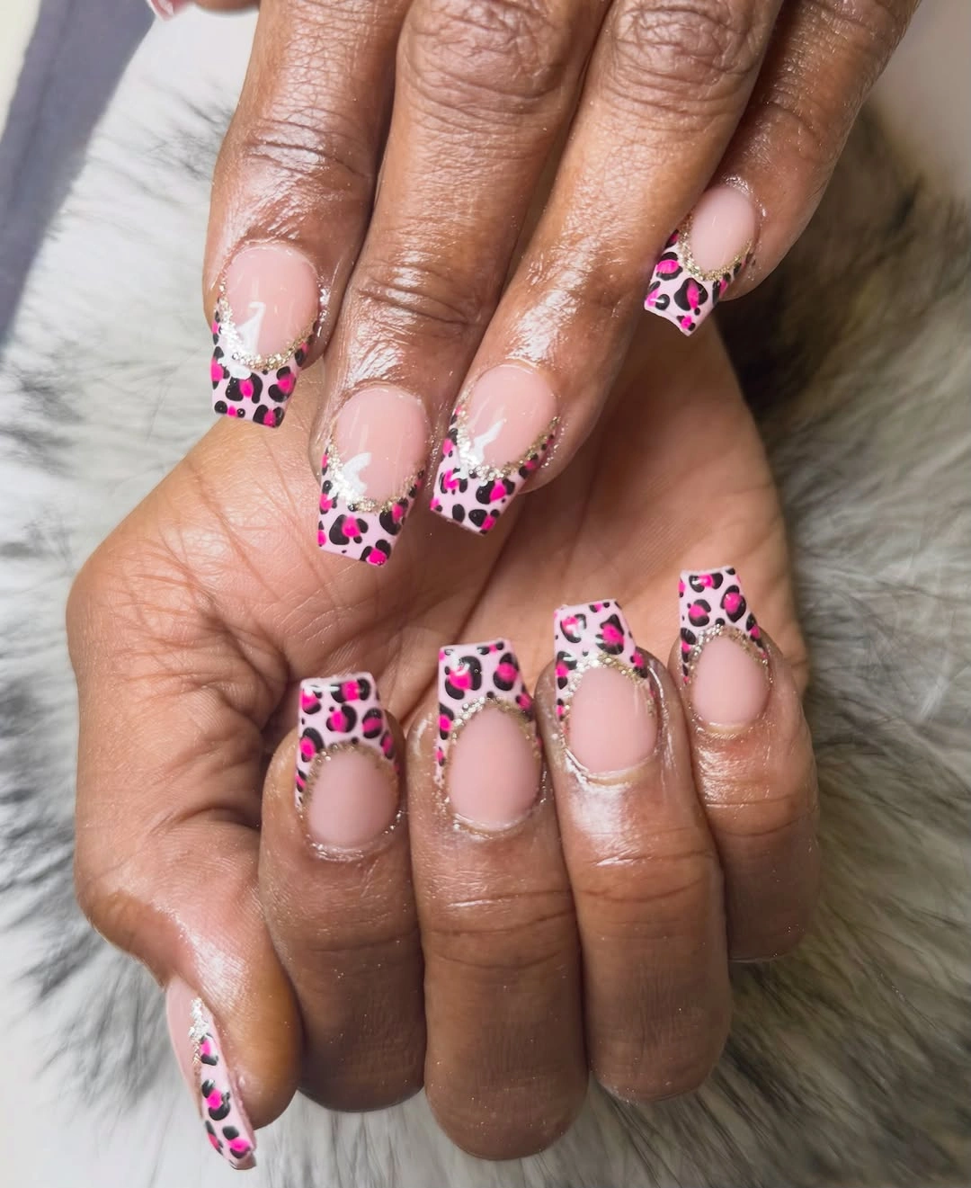
The useful adaptation is to edit the print, not erase it. Use larger, fewer spots on two accent nails and keep the remaining nails pink or lightly edged, which preserves the animal-inspired idea but lowers the visual density. A short square can carry the pattern well when the center stays sheer and the spots do not climb too far toward the cuticle.
Leopard detail has a strong personality, so the small studs should remain secondary. The print will look more graphic in black and pink, while brown and cream would soften the seasonal direction. Whichever palette you choose, let the French placement provide the order; a full spotted surface would change the manicure into a different, busier composition.
Wavy Multicolor Tips over Glossy Pink
Glossy pink nails become animated through curved tip bands in turquoise, yellow, coral, and black. The waves vary from nail to nail, but their shared direction creates movement across the hands, almost like narrow ribbons following the free edge. Because the center stays pink, the color story remains legible even though several shades are working together.
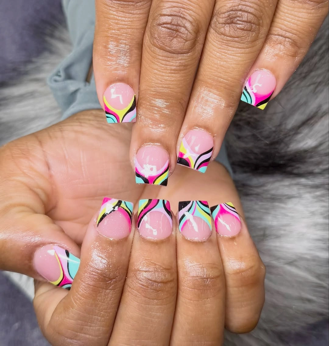
Spacing is the main design tool here. Give each color enough room to read as a separate line, and stop the bands before they cover the central pink area. For a simpler set, choose two colors and repeat the same wave on alternate nails, or use the full palette on only the thumbs and ring fingers where the pattern can act as a focal point.
Curved lines are forgiving in one way because they do not need to match perfectly, yet too many narrow bands can blur on a very short tip. A glossy surface helps the colors stay distinct, while a matte base would make the same idea more graphic and quieter. The manicure suits a playful weekend mood, but the reduced two-color version can stay useful well beyond one occasion.
Red Black and Nude with Silver Starbursts
Long square nails give this set room for a high-contrast mix of deep red, black, and nude panels. Fine silver-white starbursts and curved marks sit over selected nails, making the design feel graphic and slightly celestial without needing a literal symbol on every finger. The dark colors carry visual weight, while the nude panels keep the composition from becoming a solid block.
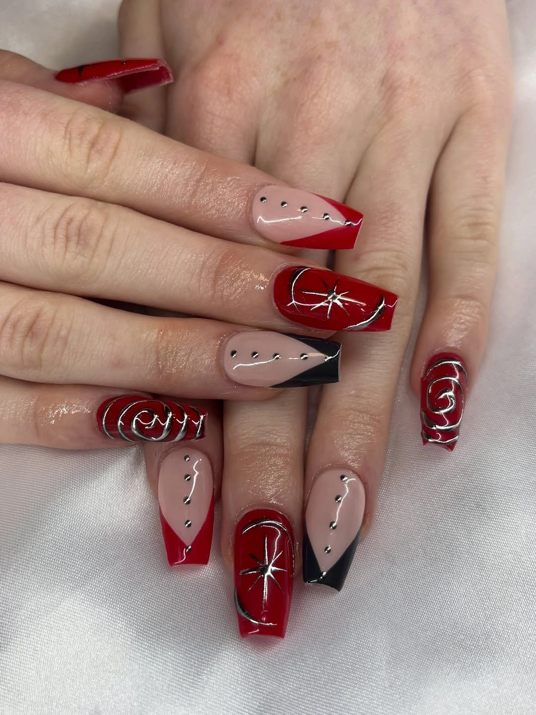
The line art works because it follows the length of the nail and leaves space around each ray. That approach can be adapted to a short square by keeping one small starburst on a nude accent and using a dark French edge on the rest. Removing extra rays is not a loss; it preserves the same contrast and makes the motif easier to read at a smaller scale.
Long square length is a real part of the look, not a detail to ignore. It gives the silver marks room, but it also creates more visual and practical commitment than the short styles earlier in the article. This design is best when the wearer wants an after-hours graphic statement; a shorter red-and-nude version will feel more flexible while keeping the strongest color relationship.
Soft Pink with a Single Textured Flower
Pale pink gives this short rounded-square set a quiet base, while one nail carries a raised white flower and another uses small bead-like dots over a mauve surface. A mint tip appears as a small cool counterpoint, so the manicure combines soft color, texture, and one unexpected accent without making every nail compete. The result is tactile but still organized around a gentle palette.
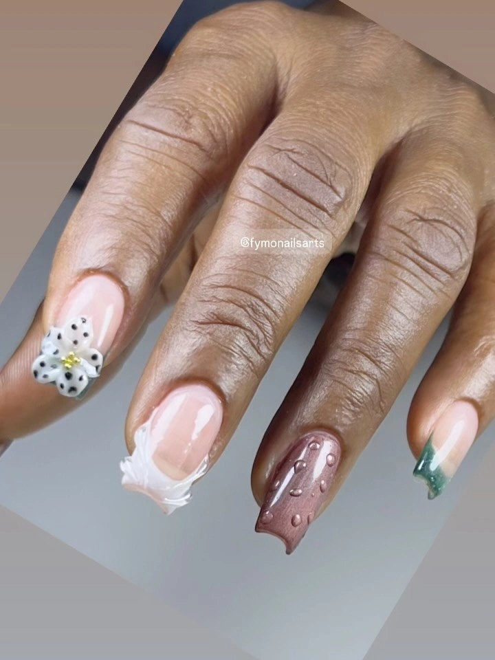
One dimensional detail is enough because the flower has a clear silhouette against the pale base. The raised dots add a second texture, but they stay isolated rather than spreading across the hand. For everyday wear, keep the flower on one nail and turn the other accents into flat white outlines or small dots, which retains the idea while reducing anything that might catch on fabric.
Soft colors can make texture look subtle, yet raised details still have a practical limit. They may need more attention around clothing and can look less tidy if the edge lifts, so the simple nails should remain plain and easy to refresh. This is a good choice when the goal is a small tactile moment, not when every nail needs to carry a separate decoration.
A Clean Red Solid for Short Rounded Squares
A saturated red gloss covers these short rounded nails with no visible pattern or accent. The hand pose and ring stay secondary, leaving the color and soft square outline to carry the entire design. That directness is useful in a list of short coffin nails designs because it proves a strong shade can create a statement without adding length or line work.
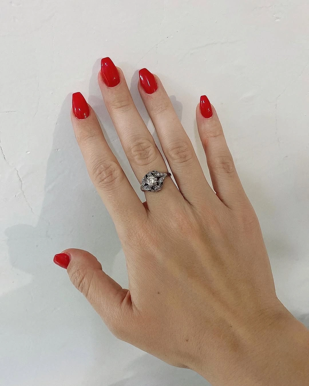
The shape softens the intensity of the red. Rounded corners keep the compact nails approachable, while the even shine makes the color look deliberate rather than unfinished. A small nude half-moon or one metallic accent could change the balance, but leaving every nail solid is the clearest way to keep the look simple.
Red is easy to adapt to different undertones, though a saturated tip will show chips quickly and demand a clean outline. It suits a day when the color should be the accessory, and it can move into an evening setting without additional art. The tradeoff is straightforward: fewer details mean less visual clutter, but the finish has nowhere to hide.
Neon Color Blocks with Repeated Metallic Dots
Short square nails alternate vivid orange, hot pink, and yellow, with small metallic studs repeating across the bright surfaces. Each nail reads as a clean color block first, and the studs act as a common detail that connects the varied palette. That repetition gives a loud manicure structure without forcing every finger into the same exact design.
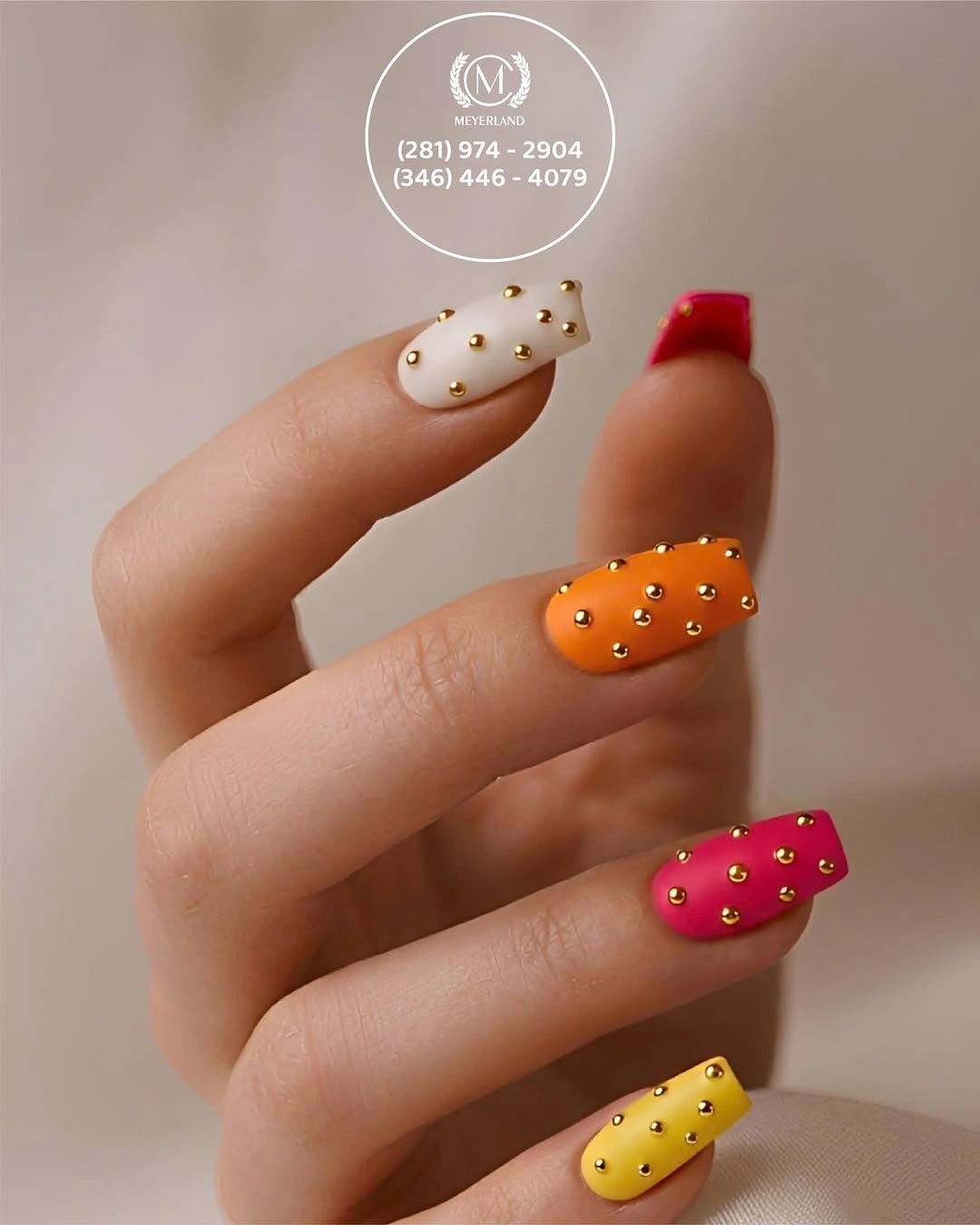
Solid color is the best support for tiny embellishment because the dot remains visible and the eye can separate one element from the next. A reduced version could use orange and pink only, placing the studs on two accent nails and leaving the yellow out. Muted pumpkin, berry, and cream would also keep the layout while lowering the brightness for fall.
The bright palette already supplies energy, so adding larger charms would be unnecessary. Studs can catch on fabric when they sit too close to the edge, making a low or central placement more practical. Keep the shapes short and the color count intentional, and the set reads as a controlled color experiment rather than a pileup of accents.
Coral and Black with Slim Botanical Lines
Warm coral-orange panels sit beside nude accents marked with narrow black branches, while solid black nails add a dark counterweight. The botanical lines are vertical and centered, which suits the short-to-medium length by guiding the eye along the nail instead of widening it. The palette is stronger than the delicate motif, so the branch remains a precise detail rather than a decorative forest.
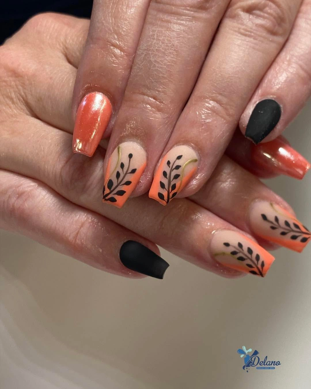
The open nude nail is important because it creates breathing room between coral and black. One simple branch can be copied onto two nails, with the rest left coral or black, and the design will still have a clear focal point. If the coral feels too bright for autumn, burnt orange or rust can keep the warm contrast without changing the line placement.
Botanical art asks for a steady center line, but it does not need to be identical on every nail. The main limitation is density: too many leaves would crowd a short plate and compete with the solid black. Keep the branch slim, and the manicure can feel seasonal through color and rhythm rather than through a literal fall symbol.
Translucent Pink with a Pale Shifting French Edge
The final look returns to a softer direction with medium almond nails, a translucent pink base, and pale white-to-greenish edges at the tips. The finish is glossy and gently luminous, so the edge feels like a light shift rather than a hard block. That combination visually lengthens the tapered shape while keeping the overall design airy and free of dense decoration.
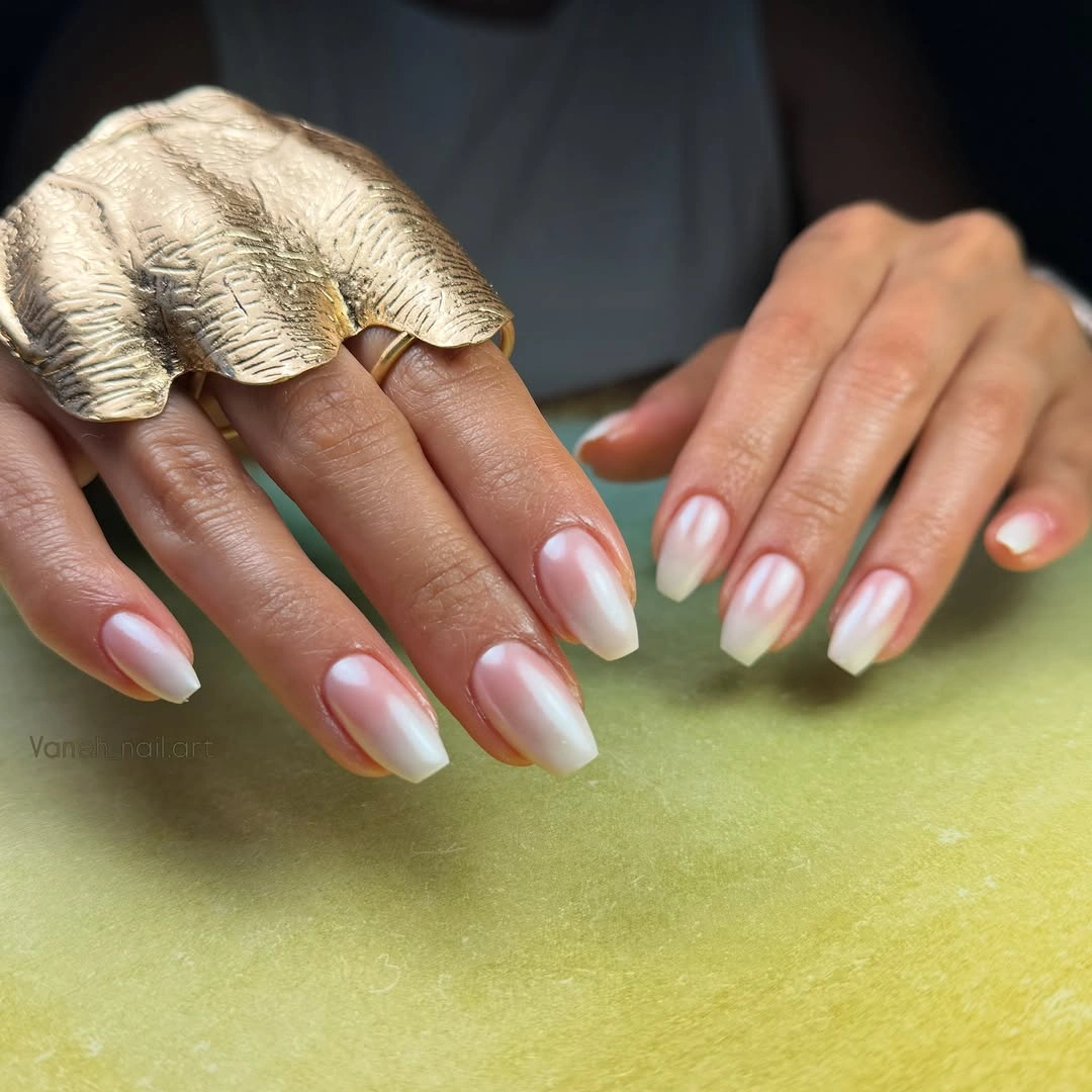
The almond silhouette and light tip work together: the taper gives the eye a longer line, while the pale edge keeps the color from becoming heavy. A shorter oval can carry the same idea if the tip is made narrower, and a single cream shade can replace the shifting edge for a simpler fall version. The central pink should remain visible because it is what keeps the French from looking too busy.
Light French designs reward a tidy outline and a smooth surface, especially when the color transition is delicate. They are less forgiving of a rough tip than a mottled pattern, but they are easy to adapt across occasions and wardrobes. Closing on this restrained contrast leaves the collection with a useful edit: remove one color, one line, or one accent only when the main shape still has something clear to say.