The most wearable seasonal color does not need to be the safest one. It needs a setting that explains it: a dark shade needs a clean edge, a bright shade needs enough empty space, and a mixed palette needs one repeating element that keeps it from fragmenting. Once that structure is in place, even an unexpected hue can feel intentional instead of like an accent chosen in isolation.
Choose color by asking what it changes on the hand, not what month it belongs to. A deep tone can sharpen a short outline, a pale base can make a small contrast easier to read, and a reflective finish can provide variation without a second shade. That approach makes it easier to edit the palette later, because the visual logic survives even when one color is swapped for another.
Stained Glass Color Framed in Black
Long square nails become tiny stained-glass panels through black outlines around amber, green, blue, purple, pumpkin, and star-like details. The dark framework gives each color a boundary, so the many autumn references read as one surface rather than several unrelated illustrations. On this length, the pane structure is what keeps the saturated palette coherent.
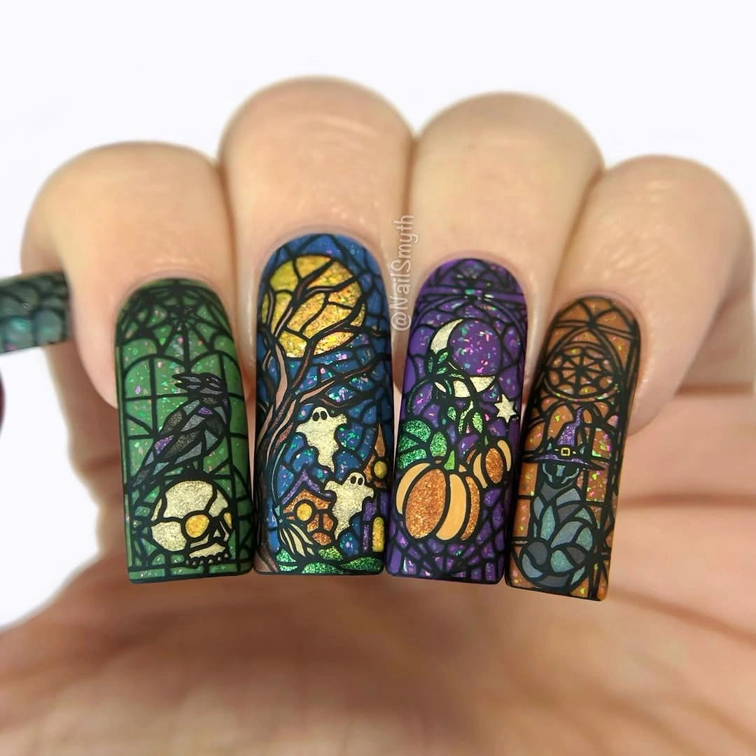
When many colors appear together, an outline can do the organizing that a simpler palette normally would. Black is strong enough to separate the colors, yet it also repeats on every nail and gives the set a shared visual grammar. A shorter version should reduce the number of pane colors and keep only one pumpkin-like detail, because the small panels would otherwise lose their clarity.
The design already has texture, color, and illustration, so extra glitter would not improve the result. If you want to change it, shift the balance toward more open background or fewer colored sections rather than adding another effect. The most essential element is the black grid, because removing that framework would make the rich hues compete instead of looking like parts of the same October story.
Deep Navy on a Short Rounded Shape
Glossy deep navy gives short rounded nails a focused October color direction, while pale crescent-like details prevent the surface from becoming completely solid. The shade is dark but not as expected as black, and the compact shape makes it feel neat rather than severe. Light catching across the finish adds dimension without needing another heavy decorative layer.
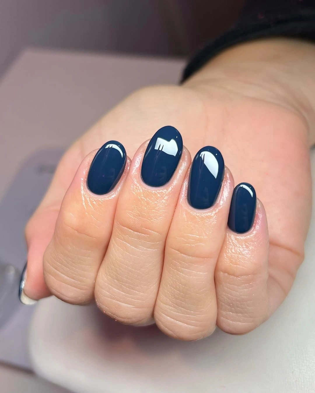
Dark blue is useful when you want seasonal depth without a literal orange, brown, or web motif. The pale curve creates a small contrast point that keeps the color from looking flat, but it does not disrupt the clean outline of the nail. For a simpler adaptation, use navy on every finger and place the light curve on only one or two nails near the tip.
Short nails make saturated color practical-looking because there is less surface for the shade to dominate. The tradeoff is that chips can be noticeable against such a deep coverage, so a tidy edge matters more than an extra accent. Leaving the shape rounded is a good choice here; a sharper square would make the same navy feel more graphic and less soft.
Black French Edges Over Rosy Nude
Rosy nude almond nails are defined by black French-like edges, a dark glitter accent, and a narrow metallic-looking stripe. The black sits at the boundary instead of covering the center, which lets the pale base remain visible from cuticle through most of the tip. That relationship makes the high contrast feel crisp and controlled rather than heavy.
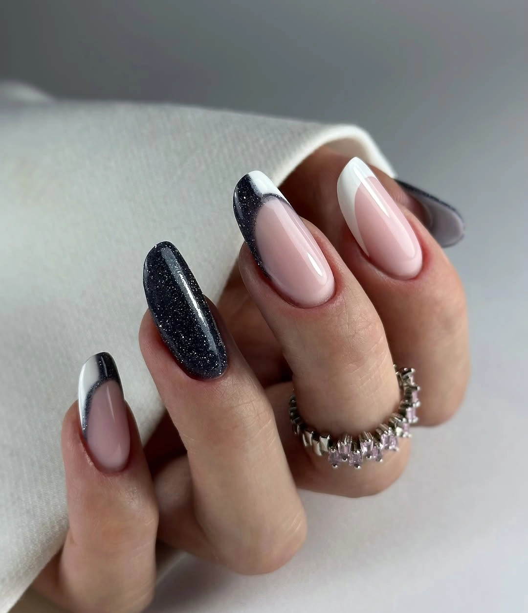
A dark edge changes a nude manicure more efficiently than a fully black nail because it preserves lightness while still outlining the shape. The glittered finger is strongest as a single interruption, not a finish to repeat everywhere. If you want a lower-contrast version, substitute espresso brown for black but keep the same narrow placement, otherwise the French reference will disappear into the base. For deeper tonal variations, browse purple nail designs built around similarly controlled contrast.
The almond outline gives the black curve somewhere to travel, which is why the line looks graceful rather than blunt. On a shorter nail, use a slightly thicker edge and skip the metallic stripe so the tip remains the primary feature. The important contrast is between open rosy center and dark boundary; extra art inside that center would weaken the design’s precise, graphic mood.
Mauve Base With Soft Brown Animal Print
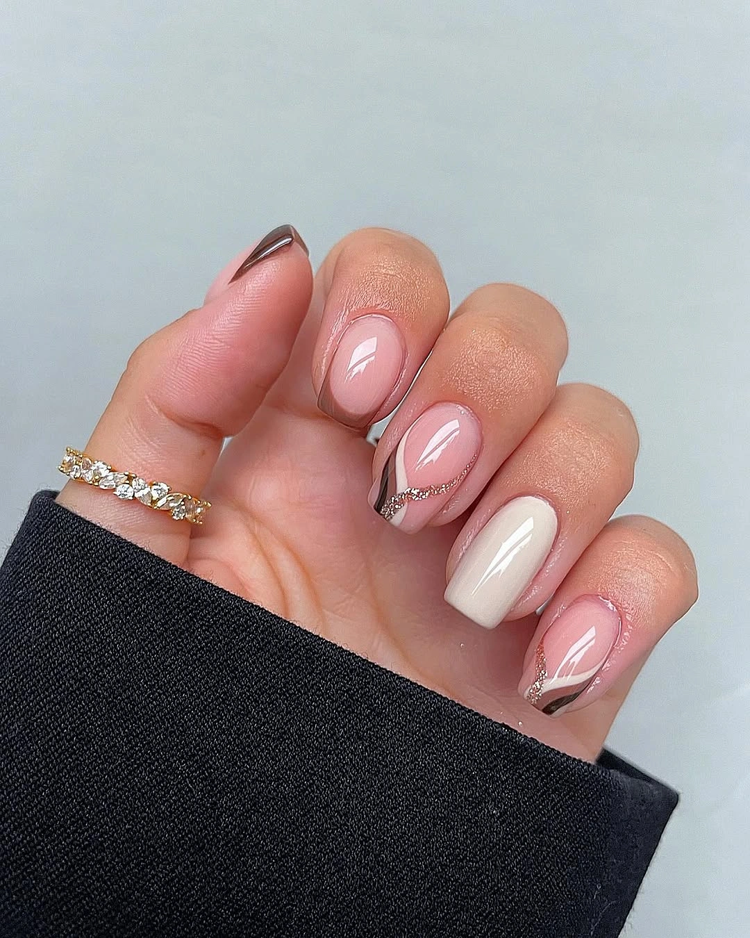
Mauve-nude, chocolate brown, white curves, and brown animal-print patches create an October palette that feels softer than a standard black-and-tan combination. Several nails remain almost plain, giving the patterned areas a clear place to stand out. The rounded almond shape also smooths the contrast between the curved white detail and the irregular brown markings.
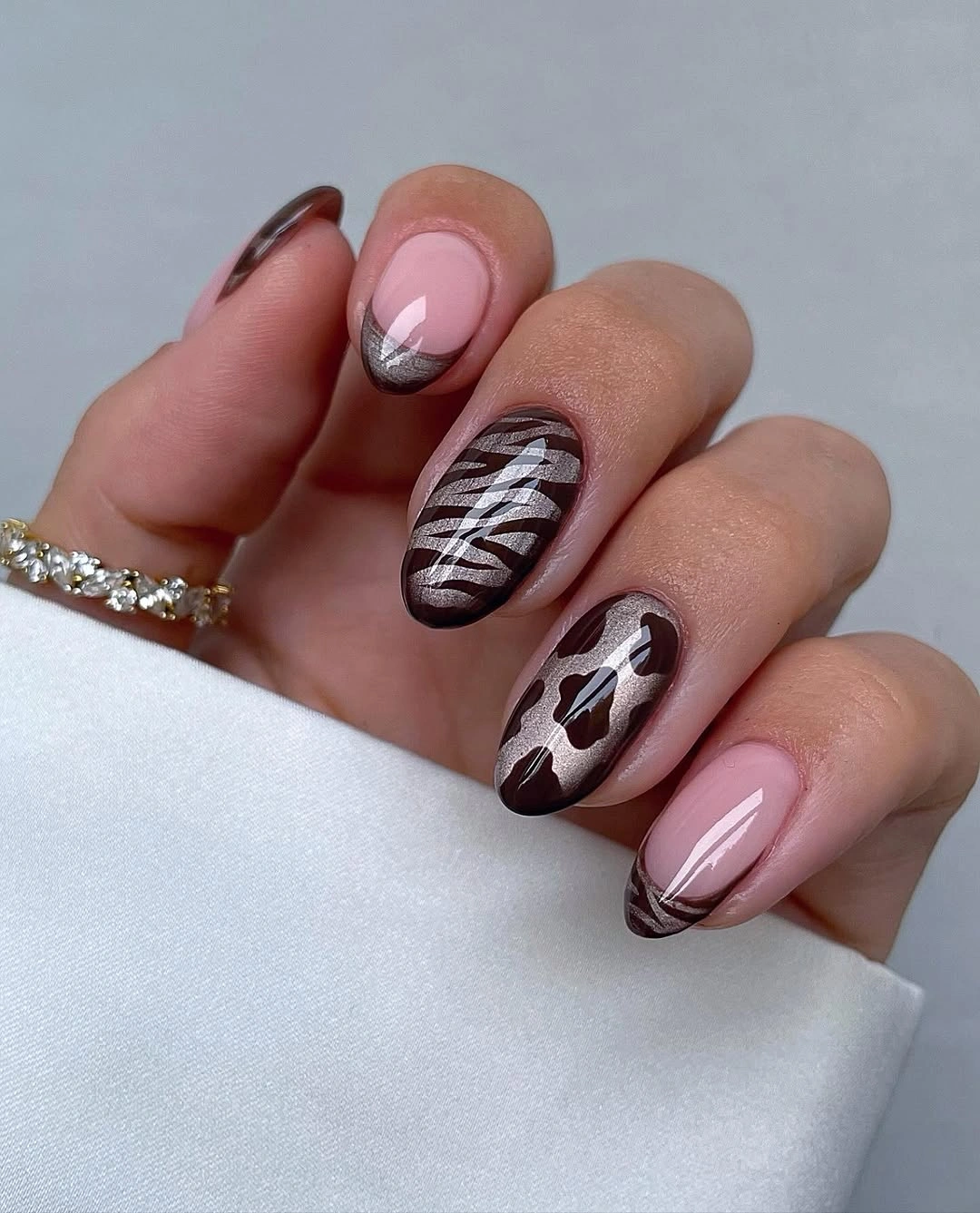
Animal print has more visual impact when it is treated as one accent language rather than a full coverage pattern. The mauve background quiets the brown, and the white line provides a small light break without starting a new theme. A shorter version could use only one spotted nail and one brown solid, then let the remaining nails stay mauve for a much more wearable reading.
Color balance matters more here than exact motif replication. If the brown patches become too small, they will look like random dots instead of intentional print; if they become too large, they will take over the soft base. Keeping the white curve limited preserves a second rhythm without forcing every nail to become decorative, which is what keeps the palette composed.
White Stilettos With Purple Starbursts
Long pointed nails use white and nude sections as open space for purple starbursts, small orange details, and thin dark lines. The light background makes the star shapes visible from a distance, while the pointed length gives the graphic marks an especially dramatic direction. Because the art is distributed unevenly, the design retains some quiet surface between its strongest details.
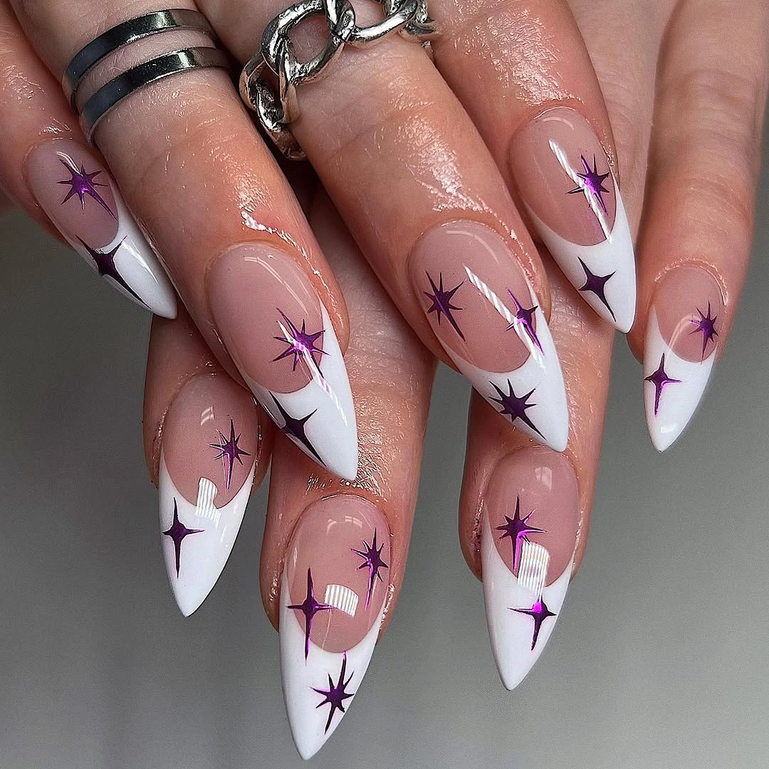
White space is carrying more of the design than the individual colors. It allows purple to look crisp and makes the orange notes feel like small sparks instead of a competing palette. For a less intense option, use a milky nude base instead of white, keep one purple burst, and remove the orange so the nail shape remains the clear first impression.
Stiletto tips make every line appear sharper, which means small placement errors would be more obvious than on a rounded nail. Keep the starbursts away from every point and let at least one nail stay mostly white or nude. The useful choice is not adding further shine; it is deciding where the linework can stop so the existing color and shape keep their dramatic tension.
Orange Coffin Nails With Dark Botanical Contrast
Vivid orange covers long coffin nails, while black and green leafy or floral details introduce a darker botanical contrast. The solid orange fingers are important because they give the decorated nails a strong color echo elsewhere on the hand. Rather than filling every surface with art, the set alternates broad warm color with a few concentrated illustrations.
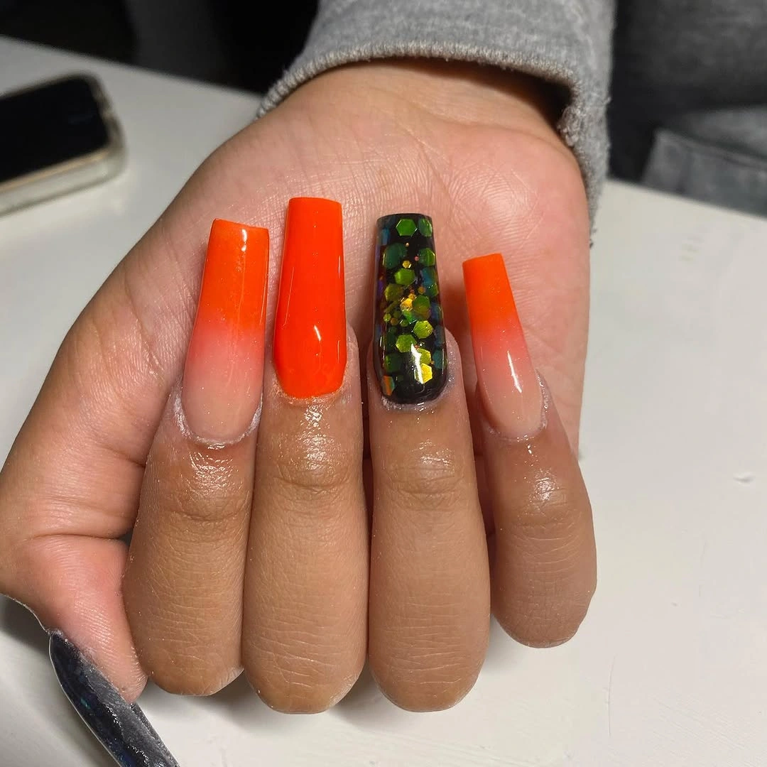
Orange becomes more versatile when it is paired with a deep outline color rather than more bright shades. Black gives the leaf-like marks definition, and the green keeps the palette from becoming a single warm block. If you prefer a quieter manicure, choose orange as a French tip over nude and reserve the botanical detail for one accent nail, which maintains the October cue with less coverage.
The coffin shape has enough width for the design, but it also amplifies visual density when too many details sit near the tip. Solid nails provide the needed pause and should not be replaced with another print. A tiny metallic addition would not be necessary because the contrast between orange, black, and green already establishes depth, rhythm, and a clear seasonal focal point.
Cobalt and Cream Curves on Short Nails
Glossy cobalt blue and pale cream form flowing waves across short rounded nails, giving the saturated color a lighter partner without hiding it. The curved marks echo the nail’s shape and create movement where a straight color split would look rigid. Several blue areas remain solid enough for the set to still read primarily as a deep, cool color manicure.
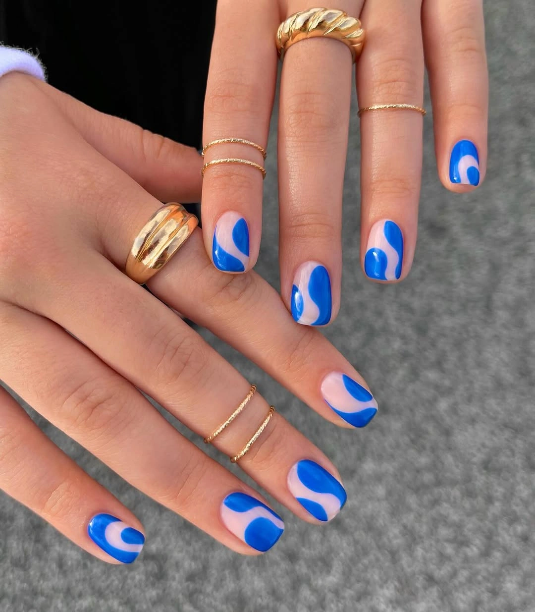
On a compact length, wavy placement is more forgiving than very small detailed drawing because each curve can remain broad and visible. Cream works as a soft counterpoint to cobalt, keeping the overall design from looking as stark as blue with bright white. To simplify it, place the wave on two nails only and keep the others glossy blue, which lets the color do more of the visual work.
The key tradeoff is between movement and clarity. Adding a second pattern such as dots or checkerboard would give the hand too many directions to follow, while the existing curves already introduce a clear rhythm. Rounded tips are particularly effective because they repeat the soft sweep of the cream lines; a square version would make the same pattern look more graphic and less fluid.
Muted Olive With Irregular Metallic Edges
Short squared nails combine muted olive green, translucent nude, and irregular silver or iridescent foil-like edges. The green is subdued enough that the reflective border can register without turning the set into a bright metallic statement. Uneven placement makes the edge look more organic than a strict French line, while the nude sections preserve visual space around the color.
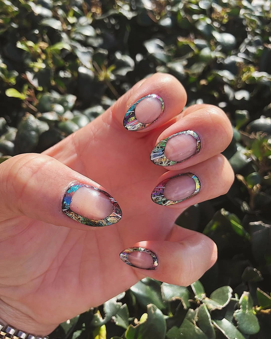
Metallic detail is most useful here as an outline rather than a separate full nail. It catches light at the boundary of the olive and nude, making the modest color feel more dimensional. For a simpler version, keep the olive on two nails and use a thin silver edge only once, because repeating irregular foil around every finger could make the short set feel overly busy.
The soft green has enough autumn depth without reading as a bright novelty shade, which makes it easier to pair with neutral clothes. A thicker metallic border would draw more attention to the tip and make the design feel sharper, while the current finer edge keeps the whole composition open. The cleanest removal would be a second foil mark, not the small contrast that separates olive from nude.
Teal and Coral Curves on Nude
Muted teal, coral-red, pale lines, and a nude-pink base are arranged as curved edge designs rather than full-color nails. The visible base allows the contrasting hues to share the same surface without colliding, and the curves make the color placement feel connected. Each tip holds a different proportion of teal or coral, which gives the set quiet variation.
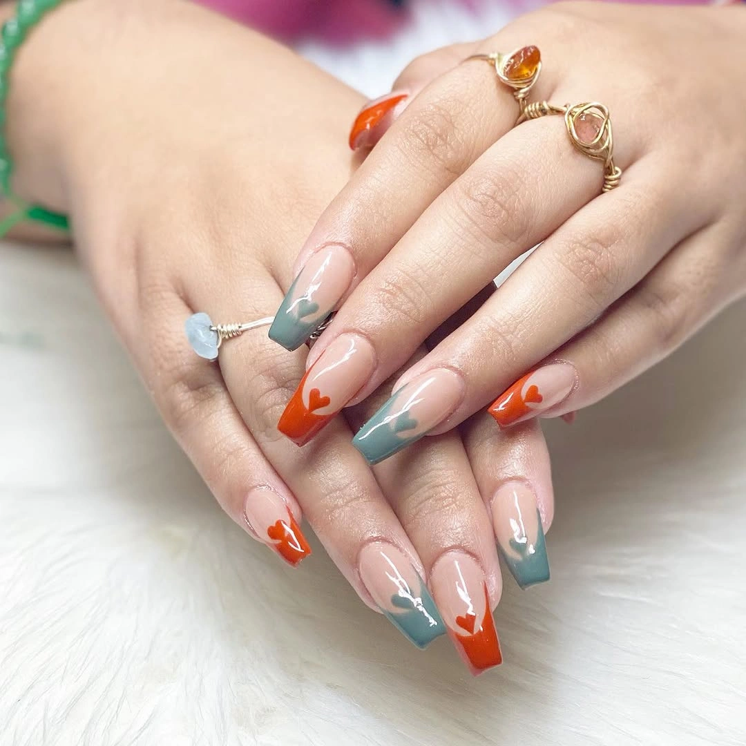
Two colors can feel more cohesive when they are both treated as partial shapes. Teal cools the warmer coral, while the nude base becomes the space that keeps them from looking like separate manicure ideas. If you want a more restrained color combination, choose one hue for the curves and let the other appear only as a thin accent line on a single nail.
The design does not need a full solid nail because the curves already provide enough color weight. Adding one could make the hand feel unbalanced unless it were placed carefully beside a more open tip. The best adjustment is usually to reduce the width of a curve, not add a new detail, because the present spacing is what lets the teal and coral remain readable together.
Graphic Orange Tips on Soft Pink
Pale pink nails are interrupted by orange angular tips, muted gray-green blocks, and thin dark outlines. The warm tip color gives the set its October direction, but the gray-green keeps the palette from becoming only bright and warm. Because the angles sit near the ends, the natural-looking pink center remains visible and stops the shape from feeling fully covered.
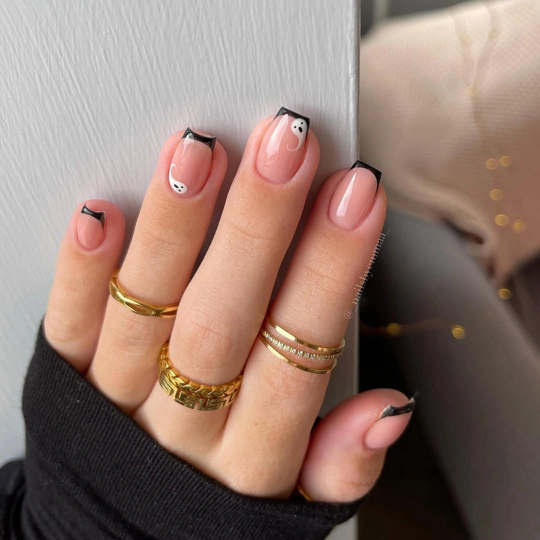
Angular French-like placement makes orange look more structural than a traditional curved tip would. The small muted block is useful because it creates a second temperature in the palette without demanding equal attention. To recreate the idea more simply, use the orange angle on two nails and leave the gray-green detail off the rest; the pink base will still make the contrast feel crisp.
Dark outlines should remain thin in this arrangement. If they become too heavy, they will compete with the orange instead of defining its edges, and the manicure will read much harsher. The balance comes from the nude-pink center and clean geometric shifts, so another motif such as glitter or leaf art would distract from the controlled direction already established at the tips.
Pearly Royal Blue as a Complete Color Statement
Royal blue shifts across short rounded nails with a pearly, light-catching surface that changes from brighter to deeper blue. No illustrated accent is needed because the finish itself creates movement as the curved nails turn. The compact shape gives the color a neat outline, while the reflective quality keeps the single shade from reading as visually flat.
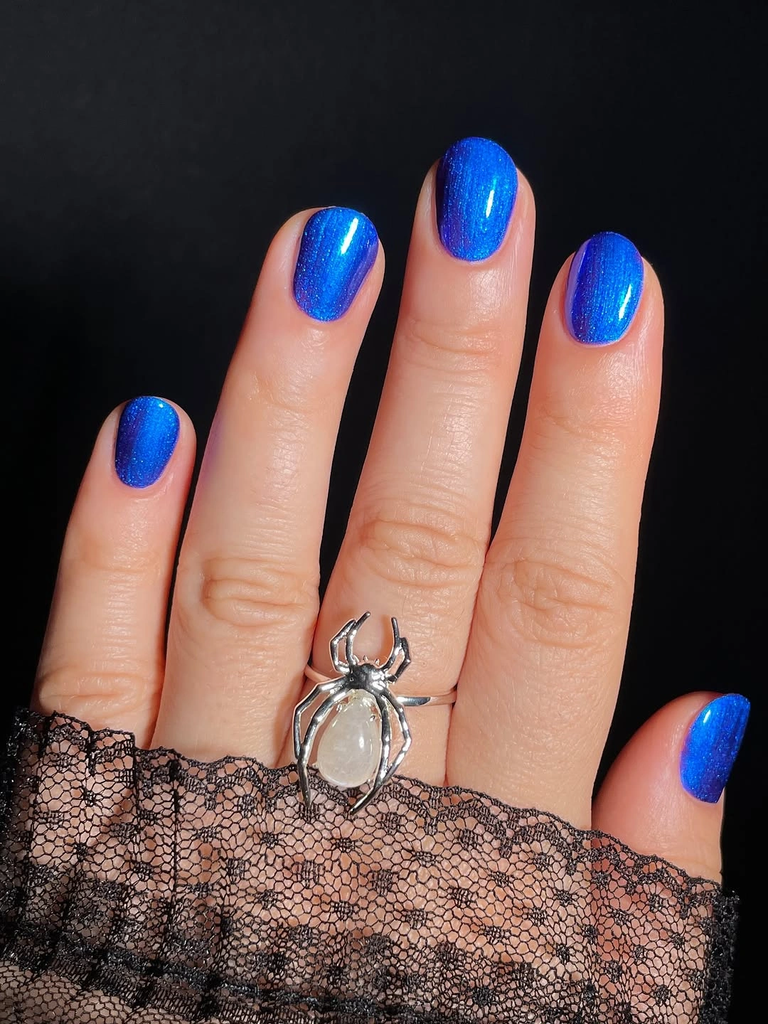
A luminous finish lets one color handle both coverage and detail. The design looks more considered when the shade is applied evenly and the shape stays consistent, because any mismatch becomes visible against such a clear surface. If you enjoy this clean, color-first direction, cute spring nail colors offer another set of concise manicure ideas based on clear shade placement.
Strong blue can be easier to maintain visually than a busy art set, but the glossy surface makes chips more obvious near the free edge. That is a practical reason to keep the nails short and rounded. The most useful thing to leave out is a separate accent nail, since it would interrupt the continuous color reflection that makes this manicure feel intentionally simple rather than unfinished.
Olive and Berry Details on Pale Pink
Pale pink, deep olive green, small red-and-cream leaf-like strokes, and thin dark outlines create a gentle autumn color conversation across medium almond nails. The olive solid nail provides depth, while the lighter fingers give the miniature leaves enough room to remain distinct. The set looks seasonal through its color relationship rather than through a large literal scene.
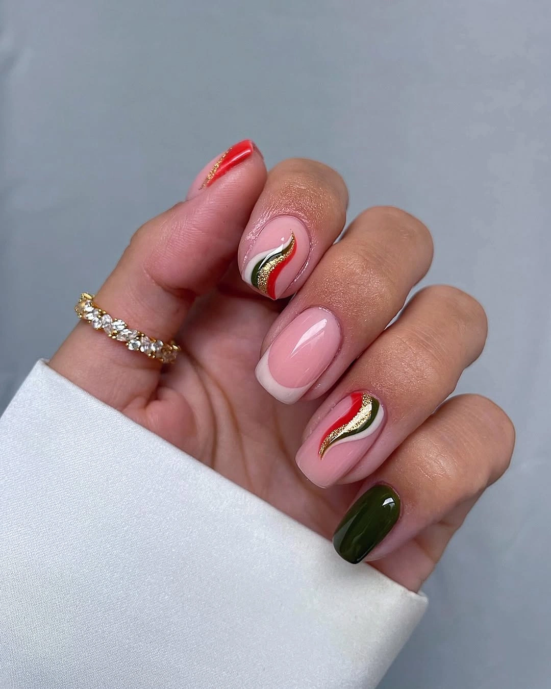
The strongest placement decision is keeping the botanical marks small and allowing the olive color to appear as a plain counterweight. If every nail carried red and green detail, the result would become much more decorative and lose its delicate spacing. A shorter option could keep the pale pink base and use only one olive accent with a single red leaf-like mark near a tip.
Olive and berry tones can be deepened or softened depending on how seasonal you want the set to feel, but the value contrast should remain clear against the pink. The thin outlines help the tiny marks stay legible without making them heavy. A full dark French edge would be unnecessary because it would compete with the small illustrations instead of supporting their quiet scale.
Black and Nude With Ghost Details
Long pointed nails combine black, sheer nude, tiny white ghost figures, orange butterfly-like forms, and fine white floral lines. The dark and nude base sections create immediate contrast, giving the small drawings different backgrounds to sit against. Because the illustrations are separated across the set, each one has room to read instead of becoming part of a crowded Halloween collage.
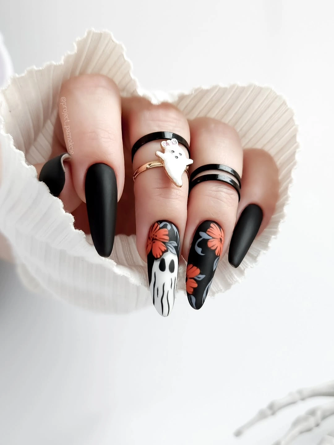
Illustrative October nails work best when the base establishes a clear hierarchy before the characters arrive. Black creates the strong frame, nude provides calm surface, and white or orange marks become accents that are easy to notice. To make the look more wearable, choose either ghost art or butterfly-like art and keep the other nails to black tips and nude panels.
The pointed length adds its own drama, so there is no need to add large stones or glitter around the drawings. Fine white linework is enough to connect the separate motifs and keep them from feeling pasted on. The useful tradeoff is whether to leave more nude space or add one more dark panel; adding a third illustration would not improve the composition’s clarity.
Red Dots Across a Creamy Nude Base
Creamy nude almond nails use tiny red-and-black ladybug-like dots, red accents, and a few almost bare-looking areas to create a delicate October color detail. The warm neutral base keeps the red from appearing harsh, while the miniature marks give the nails a close-up point of interest. Open nails around the motifs ensure the set still reads as light from a distance.
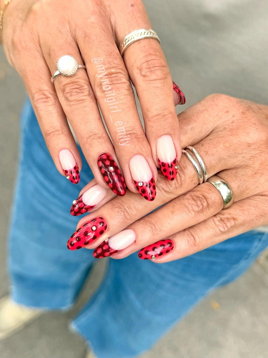
Small red details can suggest an autumn palette without turning the hand fully orange or burgundy. The dots work because they are deliberately sparse, allowing each one to remain a visible mark rather than texture. For a softer color direction, explore pink nail designs and keep the red accents on only one or two nails. That preserves the same gentle contrast with even less visual upkeep.
The line between delicate and cluttered is especially narrow with such a small motif. Adding extra leaves, web lines, or glitter would change the visual scale and make the dots lose their quiet charm. A slightly deeper nude base would make the red feel richer, but it should not become so dark that the tiny black outlines and bare-looking spaces stop being distinguishable.
Lavender Web Lines With Graphic Contrast
Mauve-lavender and pink nails carry black spiderweb lines, white details, and a dark graphic accent. The pastel-leaning background changes the mood of the web pattern, making it more playful than a fully black Halloween manicure. Long square surfaces give the lines enough room to stretch cleanly, while the contrasting dark pieces provide a necessary visual anchor.
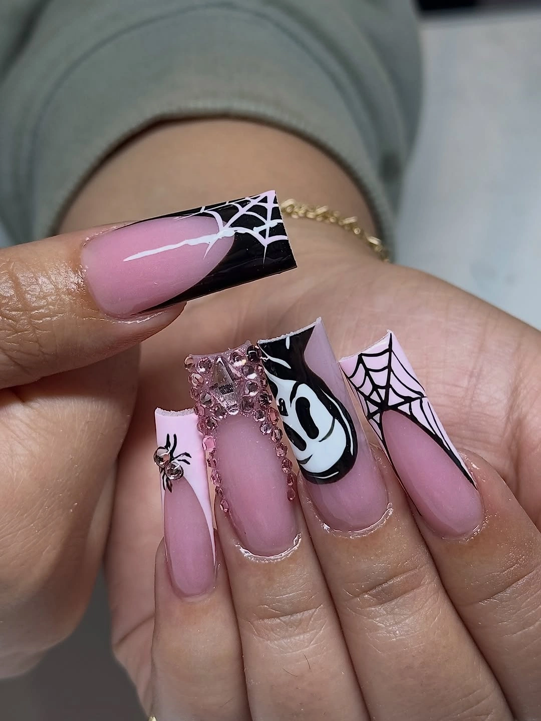
Web linework stays more readable on a light field because the dark intersections remain distinct. If you prefer a softer version, keep the lavender base and use a web on only one nail, then repeat the black as a small French edge on another. That retains the graphic relation between background and line without covering every tip in the same seasonal motif.
The square shape makes the design feel structured, so the pink and lavender are useful for preventing the overall result from becoming too severe. More white detail is not necessarily better; a few clear lines already give the web its identity. The most valuable thing to preserve is the contrast between open pastel areas and dark linear structure, not every tiny branch of the pattern.
Chrome Silver Breaking Up Black Panels
Long pointed nails use high-shine silver, black, and a blue-violet reflective accent in broad, flowing panels. The metallic surfaces provide their own light and movement, while the black sections create strong depth beside them. Because the colors are divided into larger areas rather than detailed drawings, the dramatic length remains readable rather than overloaded.
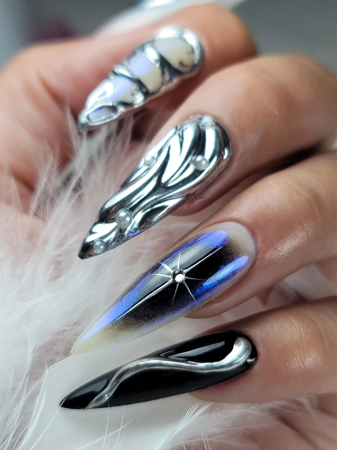
Chrome is already a strong visual statement, so broad placement is more effective than adding a separate glitter or illustrated motif. Black gives the silver an edge and keeps the reflective panels from looking washed out under bright light. For a more restrained interpretation, choose one chrome accent and keep the remaining nails black with a narrow metallic line, maintaining contrast without the full high-impact surface.
The pointed silhouette can carry this level of shine because it directs attention along the length. On a shorter nail, the same broad silver-and-black split would still work, but the blue-violet accent could be removed to keep the palette concise. The essential decision is preserving clean panel edges; extra tiny decoration would only interrupt the sleek, reflective flow.
Pink, Lime, and Pumpkin Graphic Accents
Pink almond nails are paired with lime-green details, orange pumpkin-like art, black marks, and small yellow accents, creating an October palette with an unexpectedly bright edge. Black lines give the lively colors a necessary outline, making the individual drawings clearer against the pale base. The contrasting hues feel playful because they are not spread in equal amounts across every nail.
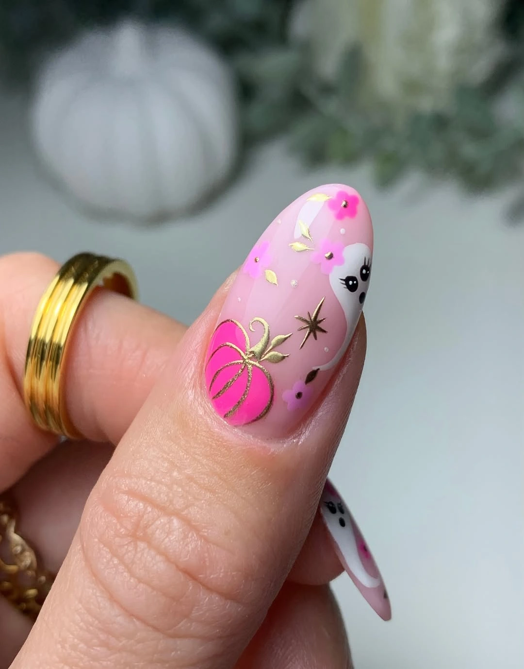
Bright colors need a shared structure, and the black outlining provides that structure here. Lime green keeps the orange pumpkin-like element from becoming too traditional, while the pink base gives all the accents a softer starting point. To tone it down, keep pink and one orange accent, remove the lime from most nails, and use black only as a fine outline rather than a large block.
The design has enough energy that clothing and jewelry can stay quieter around it. Adding more colorful stones or a dense patterned cuff would make the hand look crowded, while a neutral sleeve lets the small details remain legible. The most useful simplification is removing an accent color, not shrinking every motif, because the current black outlines already make the existing shapes easy to follow.
Red Waves Across a Visible Nude Center
Glossy red, pale nude, and sweeping white-and-red curved lines alternate across medium almond nails. The red is concentrated in flowing shapes rather than applied as one solid cover, so the nude center remains part of the design. Alternating patterned and plain nails gives the curves a pause, which keeps the overall color story from becoming visually relentless.
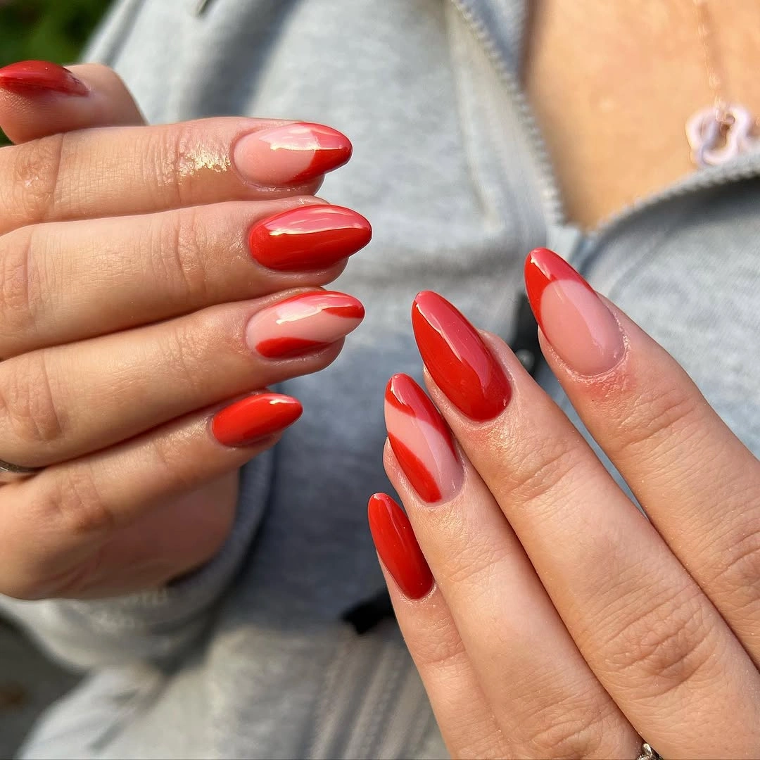
Wavy red placement is a useful way to wear a strong color while keeping part of the nail light. The white line creates separation between red sections and makes the movement easier to read from a distance. A simpler version could use red waves on two nails and solid red on one, leaving the other fingers nude, but the curved direction should stay consistent across the set.
Medium almond tips suit this kind of linework because the curve can travel along the shape without looking chopped. If the waves become too thin, the red loses impact; if they become too wide, the nude center disappears and the design becomes closer to full coverage. The balance is not about adding another color, but about allowing the existing red and white paths enough open space.
Warm Red Curves With Peach Light
Rich red, peach, white, and nude combine in layered curved stripes across medium almond nails. The peach acts as a lighter temperature between the deep red and white, preventing the pattern from looking like a simple two-color candy stripe. Each nail uses a slightly different path, which gives the hand a sense of movement instead of a repeated stamped layout.
Adding peach changes the red color story more gently than adding a sharp contrasting blue or green would. It creates depth within a warm palette and gives the white line a softer neighboring shade. For a pared-back manicure, use red and peach on one accent nail, then keep the remaining fingers nude with a thin red curve, which would preserve the layered effect with less density.
The lines should remain broad enough to stay separate as the hand moves. Very fine peach stripes could disappear beside the red, while wide white bands would take over the palette and make it less autumnal. The easiest detail to remove is a secondary curve, not the peach itself, because that lighter warm shade is what gives the red design its more nuanced, dimensional reading.
Green Spiderwebs With a Dark Gradient
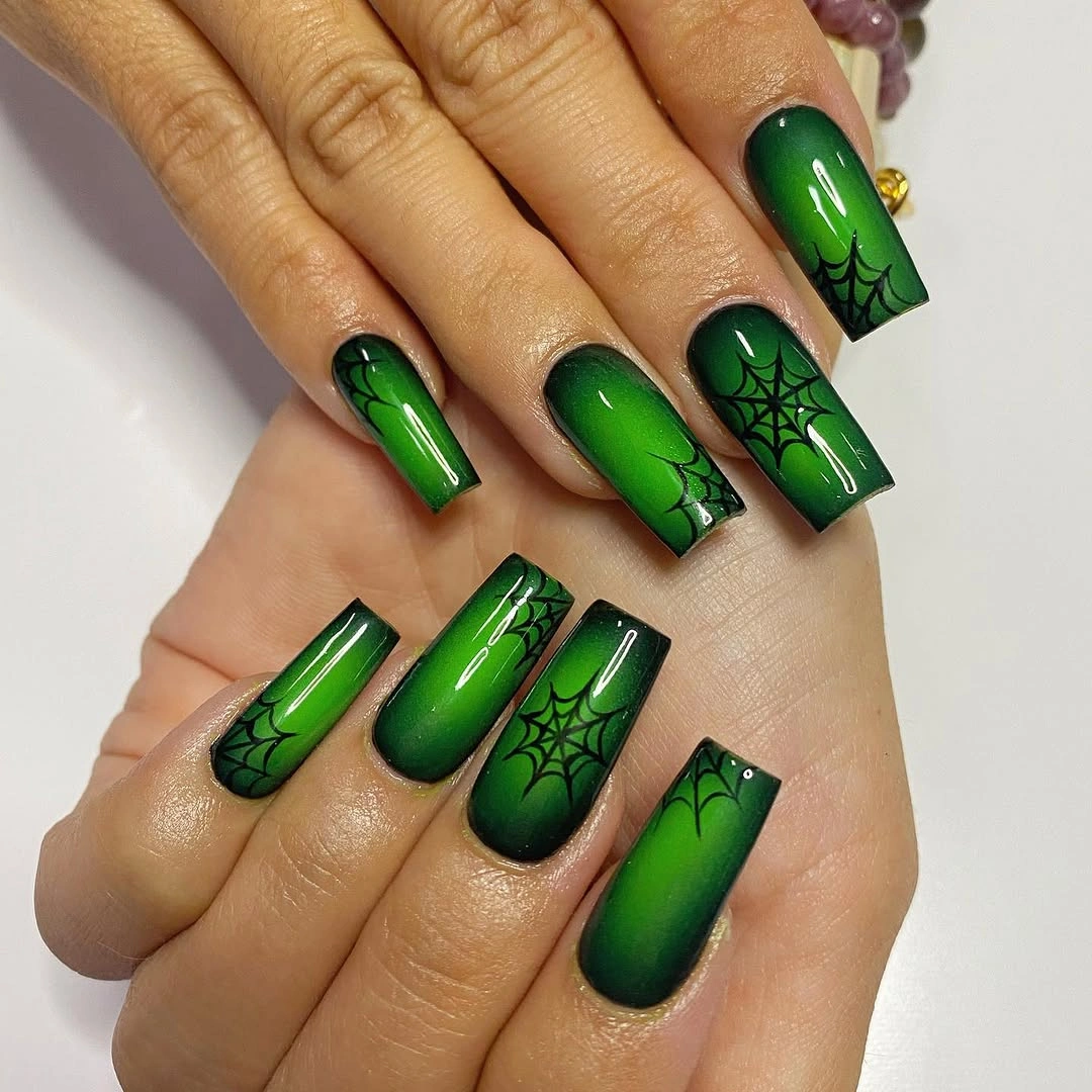
Deep green medium square nails use black gradient edges, black spiderweb linework, and a few brighter green touches for a strong October contrast. The broad squared surface lets the web pattern remain visible, while the green shifts prevent the dark outline from becoming one flat black frame. This palette is dramatic, but its repeated black-and-green relationship keeps it organized.
Green and black make a direct seasonal pair without relying on orange, and the gradient gives the color more depth than a solid block would have. A more wearable version could keep one web accent and use plain deep green on the other nails, which would retain the color mood while reducing the amount of high-contrast linework. The square shape should stay tidy because it supports the graphic layout.
Spiderwebs need clear open areas around their intersections, especially when placed over a darkened tip. Adding extra small symbols or metallic dots would make the linework harder to follow and reduce the design’s sharpness. The best decision is to preserve the green-to-black transition and allow the web to remain the only drawing, because those two elements already provide color, depth, and an unmistakable structural focal point.