October is where a manicure can lose its focus surprisingly fast. One seasonal detail invites another, and before long the color, finish, outline, and tiny drawing are all competing for the same small surface. A more convincing result starts with the feature you want someone to notice first, then uses the remaining nails to give that feature room rather than more rivals.
Before choosing art, decide whether the shape, a color edge, a finish change, or one placed motif should lead. Short nails reward a clear color decision, while a longer outline can support more delicate movement. Editing one extra mark is often what keeps a design readable as the hand moves, and it makes the final choice feel deliberate instead of merely seasonal.
Black and White With Silver Punctuation
Soft pink, white, black glitter, and fine black lines are distributed across medium almond nails rather than piled onto one surface. Tiny reflective accents make the pale-and-dark mix feel more deliberate, especially because most of the base remains visible. The darker details are strongest where they can frame an edge or interrupt a plain panel.
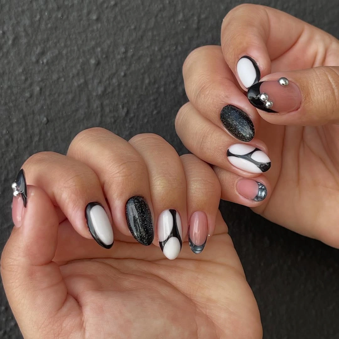
The benefit of this layout is restraint. Black has enough contrast to make the design seasonal, yet the white and nude sections stop it from becoming a full dark set. If you shorten the shape, keep the silver accents smaller and reduce one of the line motifs, because several tiny features can blur when the available nail surface becomes compact.
Notice how the reflective detail works as punctuation rather than the headline. A similar color mix could use a single metallic-looking dot or a thin line, but adding shine to every nail would flatten the contrast between matte-looking dark areas and clear nude space. The most useful thing to preserve is the pause between the light panels and black markings.
Chocolate Checks on a Warm Nude Base
Warm nude almond nails carry brown plaid lines, small dots, a chocolate-toned nail, and a character-like accent with a playful October mood. The palette stays coherent because the brown appears in several forms instead of introducing a separate bright color. Even the most detailed nail still shares the same warm base that holds the set together.
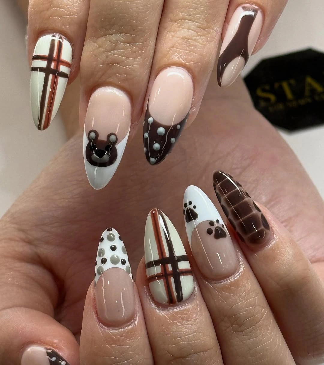
Mixed motifs need a common color more than identical placement. Here, the repeated chocolate shade gives the checks and small drawings a shared direction, while the nude background keeps the long shape open. For a quieter version, retain the plaid on one nail and the dark solid on another, then remove the smallest accent so the remaining details can breathe.
Brown is doing more than supplying a fall reference; it creates a softer contrast than black would against this base. That makes the manicure easier to pair with cream, camel, and deep berry clothing without feeling overly literal. The tradeoff is that very fine brown lines may disappear sooner against a warm nude, so the grid should remain simple and clearly spaced.
Outlined White Panels on a Nude Ground
Long tapered nails use a nude base, white panels, black outlines, and small graphic details that resemble flowers or web-like marks. The white areas have enough coverage to be seen from a distance, but the black tracing keeps their edges sharp. Empty nude sections make the several designs feel connected rather than crowded across the full length.
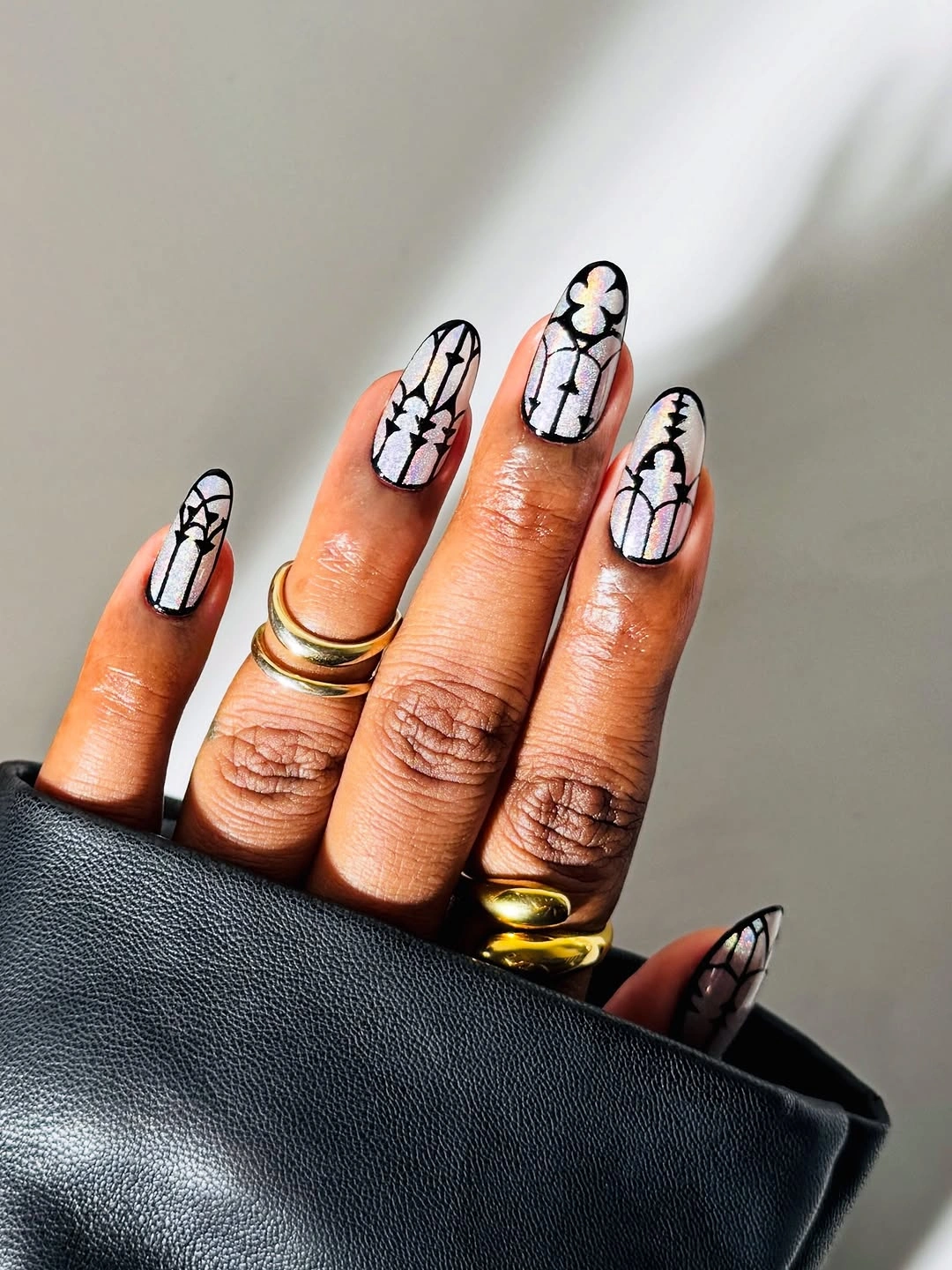
Outline work is helpful when you want a high-contrast manicure without filling every nail in solid black. The border defines the pale shape, then the interior motif provides a second level of interest for a closer look. On a shorter almond, use fewer outlined panels and let one plain nude nail remain entirely undecorated so the proportions do not feel compressed.
The most convincing adjustment would be to change scale, not add colors. A thicker black outline would look bolder but might overwhelm the delicate white areas; a thinner line would make the set feel lighter but less graphic. Keep the central nude space visible, because that is what stops the pale panels from reading like separate stickers placed on a busy base.
Short Orange Nails With White Details
Glossy orange-red and translucent nude create the core of this short rounded manicure, while small white floral-like marks and a textured rust accent add variation. The bright color is not applied everywhere in the same way, which gives the set movement despite the compact length. Each decorative decision stays readable because nearby nails remain simple.
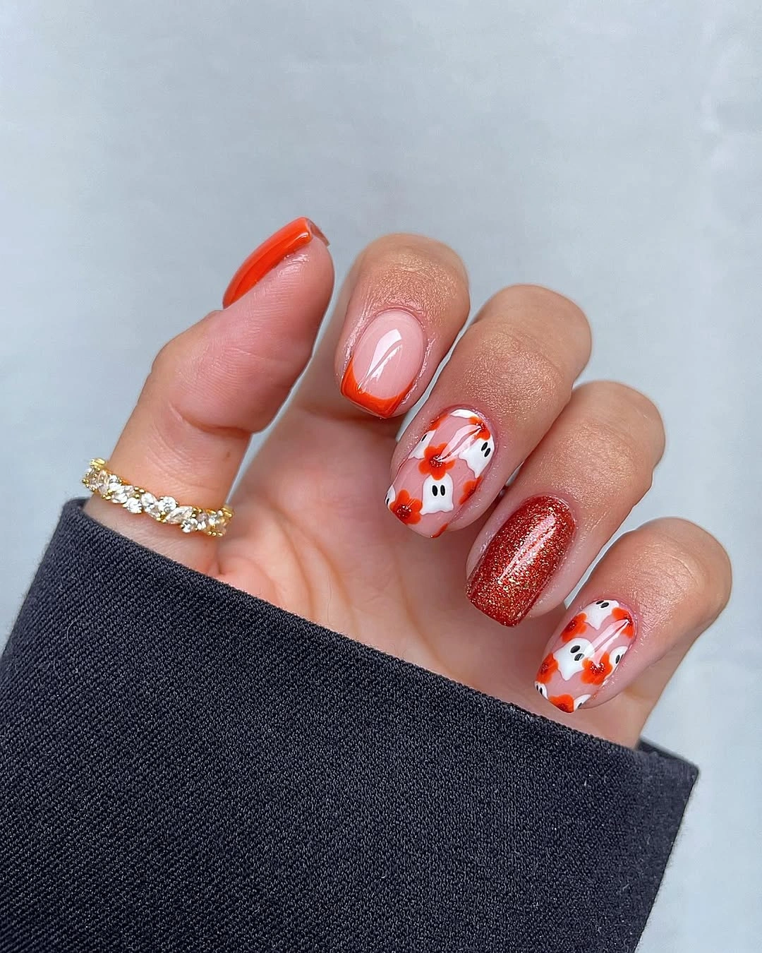
Short October nails design ideas often benefit from one bold color plus one small motif rather than a dense scene. Orange has enough visual energy to lead on its own, and the white details give it a crisp counterpoint. If a full orange nail feels too direct, use the shade as a curved tip over nude and keep the flower-like mark only on one accent nail.
The practical limitation is scale: tiny white marks need a clean background and enough distance from the cuticle to remain recognizable. A longer nail could carry several petals or dots, but this length is more successful when the drawing stays spare. The textured rust accent also works better as an isolated change, otherwise the glossy finish would lose its role as the unifying surface.
Muted Green and Gold Botanical Notes
Milky nude, soft white, gray-green, and fine gold details create a quiet manicure with small botanical-looking accents. The green sits close to the pale base rather than jumping forward as a bright block, so the gold can read as a measured highlight. Almond tips keep the different tones flowing in one direction instead of breaking the set into separate graphic pieces.
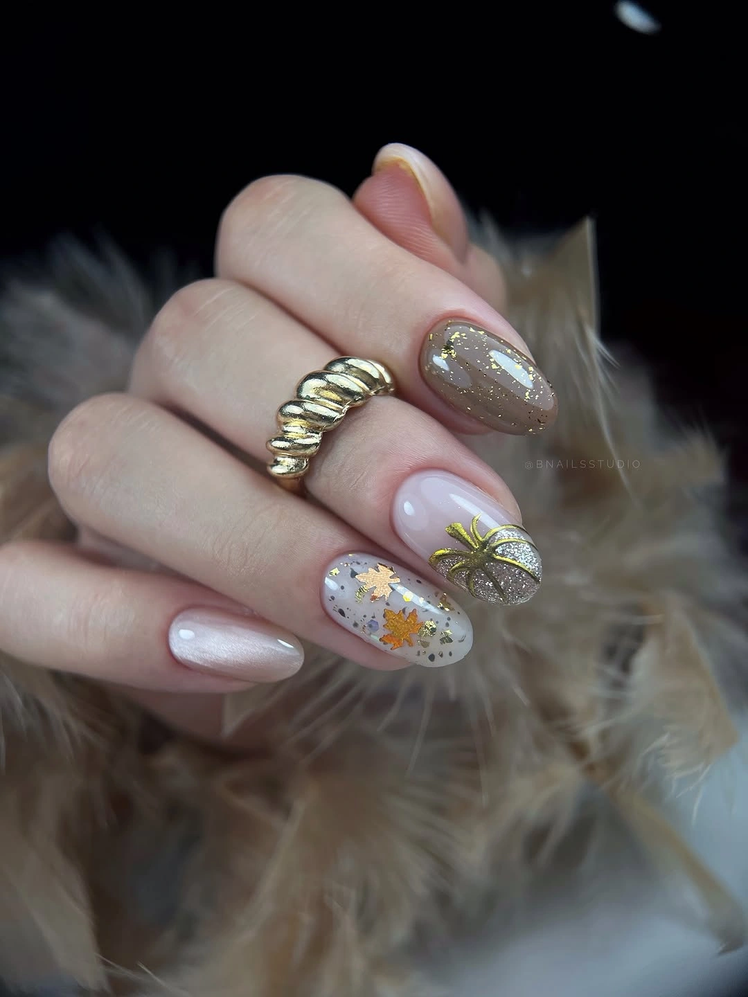
This is a useful option when you want autumn references without obvious orange or black. The muted green gives the palette depth, while the light base keeps the tiny details from becoming visually heavy. To simplify it, keep one green nail and one gold-lined accent, then leave the rest milky nude; more decoration would weaken the calm spacing that makes this set work.
Fine gold is most effective where it follows the design rather than covering it. A thicker metallic stripe would turn the focus toward shine and away from the botanical feeling, while a scattered foil look could compete with the small marks. The quietest choice is also the easiest to adapt later, because the palette can shift toward sage, brown, or cream without changing the basic placement logic.
Short Cobalt With a Clean Glossy Finish
Saturated cobalt blue covers short square nails with no visible secondary art, allowing the glossy finish and tidy shape to carry the whole result. The strong color has enough depth to feel appropriate for October without relying on a literal seasonal symbol. On a compact nail, the even surface reads as a conscious design decision rather than a minimal fallback.
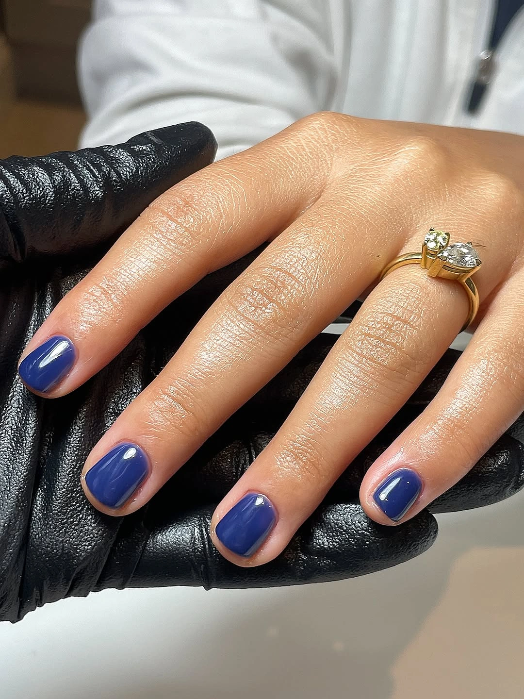
One-color sets are most interesting when the chosen shade has presence and the shape supports it. Cobalt works here because the square corners give the blue a crisp outline, while the shine keeps the surface from looking flat. For another compact, color-led reference, cute spring nail colors show how a clean finish can carry a short shape without extra art.
Maintenance is the main consideration with a saturated solid shade: chips and uneven edges will be easier to notice than on a patterned set. That makes careful shaping more valuable than an extra accent nail. A single pale dot near the base could be added for a tiny change, but it would shift attention away from the smooth, uninterrupted blue that gives this short design its strength. For more compact shapes, browse short nail design trends.
Fine Black Curves on a Sheer Base
Short sheer nails are marked with fine black curved edges and tiny green leaf-like details, producing a design that is subtle until the hand is viewed closely. The translucent base is doing important work because it gives the lines visible air around them. Rather than covering the nail, the marks trace movement across a naturally light-looking surface.
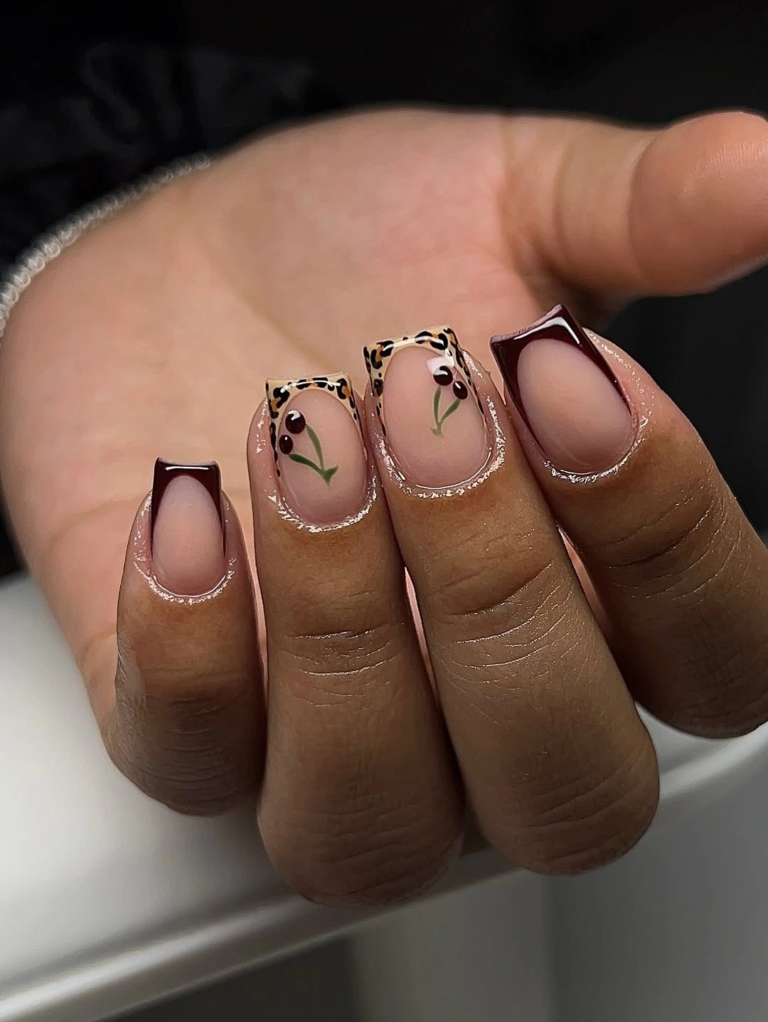
Small linework is more wearable when it follows the nail’s shape instead of cutting directly across it. The curved black marks echo the rounded tips, and the green details act as brief color interruptions rather than a full second palette. For an even simpler version, choose either the black edge or the green leaf-like accent; both are not necessary on every nail.
The risk is overworking a short canvas. Adding a dense French edge, multiple dots, and several colored leaves would make the same airy idea feel busy. Keep the clear base visible from cuticle to tip wherever possible, because it provides the contrast that lets the black line remain precise. This is a case where removing one detail makes the existing marks easier to notice.
Small Checkerboard With Grounding Brown Solids
A nude short set mixes brown-and-cream check squares, a small white outlined accent, and a dark brown solid nail. The checkerboard is confined to a limited area, which prevents the geometric pattern from taking over the rounded shape. Brown then reappears in a plain form, giving the little grid a visible anchor elsewhere in the manicure.
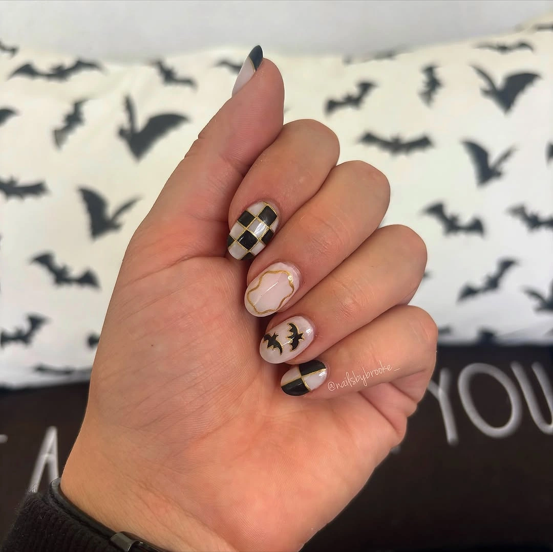
Checks look cleaner when the squares are large enough to distinguish from one another. On this length, a miniature grid would turn fuzzy, so the restrained pattern has more impact than a fully covered nail. If you want to change the palette, keep the nude background and switch the brown for deep green or burgundy, but use the replacement shade both in the check and a plain nail.
The rounded silhouette softens the hard geometry, which is why the result does not feel too severe. A long square nail could carry more rows of checks, but then the solid accents would become even more important as pauses. Treat the white outline as a supporting note, not another main motif, because the brown grid already supplies the detail that the eye remembers.
Hot Pink Framing Mixed Animal Prints
Vivid pink, warm orange-brown, black-and-white stripes, and spotted print are combined on short rounded nails with clear color blocks between the patterns. The pink is essential because it gives the darker prints a bright, unexpected frame. By limiting the prints to selected nails, the manicure avoids looking like every available motif was used at once.
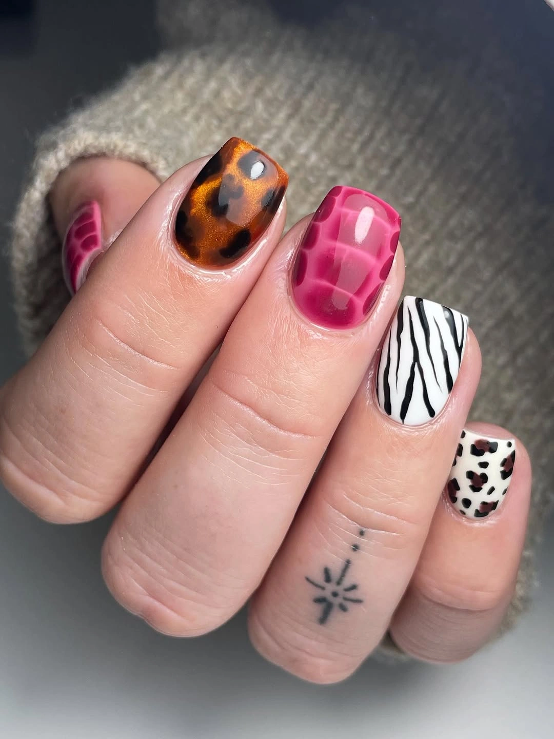
When several animal-inspired patterns appear together, the strongest control is color placement. Here, solid pink and orange-brown nails give the stripes and spots room to remain distinct. A more restrained adaptation could keep the pink solid, choose only one black-and-white patterned nail, and use a warm brown accent rather than attempting to repeat both print types across the hand.
Short nails are forgiving for bold color but less forgiving for micro-detail, so the spotted areas need to remain clearly sized. Fine speckles would disappear into the base and weaken the contrast. The result also has a deliberate playful mood, which means it may pair best with quieter clothing colors; adding equally strong print at the cuff would make the hand look visually crowded.
Mint and Pink Around Graphic Prints
Long almond nails combine pale pink, mint green, black-and-white cow-like print, and small metallic-looking details without treating every nail as a separate illustration. The softer colors are placed as open fields around the graphic markings, which makes the black pattern feel intentional. The length gives enough room for these changes, but the design still relies on leaving several areas relatively quiet.
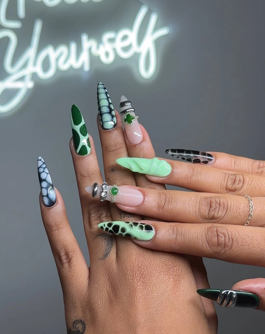
Mint and pink work here because both are light enough to soften the visual bite of black-and-white print. The best adaptation is to preserve that relationship while reducing the number of decorative nails, not to add another trend color. On a medium length, use one printed accent and one mint nail, then let the pink base carry the remaining fingers for a cleaner outline.
Long almond tips can make small embellishments appear more dramatic than they are, so placement matters. Keep metallic-looking details away from every point and avoid stacking them beside the busiest print. The manicure has a playful edge, but its strongest design move is the contrast between large open pastel areas and a few highly graphic marks, not the number of separate effects.
Peach Squares With One Gold-Flecked Accent
Glossy peach-nude covers long square nails, while one creamy accent carries irregular gold foil-like detail. The mostly solid color allows the reflective nail to register immediately without needing a matching embellishment elsewhere. Its warm base keeps the contrast gentle, so the result feels more considered than a full metallic manicure would on the same long shape.
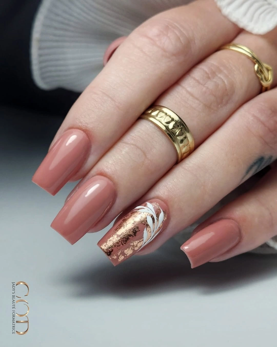
A single accent works because the surrounding peach is not trying to compete with it. If you want more variation, repeat the gold only as a narrow line on one additional nail rather than covering several fingers with foil-like patches. That preserves the hierarchy between the clean solid surface and the textured moment that makes this manicure memorable.
The square length provides a broad flat-looking area, which gives the peach color a polished presence even without art. At a shorter length, the same color would feel simpler and the gold accent might need to be reduced further. The key limitation is that too much shine would erase the contrast between smooth coverage and irregular reflective detail that creates the set’s rhythm.
Pale Floral Lines With Lavender Movement
A pale base supports black botanical linework, lavender color, and butterfly-like accents across long almond nails. The individual motifs stay distinct because the background is not filled with a second pattern or heavy dark tips. Fine lines create the seasonal reference, while the lavender provides a softer color field that keeps the overall result from becoming too stark.
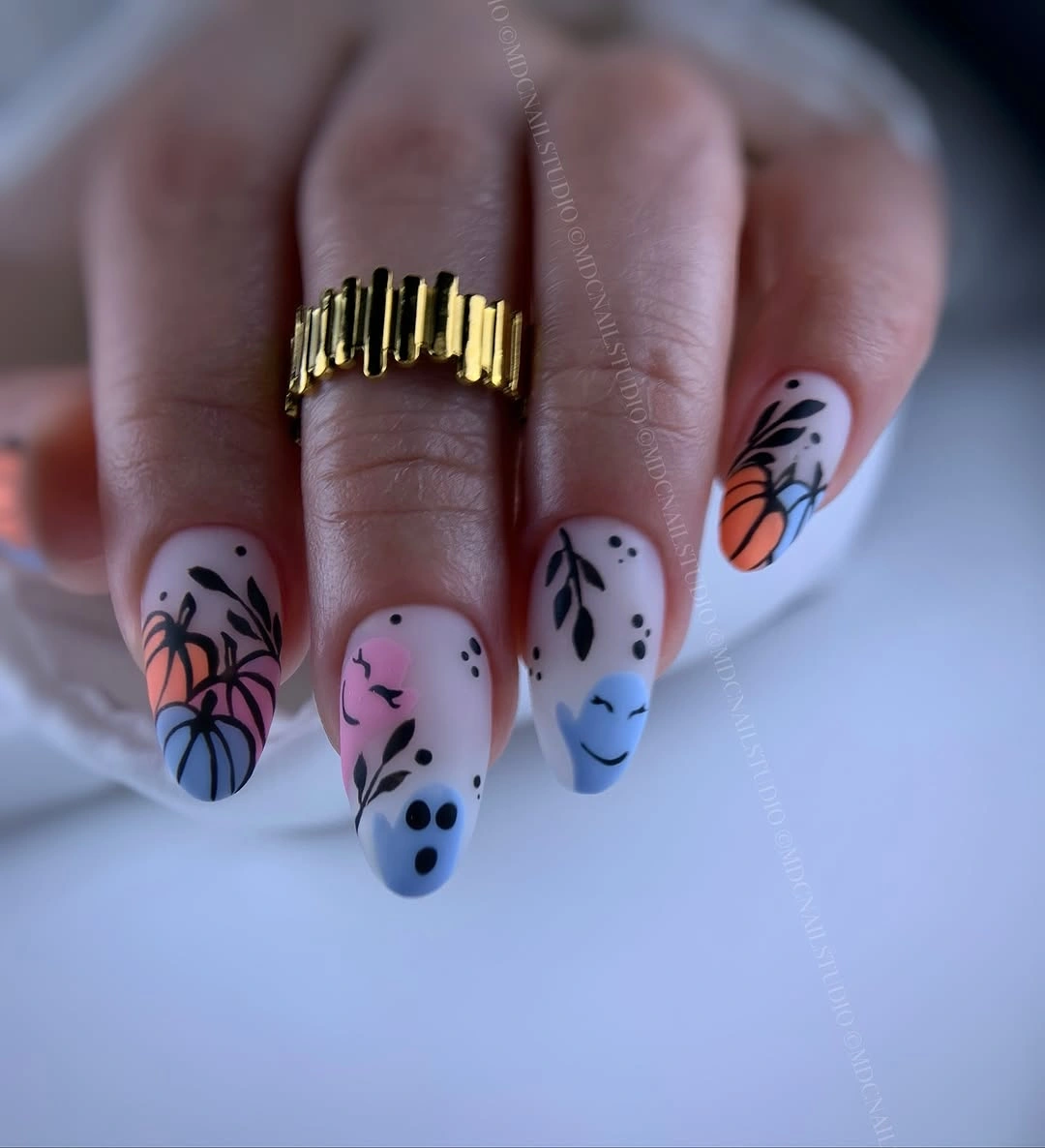
Detailed floral work benefits from an open base because it gives every leaf-like or wing-like mark a clean edge. If you prefer a more minimal October nail design, choose lavender on one or two nails and place the black linework on only one accent, leaving the others pale. Readers comparing lighter and deeper violet tones can also explore purple nail designs for a related color-first approach.
There is a difference between fine illustration and visual clutter. Here, the marks look most successful where they do not overlap the same area as the lavender fill. Keeping those tasks separate makes the shape readable and helps the long almond outline stay elegant. The easiest detail to remove is an extra small motif, not the open pale space that lets the existing work show clearly.
Green and Berry Around Tiny Botanical Art
Deep green, burgundy-speckled brown, milky white, and small fruit or botanical accents create a manicure with a grounded autumn palette. Solid dark nails alternate with lighter illustrated ones, so the tiny marks do not have to carry the entire visual load. The almond form makes the different colors feel like a sequence rather than disconnected samples.
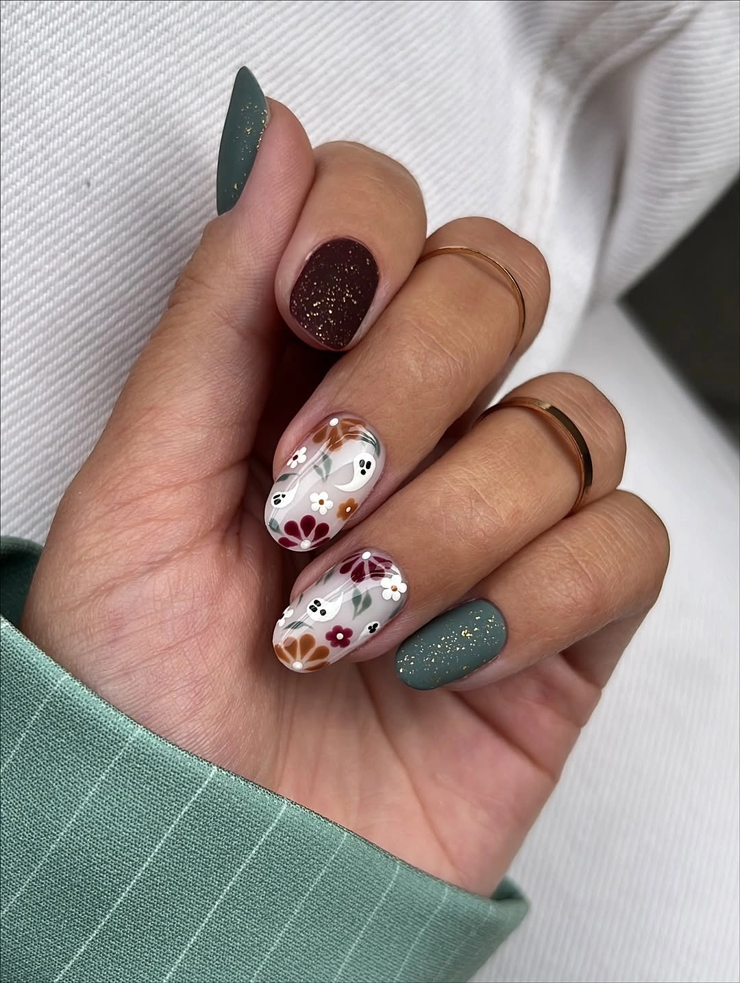
Alternation is the strongest organizing tool in this set. The dark green and berry tones provide depth, then the pale nail gives the illustration a readable surface. A shorter version could keep the green solid and move just one botanical mark onto a nude accent, which would preserve the color story while respecting a smaller area for detail.
The manicure’s charm comes from allowing the illustrated elements to remain small. Enlarging every fruit-like or botanical mark would make the set more literal and less composed. If you want to intensify the October mood, deepen the green or berry tone rather than adding more pictures, because the existing dark colors already establish the seasonal direction with fewer moving parts.
Chocolate Solids Beside a Compact Grid
Glossy chocolate brown, nude-pink, white curved lines, and a small brown checkerboard are arranged on short rounded nails with plenty of plain surface between them. The dark solids give the pattern a repeated color anchor, while the nude areas prevent the palette from looking heavy. Each nail has a different task, but the color family keeps the mix coherent.
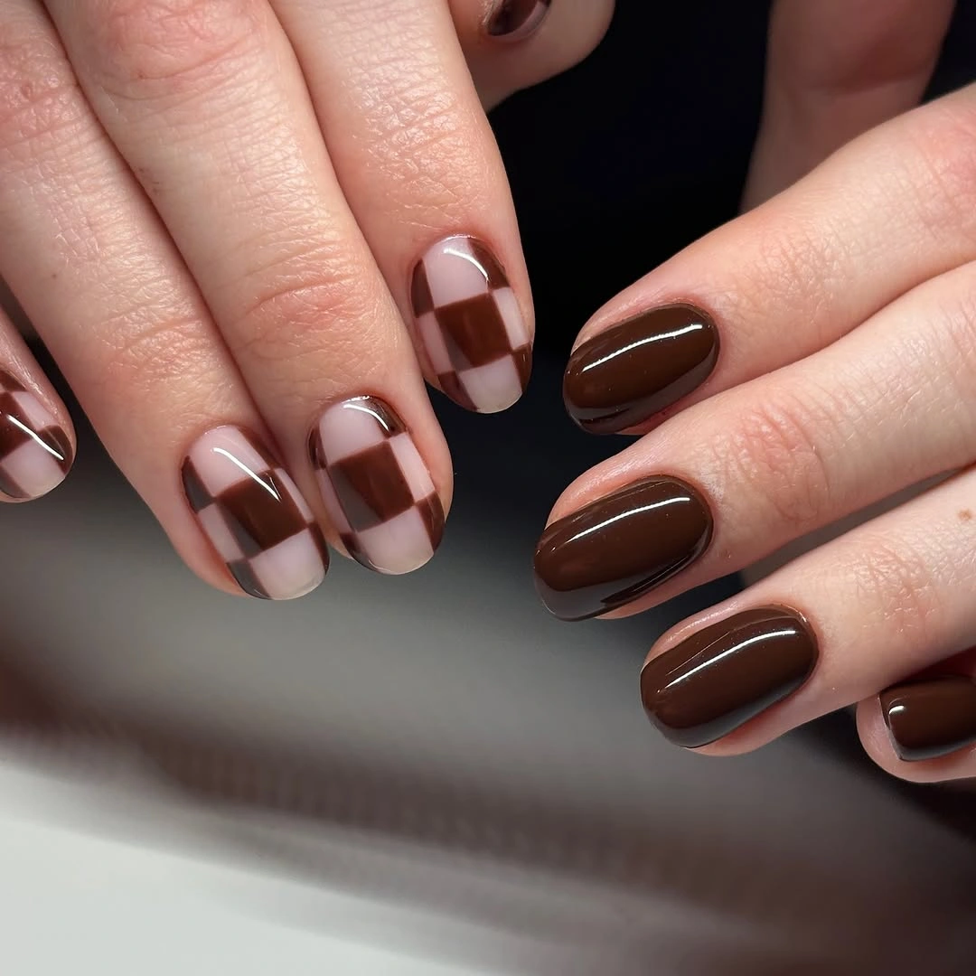
Short nails benefit from motifs that can be read in a single glance. The compact grid delivers that, and the solid brown nails provide relief from its geometry. If you choose a lighter brown, increase the contrast against the nude base so the checks do not disappear; if you choose black, remove one other accent so the design does not suddenly become much more severe.
The white curves are useful because they create a small light interruption without functioning as another full pattern. A glitter nail would add a different type of emphasis and might steal attention from the checkerboard, so it is not necessary here. The most adaptable part of this manicure is the color pair, while the limited scale of the grid is what keeps it practical for the shape.
Red Curves Around Tiny Ghost Accents
Pale pink almond nails are marked with red curved tips, fine black lines, and small white ghost-like accents. The red carries most of the visual energy, while the tiny illustrations become a closer-look surprise rather than the first thing seen. Keeping the base light makes each feature sit separately, which is especially important when several motifs share a nail.
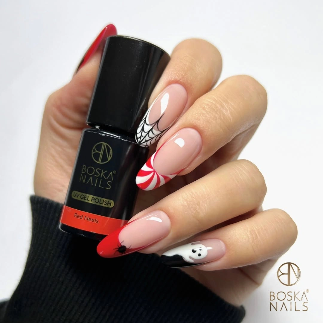
Curved red edges are more flexible than a fully opaque red nail because they leave the central pink visible and can follow the almond shape. For a less literal version, remove the ghost-like accent and keep the red curve with one black line detail. The color relationship will still suggest October, but the manicure will feel less themed and easier to wear beyond a single occasion.
Small character marks need room around them, so avoid placing extra stars, dots, or glitter beside them. The nail already has a red direction line and a pale background; that is enough structure for the miniature white detail. The most important maintenance choice is keeping the curved edges clean, because an uneven red line would be more noticeable than a missing tiny motif.
Abstract Black Doodles on Light Almond Nails
A light nude-pink base is covered selectively with black faces, stars, curves, and small green or yellow touches across long almond nails. The design looks animated because the linework changes from nail to nail, yet the shared black stroke quality keeps it from feeling random. Open background areas remain visible around every drawing and protect the delicate rhythm.
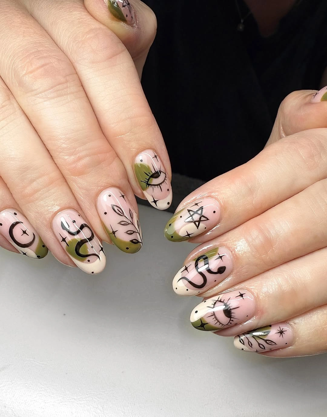
Abstract linework has its most interesting effect when no single drawing needs to be understood as a complete picture. The eye follows the curves and small shapes as a system, then notices the color dots afterward. If you want a calmer option, choose two kinds of mark such as stars and faces, not every available symbol, and keep the accent color on one nail only.
The long almond shape gives the lines a graceful path, but it also means overfilling the tips could make the whole set look dense. Leave at least one nail nearly bare to create a visual rest. The black outlines carry enough contrast on their own, so extra dark French edges or thick borders would make the doodles lose their individual, hand-drawn character.
Smoky Sage Green With Reflective Depth
Medium almond nails appear deep sage green with a darker smoky center and a softly reflective surface, creating variation without separate art. The color shifts across the curved nails instead of sitting as a flat block, which makes the subdued green feel richer. The absence of a busy motif lets the finish and gradient-like depth remain the main observation.
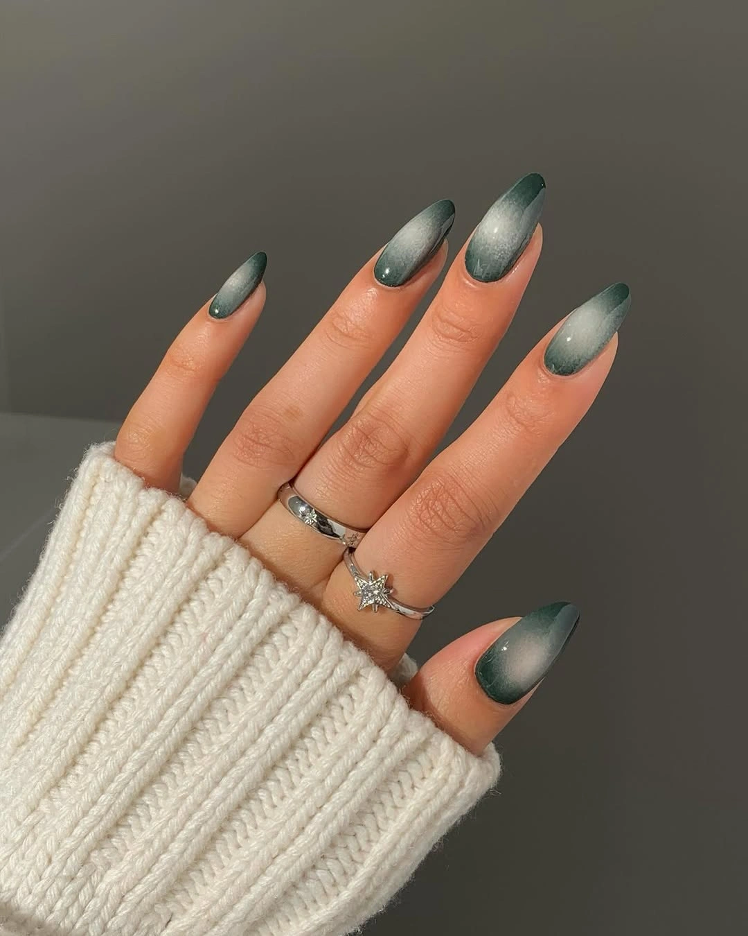
This is an effective choice for someone who wants October depth but does not want an illustrative manicure. The darkened middle gives the green a focal point, while the lighter edges prevent it from becoming an unbroken dark mass. To simplify the look further, choose a uniform smoky green finish and retain the almond shape, which will still provide a soft elongated outline.
Reflective finishes already change in different light, so an added glitter accent or patterned nail could distract from the movement that is present naturally. The practical tradeoff is that very dark centers make irregular growth more visible as time passes. Keeping the depth diffuse rather than sharply striped helps the manicure remain visually forgiving while preserving its restrained, dimensional quality.
Lavender Swirls With Selective Reflective Details
Long almond nails use lavender and purple with translucent areas, swirling lines, and small reflective or raised-looking accents. The design relies on direction: the curved lines move along the length instead of chopping it into short sections. Purple appears in several weights, from pale wash to stronger marks, which gives the set depth without needing a separate contrasting palette.
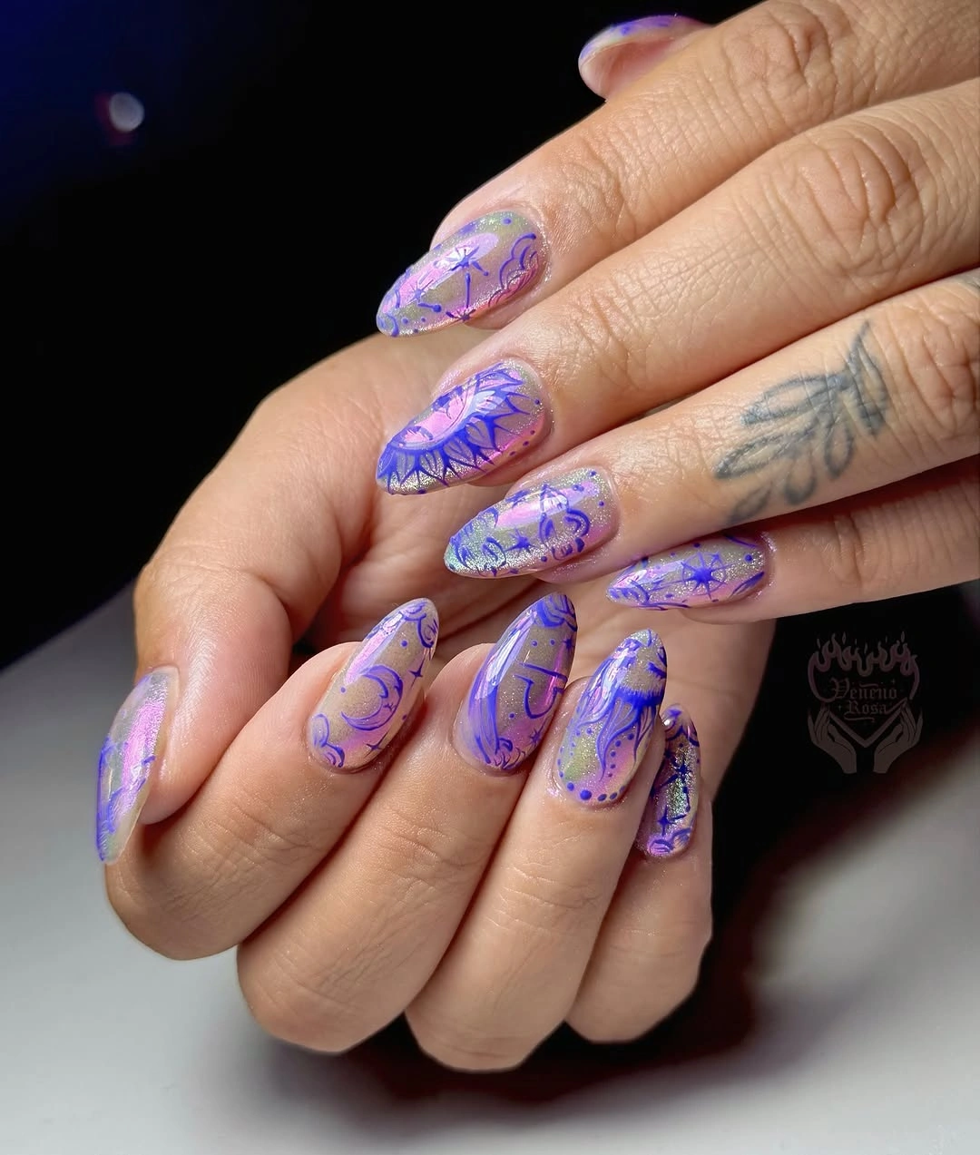
Swirls look more controlled when the largest one is balanced by quieter nails rather than repeated identically everywhere. An easier adaptation would keep a lavender base, one purple curve, and a single reflective point on only two fingers. That approach retains the layered feeling while reducing the amount of visual maintenance required from a longer, more detailed manicure.
The main thing to avoid is adding another strong color beside the purple. The existing reflective details already provide light contrast, and a bright orange or black accent would break the fluid direction. If something must be removed, remove an extra small embellishment first; the transparent space and curved line are the two elements that give the manicure its sense of movement.
Thin White Edges on a Sheer Neutral
Long almond nails have a translucent nude base with fine white curved tips and a few tiny clear or metallic-looking points. The white edge is narrow enough to outline the length instead of filling it, so the manicure remains light even with a defined graphic element. The open centers make the shape feel precise rather than simply long.
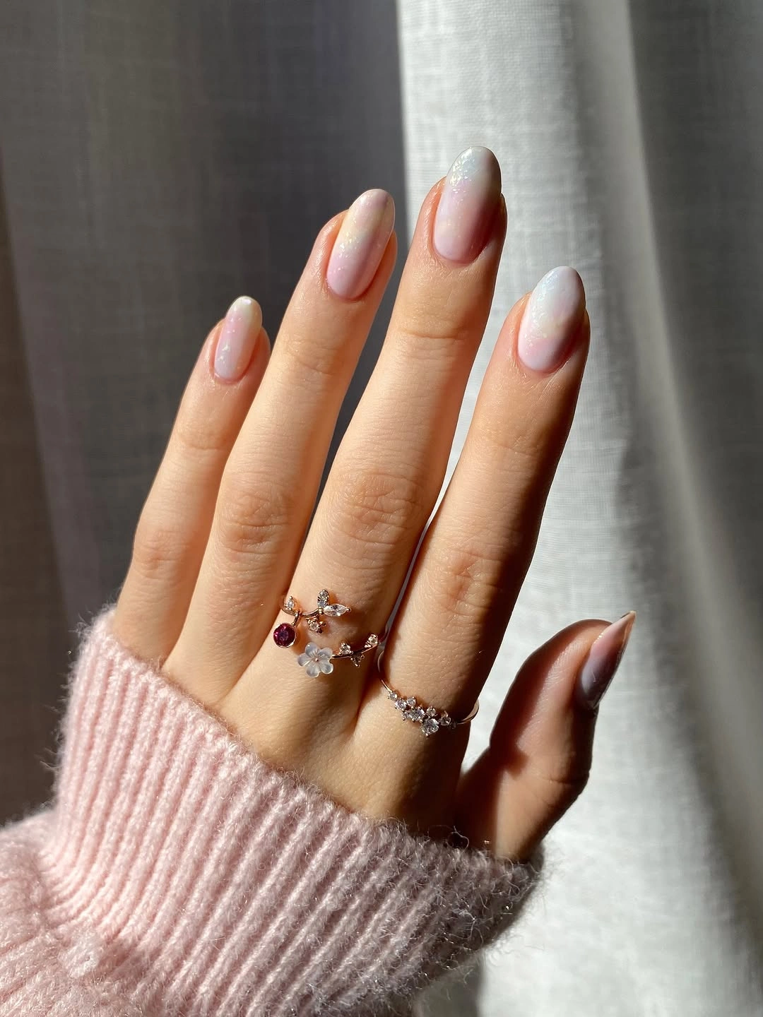
Fine white edge work is useful when you like a French reference but want something less uniform than a straight tip. The curve follows the nail and gives the eye a direction to travel. On a shorter length, make the white line slightly bolder and remove the small accent points, because the edge should remain the first detail rather than becoming one of several tiny features.
Neutral transparent bases can make grow-out less abrupt, but the contrast of a clean white line means uneven tips will still be noticeable. That makes consistency more important than adding further art. A full white tip would create a stronger statement, yet it would also cover the airy center that is doing most of the work to keep this long manicure visually spare.
Black Base With Flowing White Smoke
Glossy black almond nails are crossed by high-contrast white and gray marble-like swirls that curve across the surface. The lines soften the severity of black without making the manicure delicate, because they retain a bold irregular movement. Dark ground and pale pattern are clearly separated, allowing the swirl to be read from a distance as well as up close.
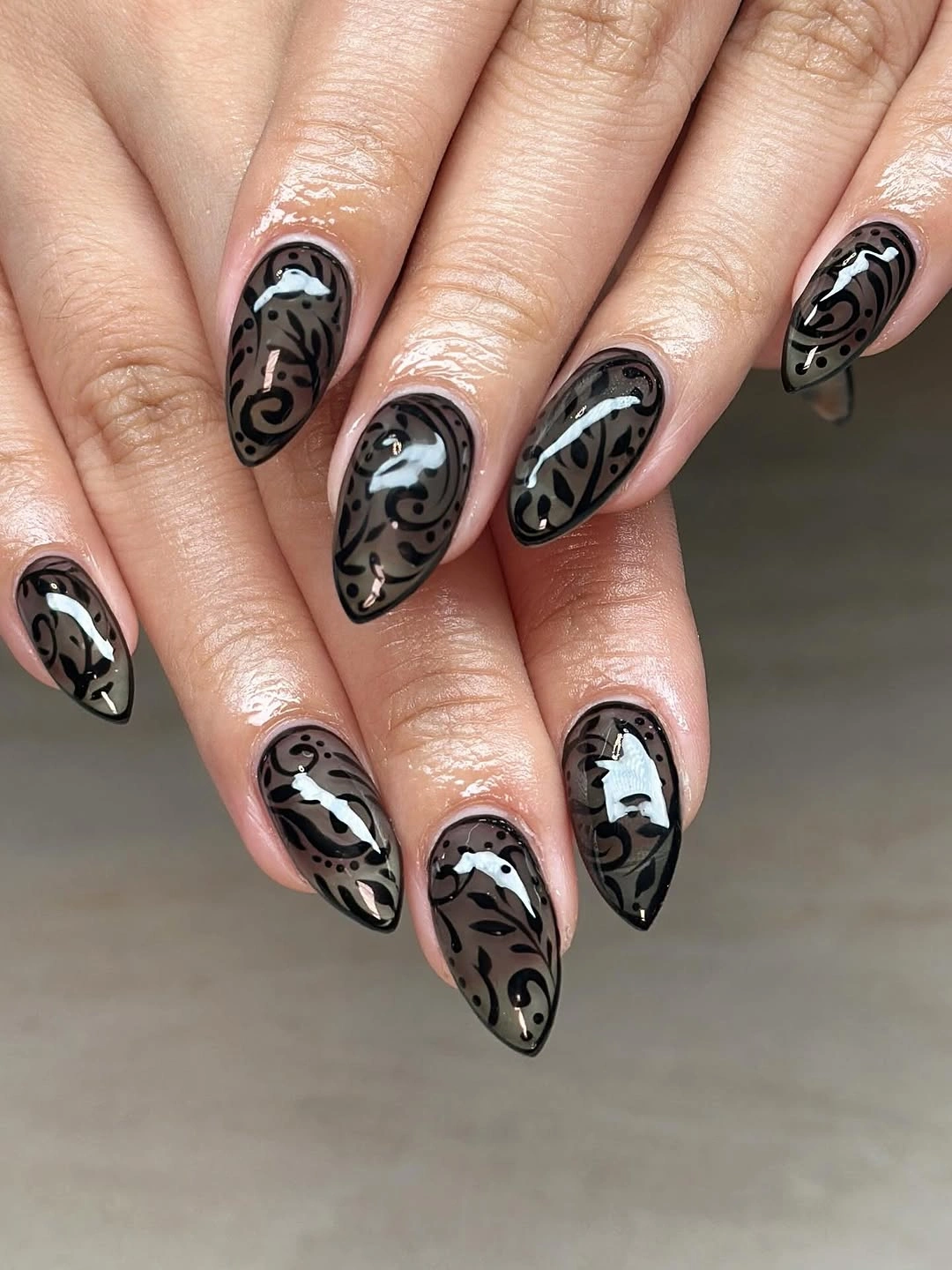
A black base gives white linework immediate authority, so the best adjustment is to control how many nails receive the full pattern. One or two mostly black nails would make the smoky sections look more intentional and give the eye a break. If you prefer a less dramatic contrast, use charcoal with soft gray swirls, but keep the curved direction rather than adding a different pattern.
The movement is stronger when each swirl has a slightly different route across the nail. Repeating identical marbling would make the hand look stamped and reduce the natural flow. Because the color contrast is already high, avoid extra rhinestones or bright accents; the useful tradeoff is choosing between more open black surface and more visible white movement, not adding a third focal point.
Pumpkin Accents With Black Graphic Tips
Long coffin nails combine nude and black sections with orange pumpkin faces, white web lines, and graphic dark tips. The black tips give the smaller orange illustrations an outline color to connect with, while the nude areas leave enough surface around every drawing. This October set uses several seasonal notes, yet the repeated black framing keeps the components organized.
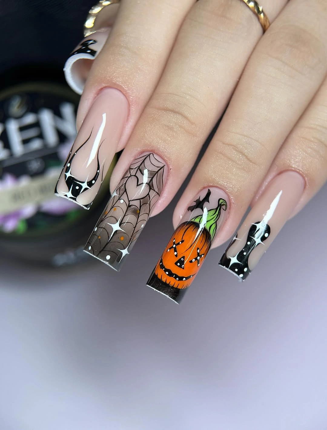
Long square surfaces can hold detailed seasonal art when the layout includes plain areas between illustrations. Here, the pumpkin motif gains clarity because not every nail carries a face or web. For a shorter rendition, choose either one pumpkin accent or one web accent, then use black tips on the rest; keeping all motifs at a reduced scale would make them much harder to read.
The strongest compositional choice is the repeated black edge, not the number of themed drawings. It gives the orange and white details a stable boundary and stops the palette from feeling scattered. A bright glitter accent would add more noise than value, while a simple nude nail would give the existing web and pumpkin art the space it needs to stay recognizable.
Orange Stiletto Nails Broken by Black
Bright orange and soft nude are split by black pointed sections, flame-like lines, and one textured orange accent across long stiletto nails. The shape already creates drama, so the color placement wisely leaves part of several nails bare-looking. Black works as a sharp interruption that prevents the orange from becoming a single uninterrupted field from cuticle to tip.
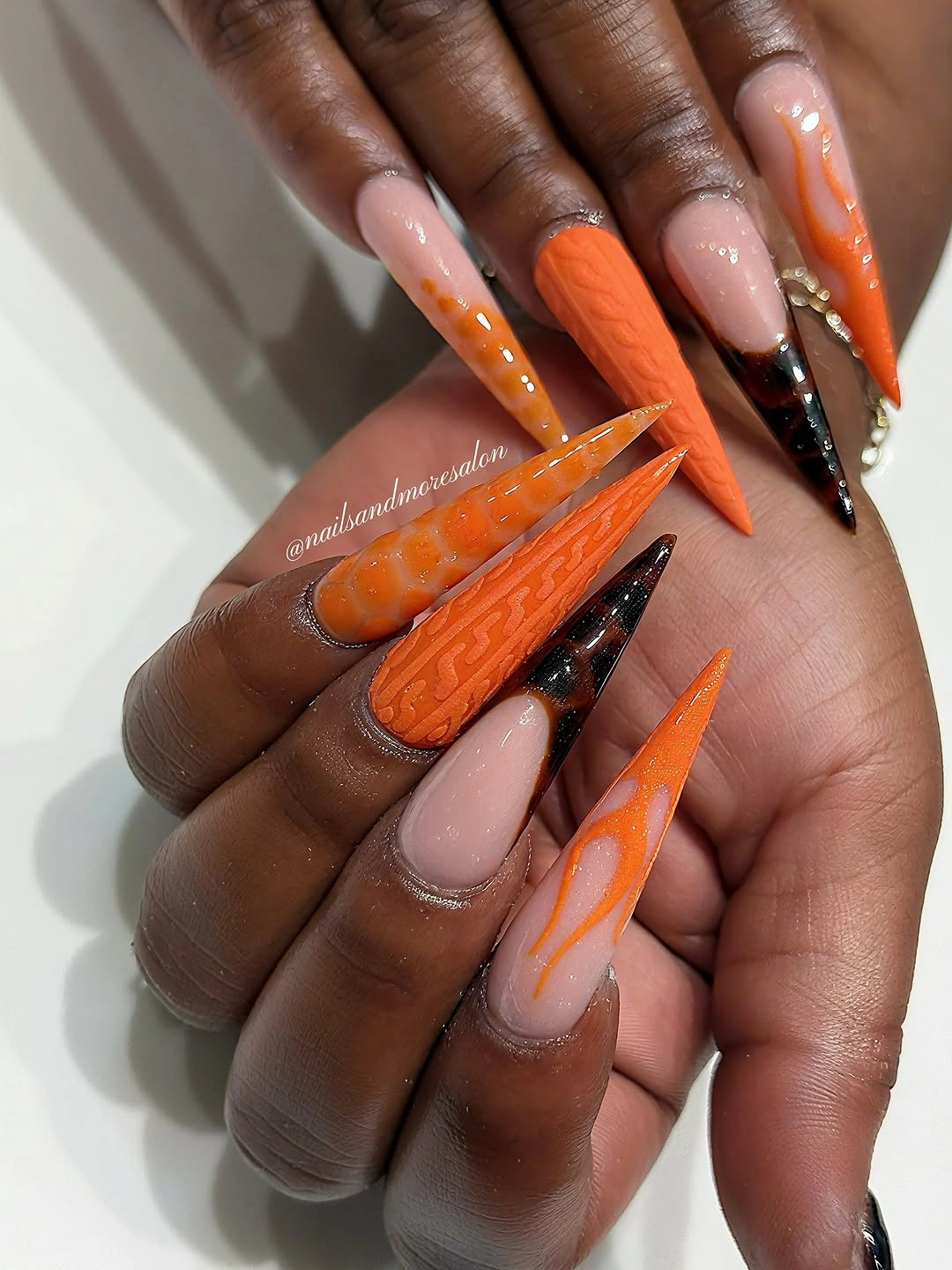
On a pointed shape, a diagonal black section can emphasize length more effectively than a full black nail. The nude areas also give the warm orange a clearer edge, which makes the palette look graphic rather than overloaded. If you need a more wearable variation, shorten the tip and keep only one orange flame-like nail plus a black French edge on another finger.
Texture should remain an accent in this design because the saturated color and pointed silhouette are already major statements. Repeating it across multiple nails would erase the difference between smooth coverage and the raised-looking orange feature. The cleanest finishing decision is to preserve the nude space, since that breathing room is what makes the black and orange feel placed instead of simply applied.