Hair color reads through movement as much as through shade. A technically beautiful tone can lose its effect when placement disappears in the haircut, while a restrained change can look striking when the light catches the right curve. Start by watching what the hair does in motion; the strongest choice is the one that remains legible from more than one angle, even when the styling is relaxed and the finish is not perfectly polished.
Use contrast as a placement decision rather than treating it as decoration added at the end. Ask where the eye should meet the light, how much depth the base needs to keep the result believable, and whether the haircut gives that shift enough room to show. This makes color placement easier to judge as a visual choice, not a label to copy without considering your own shape and movement.
A Central Braid Turns Dark Length Graphic
Long dark hair is gathered into a broad braid running down the center of the back, with overlapping sections visible across the glossy surface. The style takes a large amount of length and gives it one controlled direction, so the shape feels intentional rather than diffuse. The deep color also makes the braid pattern easy to read because every raised section creates a small change in reflection.
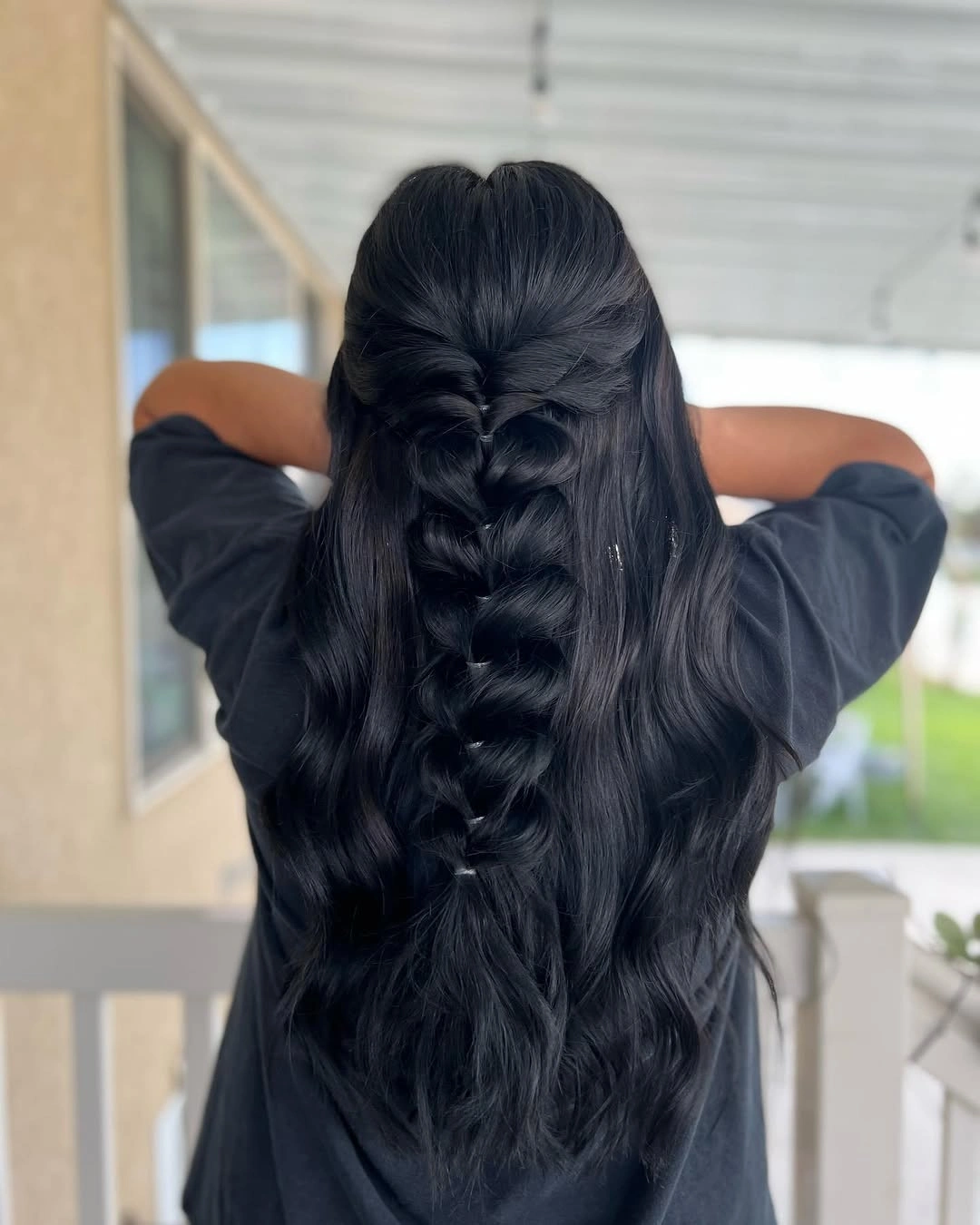
The important feature is the repeated structure inside the braid. It creates rhythm from the crown through the tail, while the smooth surrounding surface keeps the result from looking overly textured. Because the color is already concentrated, the hairstyle does not need extra contrast; its impact comes from how the length has been organized.
A looser finish would keep the braid soft and slightly irregular, while tighter sections would make the pattern more graphic. Either way, flyaways will show clearly against a deep base, so the choice is between preserving a touch of softness and keeping every overlapping edge sharply visible. a central braid turns dark length graphic stays readable when the surrounding shape is allowed to move without extra visual noise.
Wine Burgundy Waves Catch Every Turn of Light
Deep wine-burgundy color runs through long loose waves, with the back view showing bends that begin around the middle lengths and continue toward the ends. The shade stays rich because the wave pattern creates small reflective changes across it. There is no need for a separate bright highlight to make the hair dimensional; movement is already doing that work.
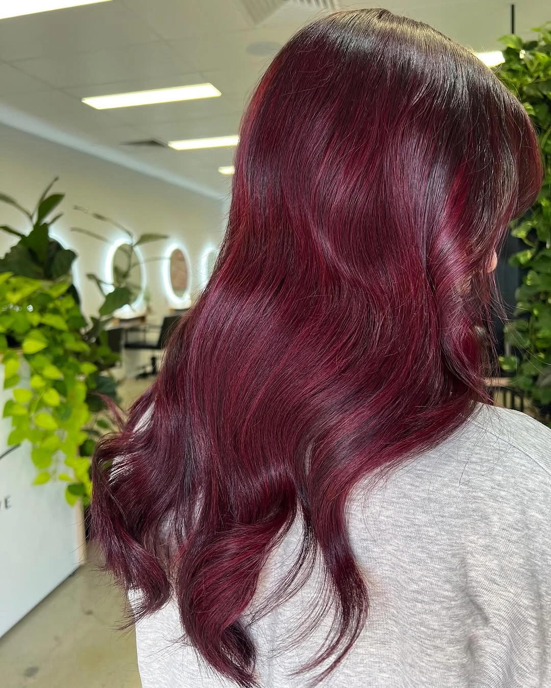
The color reads as one deep family, but the curved sections keep it from becoming a flat red-violet sheet. Wider bends give the result a relaxed softness, while tighter bends would make the same shade look more styled and defined. The long length gives the tone enough room to shift subtly as it falls.
A center or slightly off-center part would change the front balance without disturbing the main color story. Keep the shape simple if you want the burgundy to remain the focus, because a strong braid or crowded accessory would hide the wave movement that gives the shade its depth. Let wine burgundy waves catch every turn of light keep the first pause, then use the quieter pieces to carry the practical part of the look.
Clean Copper Length with a Soft End Bend
Warm copper-red hair falls past the shoulders in a mostly straight line, with a centered part and a small bend at the ends. The uninterrupted surface makes the tone feel deliberate and even, while the slight movement prevents the cut from looking rigid. This is a color-led result where the part and length quietly support the shade.
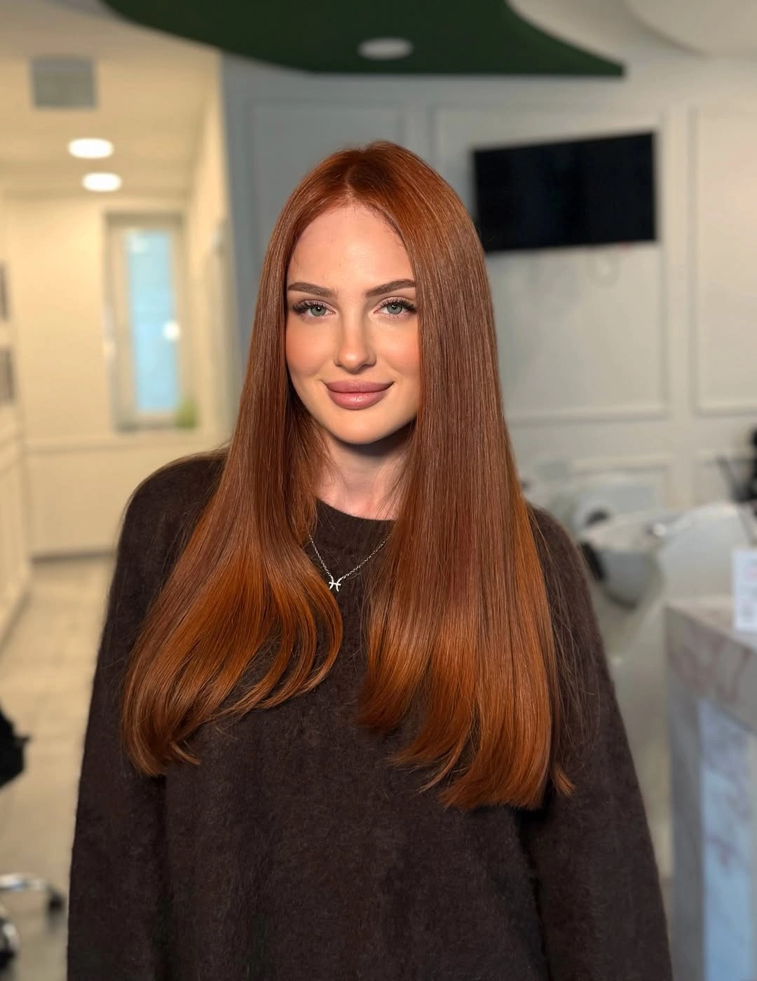
The middle part creates symmetry, which gives the copper color a clean frame around the face. The ends are not heavily curled, so the eye follows the long warm line first and notices the bend second. That restraint is useful when the goal is to show a uniform tone rather than a complex styling pattern.
A broad soft wave would add more reflection and make the copper feel more dimensional, while keeping the hair straight shows color continuity most clearly. If you add face-framing pieces, keep them subtle so they do not interrupt the long line that currently carries the result. The line of clean copper length with a soft end bend remains clearer when a new accent is kept away from its strongest edge.
Short Black Waves Concentrate Volume at the Crown
The short dark crop is close around the sides and back, with sculpted waves concentrated across the top and a visible ear opening the profile. The compact length puts all the attention on the texture and direction of the upper section. Because the base color is deep and even, the shape of the waves becomes the detail that gives the cut personality.
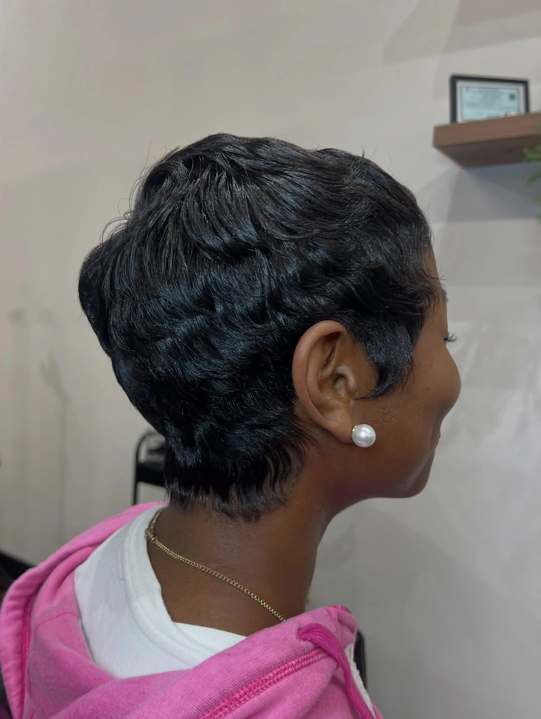
Volume is placed above rather than spread through the whole silhouette, which makes the cut look light around the edges and defined at the crown. The soft bends are more important than a precise fringe because they create the visible rhythm across the top. A small earring adds context near the ear, but the hair remains the main feature.
This shape rewards careful control around the crown while allowing the sides to stay close. A flatter finish would make the crop feel quieter and more minimal; preserving the lifted waves keeps the outline active without needing extra length or color contrast. Keep short black waves concentrate volume at the crown in view as the outfit or hairstyle shifts, because its placement is doing the useful work.
Honey Copper Waves Open Around the Face
Warm copper hair reaches the shoulders in loose waves, with lighter-looking front pieces opening around the face. The shorter length lets the color feel concentrated, while the face-framing sections prevent the warm tone from becoming a single solid curtain. Movement begins around the cheeks and continues through the ends, giving the result a soft outline.
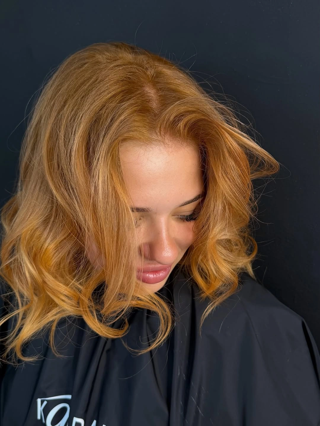
The lighter front placement is what changes the balance. It directs attention forward and breaks up the dense copper field, while the waves keep the transition gentle rather than sharply striped. The shoulder length also allows the ends to move without overwhelming the face or neckline. The simplest support for honey copper waves open around the face is enough here; another strong surface would blur the visible relationship.
A side part would make the framing asymmetrical and add lift on one side, while a center part would keep the result even. Use broad bends if you want the color to stay soft; smaller curls would make the same placement feel more deliberately styled. Because honey copper waves open around the face already sets direction, the remaining details can stay smaller and easier to adapt.
Blonde Bob Relies on a Clean Jawline
A pale blonde bob ends around the jaw, with smooth straight sides and a subtle center part. The short length creates a clear frame around the face, and the restrained finish lets the light color stay crisp rather than diffuse. The result is simple, but the edge of the cut gives it enough definition to carry the whole look.
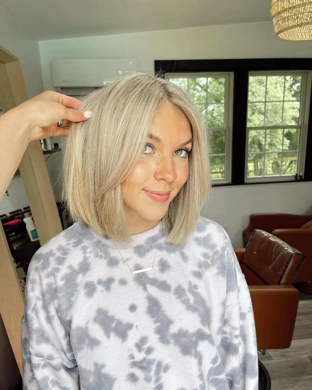
The bob’s strongest feature is the clean line at the ends. It keeps the pale shade from becoming visually weightless and gives the face a distinct border, while the center part preserves balance from left to right. No additional wave is needed because the cut already supplies structure. A calm surrounding line gives blonde bob relies on a clean jawline more presence than an additional statement piece would provide.
Tuck one side behind the ear when you want to expose more of the jawline and earrings, or leave both sides forward for a stronger graphic frame. A rounded curl would soften the outline, but it would also hide the straight edge that makes this blonde bob feel precise. The eye can return to blonde bob relies on a clean jawline quickly when the neighboring shapes stay open and uncomplicated.
Low Ponytail Softened by Loose Front Pieces
Light blonde hair is gathered into a low ponytail, while two loose sections fall near the face and soften the side profile. The back is controlled and tidy, but the front pieces keep the result from feeling severe. The contrast between the gathered length and the free strands is the visible styling decision.
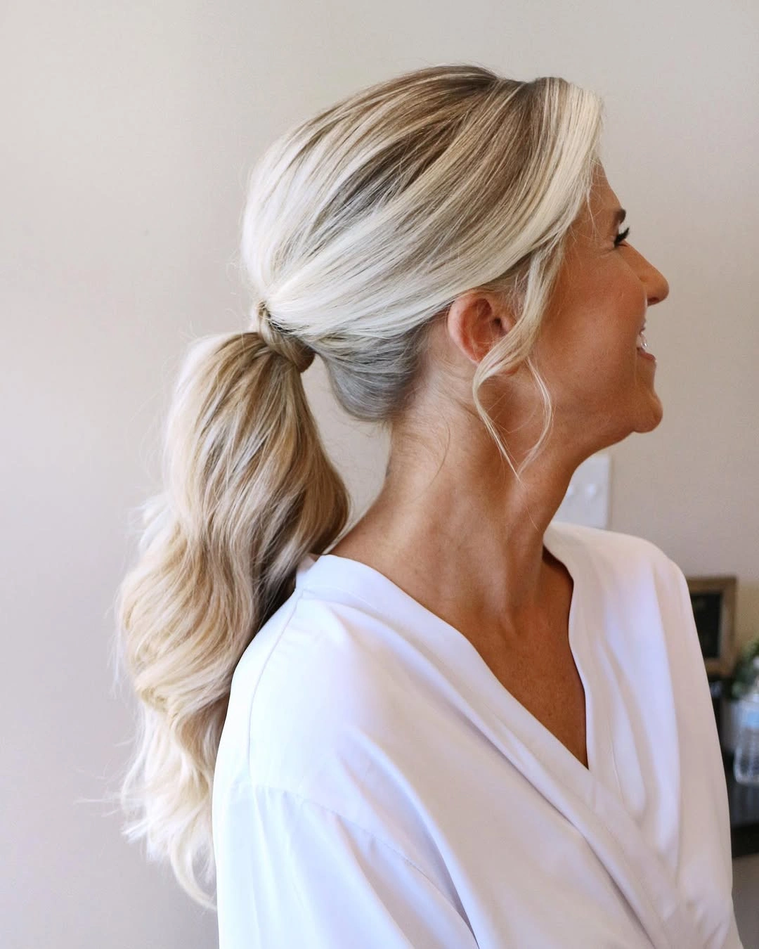
The low placement leaves the neck and upper silhouette open, which helps the pale color feel light rather than bulky. The loose pieces create a small frame around the face and introduce movement where the ponytail is most contained. Because the hair is otherwise simple, their length and direction carry more weight.
A lower tie keeps the look calm and elongated, while a higher ponytail would make the shape sportier and show more lift at the crown. Keep the face pieces soft if you want an easy finish; sharply curled sections would create a more deliberate contrast with the plain ponytail. Use the existing contrast around low ponytail softened by loose front pieces rather than adding a second contrast that would divide attention.
Bronde Waves Use Soft Contrast for Depth
Shoulder-length hair carries a blended brown-blonde tone, loose waves and a centered part with volume through the ends. The color contrast is gentle, so the wave pattern supplies most of the visible dimension, the same placement-first logic that makes dimensional brunette hair color read naturally. The shape feels airy because the waves are broad and the length stops before the silhouette becomes heavy.
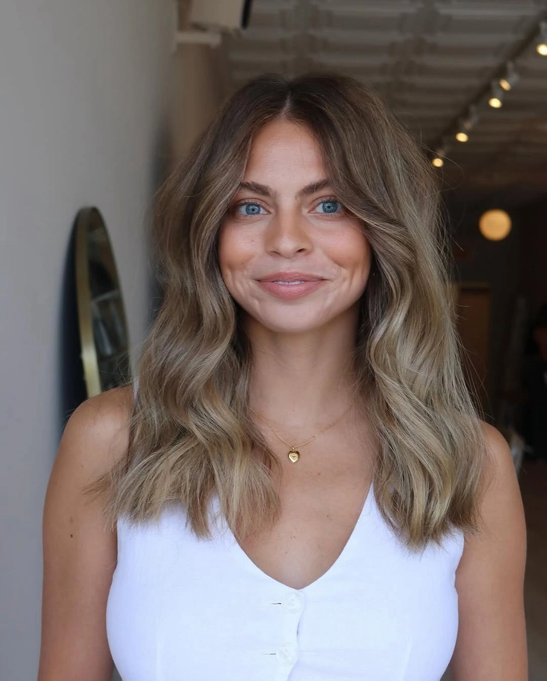
Slightly darker color near the top and lighter-looking lengths give the waves somewhere to move visually without creating a hard stripe. The center part keeps the result balanced, while the rounded ends prevent the blended tone from looking flat. This is a good example of color and shape sharing the work.
Keep the bends broad for a relaxed result, or use smaller sections when you want more visible texture. If the color is already softly contrasted, avoid adding a strong accessory at the face; it would draw attention away from the gradual transition that makes the style feel dimensional. The placement of bronde waves use soft contrast for depth is most convincing when the finish remains practical enough for ordinary movement.
Black and Blonde Split Dye Needs Open Waves
Long hair is visibly divided into dark and pale sides, with both sections shaped into loose waves. The vertical split is the defining color placement, so the styling stays simple enough for each half to remain separate. The waves add movement, but they do not disguise the boundary between the two tones.
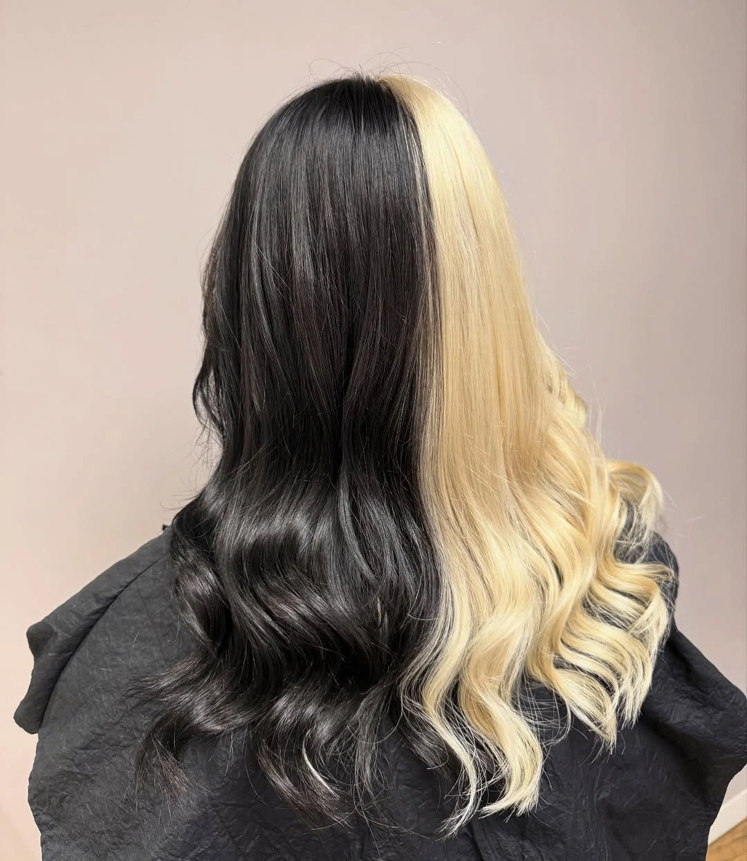
A center part would reinforce the symmetry and make the split read as a deliberate line, while an off-center part would make the contrast more directional. The pale and dark sides carry so much information that a braid or busy accessory would reduce the clarity of the design. The long length gives the color division room to travel.
Use broad waves if you want both sides to remain easy to compare, and keep the top smoother than the ends. More volume at the crown could soften the division, which may be useful for a less graphic result but would weaken the sharp color contrast that defines this option. Leave a little breathing room around black and blonde split dye needs open waves; that spacing is part of why the visible proportion works.
Copper Plait Turns Color into Texture
Warm copper length is gathered into a substantial braid with multiple visible sections and a softer loose tail. The plait turns the color into a textured vertical column, so each overlap catches the warm tone differently. The result is more about repeated structure than about a changing palette. If the surrounding pieces become louder, copper plait turns color into texture loses definition, so restraint keeps the result more useful.
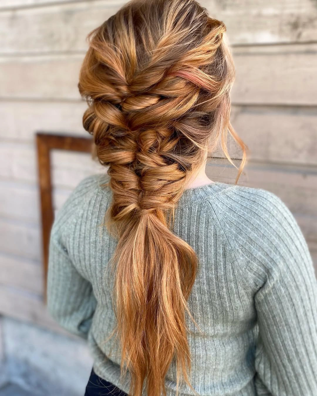
The braid’s sections are the key detail because they create small bands of light and shadow through the copper. The tail remains looser, which keeps the style from looking rigid and gives the long shape a natural finish. The back view is especially useful for seeing how much of the color survives after the length is gathered.
Leave a few pieces loose when you want softer edges, but keep enough tension for the pattern to remain visible. If the braid is made too loose, the warm color will still show, yet the defining structure may disappear into a general textured mass. The defining surface of copper plait turns color into texture has enough interest to carry the moment without another competing texture.
Peach Coral Waves Keep a Shorter Length Lively
Coral hair falls around the shoulders in defined loose waves, with the back view showing repeated bends through the ends. The warm pastel color is already noticeable, but the movement prevents it from looking like a flat block. The length is short enough to feel light while still giving the wave pattern room to develop.
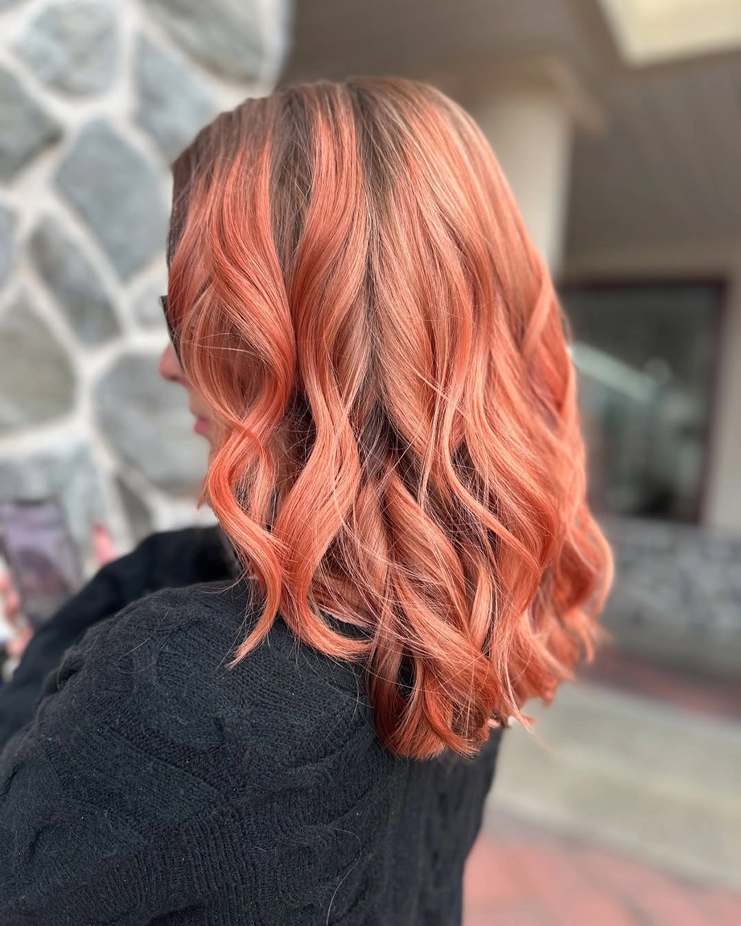
The waves make the coral shade appear to shift from soft peach to warmer orange as the surface turns. That variation is subtle, so the silhouette remains gentle rather than high-contrast. A dark top in the background makes the color easier to read, but the hair’s repeated bends remain the reason it feels dimensional.
A smooth finish would make the coral more graphic and emphasize the color itself, while keeping the waves gives the result a softer, more playful surface. Avoid adding a heavy accessory at the ends; the shoulder length already has enough movement to carry the look. Keep the supporting edge clean beside peach coral waves keep a shorter length lively, and the whole silhouette will retain its intended rhythm.
Silver Gray Layers Build Rounded Movement
Cool silver-gray hair reaches the shoulders or slightly below, with layered waves stacking through the ends and creating rounded volume. The shade looks concentrated, but the layers stop it from reading as one heavy gray shape. Each bend helps distribute the color across the lower silhouette. A small change near silver gray layers build rounded movement can shift the balance, so the surrounding styling should stay deliberately measured.
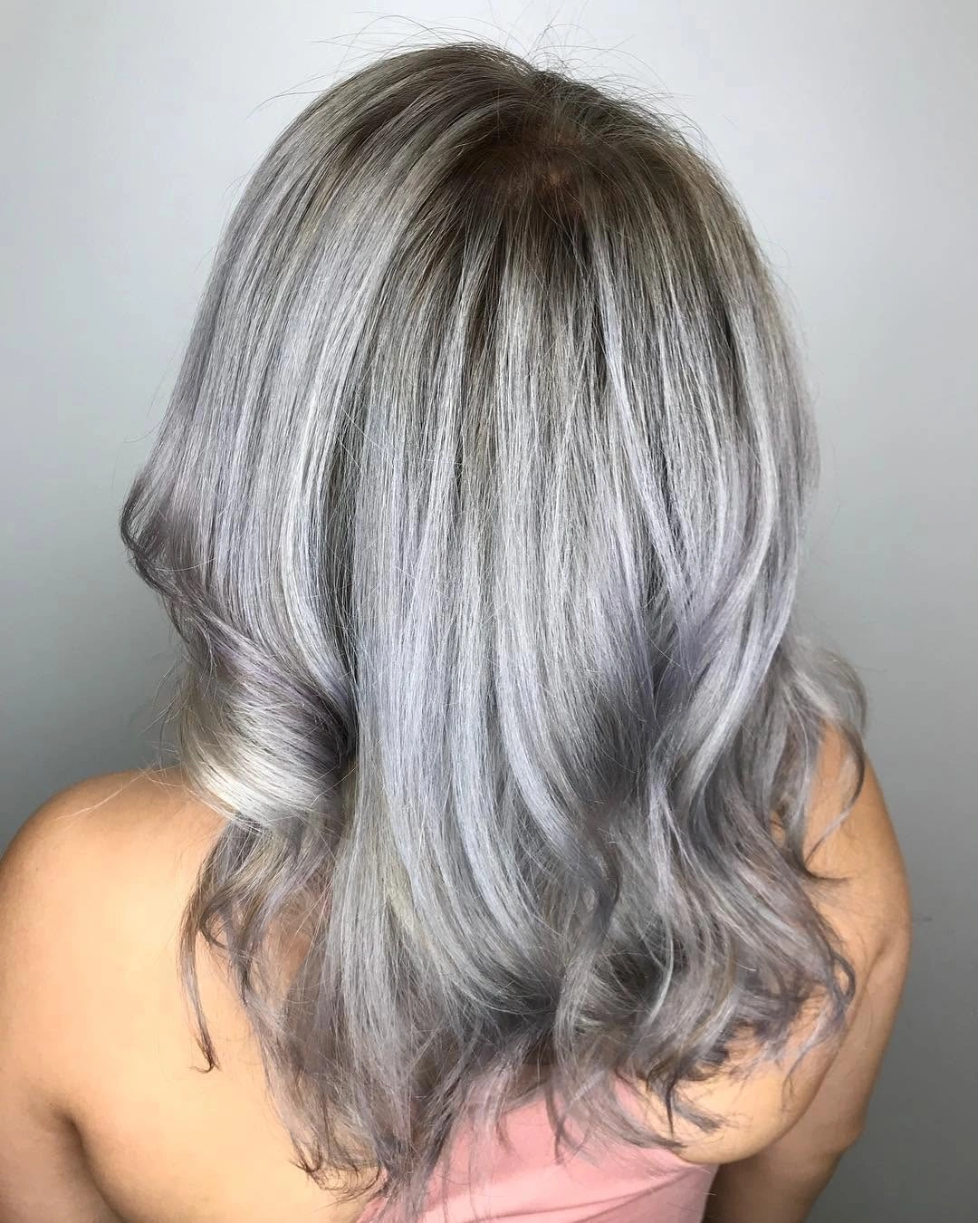
The layers do not simply add volume; they give the cool tone several edges to catch light. That makes the result feel dimensional even though the palette remains close to one family. The broad wave pattern keeps the style soft, while sharper piecey texture would make it more graphic. The result feels clearer when silver gray layers build rounded movement is treated as the anchor and not as one detail among many.
A smoother finish would emphasize the gray color and clean the outline, but the visible wave is more relaxed and shows how the layers support movement. Because cool gray reveals uneven surface detail quickly, keeping the ends controlled will help the shape stay intentional. Let silver gray layers build rounded movement remain the visible reason for the choice, while the rest handles comfort and movement quietly.
Honey Blonde Length Stays Straight and Clear
Pale golden-blonde hair falls well past the shoulders in a straight, even sheet with a centered part. The uninterrupted length makes color continuity the main visual effect, while clean ends keep the silhouette polished. There are no strong waves to distract from how the light tone travels through the full length.
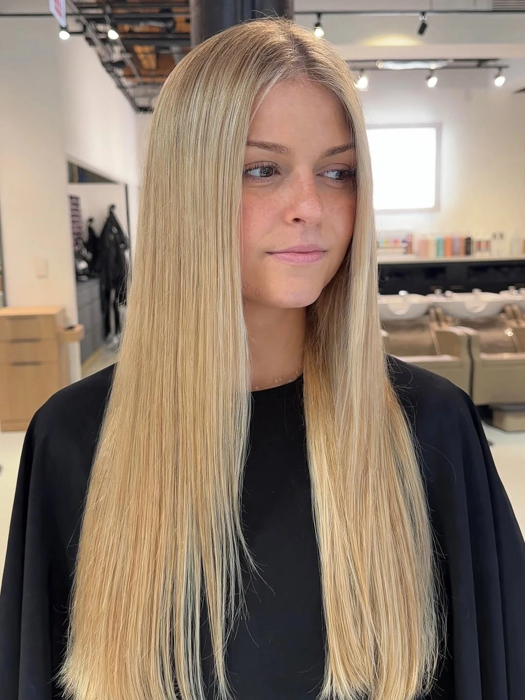
The centered part creates a balanced frame, and the straight surface shows the blonde as one continuous field. That simplicity can look more dimensional than expected because the eye follows the length and notices small changes in reflection along it. The shape is especially dependent on a clean fall rather than decorative texture.
Add a few subtle face-framing layers if you want movement without giving up the long line. Heavy layering would distribute the color differently and make the result more animated, while the straight version is the clearest choice when continuity is the priority. The strongest version keeps honey blonde length stays straight and clear distinct from the nearby layers, colors, or texture changes.
Teal Lower Lengths Lighten a Dark Base
Dark hair transitions into vivid teal sections that become more visible through long waves at the back. The teal is concentrated below the darker upper area, so the result has a clear vertical progression rather than scattered highlights. The waves help the cool accent catch light and reveal its placement as the hair turns.
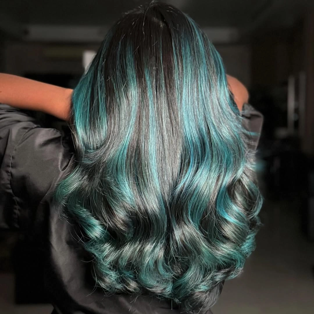
The upper darkness gives the teal a strong background, which is why the color feels bright without covering the whole silhouette. The wave bends create smaller reflective shifts across the accent, making it look dimensional instead of like one flat panel. The contrast is graphic, but the long shape keeps it fluid.
Keep the top smoother when you want the dark-to-teal change to remain clear. More volume at the crown would distribute the contrast differently, while a simple upper shape lets the lower color stay concentrated and easier to judge. When teal lower lengths lighten a dark base stays unobstructed, its scale and direction are easier to judge in a real wardrobe or routine.
Cool Brunette Gray Waves Stay Low Contrast
Long hair is softly waved in a cool brown-gray tone, with volume gathering through the lower lengths and ends. The color remains quiet, so the broad movement becomes the main source of dimension. The style feels muted because neither the shade nor the wave pattern is pushed to a sharp extreme. That restrained placement is also why hair lowlights work best when the transition stays soft rather than turning into a hard stripe.
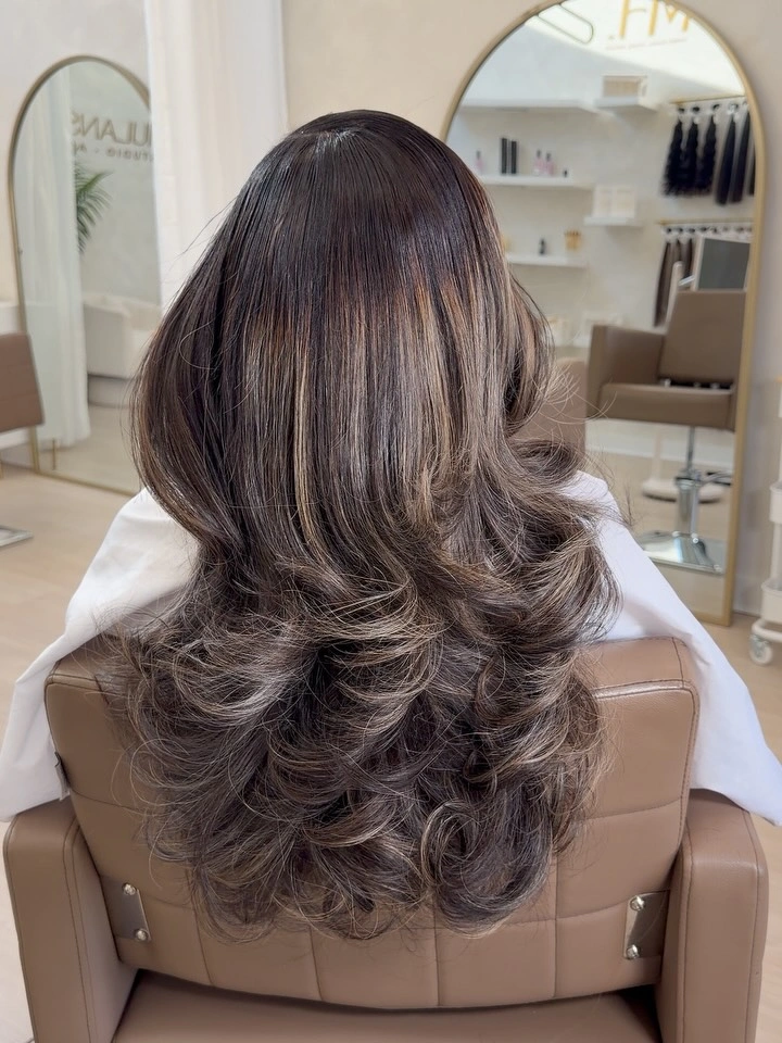
The ends supply most of the movement, which keeps the upper half calm and lets the cool tone read as a blended surface. A center part would preserve balance, while a side part could add more lift and change the distribution of the waves. The subdued palette benefits from this restraint. The surrounding pieces should echo the balance of cool brunette gray waves stay low contrast without copying its exact surface or proportion.
Use broad bends rather than tight curls if you want to keep the result low contrast. A bright accent or very defined curl would shift attention away from the quiet color relationship, while a smoother finish would make the same tone look more polished and less relaxed. Keeping cool brunette gray waves stay low contrast simple to read makes the whole choice easier to repeat with different supporting pieces.
Burgundy Bob Gains Motion from Loose Waves
Deep burgundy color shapes a short bob, with loose waves bending through the sides and ends. The short cut concentrates the rich shade around the face and neck, while the irregular texture stops the outline from looking rigid. The result is compact, but it carries movement in a small space. The practical adjustment works because burgundy bob gains motion from loose waves remains visible while the rest of the look stays flexible.
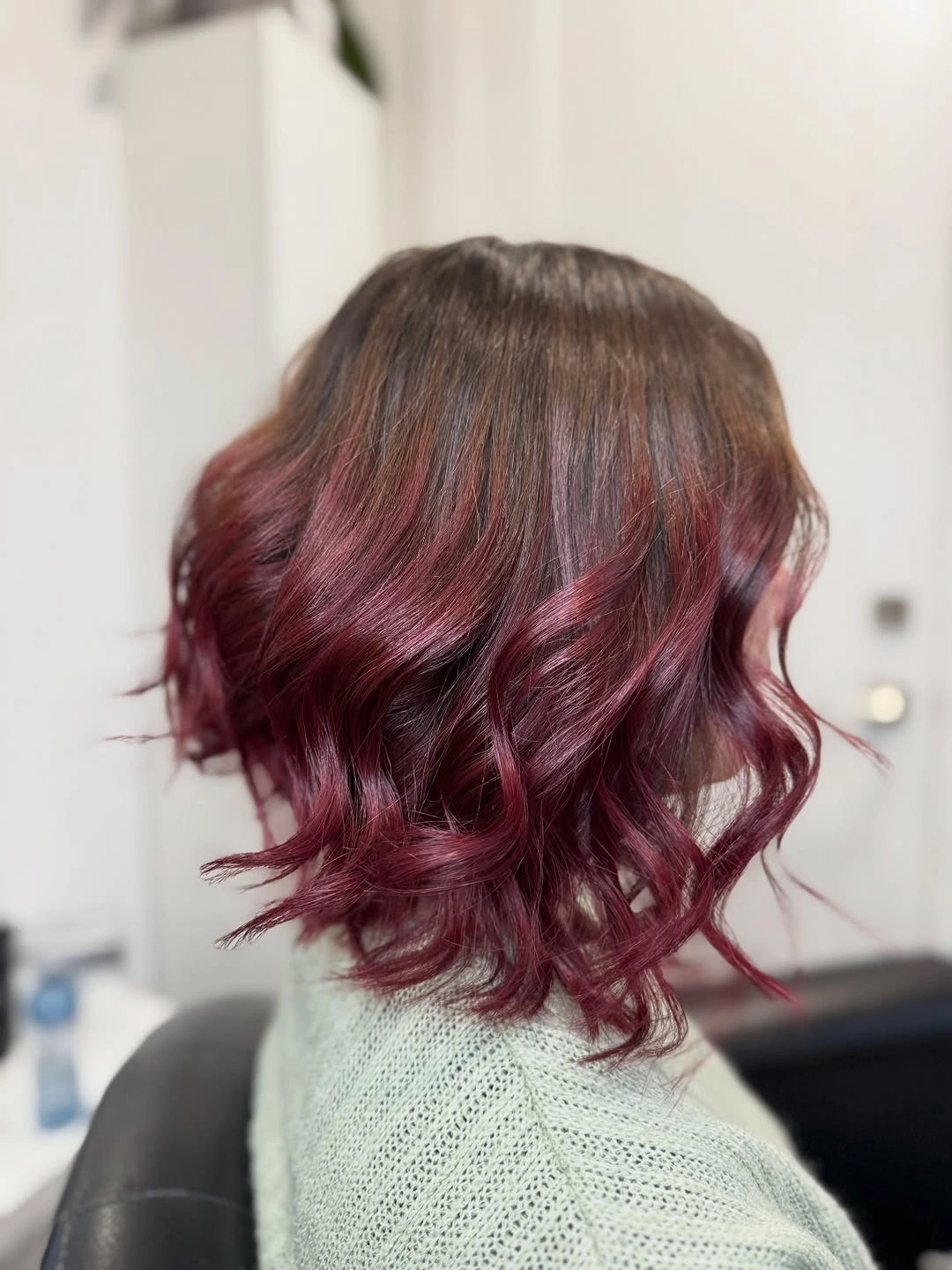
The bob’s color is strong enough to stand alone, so the texture works as a supporting detail rather than a competing statement. The waves create small changes around the edge, giving the cut a softer finish than a straight blunt line would. The shorter length also makes the burgundy feel concentrated and intentional.
A smooth finish would turn this into a cleaner, more graphic bob, while the visible texture suits a relaxed result. If you want the color to remain the focus, keep the wave size uneven but controlled and avoid a bright accessory near the face. Give burgundy bob gains motion from loose waves the clearest space in the silhouette, and the quieter details can do their job without clutter.
Warm Brown Highlights Travel Through Loose Waves
Dark brown hair falls down the back in long loose waves, with warmer strands catching through the mid-lengths. The contrast is subtle, so the large wave pattern reveals the color variation without turning it into a high-contrast design. The base remains deep and calm while the warmer pieces add movement.
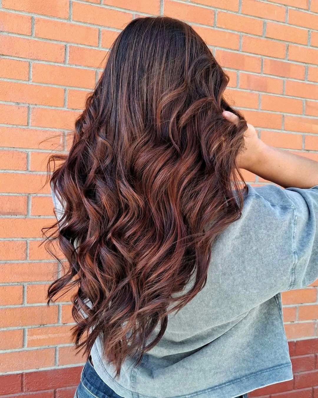
The highlights are most useful where the hair bends, because a curved surface shows more change than a straight one. That placement keeps the result dimensional but believable to the eye, with no need to describe an exact formula or hidden process. The long shape gives the warmer notes space to appear and disappear naturally.
Keep the wave broad if you want the contrast to stay soft; tighter curls would make the highlights look more pronounced. A smoother finish would shift attention toward the color placement, while a loose texture keeps the result relaxed and less graphic. warm brown highlights travel through loose waves stays readable when the surrounding shape is allowed to move without extra visual noise.
Neon Green Panels Need Layered Edges
Vivid green hair is cut into a short layered shape with strong black sections and a visible clip near the back. The contrast is deliberately graphic, while the uneven layered edges give the bright color an energetic outline. Because the base is cropped, the panels remain close to the head and easy to read.
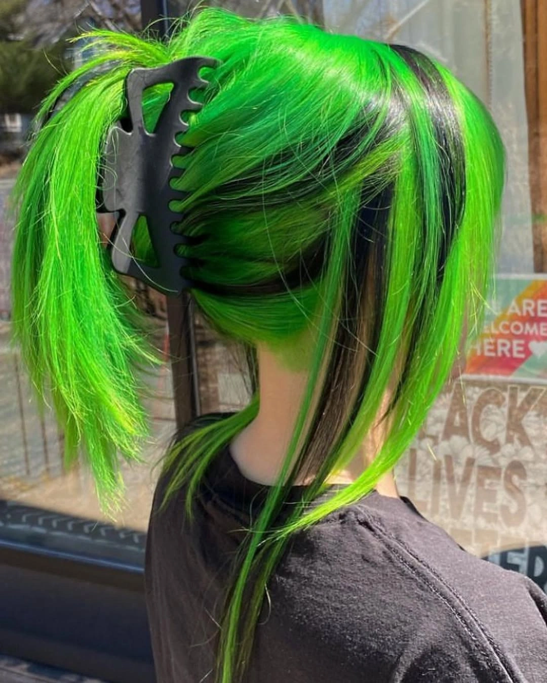
The black sections create breathing room inside the neon green, so the color does not become one fluorescent mass. Layered ends add movement around that contrast and keep the silhouette from looking like a single hard shape. The clip is secondary, but it helps explain how the short sections are being held back.
A smoother side finish would make the panels cleaner and more graphic, while leaving the layers loose preserves the playful irregularity. Keep additional accessories minimal if you want the green and black placement to remain the central detail. Let neon green panels need layered edges keep the first pause, then use the quieter pieces to carry the practical part of the look.
Green Streaks Frame a Short Dark Bob
A dark short bob is accented by bright green sections around the face and lower side, with a visible side part guiding the shape. The color is concentrated at the frame rather than spread evenly through the whole cut, so the eye follows the bob’s edge as much as the hue. The contrast feels sharp because the base stays deep.
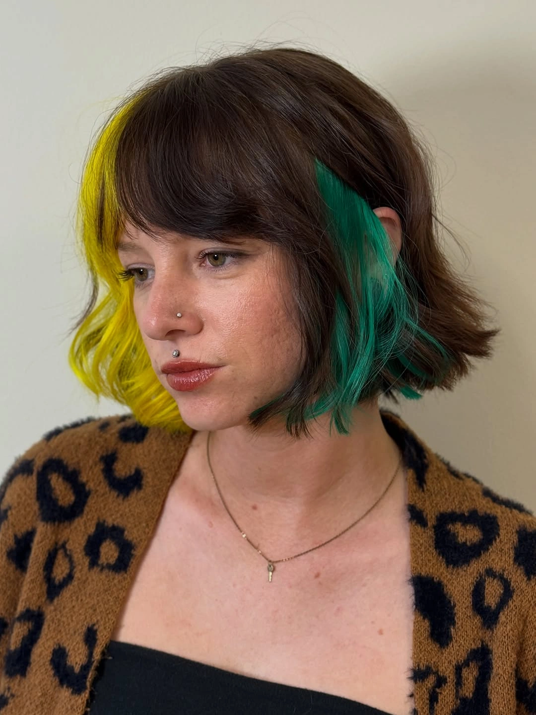
The placement changes the balance of the haircut. A narrow green section can highlight the direction of the front pieces, while a wider section would make the color the dominant feature of the entire bob. The side part supports that asymmetry and keeps the accent from feeling randomly placed. The line of green streaks frame a short dark bob remains clearer when a new accent is kept away from its strongest edge.
Keep the green narrow when you want a controlled face-framing effect, and let the bob’s dark outline stay visible around it. Spreading the bright color across the back would make the result louder but would remove the precise edge that gives this version its character. Keep green streaks frame a short dark bob in view as the outfit or hairstyle shifts, because its placement is doing the useful work.
Copper Length with Lighter Front Sections
Copper hair falls long around the shoulders, with lighter-looking front pieces and soft bends opening around the face. The warm length keeps the result unified, while the lighter frame gives the front more visibility and depth. The waves are broad enough to soften the transition rather than turning it into a hard stripe.
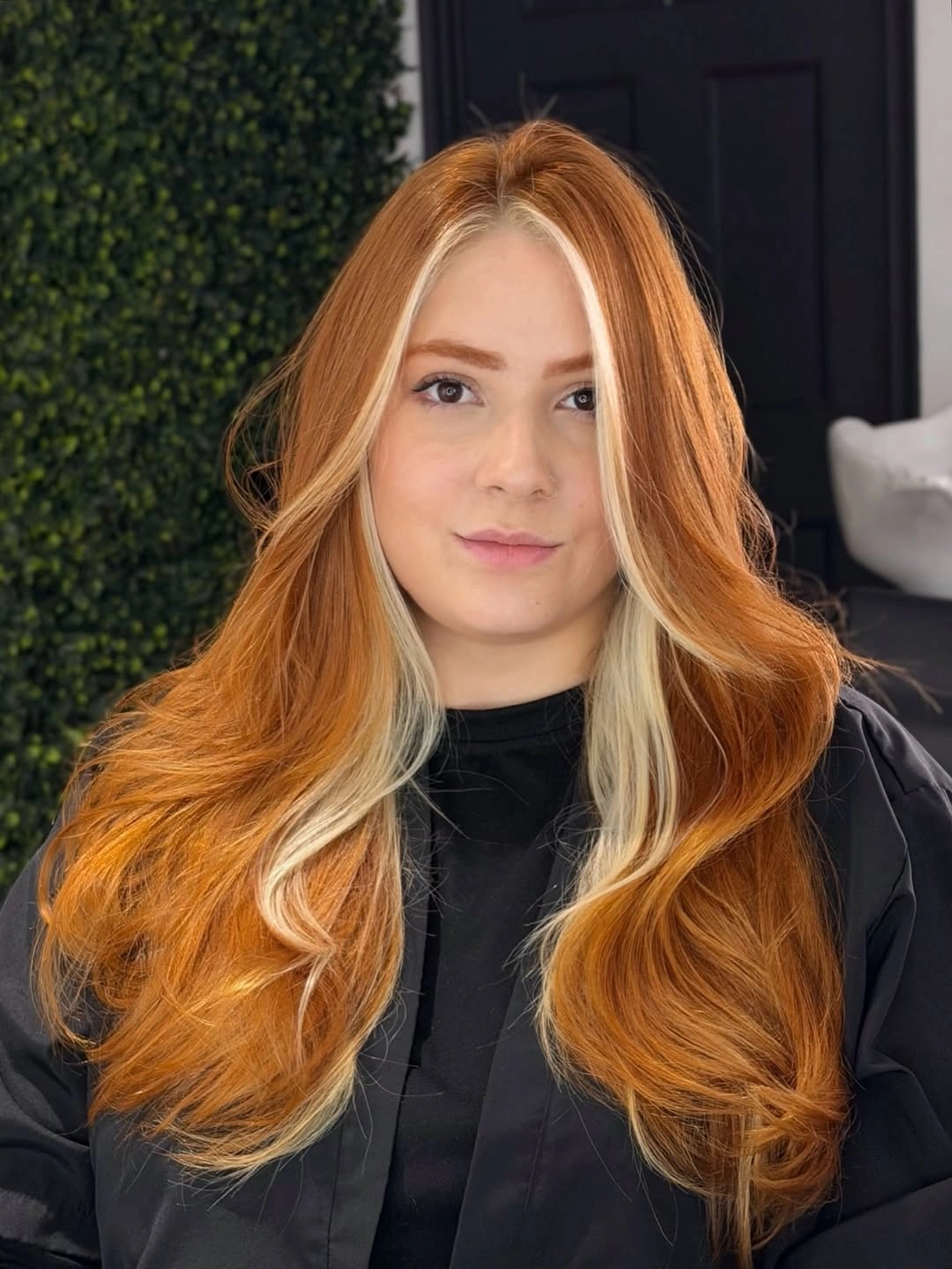
The front placement is the small feature that changes the whole color result. It brings light closer to the face and lets the copper lengths remain the supporting field, while the wave pattern helps both values move together. The style therefore feels dimensional without needing many separate shades.
A straighter finish would show the placement more graphically, while loose waves create a gentler transition at the front. Keep the lighter sections close to the face if you want them to frame rather than spread; moving them farther back would make the overall result more uniform. The simplest support for copper length with lighter front sections is enough here; another strong surface would blur the visible relationship.
Platinum Hair with Burgundy Vertical Panels
Very light hair falls to a blunt line, with narrow burgundy panels visible through the lower back sections. The straight surface keeps each vertical stripe crisp, turning a simple pale shape into a graphic color design. The contrast is strong because the panels remain narrow and clearly separated against the light base.
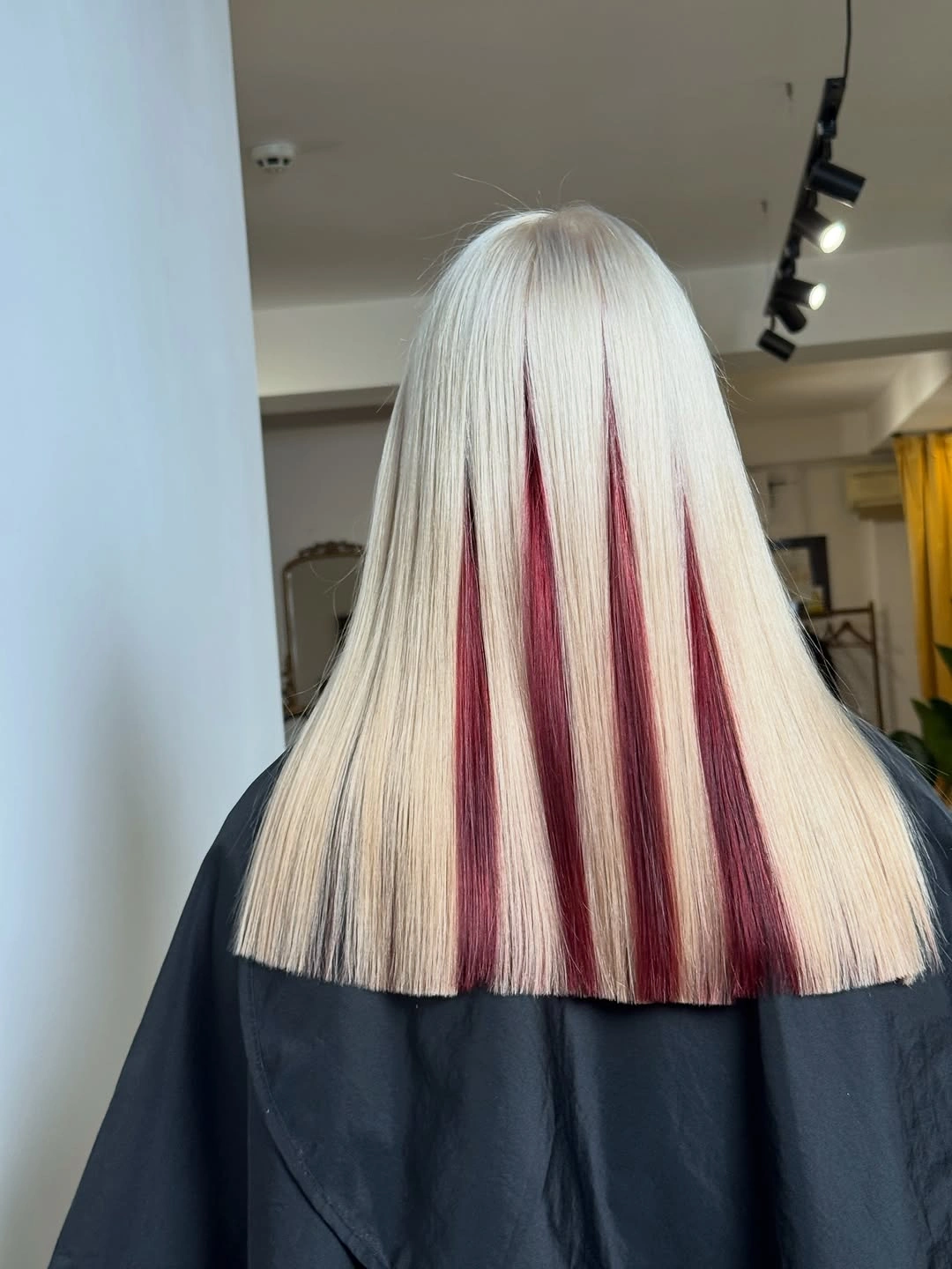
The blunt edge gives the panels a clean place to end, so the color and haircut reinforce one another. The stripes travel downward rather than outward, which preserves the long shape and makes the placement easy to compare. No extra texture is needed because the contrast already supplies rhythm. Because platinum hair with burgundy vertical panels already sets direction, the remaining details can stay smaller and easier to adapt.
A slight bend would soften the design but may blur the panel edges. Keep the hair straight when you want the burgundy placement to read precisely, and use a softer wave only when you prefer the color to appear as a more blended movement through the lower lengths. A calm surrounding line gives platinum hair with burgundy vertical panels more presence than an additional statement piece would provide.
Side-Parted Blonde Bob with a Rounded Bend
A pale blonde bob is cut around the jaw with a side part, soft bend and rounded movement through the ends. The side part adds asymmetry to an otherwise compact shape, while the bend keeps the light color from looking like a flat geometric cap. The result feels polished but not rigid because the edge has some motion.
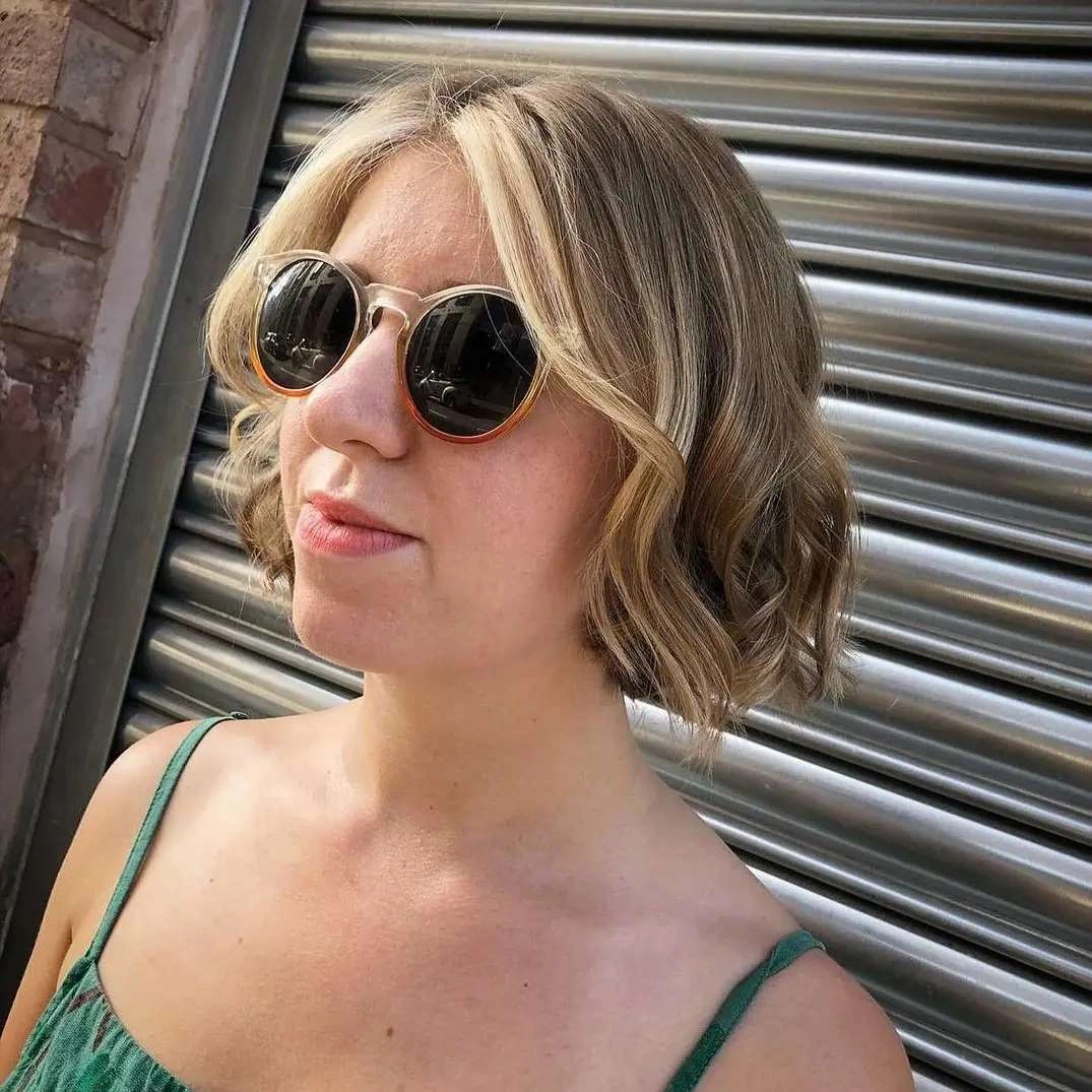
The fuller side of the part creates the main shift in balance. One side carries more visible volume, while the shorter-looking side exposes the jaw and makes the bob feel lighter. The blonde shade stays clean because the texture is controlled rather than overly curled. The eye can return to side-parted blonde bob with a rounded bend quickly when the neighboring shapes stay open and uncomplicated.
Tuck the fuller side behind the ear when you want a sharper outline and more face exposure. Leave it forward for a softer frame, but avoid adding strong curls unless you want to change the bob from a clean bend into a more decorative style. Use the existing contrast around side-parted blonde bob with a rounded bend rather than adding a second contrast that would divide attention.
Deep Burgundy Length Keeps the Finish Simple
Dark red-burgundy hair falls long down the back with a smooth surface and a gentle bend toward the ends. The saturated shade is the central feature, and the simple fall gives it uninterrupted space to read richly. The shape does not compete with the color, which makes the result feel concentrated and calm.
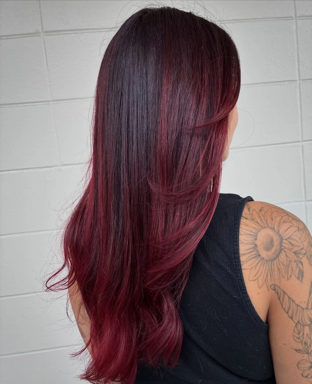
The slight side-swept direction keeps the long hair from becoming a perfectly straight column, while the restrained bend preserves the evenness of the deep tone. Small changes in reflection become visible along the surface, so the color gains dimension without a separate bright section. The placement of deep burgundy length keeps the finish simple is most convincing when the finish remains practical enough for ordinary movement.
A few loose waves would add more movement without changing the shade, but heavy texture could make the burgundy look less uniform. If you want the color to remain the first impression, keep the finish smooth and let the gentle end bend provide the only shift in rhythm. Leave a little breathing room around deep burgundy length keeps the finish simple; that spacing is part of why the visible proportion works.