The smallest visual decision can change a manicure more than an entire extra layer of decoration. In fall dip nails searches, it is easy to focus on the label instead of the evidence that actually makes a set feel right: where color darkens, how a tip is edged, whether a shine is quiet or emphatic, and how much space remains around a detail. Those choices decide whether a design reads intentional on a hand or simply busy.
A useful way to narrow the choice is to start with contrast, then judge whether the shape can carry it comfortably. A saturated tone may need a calm base, while a dense accent often benefits from a shorter outline or a repeated neutral shade. The palette guidance in fall manicure color choices can help with the first decision, but the scale and placement of each detail should make the final call.
Violet Gradient on Sharply Tapered Tips
Deep violet near the base moves into a brighter purple along these long pointed nails, so the color shift follows the narrow silhouette rather than fighting it. The glossy surface keeps the transition visibly clean, and the lack of extra motifs is what lets the pointed tips look purposeful instead of overloaded. It is a strong option for someone who wants a saturated fall color but would rather make one visual move than combine several unrelated accents.
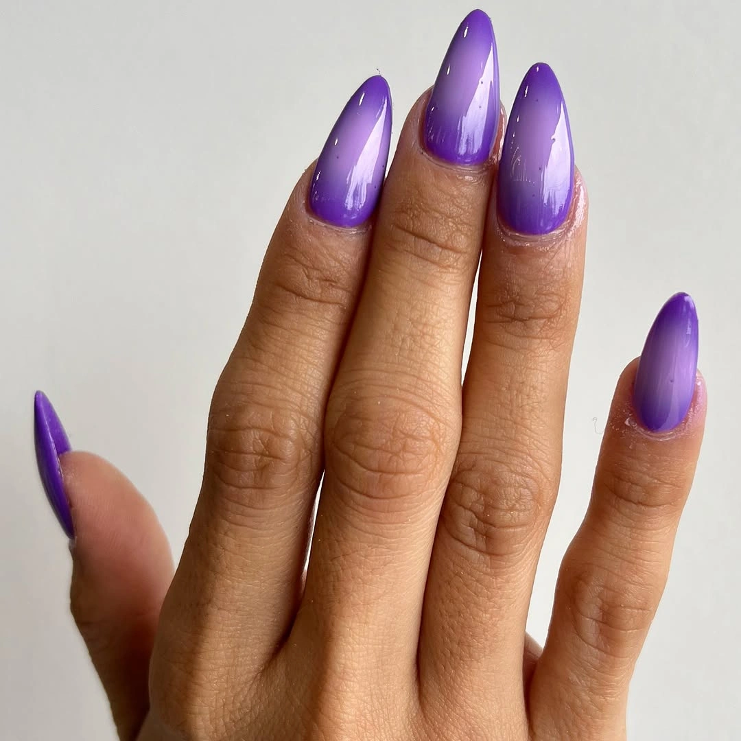
The gradient would feel softer on a medium almond shape, where less length gives the purple more room to fade without turning the tip into a sharp focal point. Keeping the darkest color close to the cuticle and a clearer purple at the end also makes the design easier to pair with both dark knits and lighter neutral outfits. Because the finish is smooth and uninterrupted, small chips or uneven growth near the base could be more noticeable than on a patterned set.
What works especially well here is the restraint around the center of every nail. There is no need to add a contrasting ring-finger pattern when the changing purple already creates depth, and a single tone would make the effect flatter. If daily wear makes very long points impractical, retain the same dark-to-light direction on a shorter tapered shape rather than copying the length alone.
Cocoa Florals Over a Soft Nude Base
Soft nude and cream sections keep these almond nails light, while cocoa-brown curves and small flower-like marks supply the seasonal weight. The darker artwork is distributed across selected nails instead of repeated as a full set, which gives the hand a rhythm of quiet space and concentrated detail. That balance makes the palette feel warmer than plain beige without requiring a literal leaf or pumpkin reference.
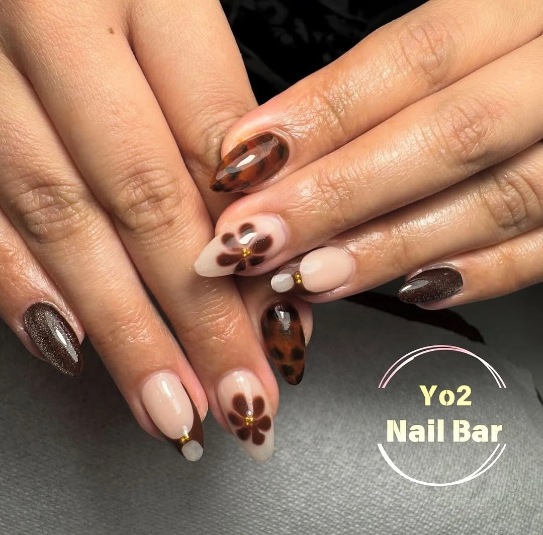
A similar layout can be made more understated by limiting the brown design to two nails and leaving the others in the same warm nude family. The important part is preserving a little contrast between the pale base and the curved marks, since muddy tones would make the small motifs disappear at a distance. On shorter nails, simplify each flower-like element into a few rounded marks so the pattern still has breathing room.
The nude ground is also practical because it softens the transition as the nail grows, while the darker art gives the set enough presence for cooler weather. There is a tradeoff, though: fine brown lines will lose their clarity if they are crowded near the sidewalls or cuticle. Let the pattern stay slightly off-center, as it does here, and the negative space continues to look deliberate rather than unfinished.
Glossy Lavender with a Clean Taper
A uniform lavender-purple shade covers these tapered square nails from base to tip, placing all of the attention on the shape and reflective surface. The color is bright enough to feel playful, yet its single-tone treatment keeps the long outline from competing with itself. It proves that a fall manicure does not have to rely on brown or burgundy when the silhouette has enough presence to support a clearer hue.
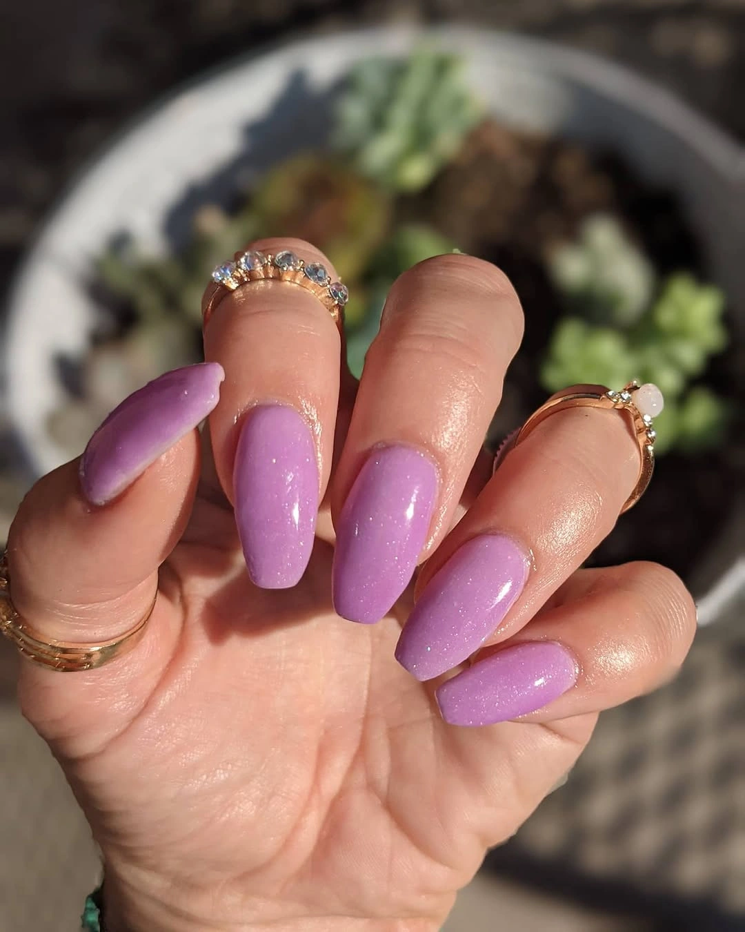
For a more wearable version, bring the same lavender onto a shorter squoval nail and let the squared edge stay slightly softened. That adjustment keeps the color statement while reducing the sharp, extended profile that can feel less convenient for typing or close handwork. The even coverage here means the polish line at the cuticle becomes part of the overall neatness, so a closer grow-out will matter more than it would with a sheer base.
This set gains its strength from being decisive rather than complicated. Adding a glitter nail, a black tip, or several decals would interrupt the clean block of color and make the proportions feel less calm. If the purple seems too cool beside your wardrobe, shift it toward a dustier mauve while keeping the glossy, uninterrupted finish that gives this version its clarity.
Fine Lines Across Sheer Almond Nails
These long almond nails use a translucent blush ground with slim dark outlines, pale reflective-looking tips, and a few tiny scattered marks. Each element is small, but the placement changes from nail to nail, creating a light editorial pattern instead of one large graphic. The sheer center is crucial because it prevents the mix of lines and tip details from becoming visually heavy.
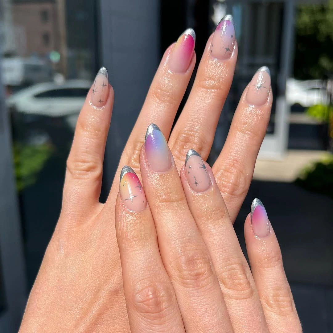
Someone drawn to the contrast can reduce the maintenance burden by keeping the dark linework closer to the free edge and leaving the lower half almost bare. That preserves the airy feeling while making a little growth at the cuticle less disruptive. The combination is less forgiving if every nail receives a different dense motif, so use one or two small variations and repeat the same dark accent color for continuity.
The most useful lesson here is that fine decoration needs a quiet field around it. A creamy opaque base would change the design into something bolder and could hide the delicate edge work, whereas this transparent-looking base lets the lines read as punctuation. For everyday styling, pair the detailed tips with simple jewelry or sleeves, since competing accessories can pull attention away from the small marks that make the manicure distinctive.
Graphic Black Swirls on Milky Neutrals
Narrow black curves cross a milky neutral base on these almond nails, with pale wave-like bands and small reflective-looking touches adding dimension. The pattern has enough contrast to be visible quickly, but it does not cover every surface with the same line density. That variation is why the abstract design feels composed rather than like a repeated print stamped across the whole hand.
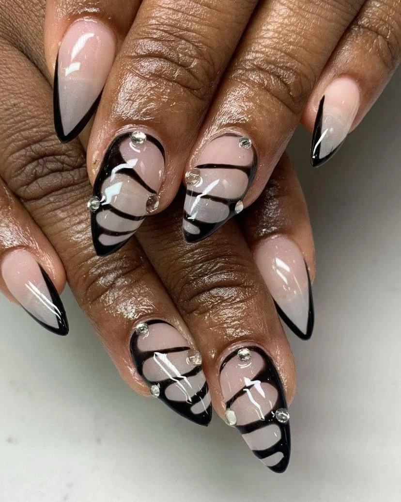
To adapt the idea for a shorter manicure, widen the blank nude areas and keep the black curves mostly along one side of each nail. The side placement maintains movement without compressing the design into a narrow tip, which is often where busy patterns start to look cramped. A warm beige base would make the black softer, while a cooler pink-beige base, like the one visible here, gives the graphic marks a crisper edge.
There is a clear tradeoff between the bold swirls and an easy visual grow-out. High-contrast lines near the cuticle will call attention to any gap, so a version meant for longer wear should start the pattern slightly farther up. The reflective-looking details are best kept sparse; they offer a moment of light, but too many would turn the restrained black-and-neutral dialogue into a scattered collection of accents.
Sculptural Gold Details on Long Points
Very long pointed nails combine pale and nude areas with sweeping gold-toned details that appear raised, plus small rounded accents near the center of the design. The warm metallic-looking elements are concentrated instead of spread evenly, giving the light base a dramatic focal point without hiding the pointed outline. This is a manicure that reads as jewelry-inspired through placement and scale, not through a crowded mix of colors.
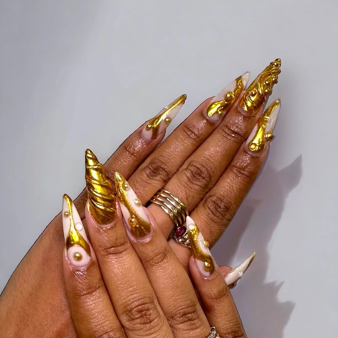
The visible length is part of the effect, so shortening the shape would require simplifying the gold curves rather than shrinking every feature proportionally. On a medium almond nail, choose one sweeping accent and let the remaining nails stay pale with a small echo of the same tone. That edit keeps the design recognizable while avoiding thick-looking details that could overwhelm a smaller surface.
For occasional wear, the strongest detail is the contrast between the smooth light background and the concentrated gold-toned movement. For a more practical routine, reduce the number of raised-looking elements, since pronounced texture can catch attention and make the set feel less quiet in close-up. The pointed silhouette already has drama; preserving one clear line of ornament is more convincing than adding a different embellishment to every finger.
Sage Blocks and a Silver Accent
Short square nails alternate peachy nude, muted sage green, and one dense silver sparkle-like accent, creating a compact palette with clear pauses between textures. The squared length keeps the darker sage and brighter silver from feeling too formal, because each color block stays close to the fingertip. It is an effective example of how a mixed finish can still look grounded when the palette has a shared soft undertone.
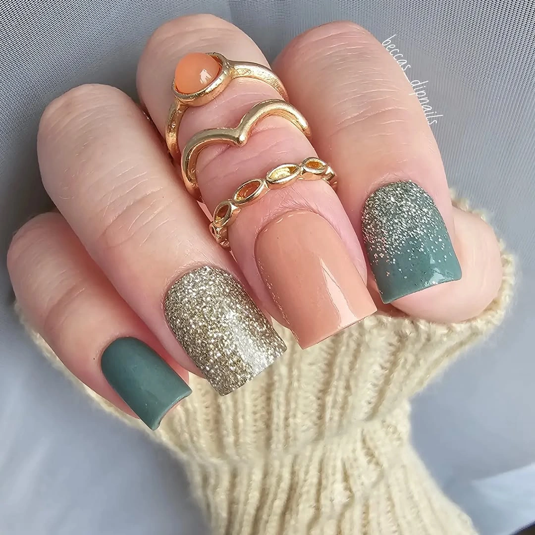
The same contrast would suit someone looking at fall accent nail designs but wanting less decoration overall. Keep the silver-like texture to one nail, then repeat sage on only one or two others so it remains an accent rather than a second competing pattern. If your nails are very short, a narrow sage tip or side block can deliver the color idea with even more open nude space.
This combination is forgiving in a visual sense because the nude portions soften the change as the nail grows, while the colored nails keep the set from fading into the background. The limitation is that dense sparkle-like texture can look heavier next to a very dark green, so the muted sage is doing important balancing work. Pairing both finishes with a glossy nude anchor makes the variation read intentional instead of randomly mismatched.
Pastel Curves with Small Color Surprises
Pale pink, peach, lime, lilac, and blue appear in small curved moments across these almond nails rather than as one repeated full-color formula. The soft base allows each tone to register separately, and the rounded placements suit the tapered shape more naturally than hard straight blocks would. Although the palette is bright, the restrained coverage keeps it from feeling disconnected from a transitional fall wardrobe.
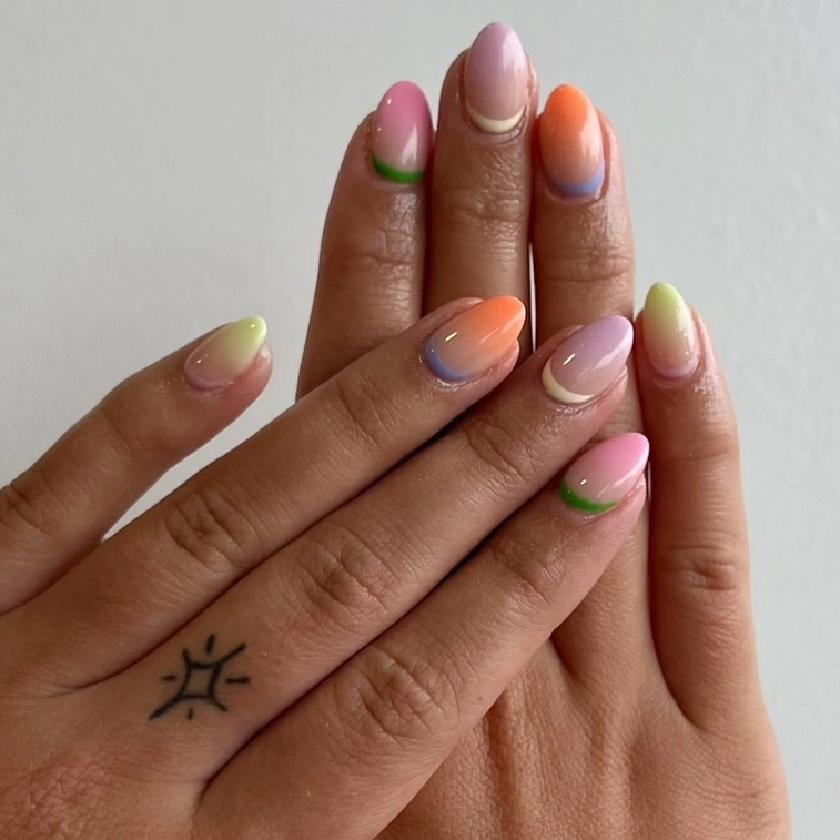
A good way to make this approach more cohesive is to select three colors instead of five and repeat one of them twice at different positions. That creates an internal thread without losing the playful, individual quality of the nails. On a wider square shape, keep the curved accents thin and nearer the corners, because broad pastel fields can make a short nail look visually flatter.
What makes the design appealing is the scale of the color, not the number of shades by itself. Each small accent has enough neutral space around it to look intentional, which means a more muted version could work well with olive, dusty rose, and soft blue. Avoid adding a dark outline around every curve; the unframed edges are part of the lightness, and heavy borders would make the mixed palette feel more rigid.
Smoky Silver Points with Textural Contrast
A smoky silver-gray surface gives these pointed nails a cool base, while dark graphic marks and small dimensional-looking elements interrupt the otherwise sleek shine. The contrast is strongest where the uneven accents meet the smooth reflective-looking areas, making the design feel more tactile without relying on a bright color story. Its narrow pointed silhouette keeps the gray from reading flat or purely industrial.
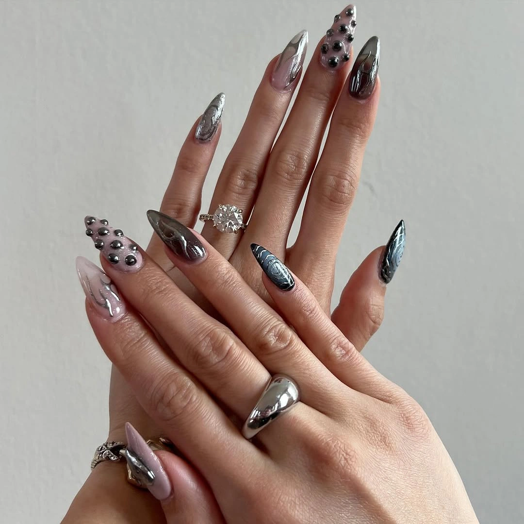
For a less dramatic interpretation, retain the gray tone on a medium almond shape and use one irregular accent on each hand rather than several clustered details. That choice preserves the visual tension between smooth and textured surfaces while making the result easier to coordinate with everyday clothing. Because the dark pieces are small, their spacing matters more than their size; place them where they break a broad gray area instead of lining them up mechanically.
The gray base offers a useful alternative to black for someone who wants a moody manicure with more visible light. Still, reflective-looking finishes reveal unevenness and fingerprints more readily than creamy opaque colors, so the clean surface is part of the appeal. Keep the surrounding nails simple if you borrow the dimensional idea, since adding bright color, heavy glitter, and dark graphics together would weaken the controlled contrast visible here.
Black Edges Around a Sheer Center
Thin black curved tips trace the perimeter of these long almond nails, leaving the pink-beige center open and almost weightless. Tiny dark details near the edges echo the linework without making every nail identical, so the eye moves along the outline instead of stopping at one focal nail. The design demonstrates how a dark color can feel surprisingly light when it is used as a border rather than a full fill.
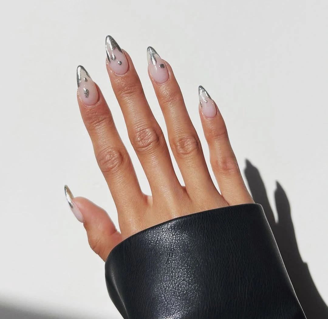
The border can be softened for daily wear by choosing a deep espresso or charcoal line instead of stark black, especially on a shorter almond or oval shape. What should remain unchanged is the open center, because that negative space gives the edge enough contrast to read clearly. If the line becomes too thick, the manicure loses its airy quality and the long nail begins to look visually shorter from the front.
This is also a sensible route for anyone who likes a dark manicure but dislikes the grow-out visibility of a solid shade. Keeping the lower portion transparent-looking reduces the visual break near the cuticle, while the dark tips continue to frame the nail as it lengthens. The precision is the tradeoff: uneven curves are easy to notice against such a clean base, so fewer, well-placed details will look stronger than many tiny ones.
Deep Brown with Amber-Like Variation
Glossy deep brown is paired with mottled warm amber-brown areas on these long almond nails, producing a tortoiseshell-like variation across selected fingers. The rich colors suit a fall mood without using a literal seasonal motif, and the shine keeps the darker tones from becoming visually dull. Leaving some nails more solid is important here because it gives the patterned sections a place to stand out.
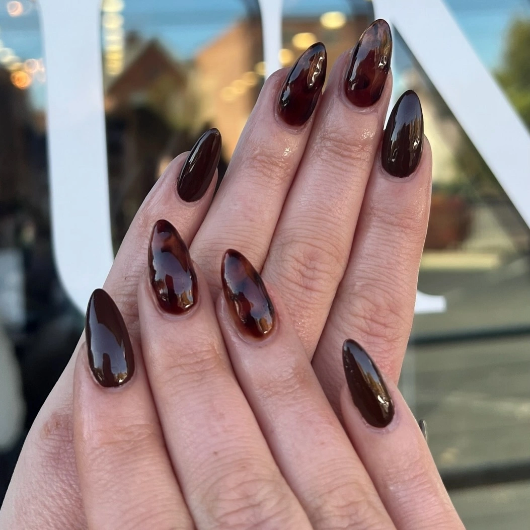
To make the palette more subtle, use the mottled effect on one or two accent nails and keep the remainder in a single espresso or translucent brown. That approach lets the warmer amber notes feel intentional instead of turning every finger into the same dense surface. A shorter shape can carry the colors well, but the patches should be larger and fewer so they do not blur into one indistinct dark area.
The strongest practical point is the warmth within the brown, which helps the manicure work beside camel, denim, cream, and darker outerwear. Pure black would create a sharper mood, while the amber variation adds depth without demanding a second color family. Because the pattern is irregular, it benefits from an organic distribution; matching every patch nail too closely would erase the relaxed, marbled character that makes the design interesting.
Red Sweeps on a Pale Almond Base
Vivid red arcs run along the tips and sides of these pale nude almond nails, while fine light lines sharpen some of the bolder color sections. The red is energetic, but it never fills the entire nail, which lets the base continue to lengthen the hand visually. That split between exposed nude and saturated color makes the set feel more graphic than a conventional all-red manicure.
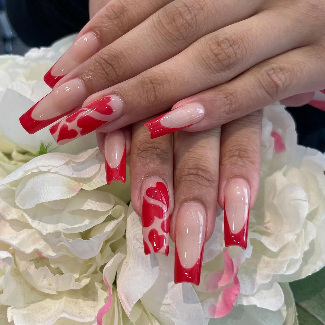
For a quieter version, select a wine red or brick tone and concentrate it on two fingers, leaving the other nails with only a narrow curve at the tip. The key is to keep the sweep asymmetrical, because a centered block would feel heavier and less connected to the tapered almond shape. If you prefer shorter nails, make the red curve shallower rather than wider so the exposed base still has enough room to show.
The red placement provides a useful lesson in controlling a high-impact shade. It feels modern because the color follows a curve and shifts from finger to finger rather than stopping at the same straight line on every tip. A very glossy finish will heighten that contrast, while a softer shine would make the red recede; choose according to whether you want the curve to be the first thing someone notices.
Navy Sparkle Against Patterned Squares
Deep navy sparkle-like nails act as calm anchors beside warm tan and densely patterned square accents with black, orange, and pale marks. The flat squared ends support the graphic palette, giving the designs a contained shape even though the individual nails are not identical. The darker navy is doing more than adding color: it creates a pause that keeps the busy accent work from spreading across the whole hand.
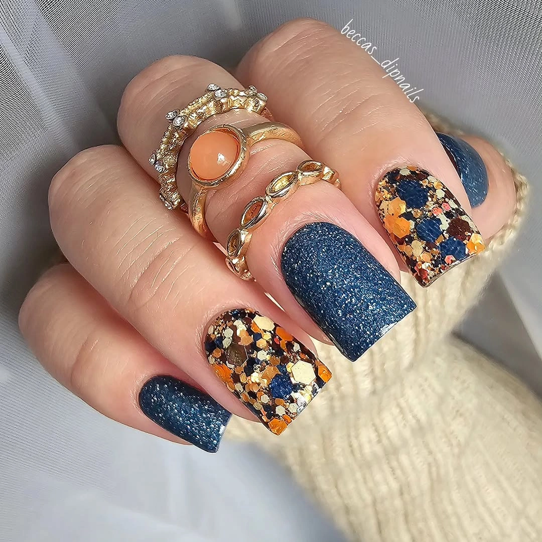
A practical adaptation is to choose one patterned nail per hand and use navy on the rest, with a tan accent only if the wardrobe calls for a little extra warmth. That pared-back formula keeps the contrast but makes the individual pattern easier to appreciate rather than treating every nail as a separate statement. For a shorter square shape, make the patterned areas larger and less intricate so the colors remain readable at normal distance.
This manicure works best when the navy remains visibly darker than the surrounding warm pieces. If the blue is too pale or the orange too bright, the design could lose its autumnal depth and begin to feel scattered. The contrast can be adjusted without changing the concept: soften the tan, make the navy more ink-like, or remove one color from the patterned nails while preserving the pause created by the dark anchors.
Minimal Marks on Long Nude Squares
Soft translucent nude keeps these long square nails calm, while sparse dark tips, fine lines, and tiny dot-like details introduce just enough interruption. The broad straight edge gives the minimal marks a graphic frame, yet the light base prevents the length from looking severe. It is a useful counterpoint to dense nail art because the empty space is carrying as much of the visual identity as the dark details.
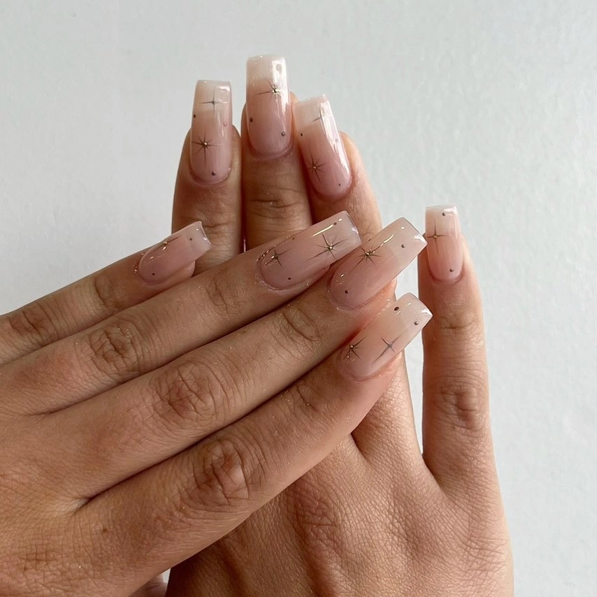
Readers who usually prefer medium-length fall nails can take the same idea onto a shorter square or soft squoval without losing the restrained mood. The adjustment is to keep one dark mark near the tip and omit extra dots when the surface area is smaller. A pale neutral base is particularly helpful here because it lets the fine accents feel chosen rather than making them compete with a strong background color.
The maintenance advantage is visual rather than technical: much of the lower nail remains close to a natural nude, so the design does not rely on a solid dark band near the cuticle. However, minimal work leaves very little room to hide uneven spacing, which means a few well-positioned details matter more than a long list of additions. Let the straight edge and the open base do their work before considering any extra accent nail.
Copper Sparkle with a Plum Counterpoint
Muted rosy-copper sparkle-like nails sit beside a glossy deep plum-brown nail and pale vertical blocks, creating a compact palette that feels warm without becoming uniformly dark. The short square length makes the glittered areas feel approachable, while the plum shade supplies a deeper note that keeps the copper from looking overly festive. Those color changes are clear, but the simple shapes stop the manicure from becoming too ornate.
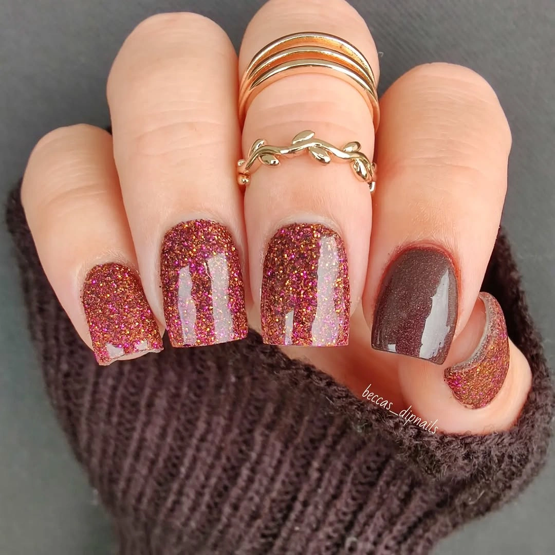
A toned-down version could place the copper-like finish on only the ring finger and use plum on the thumb, with the remaining nails left in a dusty nude. That edit keeps the warmth and contrast while giving the short silhouette more breathing room. If a very shiny texture feels too prominent for day-to-day wear, a softer rosy brown can replace it, but retain one darker nail to preserve the depth that makes the palette work.
The key visual decision is not simply sparkle versus no sparkle; it is the way the muted copper is balanced by a nearly solid dark counterweight. Without the plum, the set might feel sweet, and without the lighter blocks, it could become too dense for the short length. Keep the shades within the same warm family and the different finishes will read as intentional changes in emphasis rather than unrelated seasonal colors.
Bright Abstract Shapes on a Pale Field
Bright lime, yellow, blue, and coral shapes cross a pale base on these short-to-medium almond nails, with every finger using a slightly different abstract arrangement. The light background creates a clear boundary around each color moment, so the mixed palette remains legible instead of blending into one busy surface. Even with the energetic hues, the curved forms make the result feel more fluid than a strict color-block design.
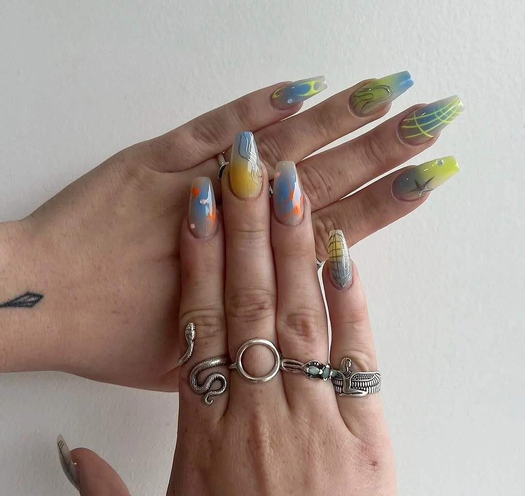
For a fall-leaning adaptation, exchange the brightest yellow and coral for rust, olive, and dusty blue while keeping the same loose curved placement. That preserves the openness of the design without forcing a literal seasonal motif onto every nail. A shorter version should use one larger shape per finger, since several tiny color fragments would crowd the available area and make the abstract pattern harder to read.
The pale field is doing quiet but essential work here, because it separates tones that would clash if they touched too often. You can make the palette more personal by repeating one favorite color on two nails, but let the remaining accents stay uneven so the set retains its hand-drawn visual rhythm. Adding a dark outline around every shape would shift the mood considerably, making the manicure more graphic and less airy.
Olive and Blush with Botanical-Like Details
Deep olive, muted blush, cream, and fine dark outlines appear across these long pointed nails, with a few small botanical-like details breaking up the color fields. The olive gives the set its grounded fall character, while the open blush sections keep the pointed silhouette from feeling too dense. Small decorative marks are used sparingly, which makes their placement feel more important than their size.
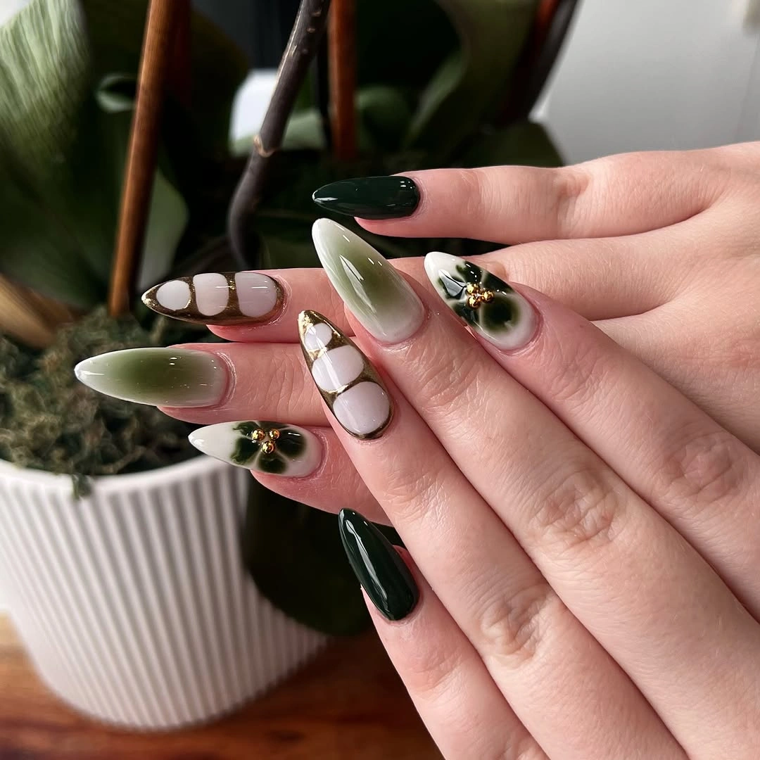
A simpler everyday version would keep olive on two nails, leave two in blush, and reserve one cream nail for a single small leaf-like or flower-like accent. That distribution echoes the visual idea without asking every finger to carry the same amount of detail. The pointed shape can be shortened to a medium almond, but the fine outlines should stay thin; thick dark borders would overpower the softer earth tones.
Olive is especially useful when a manicure needs to feel seasonal without relying entirely on brown, because it pairs naturally with cream and muted pinks. The limitation is that too much dark green can make a pale decorative element disappear, so the visible open areas are not optional background. Keep the accents near a calm color field and the eye can notice the small detail before moving to the more saturated nails.
Blue-Violet Shift with Tiny Base Dots
Blue and violet move through these medium almond nails in a soft luminous-looking shift, while tiny pale dots near some bases add a restrained point of contrast. The cool transition creates depth even though the overall design is relatively simple, and the almond shape gives the gradient a smooth direction to follow. Because the dots are small and not repeated everywhere, they read as quiet punctuation instead of a second competing motif.
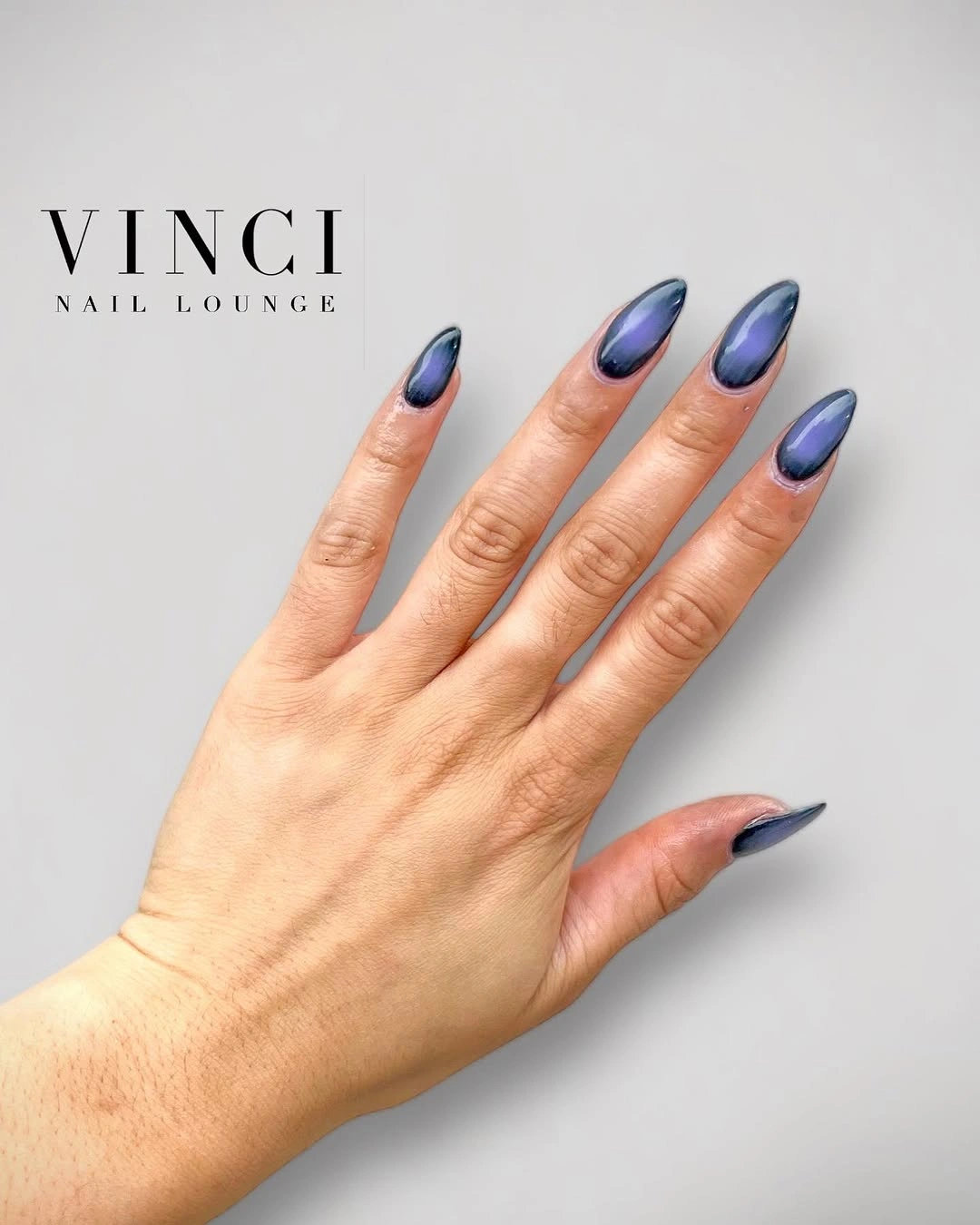
To borrow this effect in a lower-key way, choose a darker blue at one end and a dusty purple at the other, then omit the dots except on one accent nail. The gradient needs a clean surface to remain readable, so adding a heavy pattern over it would obscure the main visual advantage. On shorter nails, place the color transition vertically or diagonally rather than trying to squeeze a long fade across a narrow tip.
The cool palette is a useful contrast to the warm browns and reds often associated with fall nail ideas. It feels seasonally appropriate when paired with deeper outerwear colors, yet it avoids looking predictable because the light moves through the gradient rather than sitting as one flat shade. Keep the surrounding details subtle, since the shift itself already changes as the hand turns and does not need several extra sources of sparkle.
Smoky Orange and Black Graphic Squares
Warm orange and smoky black form rounded shapes, bright centers, and thin curving lines across these short square nails. The motif repeats with variation rather than exact duplication, which helps the bold contrast feel lively while the compact length keeps it controlled. The black deepens the orange and gives the design a moodier edge than a simple bright autumn color would have on its own.
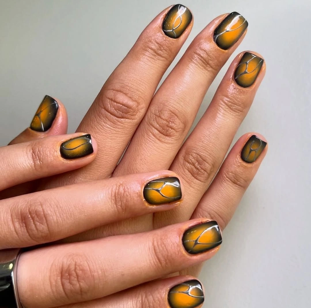
A more restrained version can use the orange-black art on two nails and leave the rest in a creamy nude or muted orange. That edit gives the curved shapes room to stand out and reduces the risk of a short square set feeling visually crowded. Make the dark portions slightly thinner if the nail bed is narrow, because broad black fields can take over the orange before the rounded pattern has a chance to read.
The loose repeat is the most transferable part of this manicure. Matching each rounded mark perfectly would turn the design into a rigid print, while the small changes from nail to nail give the hand more movement. Since orange and black are both assertive, avoid adding a third equally strong hue; a soft neutral, a subdued gold-toned dot, or an open base would offer a better pause than another full-color accent.
Mismatched Soft Brights on Long Almonds
Muted pink, pale blue, lime green, warm brown, and creamy nude are each given a place on these long almond nails, sometimes as a full color and sometimes as a curved section. The palette is varied, but the softened tone of every shade keeps the set from feeling like unrelated samples. The shared tapered silhouette is the anchor that allows the colors to change without breaking the overall rhythm.
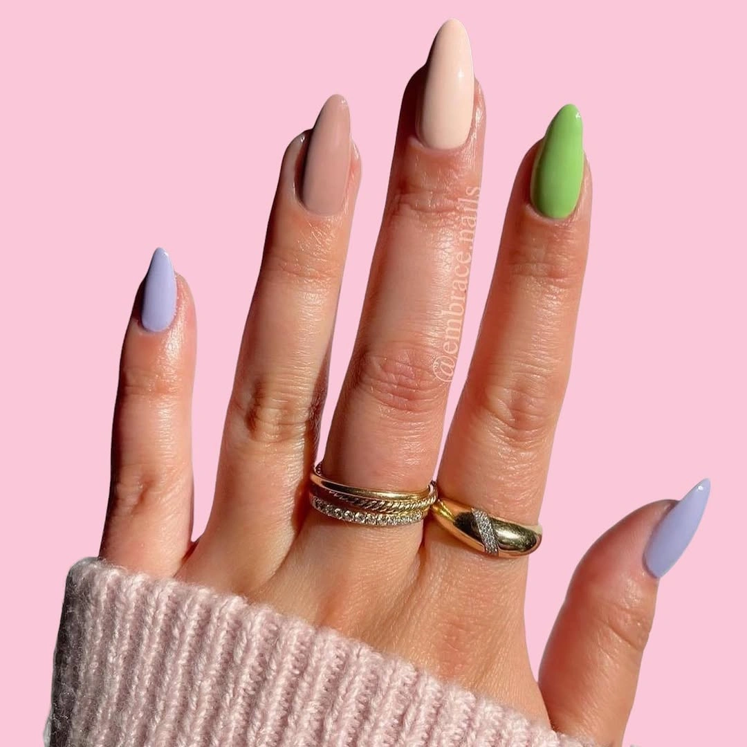
When trying a mixed palette, choose one neutral that appears in more than one place, then let three or four colored nails create the variation around it. Repeating creamy nude or muted pink makes the other shades look selected rather than accidental, especially when lime and brown sit in the same set. If the long almond profile is not practical, a medium oval will still carry the color story as long as the curved sections remain simple and broad.
The visual payoff here comes from controlled disagreement: the colors are not identical, yet their softness keeps them in conversation. A fully saturated lime, cobalt, and chocolate combination would be much louder and could overwhelm the simple sections that make this set feel balanced. Keep the finishes similarly glossy and the mismatch will read as a palette decision, not as a collection of leftover colors.
Burgundy Points with a Golden Center Glow
Deep burgundy-black edges frame warm golden-yellow centers on these long pointed nails, with small round gold-toned accents placed close to the base on selected fingers. The inward glow gives the sharp silhouette an almost lit-from-within effect, while the dark perimeter preserves a moody fall direction. It is a dramatic composition, but the repeated center placement stops the different colors from scattering across the hand.
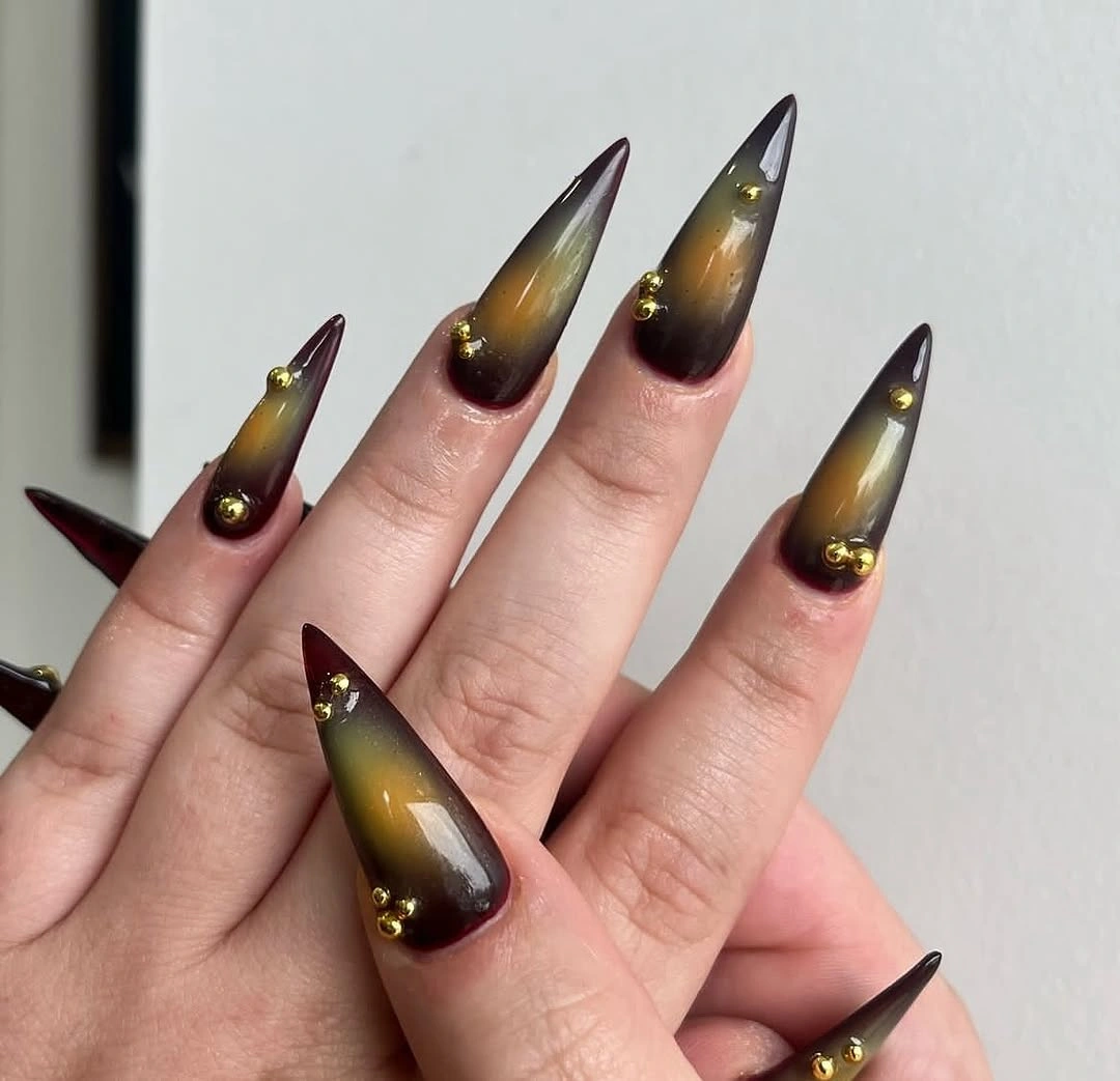
A more wearable interpretation would keep the dark burgundy around the sides of two nails and use a muted amber center on the others, leaving the small round accents off most fingers. That preserves the color relationship while reducing the intensity of the full pointed shape. On medium almonds, the warm center should be larger and the dark edge thinner, otherwise the gradient can look compressed before the eye has time to notice the glow.
The finish succeeds because the golden area has a clear job: it pulls light into the center of a dark nail rather than acting as an unrelated decorative spot. A cooler metallic-looking accent or a bright white line would change the balance and make the palette less cohesive. Let the burgundy framing remain the quiet structure, and keep any additional detail near the base small enough to support the gradient rather than distract from it.