When autumn color feels too predictable, the most convincing change is often a shift in contrast rather than another seasonal motif. A pale base beside a dark edge, a warm shade beside a cool one, or a single reflective detail can alter the whole hand while leaving the design readable. That is the useful tension to watch when choosing a manicure: decide where the eye should land, then let every other color support that decision.
Matte surfaces make those relationships especially clear because they soften glare and expose the balance between shape, negative space, and pigment. A shorter nail can carry a sharp graphic tip, while a longer silhouette can handle a quieter tonal line or a more involved accent. If you are comparing fall nail colors, pay attention to value and placement first; the right contrast usually matters more than chasing one exact shade.
A Pale Base Meets a Graphic Black Tip
The first design uses a compact rounded-square shape, a soft pale center, and black tips that curve into strong blocks at the free edge. That proportion is doing most of the work: the light area keeps the nails visually open, while the dark edge creates a clean frame that reads immediately from a distance. Because the base is quiet and the tip is concentrated, the manicure feels graphic rather than crowded. It is a smart example of how short nails can carry a decisive contrast without extra decoration.
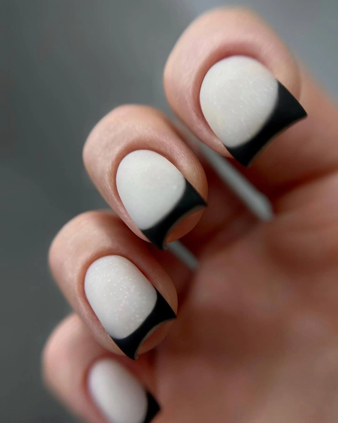
For a practical adaptation, keep the pale base broad and let the black follow the natural width of the tip instead of drawing a thin line that may look hesitant. A slightly rounded edge will echo the compact silhouette, while a square edge will make the contrast more architectural. The tradeoff is simple: a heavier black area will look more dramatic but can make the nail appear shorter, so reduce the depth if you want the hand to feel longer.
The restraint also makes this a useful starting point for short nail designs when you want a visible seasonal update without leaves, glitter, or multiple colors. Keep jewelry and clothing in the same visual register if you prefer a crisp finish, or add one small warm accent elsewhere for contrast. The manicure works because the eye receives one clear instruction – follow the dark curve – and nothing interrupts it.
Soft Pink Curves Framed by Gold
Here the short rounded nails begin with a pale pink matte base, then add uneven black and gold curves that sit near the tip like narrow contour lines. The bands are not perfectly identical, and that slight variation gives the set a hand-drawn quality while the repeated colors hold it together. Gold brings warmth to the cool pale base, while the dark line prevents the metallic accent from disappearing. It is a quieter form of graphic nail art, built from edge placement rather than a large motif.
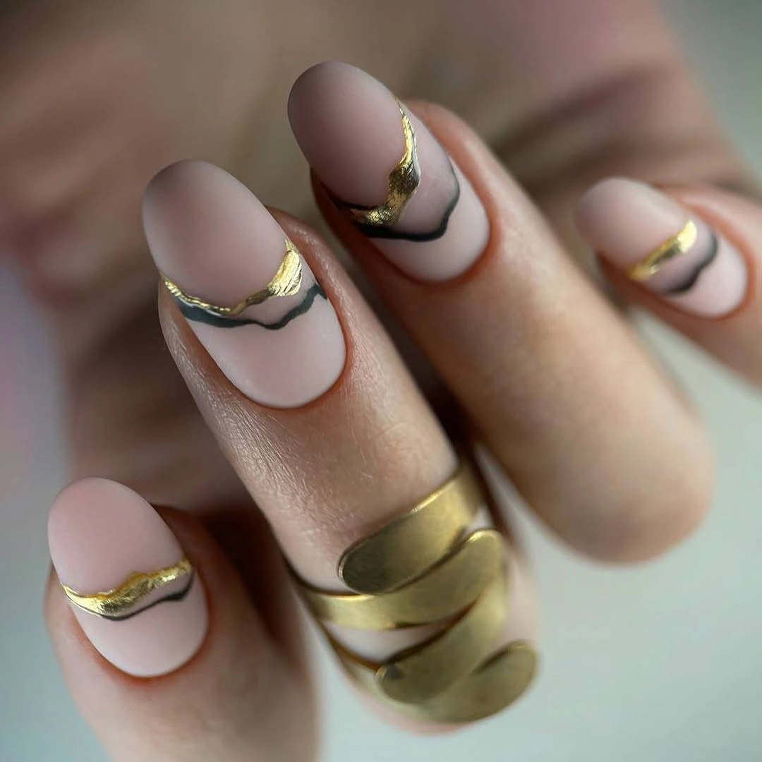
If you want the idea to feel more understated, keep the gold line narrow and let the dark outline do the structural work. A pale beige or muted blush base would preserve the contrast, but a brighter white would make the curves look more formal and less softened. The visible limitation is that uneven bands need enough breathing room to remain legible, so compressing several lines onto a very short nail could turn the design into a dark patch.
One controlled variation is to move the curve slightly higher on one accent nail while keeping the rest close to the tip. That small change creates rhythm without adding another color or motif, and it gives the hand a little movement when the fingers are held together. The combination suits knitwear, denim, or simple gold jewelry because the manicure already supplies its own fine line, so the surrounding styling can stay quiet.
Dense Indigo Color in a Matte Square Shape
A saturated blue-violet fills these short square nails from edge to edge, with a flat matte appearance that makes the color feel dense and deliberate. There is no competing pattern, so the shape and surface become the design: the squared corners give the color a stable base, while the cool pigment creates the visual weight. This kind of manicure can look more modern than a complicated set because it asks the shade to carry the entire decision. The result is bold, but the small length keeps it contained.
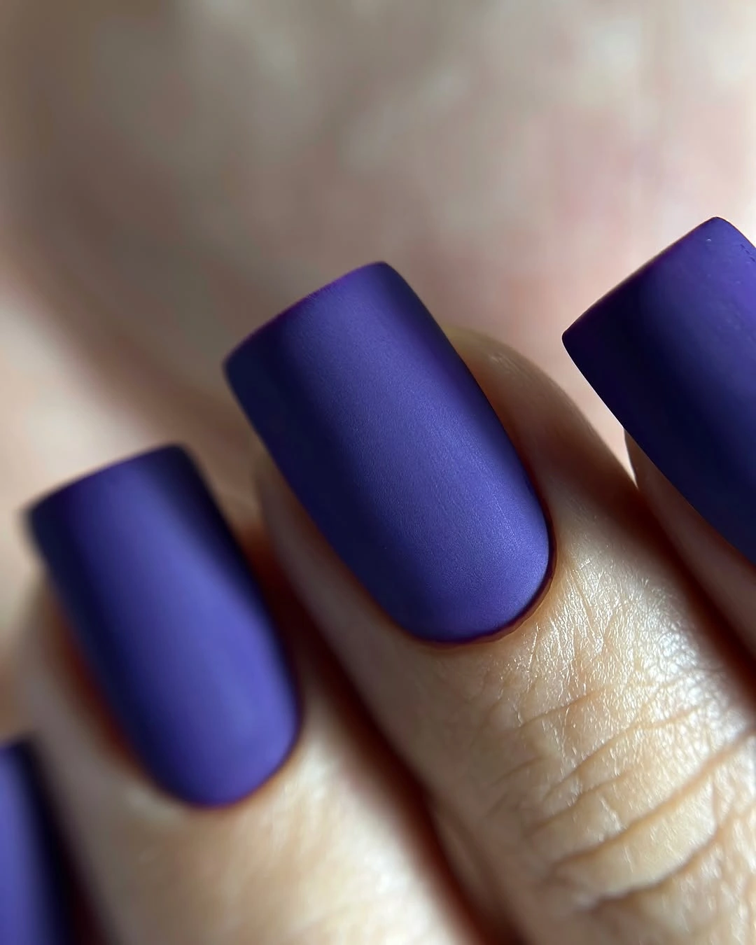
The easiest way to adapt this approach is to compare value before choosing the exact color. A dark blue-violet will feel more dramatic and can visually shorten the nail, while a slightly lighter muted purple will keep the same cool direction with less density. If your nails are very short, a softly rounded square may prevent the solid block from looking too severe. The tradeoff is that a one-color manicure shows uneven edges quickly, so the outline deserves as much attention as the shade.
Use the color as the anchor and let the rest of the styling respond to it rather than competing with it. Warm brown clothing or gold jewelry will make the purple look cooler, while gray, denim, and silver will reinforce its blue side. The appeal comes from repetition across every nail, so adding several accent details would weaken the clarity; one controlled change, such as a single glossy finger, is enough if you need contrast.
Lavender Nails with Tiny Yellow Graphic Marks
These short lavender nails combine a soft matte-looking base with small yellow dots and tiny dark marks that sit across several fingers. The pale purple keeps the set gentle, but the yellow accents create a warm interruption that gives the eye something to find. Because the details are small and spaced out, the manicure feels playful without depending on a large illustration. The compact rounded shape helps the marks read as punctuation rather than as a full decorative scene.
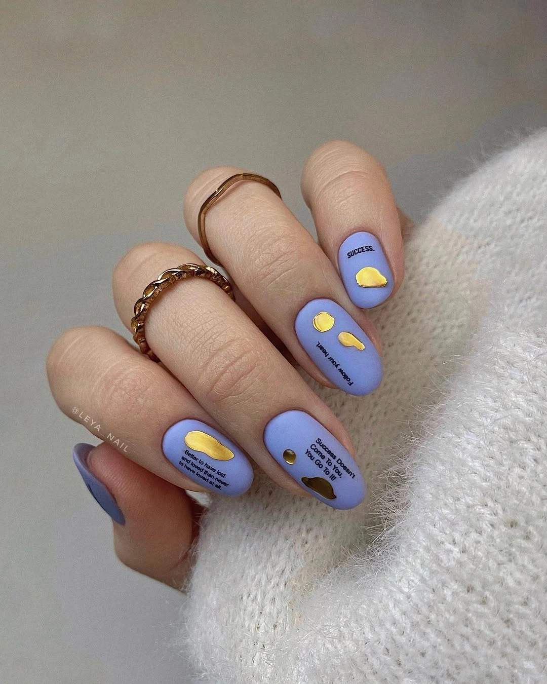
To make the idea easier to wear, keep the yellow on one or two accent nails and repeat only the smallest dark dot elsewhere. That preserves the color relationship while reducing the amount of visual information on each finger. A shorter nail may need larger spacing rather than smaller marks, since details placed too close together can blur into one patch. The visible limitation is that tiny symbols lose clarity when they are crowded, so open space is part of the design.
The lavender and yellow pairing can sit beside a neutral wardrobe without feeling childish if the base remains soft and the accents are placed deliberately. You could also replace the yellow with muted ochre for a more autumnal value shift while keeping the same warm-versus-cool logic. What makes the set useful is not the specific marks but the controlled interruption: a quiet base becomes more personal when only a few points carry the contrasting color.
Warm Coral Waves on a Short Matte Base
Short coral-pink nails carry repeating yellow and pale-pink waves that travel across the surface in a loose, flowing rhythm. The warm base already has enough saturation to stand alone, yet the curved lines make it feel more dimensional without introducing a dark outline. Repetition gives the set coherence, while the slightly varied wave paths keep it from looking mechanical. This is a good example of color and movement working together instead of relying on a single motif.
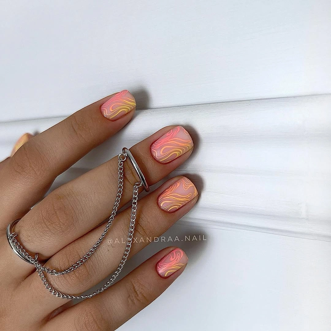
If you are translating the design to a smaller nail, use two line colors and let them follow one clear direction rather than trying to reproduce every curve. A softer peach base would make the lines blend more gently, while a deeper terracotta would increase the autumn contrast. The practical tradeoff is that freehand waves can look busy when the spacing is tight, so leave a visible strip of base between each line and stop before the design reaches the cuticle area.
One or two accent nails with full waves can also support a mostly solid coral set, which keeps the manicure easier to coordinate with patterned clothes. The color is warm enough to sit beside brown, cream, or olive, and the pale line adds a small lift without turning into glitter. Preserve the repeated curve as the central idea; changing both the palette and the motif at once would make the set lose its calm visual rhythm.
Mauve Coffin Nails with Botanical Edges
Long mauve coffin nails pair a dusty rose base with pale botanical line art and slim metallic-looking edges near the tips. The structured silhouette gives the soft color a firm outline, while the leaf-like drawings introduce a lighter vertical rhythm on selected nails. Because the motif is fine rather than filled, the mauve surface remains visible and the set avoids looking overloaded. The combination shows how a long shape can support detail when the decorative marks stay narrow.
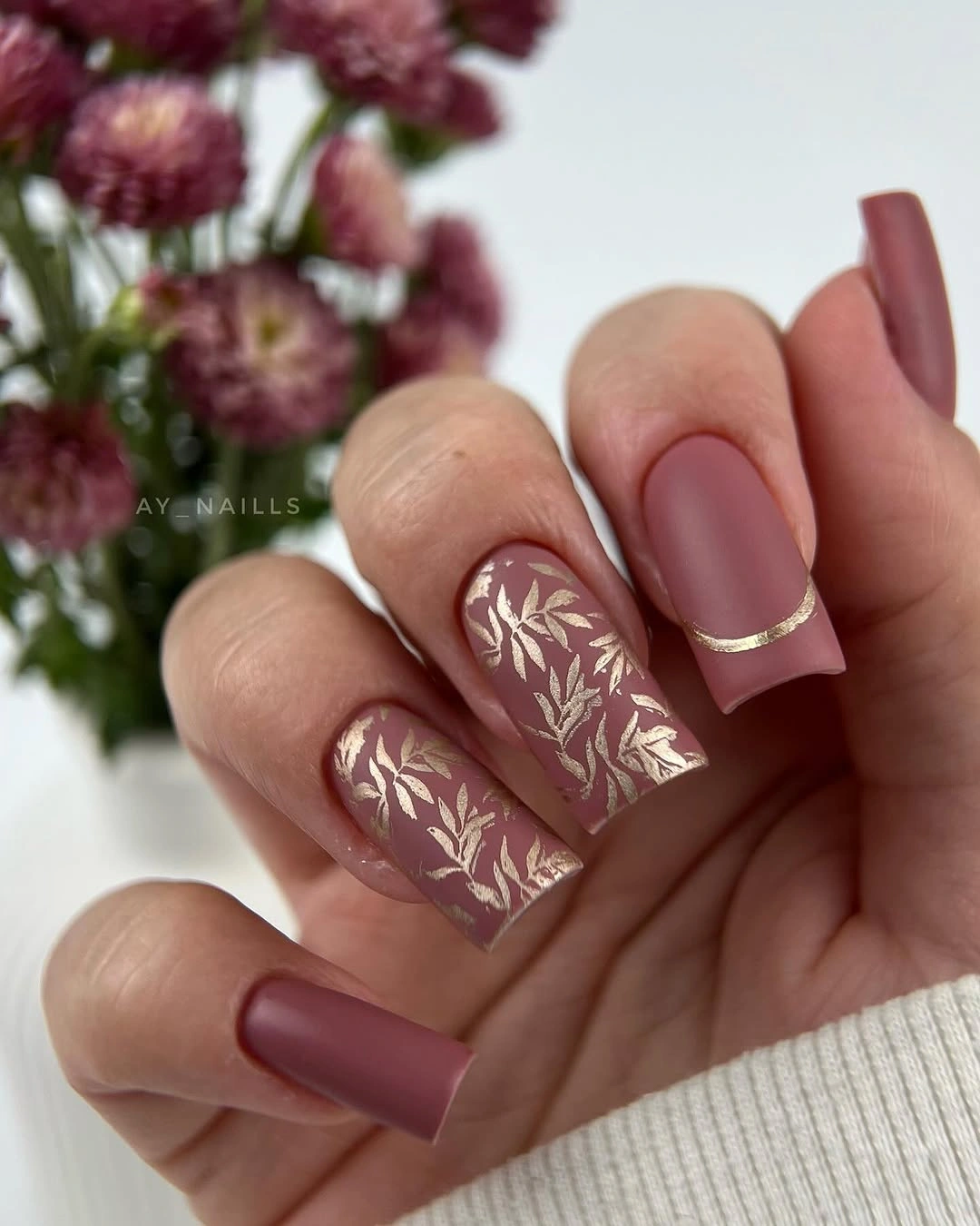
A shorter adaptation would keep the mauve base and move one botanical accent toward the center of a rounded or squoval nail. The thin edge can remain, but reducing its width will preserve the open feel that makes the design work. A darker berry base would increase contrast, while a dusty beige would make the lines quieter. The limitation is proportional: a dense botanical drawing can overwhelm a small nail, so choose one clear leaf gesture instead of several overlapping shapes.
The color is flexible around cream, gray, and warm brown clothing because it sits between a neutral and a visible berry tone. If you like fall nail colors with a softer mood, this kind of mauve gives you seasonal depth without relying on a very dark base. Keep the edge, base, and botanical line in a clear hierarchy, and the manicure will retain its composed shape even as the length changes.
Beige Matte Nails with One Gold Curve
Short pale beige nails are finished with one fine gold curve near each tip, creating a barely-there accent that is more about placement than decoration. The base has enough pink warmth to keep the hand from looking flat, while the curved mark echoes the nail edge and gives each finger a small point of light. The design stays quiet because the metallic detail is thin and repeated consistently. It is a useful middle ground between a plain neutral and a fully drawn manicure.
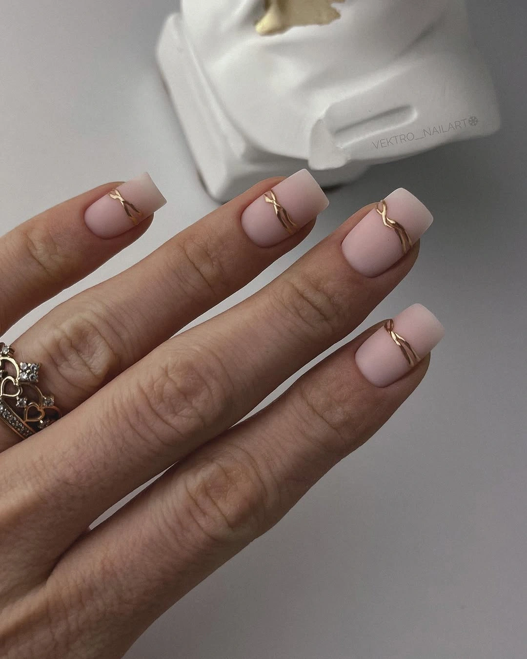
For a practical version, keep the curve slightly irregular and place it where the nail naturally begins to narrow. A straight line would make the look more graphic, while a lower curve would create a stronger French effect. Short nails benefit from one clear mark rather than several fine bands, and the visible limitation is that a very pale base can make the accent disappear in low light. A warm gold value helps, but spacing still matters more than shine.
This restrained design can sit beside almost any color because it does not introduce a large competing shape. Add a small gold ring if you want to echo the accent, or leave the hands unadorned so the curve remains the only punctuation. The manicure is successful when the line feels discovered rather than announced, so resist adding a second motif unless the base needs more contrast.
Bright Waves and Animal-Print Punctuation
Short nails mix bright pink, turquoise, lime, and black through curved stripes, dots, and small animal-print areas. The palette is energetic, but the compact rounded shape keeps the color concentrated close to the hand instead of extending the drama through length. Repeated waves create a shared rhythm across different motifs, so the set feels intentionally mixed rather than random. The defining choice is saturation: every accent is allowed to stay bright, and the dark details keep the colors separated.
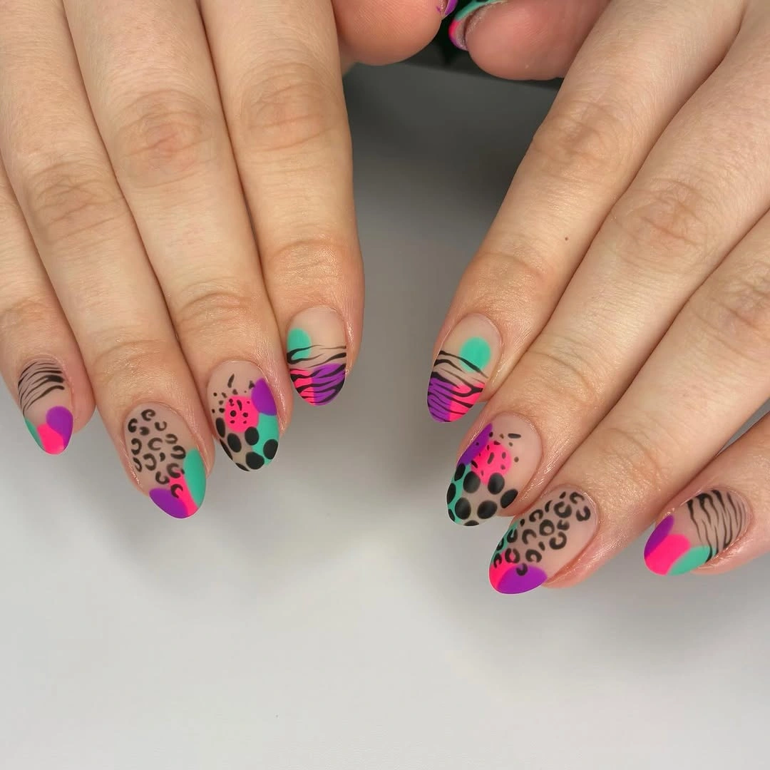
If the full palette feels too loud, keep the black and one bright color while shifting the others into softer versions of the same family. You can also use the animal print on one nail and reserve the waves for another, which makes the contrast easier to read. Short nails have limited space for several motifs, and the realistic tradeoff is that tiny dots and stripes may lose their identity if the base colors are not separated clearly.
This look works best when the surrounding outfit is simple enough to let the manicure be the focal point. A neutral sweater, denim, or a single bright accessory can support it without adding another pattern. The practical lesson is to repeat one shape across different colors; the waves and dots do not need to match, but they need a shared scale so the set retains visual balance.
Black Geometric Tips on Long Almond Nails
Long pointed nails use pale nude centers and bold black geometric tips that cut across the edge in sharp, graphic blocks. The pointed silhouette already creates a strong direction, and the black area reinforces that direction rather than softening it. Leaving the center pale prevents the set from becoming a solid dark shape, while the angular tip gives the manicure a clear visual stop. It is a high-contrast design where proportion matters more than added ornament.
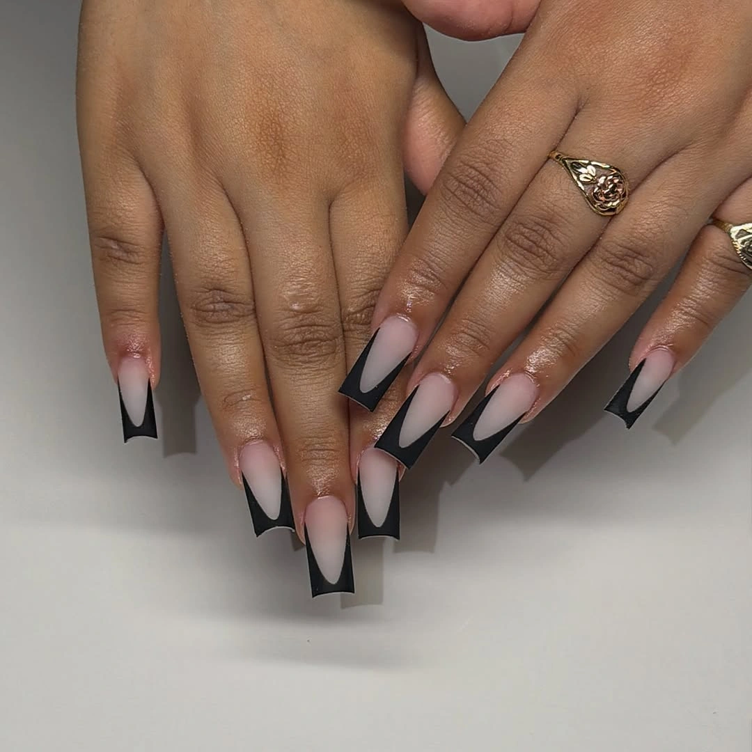
On a medium or short shape, reduce the black depth and keep the outer edge slightly curved so the dark area does not swallow the nail. A deep brown could soften the contrast, while a bright white base would make the graphic effect more pronounced. The limitation is that sharp tips draw attention to uneven length, so the design looks most balanced when the silhouettes are close in proportion. That is a shape consideration, not a requirement for a particular technique.
Use the black as the visual anchor and keep jewelry simple if you want the manicure to feel clean rather than theatrical. A matte pale base would quiet the contrast, while a reflective pale center would add more tension between surfaces. The central relationship stays the same either way: the open center carries light, the black edge carries weight, and the pointed shape connects the two.
Charcoal Patches with Scattered Gold Flecks
Short almond nails start with a translucent nude base, then place charcoal-gray organic patches and scattered bright gold fragments across the surface. The nude space prevents the dark marks from becoming a full cover, while the gold works as small points of warmth inside the cooler gray shapes. Because the patches are irregular rather than symmetrical, the manicure has a natural, slightly broken rhythm. It reads as autumnal through contrast and texture of placement, not through an obvious leaf motif.
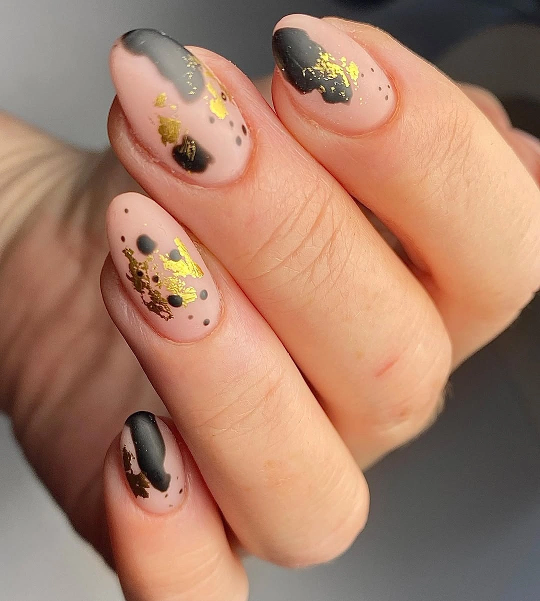
Keep the darkest shape to one side of each accent nail and let some nude space remain untouched. That gives the gold room to read as a highlight and helps the short almond silhouette stay visible. If you want a calmer version, replace charcoal with a muted brown; if you want more edge, use black but reduce its area. The tradeoff is density: too many scattered fragments can make the design look accidental instead of intentionally broken.
A single accent nail with the full charcoal-and-gold treatment can support plain nude fingers, especially when you want a manicure that works with warm knits and neutral layers. The idea also pairs well with brown fall nails because both rely on a warm-dark relationship softened by open space. Preserve that negative space even when changing the colors; it is what keeps the contrast readable.
Burgundy Solids Beside Tortoiseshell Points
Very long stiletto nails alternate deep burgundy solids with orange-and-brown tortoiseshell panels, creating a dramatic conversation between one dense color and one mottled surface. The pointed length amplifies both choices, so the set would feel intense even without additional decoration. Alternation keeps the eye moving from stable wine color to warm pattern and prevents the long silhouette from reading as one uninterrupted block. The result is seasonal through depth and variation rather than through small illustrative details.
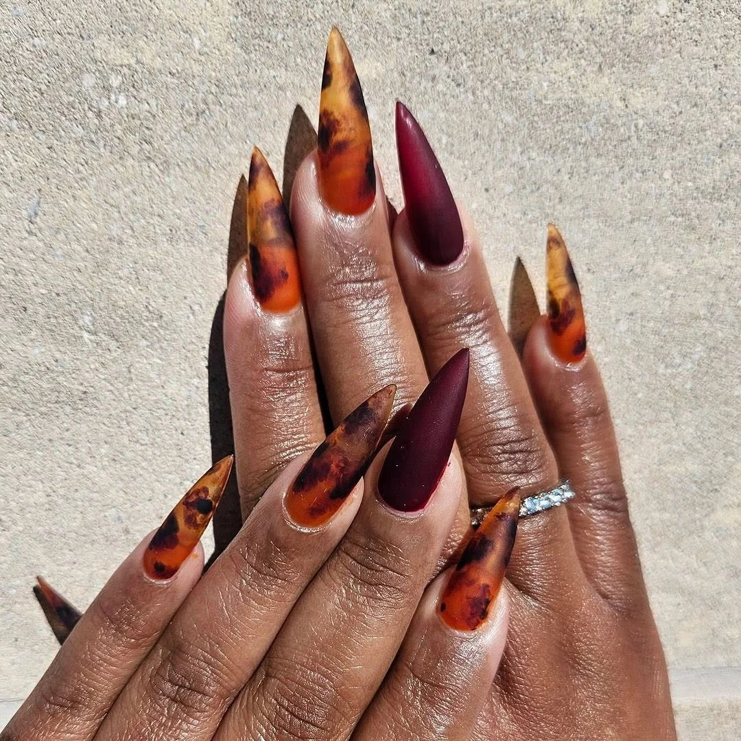
If you need a more wearable version, keep the burgundy on most fingers and use tortoiseshell on one or two accent nails. A shorter almond shape will preserve the color contrast while reducing the sharpness of the silhouette, and a muted brown can make the pattern less dominant. The honest limitation is length: pointed tips change how the hand moves through everyday tasks, so the palette can be borrowed even when the original proportion cannot.
Warm gold jewelry and cream clothing will bring out the orange notes, while black or charcoal will make the burgundy appear deeper. Avoid adding a third strong color unless it has a clear role, because the set already has two distinct visual languages. The useful decision is the alternation itself – one nail supplies calm, the next supplies variation – and that rhythm can survive a change in shape or scale.
Mustard Matte Nails with Fine Speckles
Long square nails use a warm mustard yellow matte color with a fine dark speckled detail spread across the surface. The shade is saturated enough to feel seasonal, but the matte finish removes some glare and lets the tiny marks settle into the background. The square shape gives the bright color a firm frame, making the set look deliberate instead of playful by accident. It is a one-color design with one quiet layer of texture.
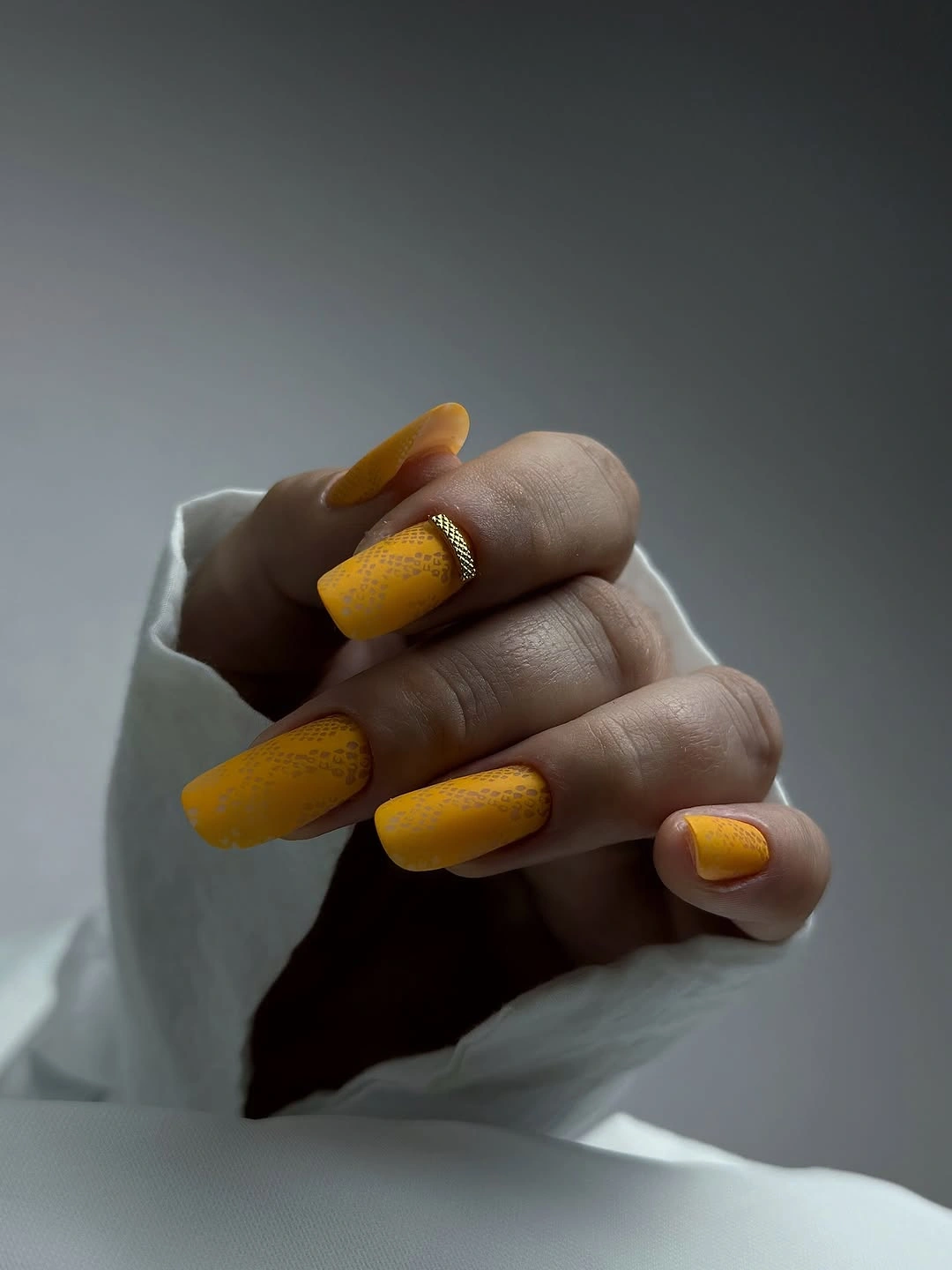
On a shorter nail, the best adaptation is to keep the mustard as the main decision and reduce the density of the speckles. A muted ochre will make the look softer, while a deeper marigold will increase the contrast against darker clothing. The limitation is that a fine pattern can disappear at a distance, so do not rely on the speckles to carry the design. They should support the color, not compete with its warmth.
Pairing the shade with brown, cream, olive, or denim keeps the manicure connected to an autumn wardrobe without repeating the exact color elsewhere. If you want more variation, place a plain mustard nail beside one speckled accent instead of adding another motif. The surface stays convincing because the eye first reads the dense yellow field, then notices the smaller detail as a second layer.
Deep Burgundy Almonds with Tonal Curves
Long almond nails are covered in a deep burgundy color, with a few darker curved accents that shift the surface without leaving the same color family. The elongated shape makes the shade look fluid, while the tonal marks add depth only when the light catches the surface. Nothing competes with the berry direction, so the manicure feels rich rather than busy. It demonstrates how a monochrome palette can still have a focal point when value changes are used carefully.
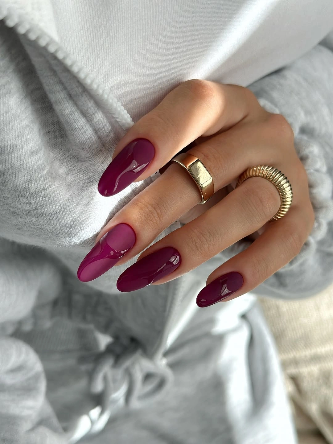
For a shorter set, use one burgundy shade across the nails and place the darker curve on a single finger. A brighter berry will lift the hand, while a brown-leaning wine will make the result moodier and more grounded. The visible limitation is that tonal detail needs enough difference to be noticed; if the two shades are too close, the accent will disappear, and if they are too far apart, the monochrome effect will be lost.
Keep the rest of the styling clean so the deep color can remain the main line through the look. A warm gray sweater or a simple gold ring will support the shade without creating a second focal point. The manicure does not need glitter or an illustration because its appeal is the quiet shift between solid burgundy and a deeper curve, a relationship that remains readable as the nail length changes.
Berry Pink Solids with Pale Leaf Accents
Medium square nails use a vivid berry-pink base and interrupt it with pale leaf-like accents on selected fingers. The bright solid color gives the set energy, while the lighter marks create small openings that keep the saturation from feeling flat. Because the motif appears only in a few places, the eye can recognize a rhythm instead of scanning an all-over pattern. The design is decorative, but its structure stays simple: strong color, pale interruption, repeated placement.
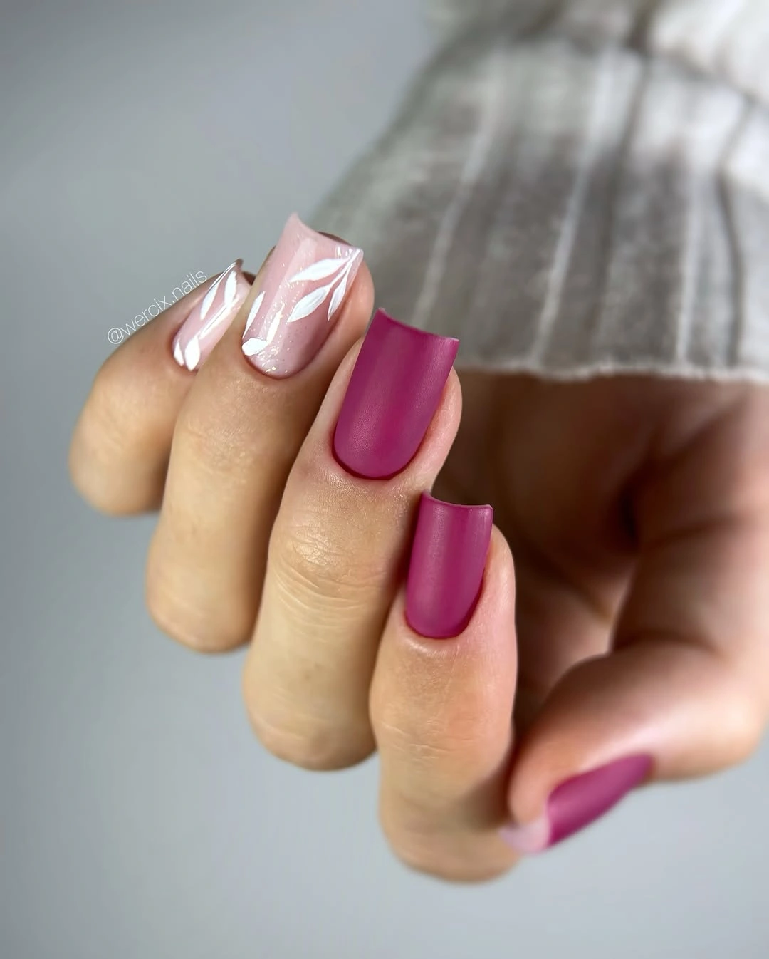
Keep two or three nails fully berry and place the pale motif where it can be seen without being crowded by jewelry. A softer raspberry will reduce the contrast, while a deeper plum will make the pale accents look brighter. The limitation is that a pale design mark on a saturated base can disappear if it is too small, so it needs enough width and spacing to retain its shape. One clear leaf gesture is more useful than many tiny lines.
This is an easy palette to coordinate with cream, charcoal, or denim because the berry color carries the visual weight on its own. If you prefer a less decorative result, use a single pale accent and remove the other marks rather than changing the base. The set works when the eye returns to the berry field after noticing the accent, so keep the contrast deliberate and let the solid nails provide visual rest.
Creamy White Nails with Warm Leaf Shapes
Short oval nails begin with a creamy white base and add small brown and orange leaf silhouettes that remain widely spaced across the set. The pale field gives the warm marks room to breathe, and the rounded shape softens the contrast so the manicure feels seasonal without becoming heavy. Each accent is simple enough to read quickly, but the repeated placement keeps the set connected. The defining choice is restraint: the background does most of the visual work.
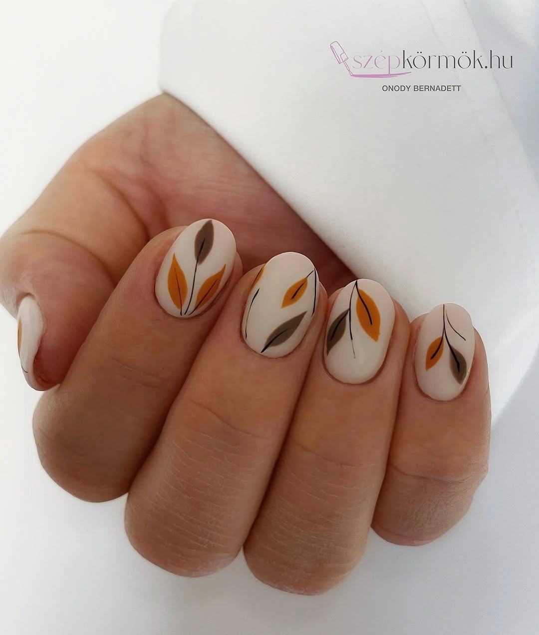
Leave a generous border of pale base around every mark, especially when adapting the design to very short nails. A warm beige would make the leaves blend more gently, while a cooler white would sharpen the orange and brown. The realistic limitation is that fine leaf points can blur if the motif is reduced too far, so simplify the silhouette into one or two broad strokes rather than trying to preserve every small branch.
Use the manicure when you want a seasonal reference that can sit beside a patterned sweater without fighting it. The warm accents connect naturally to brown bags or rust-colored clothing, while the creamy base keeps the hand light. The visual lesson is easy to carry into other fall nail art: choose one motif, repeat it with space, and let the base remain visible enough to organize the set.
Cocoa Almonds with Outlined Nude Panels
Long almond nails use a deep cocoa-brown base but leave nude center panels open inside fine gold outlines. That negative space breaks the dark color into separate shapes, so the elongated silhouette feels designed rather than simply covered. The brown supplies warmth and weight, while the pale panel returns light to the center of each nail. It is a precise example of contrast created through omission: what is not painted is as important as the surrounding color.
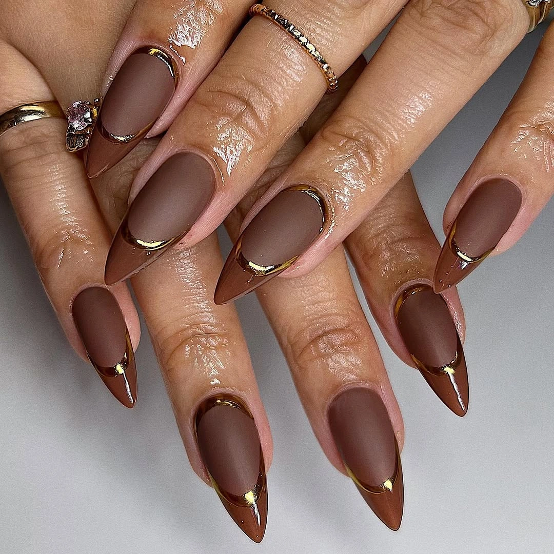
On a shorter nail, keep one outlined panel on an accent finger and use a plain brown elsewhere. A wider nude opening will feel lighter, while a narrow opening will preserve more drama but may visually shorten the nail. The limitation is that a thin outline needs clear spacing from the sidewalls to remain readable, so simplify the panel before reducing its size. The relationship between dark border and pale center should stay obvious.
Warm neutrals, cream, and soft gray will support the cocoa without competing with the outline, while bright colors may make the gold edge feel less central. If you want a lower-contrast version, replace cocoa with muted taupe and keep the nude panel. The manicure succeeds because the eye follows the border around the open center; preserve that route even if the exact color or length changes.
Mint Solids with Warm Animal-Print Accents
Short almond nails alternate pastel mint solids with white accent panels carrying irregular brown animal-print spots and dark outlines. The cool mint is clean and quiet, while the warm pattern introduces a surprising temperature shift that keeps the set from looking too sweet. Because the print is limited to a few nails, the solids provide enough rest for the eye to understand the contrast. The design depends on placement and color temperature more than on a large pattern scale.
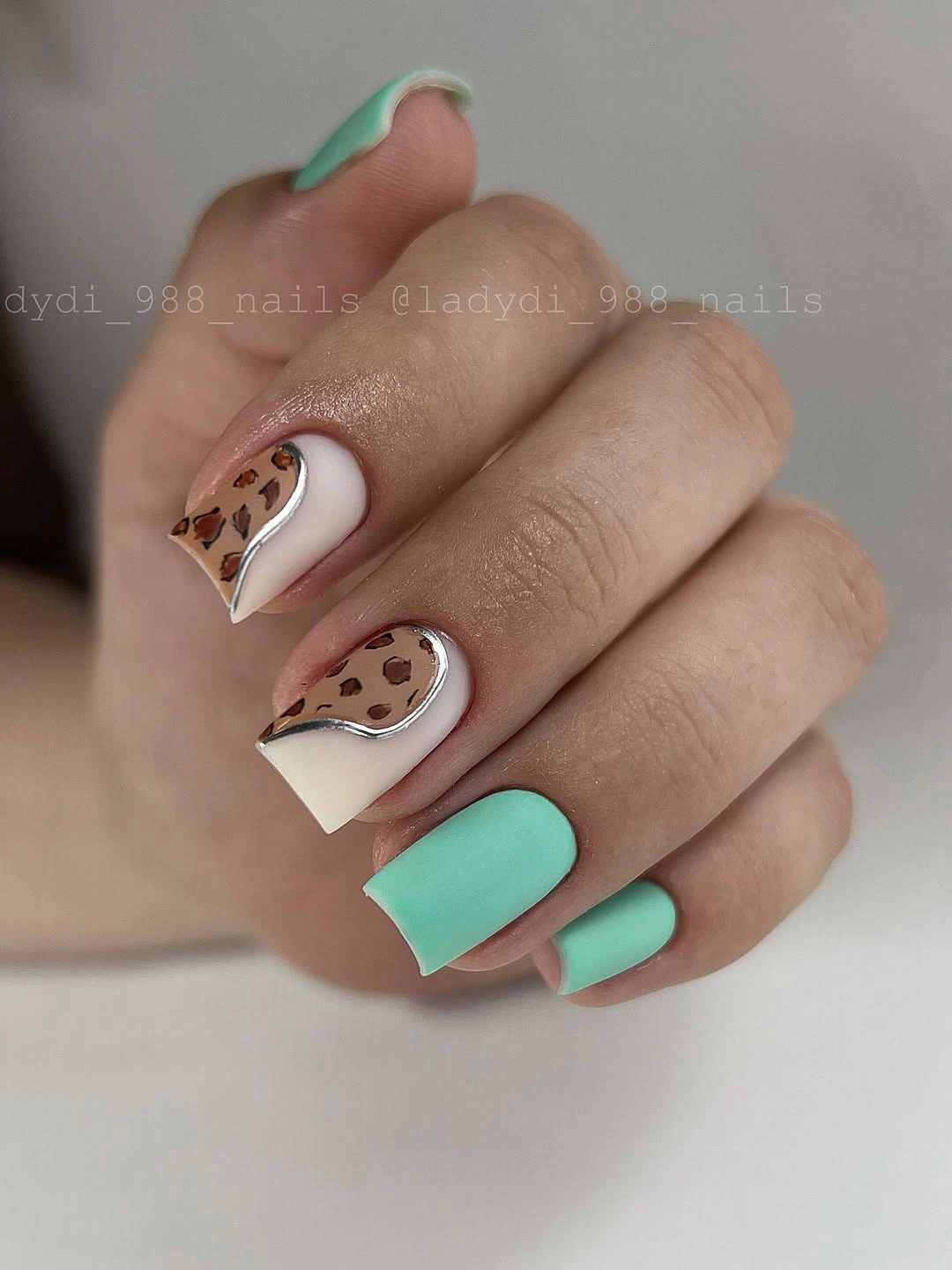
For a calmer adaptation, keep mint on most fingers and place the animal print on one or two accent nails. A pale beige panel would soften the white, while a deeper olive mint would make the brown marks feel more grounded. The limitation is that small spots can look crowded on a short surface, so leave a little open panel around them and avoid adding another accent color. The print should interrupt the mint, not erase it.
The palette works with denim, gray knitwear, and warm tan accessories because each color has a clear role. If you are unsure about wearing animal print, think of it as a warm graphic texture rather than as the theme of the whole set. The useful balance comes from repeating mint as the majority color and allowing the patterned nails to remain a controlled exception.
Cool Lavender Blue with Vertical Shimmer Lines
Long stiletto nails use a cool lavender-blue base and fine vertical shimmer lines that follow the direction of the pointed silhouette. The stripes emphasize length, while the soft cool color prevents the reflective detail from becoming harsh. Several narrow lines create a layered surface, but the absence of a contrasting motif keeps the manicure visually focused. The shape and the line direction agree, which is why the design feels elongated rather than cluttered.
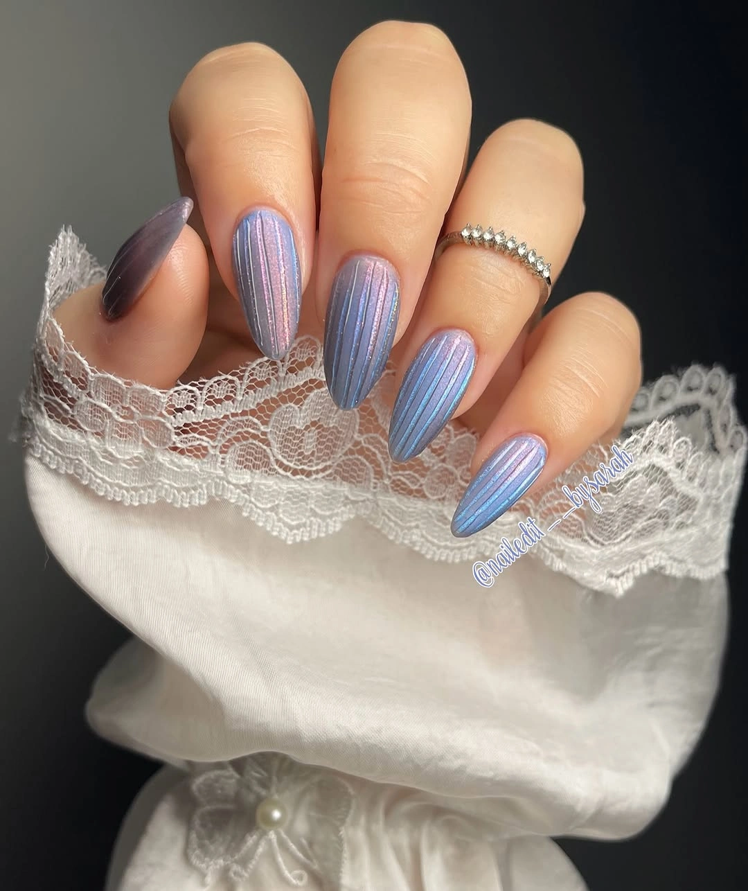
A shorter adaptation should keep the lines sparse and vertical, because too many stripes can make a small nail look compressed. Use a muted blue-gray if you want the shimmer to feel quieter, or a brighter violet for more contrast. The limitation is practical as well as visual: a very pointed length changes the scale of the whole hand, so borrow the color and line direction even if you choose a rounded or almond shape instead.
Silver jewelry and cool gray clothing will echo the blue side, while cream or warm brown will make the lavender appear more delicate. One plain nail can create a pause, but adding several unrelated accents would weaken the directional logic. The manicure works because every line points the eye in the same general route, making surface variation serve the silhouette instead of competing with it.
Coral Matte Nails with One Glitter Accent
Medium coral nails keep most fingers in a warm matte-looking solid and place dense orange glitter on one accent nail. The coral is bright but softened by the surface, while the glitter creates a focused point of light that changes the set without changing its palette. Because only one nail carries the strongest sparkle, the manicure stays easy to read. The color relationship is simple: warm matte field first, concentrated reflective detail second.
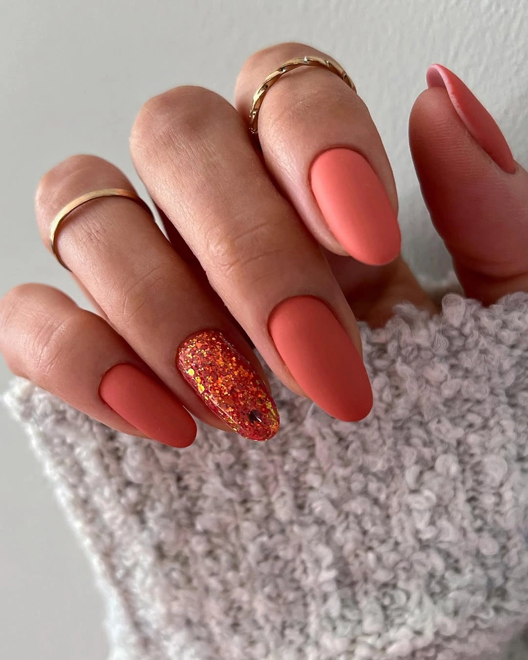
Place the glitter on the ring finger or thumb if you want it to feel intentional in everyday movement. A deeper terracotta base would make the orange sparkle look brighter, while peach would make the result softer. The limitation is that a dense accent can dominate close-up, so the other nails should stay free of additional decoration. If you need less contrast, use a thin glitter edge rather than filling the whole accent nail.
The set coordinates well with cream, oatmeal, denim, and brown because the warm colors already share a grounded direction. A small gold accessory can echo the light, but the manicure does not require it. The design is strongest when the eye finds the glitter once and then returns to the coral solids, so protect that hierarchy as you change the shade or shape.
Red Matte Solids with Abstract White Accents
Long square nails use a strong red-magenta matte color on most fingers and repeat white accent panels filled with loose red abstract shapes. The solid nails create a bold block of color, while the pale panels give the eye a lighter surface to rest on. Repeating the accent across two fingers makes the set feel organized even though the shapes are organic. The manicure is decorative, but its color structure remains clear from the first glance.
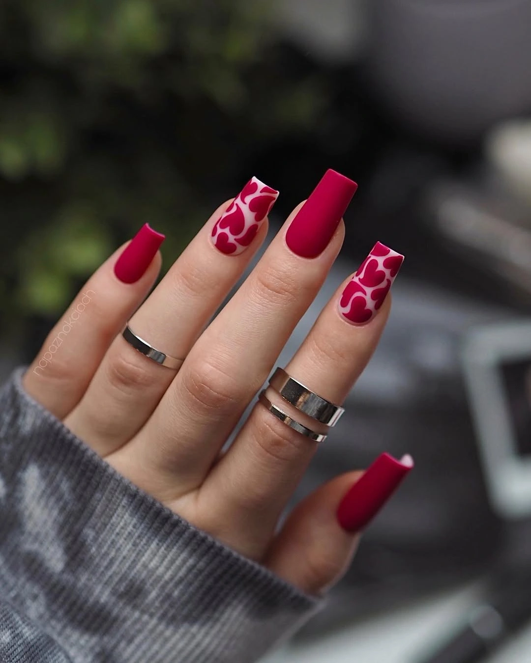
On a shorter shape, keep the red on most nails and simplify the white accents into one broad curve or spot. A deeper berry would make the white look brighter, while a muted brick red would soften the contrast. The limitation is that several abstract marks can become indistinct when the panel is small, so choose one dominant shape and allow the pale base to remain visible around it. That open border gives the accent a cleaner edge.
Use the red as the main styling cue and keep surrounding patterns restrained unless you want a deliberately maximal look. Gray, denim, black, and cream will all support the contrast in different ways. The set works because the white accents are not random interruptions; they repeat the red in a lighter field, creating a visual bridge between the bold solids and the open panels.
Olive and Orange with Fine Botanical Lines
Long almond nails mix matte-looking orange and muted olive solids with fine botanical line art on the warm accent nails. The orange supplies brightness, the olive supplies a grounded counterweight, and the thin drawing connects them without adding another loud color. The elongated almond shape gives the lines room to travel, while the solid nails keep the composition from becoming illustrative on every finger. It is an autumn palette built through value and temperature.
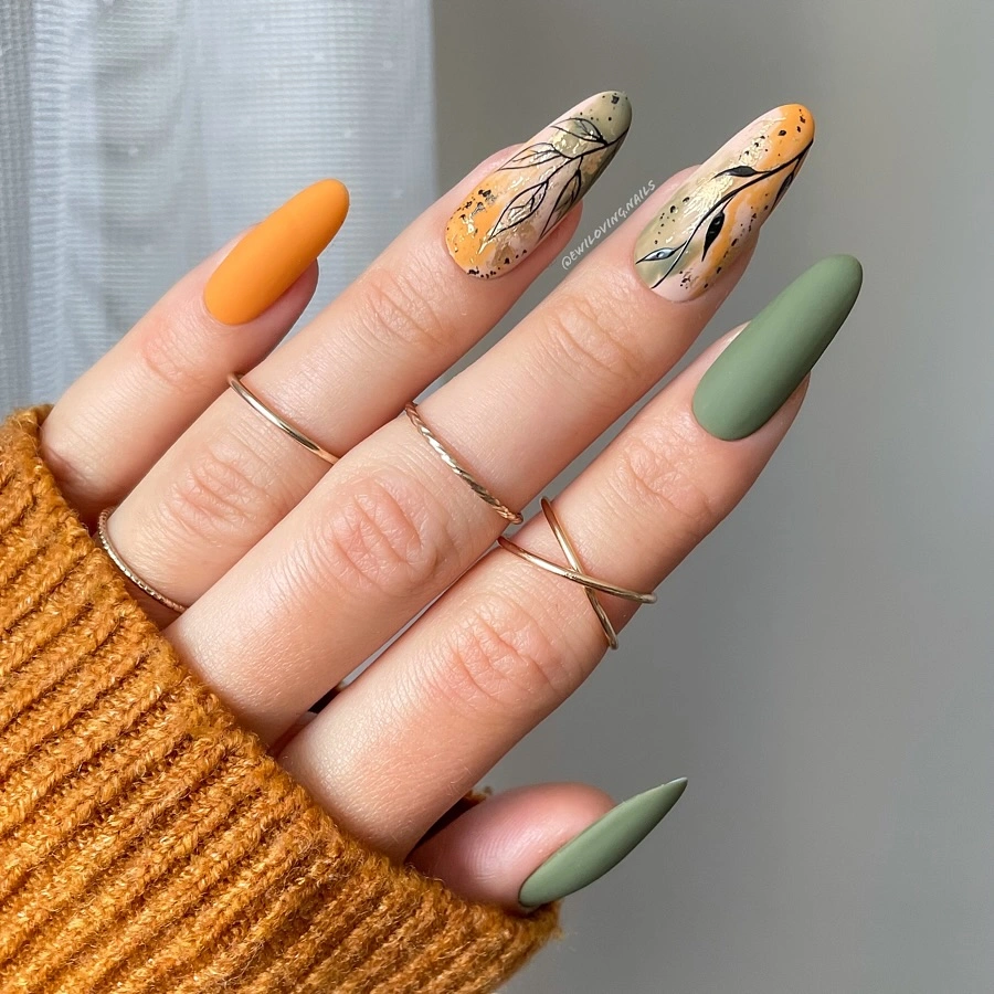
For a more wearable version, make olive the majority color and keep orange on one accent nail, using the botanical line only where the warm shade appears. A muted rust would lower the saturation, while a brighter orange would make the contrast more energetic. The limitation is that fine line art needs a calm background, so avoid placing it over a heavily patterned base or the small drawing will lose its route.
This combination works with mustard, cream, denim, and warm gray because each surrounding neutral helps one side of the palette stand out. If you want to build on the idea, change one variable at a time: keep the colors and shorten the shape, or keep the shape and soften the orange. The important balance is the conversation between bright warm color and muted green, with the botanical line acting as a quiet link.
Taupe Matte Nails with Pink Botanical Panels
Long taupe nails use a muted gray-brown matte field and place soft pink panels with black botanical lines on selected fingers. Taupe gives the set a calm, grounded base, while the pink introduces a small change in temperature and value. The black drawing sharpens the pale panels without covering them, so the contrast remains airy rather than heavy. This design shows how a muted neutral can support a decorative accent without losing its own identity.
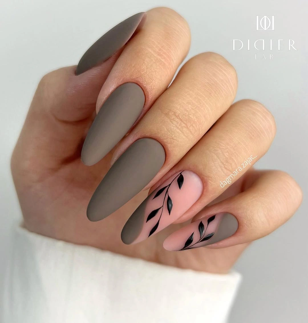
Keep the taupe on most nails and reduce the pink panel to one accent if you want the look to feel quieter. A warmer beige would make the pink blend more gently, while a charcoal base would create a stronger graphic shift. The limitation is that delicate black lines can look severe when the panel is too small, so preserve a little pink space around the drawing and avoid stacking several motifs together.
Soft knitwear, denim, and black accessories can all support the palette because the base is muted enough to adapt. Use one pink accent near the center of the hand to give the eye a destination, then let the taupe nails provide visual rest. The manicure remains balanced when the botanical line explains the pink panel rather than becoming a separate subject.
Quiet Nude Almonds with One Leaf Mark
Long almond nails carry a pale blush nude base with one small dark botanical accent, leaving nearly every other nail open and unadorned. The elongated silhouette supplies enough visual interest that the design does not need a repeated motif, while the single leaf-like mark gives the eye a precise stopping point. Soft contrast keeps the set understated, but the dark accent prevents it from disappearing. This is a lesson in concentration rather than decoration.
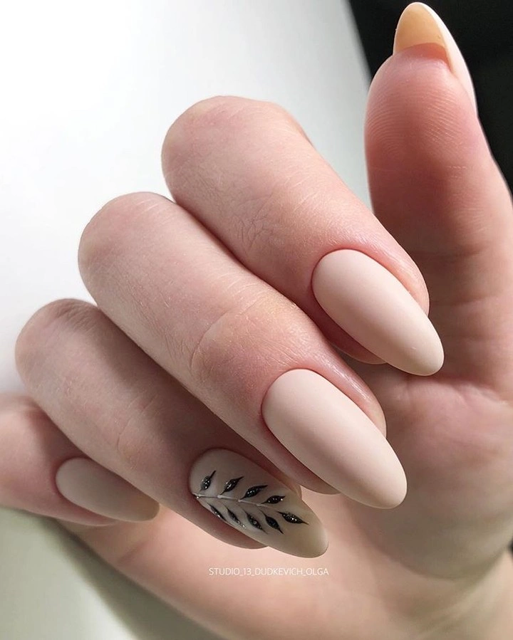
Place the accent slightly to one side and keep generous negative space around it, especially if the nail is shorter. A warmer nude will make the mark feel softer, while a cooler blush will sharpen the contrast. The limitation is that one tiny detail can vanish if it is too fine or too close to the edge, so the accent needs enough scale to remain visible without becoming a full illustration.
Choose this direction when you want a manicure that can sit beside bold clothing, jewelry, or makeup without adding another loud element. Repeating the accent on a second nail would create more rhythm, but it would also change the quiet character, so make that adjustment deliberately. The appeal is the pause between open nude surfaces and one dark gesture, and that pause should remain intact.
Pastel Speckles Across Three Soft Colors
Short rounded-square nails alternate pale aqua, peach, and pink bases, then repeat tiny dark speckles across the set. The colors are gentle and separate enough to feel playful without becoming neon, while the shared speckle detail gives the different bases a common language. The compact shape keeps the three-color mix close and tidy. Instead of one focal nail, the manicure relies on repetition: every small mark helps the pastel changes feel connected.
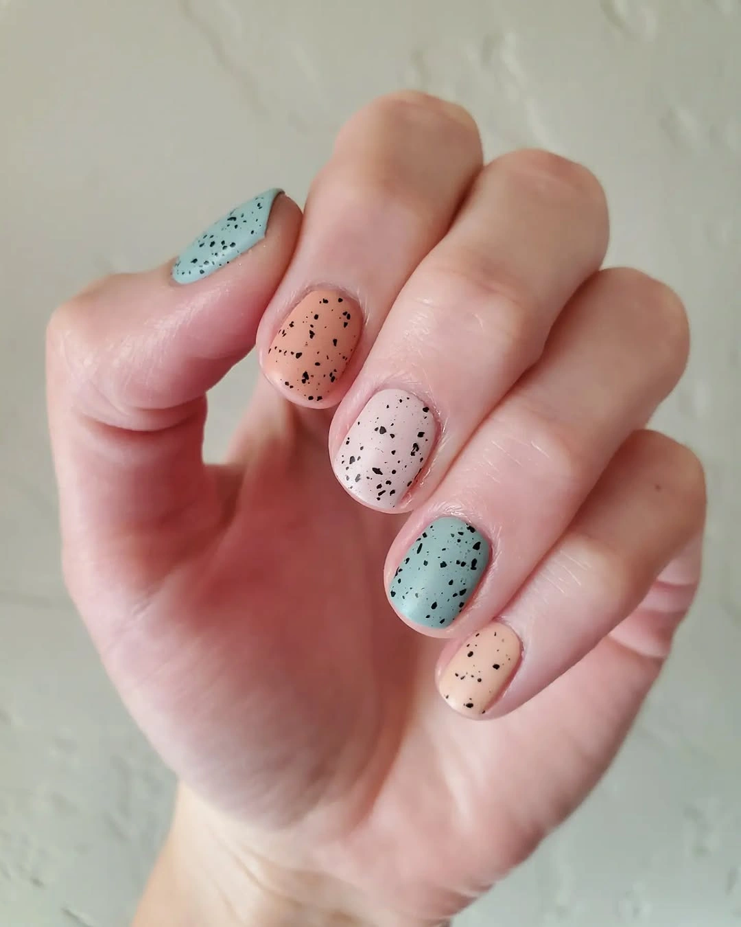
If you prefer less variation, keep two of the pastels and let the third appear on one accent finger. On a very short nail, use fewer speckles and leave more space between them so the surface does not look dusty or crowded. A cooler aqua will feel fresher, while a warmer peach will make the set more autumnal. The limitation is scale, since tiny marks can disappear or merge when the base is too small.
The palette sits easily beside cream, denim, soft gray, and warm knitwear because none of the colors is aggressively dark. You can also replace one pastel with muted sage or dusty rose while keeping the repeated speckle as the connecting element. The manicure finishes on a useful principle: when several colors share one small detail and one compact shape, the set can feel varied without losing visual order.