A square edge can make even a small color decision look more deliberate. The straight free edge turns a deep shade into a graphic block, gives a pale outline a crisp place to land, and makes shimmer feel more architectural than soft. That is why fall square nails can move from barely-there nude detail to saturated color without losing their point of view, as long as the finish and the scale of each accent are chosen with some discipline.
Start by deciding whether the edge should carry the drama or simply support it. A long square can hold a full-impact tone, while a short one often benefits from a narrow tip, a dark contour, or one concentrated sparkle-like nail. The color combinations in fall manicure colors are useful reference points, but the most flattering result comes from matching the density of the design to the width and length of the nail.
Dotted Tips on Soft Nude Squares
Pale nude squares are finished with white tips, small black dots, and fine dark curves that gather near the free edge. The contrast is sharp, yet the decoration stays light because the middle of each nail remains mostly open. That balance gives a familiar tip placement a playful graphic quality without turning the short square shape into a crowded surface.
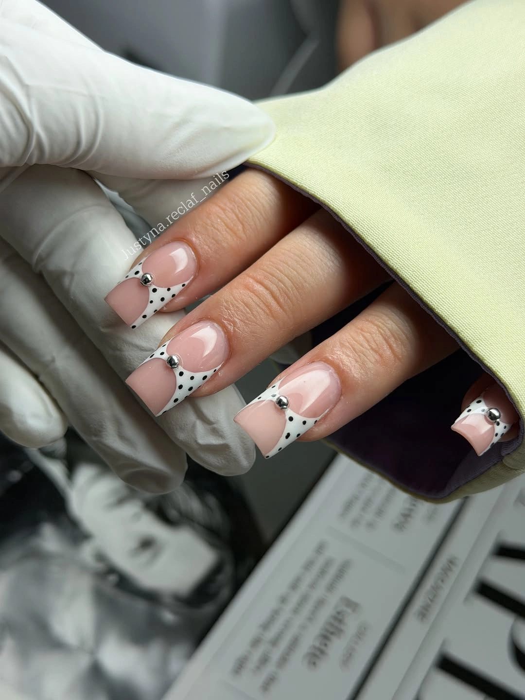
For a quieter version, use the dotted detail on only two nails and let the rest keep a clean pale tip. The dots need visible space between them; once they sit too close together, their polished rhythm disappears and they can look like accidental specks. A warm beige base would soften the black-and-white contrast, while a cooler nude would make the edge feel even crisper.
The charm here comes from the tip doing more than one job. It frames the square edge, carries the dots, and leaves the cuticle area calm enough for the design to grow out gracefully in visual terms. If the nail is very short, reduce the number of dots before reducing their size, since a few readable marks will look more intentional than a dense miniature pattern.
Olive Diagonals with Open Nude Space
Muted olive crosses these almond-leaning square nails on a diagonal, leaving broad nude sections visible beneath the glossy color. The diagonal direction prevents the olive from feeling like a heavy full cover, and its slanted boundary adds movement to an otherwise simple palette. It is an easy fall signal without relying on a literal seasonal motif or a bright accent color.
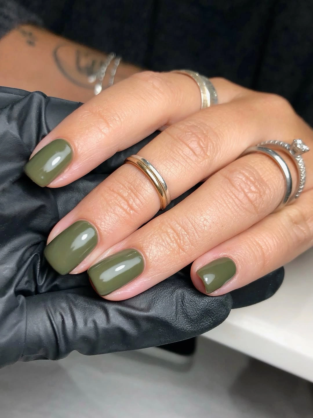
Someone who prefers a more understated manicure can place olive on the side of only one or two nails and keep the remaining squares in the same pale nude. That preserves the visual idea while making the color feel like a placed detail rather than a dominant block. The diagonal should stay generous and slightly uneven, because an overly precise central split can make a short square silhouette look rigid.
Olive works well here because the exposed nude gives it light and prevents the shade from reading too utilitarian. A darker forest green would bring more drama, but it would need even more open space to avoid swallowing the shape. The best adjustment is not necessarily another color; it is deciding how far the green travels before the nude field takes over again.
Lavender Sparkle on Long Straight Edges
Lavender-gray covers these long square nails with a fine reflective-looking surface that catches light across the broad, straight tips. The tone stays cool and polished rather than overly sweet because the shape has such a defined outline. A soft sparkle-like finish gives the color dimension, but the uniform coverage keeps the result from becoming a collection of competing accents.
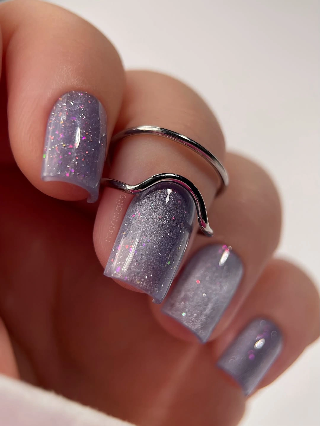
On a medium length, the same shade could be paired with a cream nail or a narrow pale tip if an all-over reflective surface feels too bright for daily wear. Keep the secondary detail simple, though, because the subtle light shift is already the main point. A high-gloss smooth surface will make the lavender appear clearer, while a less reflective treatment would make the color read more muted and smoky.
The straight shape is what gives this finish its calm glamour. Rounded nails would make the lavender feel softer and more romantic, whereas the square edge gives it a slightly sharper editorial finish. If fingerprints or surface marks are a concern, a quieter lilac with fewer light-catching particles would be easier visually, but it would not have the same luminous presence.
Dark Corners with Butter Yellow Accents
A sheer nude base is interrupted by dark brown-black marks and pale yellow touches placed at corners and tips of these square nails. The color contrast is unexpected, but the small scale keeps it polished instead of costume-like. Each corner becomes a focused detail, so the eye notices the square geometry before it notices the number of colors involved.
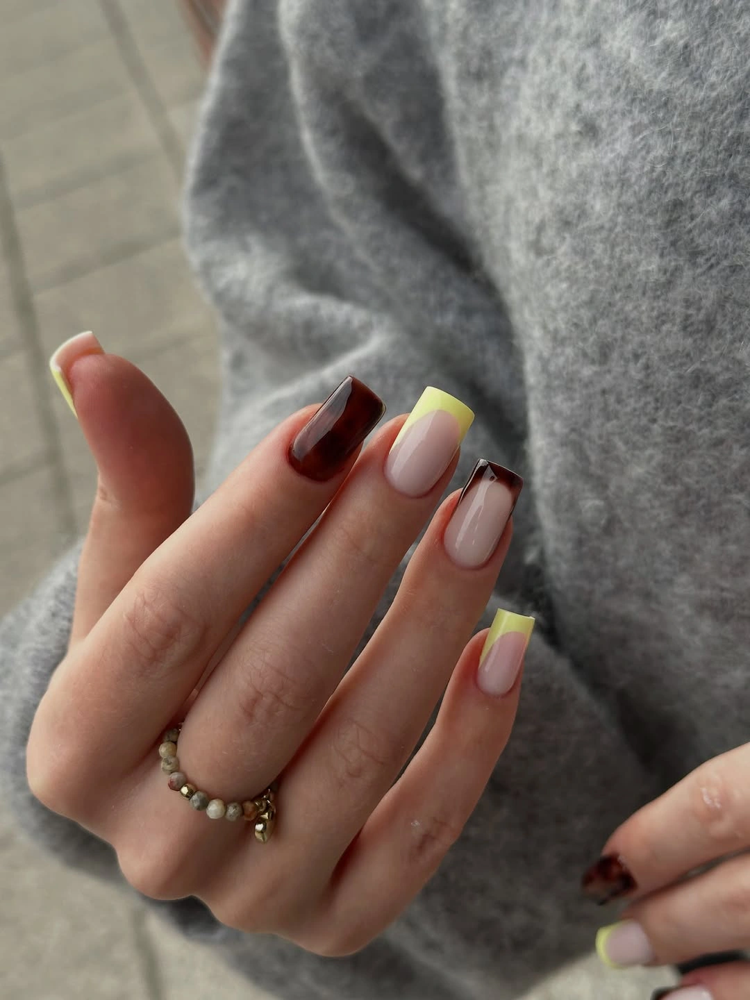
To make the palette more wearable, choose either the dark corner or the yellow accent as the repeating feature and let the other appear only once. That edit gives the design a clearer hierarchy and makes it easier to style with neutral clothing. On a shorter nail, pull the color in from the extreme edge slightly, because a thick full-corner block can make the square tip look visually wider.
The strongest quality is the tension between the light base and the deliberately placed dark pieces. A solid brown nail would make the yellow feel more ordinary, while the open nude area lets both shades remain distinct. Keep the yellow muted rather than neon if the goal is fall softness; its role here is to lift the dark marks, not to become the dominant color story.
Glossy Red with a Fine Pale Outline
Saturated red covers these long tapered squares, while a very slim pale curve traces close to the edge and gives the color a sharper finish. The red is bold enough to hold the entire surface, but the outline stops it from feeling like a single uninterrupted block. It reads glamorous because the detail is concentrated where the square tip needs definition, not scattered across every nail.
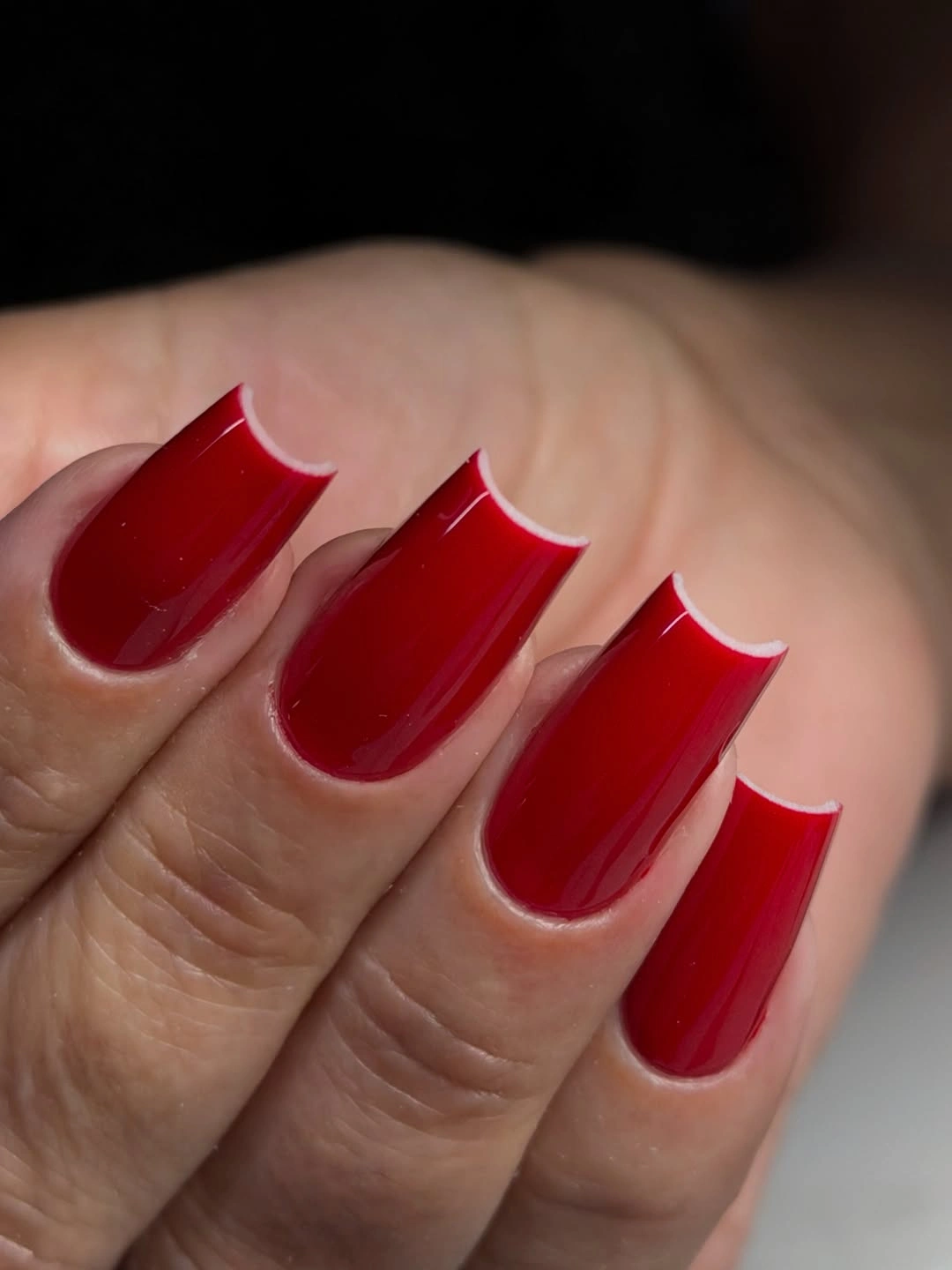
A shorter version can keep the red and simply move the pale curve closer to the free edge, making it more like a small visual highlight than a full secondary design. The line should remain narrow; once it becomes wide, it competes with the red instead of refining it. A brick or wine variation would soften the brightness while preserving the same elegant outline logic.
There is a reason the single color still feels full-impact. The long square shape supplies a large, uninterrupted field, and the tiny pale edge creates enough contrast to make the finish look considered. Adding glitter or an unrelated accent nail would dilute that concentration. Let the red remain the main statement and use the outline only as a controlled flash of light.
Black and White with Dense Dot Work
Long narrow squares mix deep black, pale nude, small dot patterns, and reflective-looking pieces in a deliberately high-contrast arrangement. The individual nails are different, yet the repeated black-and-light palette keeps them visually connected. This is a more decorated direction, but the limited colors prevent the layered details from drifting into a random assortment.
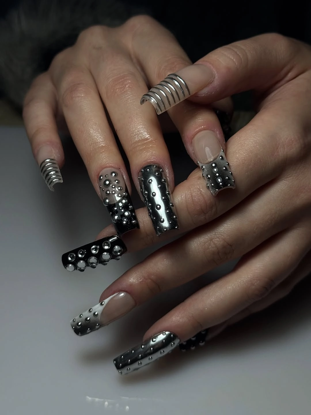
If the density feels like a little extra for everyday life, borrow the restraint of fall accent nail designs, keep the dot pattern on one nail per hand, and use black as the more frequent solid anchor. That will preserve the graphic energy without requiring every nail to carry a separate feature. The pale nude sections are important because they create a pause between dark panels; replacing them with another saturated shade would make the set much heavier.
High contrast is most effective when it is distributed with intent. Here, the black grounds the composition, the dots create texture, and the small reflective-looking elements bring brief flashes rather than a continuous shimmer. A wearer who likes the idea but not the maintenance of intricate details can choose larger dots and fewer placements, keeping the same bold rhythm at a more relaxed scale.
Mauve Squares with Fluid Dark Lines
Muted mauve and pink-lavender sit beneath thin dark wavy lines and rounded pale details on these medium square nails. The soft color tempers the black curves, while the lines soften the strict flat edge through their movement. The result feels polished without relying on a saturated palette, which makes it a strong option when a square shape needs a little visual flexibility.
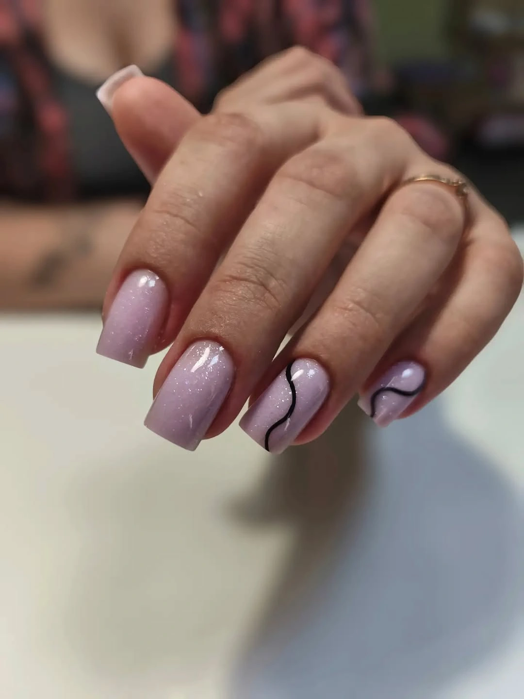
For a subtle interpretation, place one fluid line near the side of each nail and skip the extra pale details on most fingers. The design will still have movement, but the negative space will become more noticeable and easier to maintain visually. A dustier rose or warm beige could replace the mauve, provided the dark line remains fine enough to feel like an accent rather than a border.
The linework earns its place because it does not repeat mechanically from finger to finger. Some curves are longer, some sit nearer the tip, and that slight variation helps the square shape feel less static. Avoid adding a heavy French band at the same time, since two edge-focused ideas would compete. The open mauve surface needs room to make the fine lines look refined.
Graphic Panels Across Long Square Tips
Charcoal gray, pale yellow, lavender, and black are divided into panels, grids, dots, and slim lines across these long square nails. The angular mix has a design-studio quality, but the shared straight edge keeps the individual variations from feeling unrelated. Color is used in broad enough areas to be readable, while the smaller marks create a layered finish around the larger blocks.
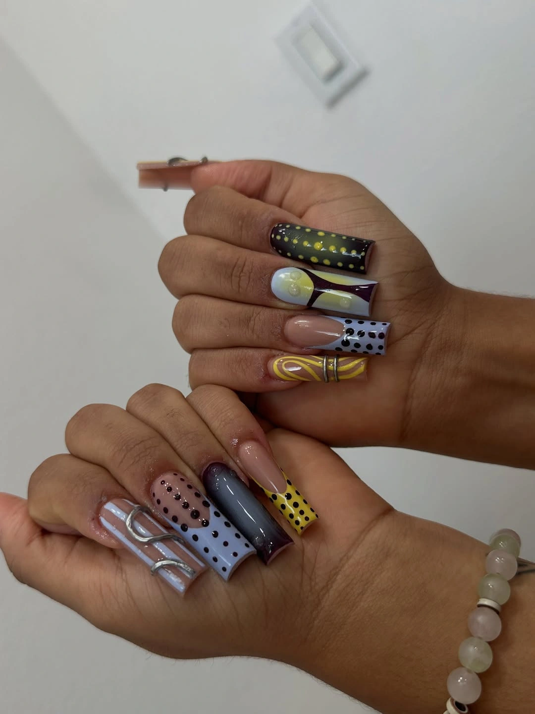
A calmer adaptation would select three of the colors and repeat one panel treatment on two nails, leaving the others mostly solid. That approach turns the concept into a coordinated palette rather than a full graphic suite. Shorter squares need fewer grid lines and larger blocks; tiny panels can lose their clarity once the free edge has less room to support them.
This design is strongest when the eye can rest on one dark or muted nail between the patterned ones. The charcoal and lavender do that job well, allowing the pale yellow to appear as a lift rather than a constant bright note. If you add a metallic-looking accent, reserve it for one small line or dot. The clean panel logic is more compelling than a surface covered with every possible finish.
Pink-Purple Swirls with a Soft Finish
Pink and purple blend across these square nails with pale curved shapes and darker swirling accents that sit mainly around the tips. The colors have enough depth to catch attention, but the softened edges keep the design from looking overly rigid on the straight silhouette. It feels expressive because the swirls move through the color rather than simply sitting on top of a flat base.
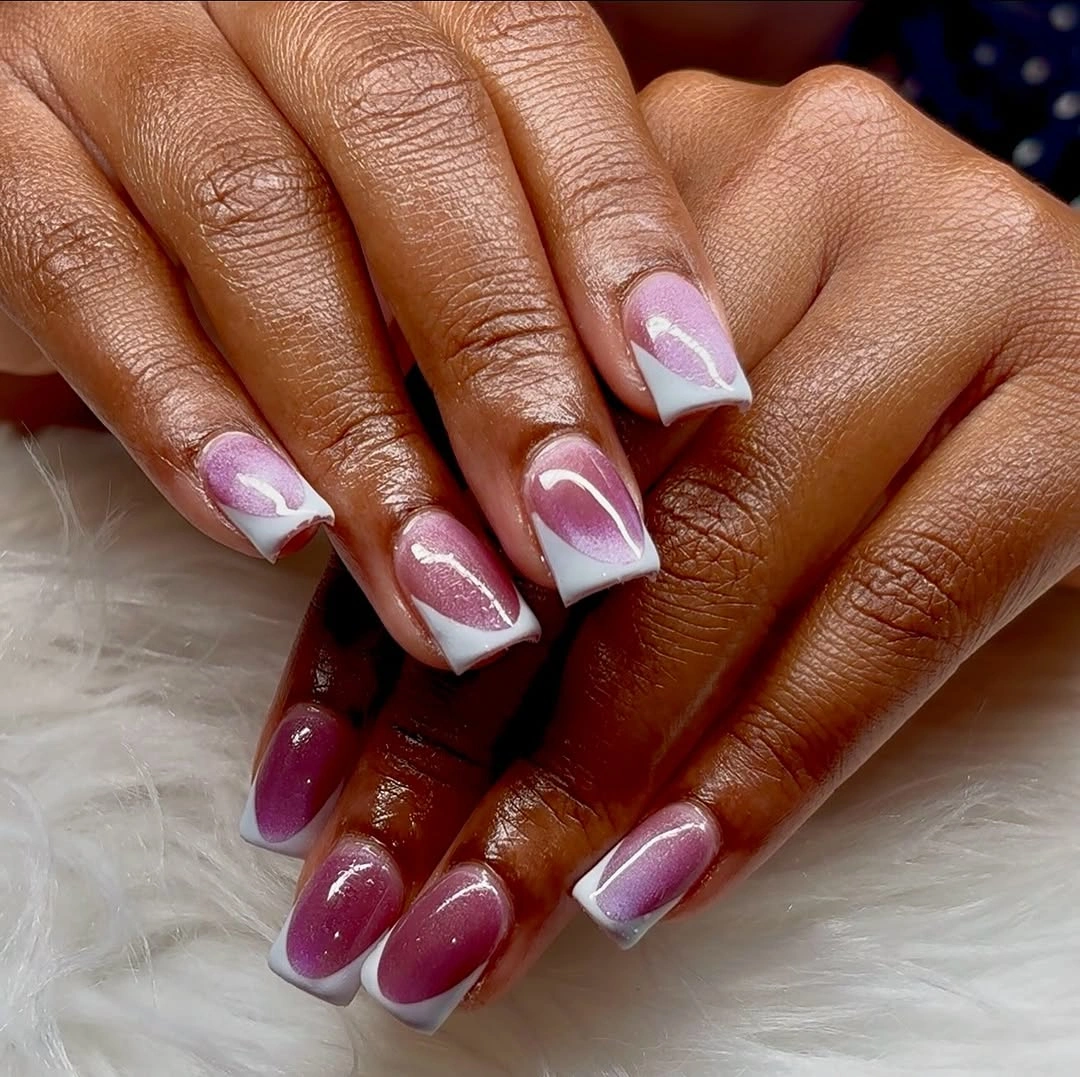
For a pared-back result, let one purple sweep cross each ring finger and keep the other nails in a muted pink that relates to the base. That preserves the color dialogue while giving the hand more visual quiet. The white or pale curves should remain light and sparse, because too many outlines would make the swirls look illustrated instead of softly integrated into the palette.
What gives the set polish is the difference in scale between the larger purple movement and the smaller pale interruptions. If every mark were the same width, the square tips would look segmented rather than fluid. The color combination can shift toward plum and dusty rose for a deeper fall mood, but keeping one light curve is useful because it stops the darker tones from closing in on the shape.
Dark Neutrals Framed by Black Contours
Deep charcoal-black, taupe brown, and pale neutral sections are brought together by dark outlines that define their edges on these medium nails. The palette is restrained, yet the contouring keeps the color changes from disappearing into one another. It is an example of glamour through contrast and placement rather than sparkle, with the black acting as a precise framing device.
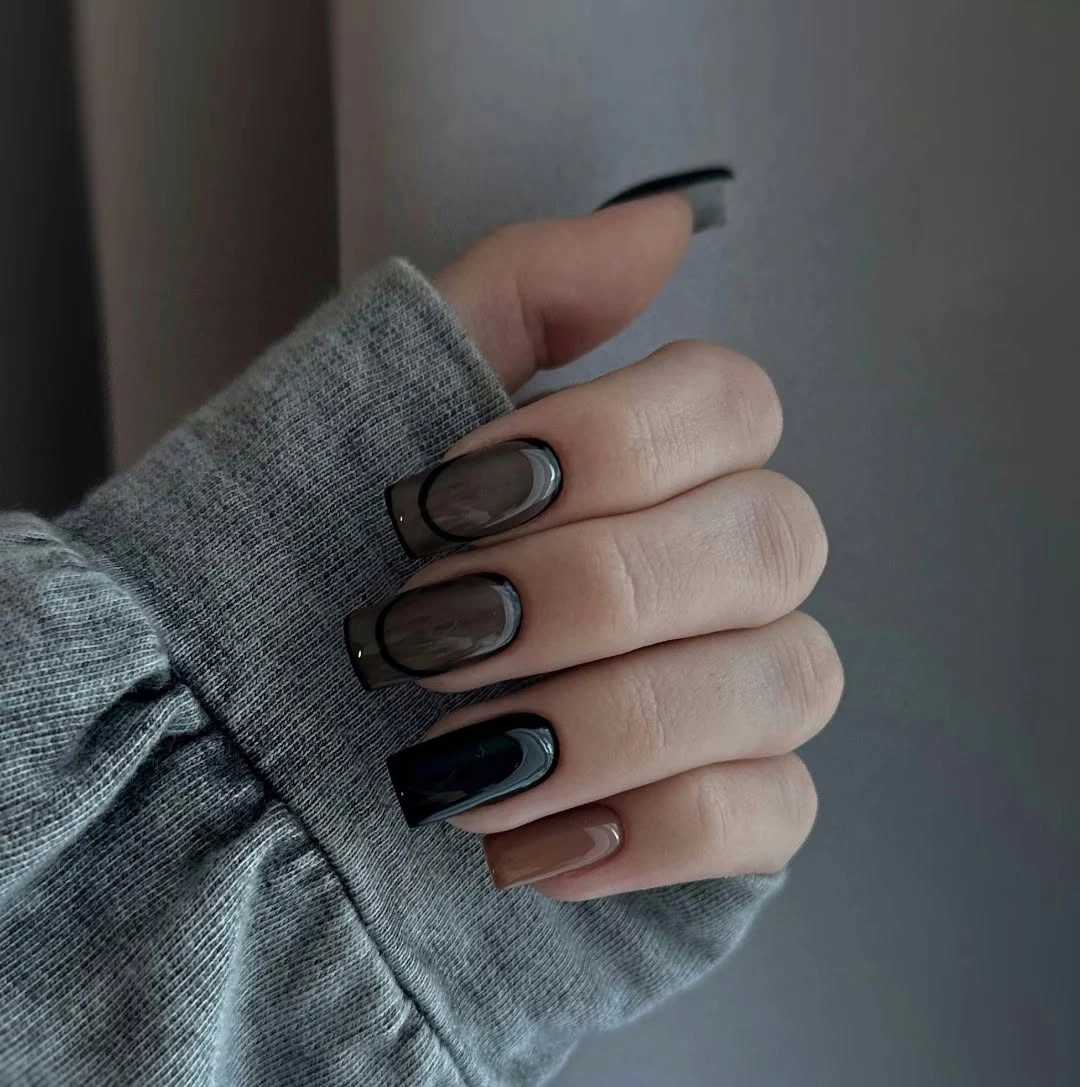
To make the idea more low-key, use taupe as the dominant color and add a black contour only on two nails, with a pale section as an occasional break. That distribution keeps the neutral family cohesive while avoiding a heavy all-dark appearance. A warm brown contour would make the set softer, but it would not have the same clean separation that the black line creates against the lighter areas.
The visible outline is the detail that makes these shades feel intentional. Without it, the charcoal and taupe might look like unrelated solid nails, especially when viewed quickly. With it, the colors read as parts of one graphic composition. The tradeoff is precision: an uneven dark boundary will be more obvious on a pale neutral ground than it would be inside a dense pattern.
Violet Borders Around a Creamy Center
Light creamy centers are edged with violet-purple shading along the outer perimeter of these long square nails. The placement gives the color an atmospheric quality, almost like a soft frame around the open middle, instead of treating purple as full coverage. That border effect makes the straight tips appear even more defined while keeping the overall surface noticeably light.
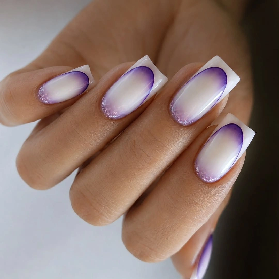
For a shorter square, focus the violet near the corners and tip rather than trying to wrap the entire nail with color. The open center is what gives the design its lift, so shrinking it too much would remove the most appealing contrast. A deeper plum border would turn the look more dramatic, while a muted mauve would make it feel softer and easier to pair with neutral clothing.
The frame works because it is not perfectly hard-edged. A strict dark French line would create a very different, more graphic effect, whereas the visible violet shading keeps the look luminous. If you prefer a more wearable version, leave the lower third of the nail almost nude and concentrate the color toward the free edge. That small adjustment makes visual grow-out less disruptive without changing the core idea.
Soft Lilac with Light-Catching White Tips
Soft lilac fills these short square nails, and curved white reflective-looking tips add a bright lift across the flat edges. The palette is delicate, but the square silhouette stops it from becoming overly sweet or delicate in a vague way. The white tip is not a full straight band; its rounded placement gives the compact nails a more fluid finish.
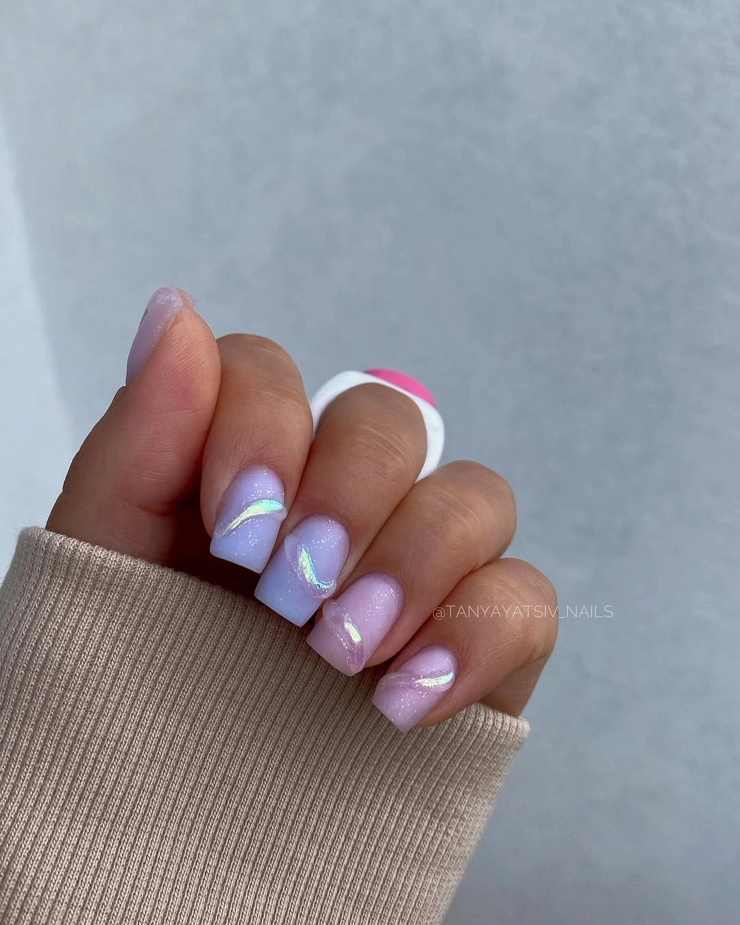
To keep the look practical, use the white accent only on the two most visible nails and let the rest remain lilac with a simple glossy surface. That brings attention to the shape without repeating the same bright curve too many times. A dusty lavender base would add more fall depth, while a pale gray-lilac would make the white tips feel cleaner and more minimal.
The appeal lies in the way the tip catches light against a calm color rather than in the number of decorative elements. Small squares can handle a little shine well, but a heavy glitter-like coating across every nail would erase the subtle curve. Keep the white accent smooth and intentional, then let the lilac serve as the soft backdrop that gives the edge its gentle contrast.
Espresso Coffin Nails with Linear Light
Rich brown and near-black tones cover these long coffin-shaped nails, with slim pale vertical and arched highlights set into the dark surface. The lines lengthen the already extended silhouette, giving the deep color a more structured, almost architectural presence. Rather than breaking the mood, the narrow light marks make the dark palette feel more polished and considered.
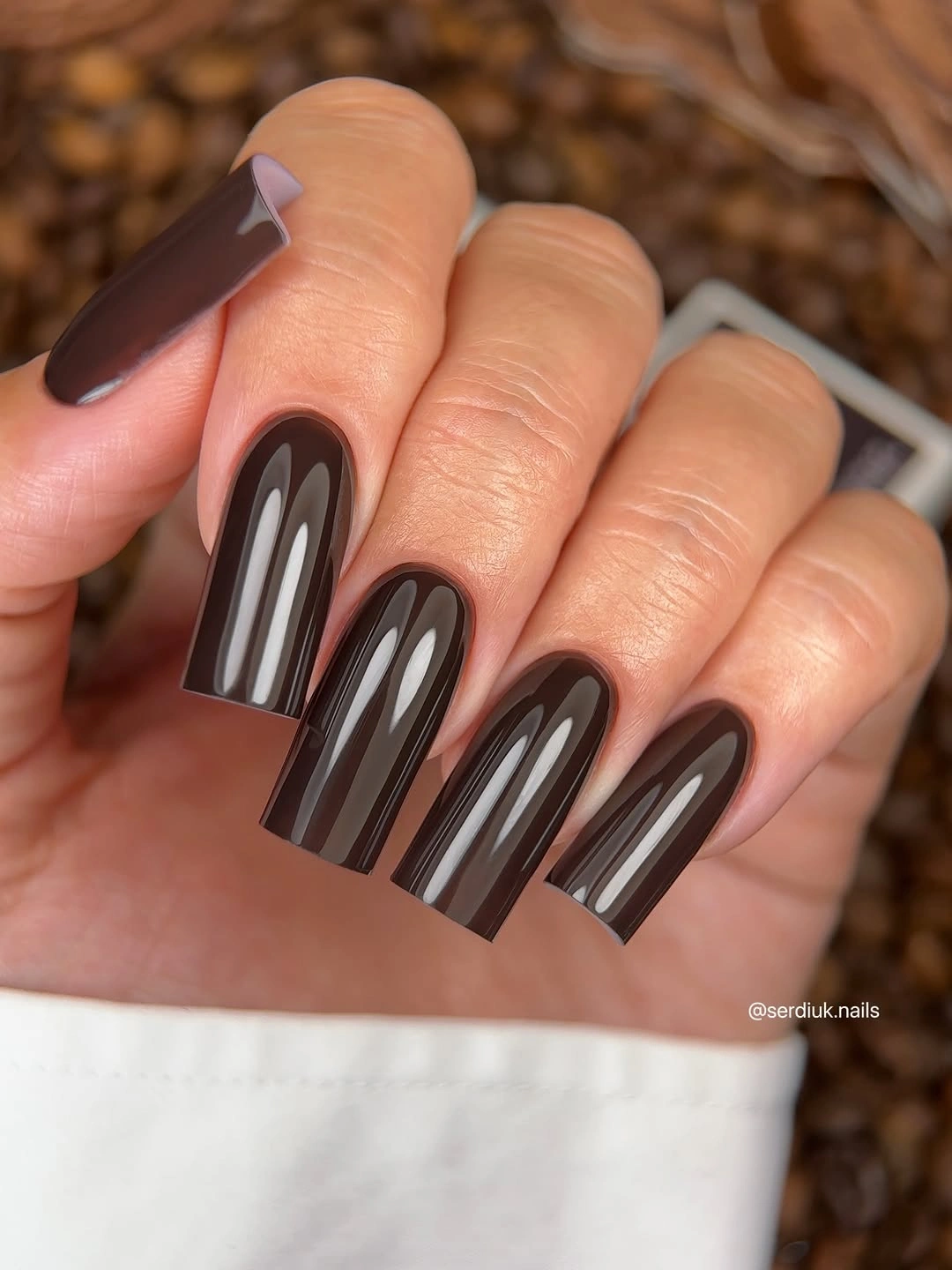
A medium square version could use one thin center line on two nails and keep the remaining fingers in plain espresso brown. That preserves the elongating effect without needing the full coffin length. The highlight should stay narrow and deliberate; a broad pale stripe would flatten the depth of the brown and make the design feel more like a color block than a refined line detail.
The drama here comes from dark space first, then light as a measured interruption. It would be tempting to add gold-toned flecks or a glittered accent, but that would change the restrained rhythm that makes the lines powerful. When the base is this saturated, one clean highlight can deliver more impact than several additional details competing for the same narrow surface.
Pure Chocolate Gloss on Compact Squares
Deep chocolate brown covers these medium square nails in one even glossy shade, allowing the color and tidy edge to speak without an accent pattern. The richness feels distinctly fall-ready, but the compact length prevents it from becoming overly dramatic. A smooth, uniform finish gives the dark brown a refined visual depth that is harder to achieve with several competing decorative choices.
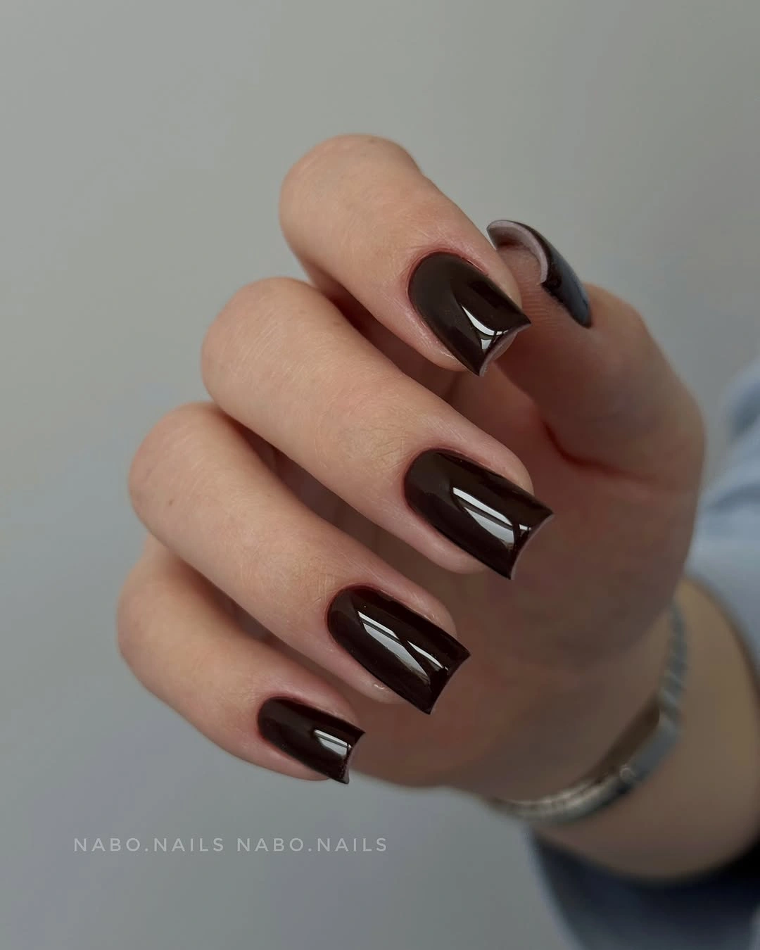
If a full dark set feels too strong, leave two nails in a warm beige and keep the chocolate on the thumb, index, and ring finger. That edit preserves the depth while creating a softer transition beside lighter clothes and jewelry. The square edge should remain clean and not too wide, because a very broad tip can make an opaque dark shade appear heavier than it does here.
There is real glamour in a color that does not ask for help. The glossy brown is polished because it is uninterrupted, and the lack of a focal nail makes the hand look coherent from every angle. The main visual limitation is that any uneven cuticle line becomes more noticeable against such a solid shade, so the simplest version benefits from especially careful, even placement near the base.
Vivid Fuchsia Across Long Straight Tips
Bright fuchsia-purple gives these long square nails a vivid, uninterrupted color payoff that feels immediately confident. The straight tips make the shade look graphic rather than floral, and the glossy surface turns the whole hand into a clean block of saturated color. It is the sort of choice that needs no layered art because the hue and length already create a strong visual event.
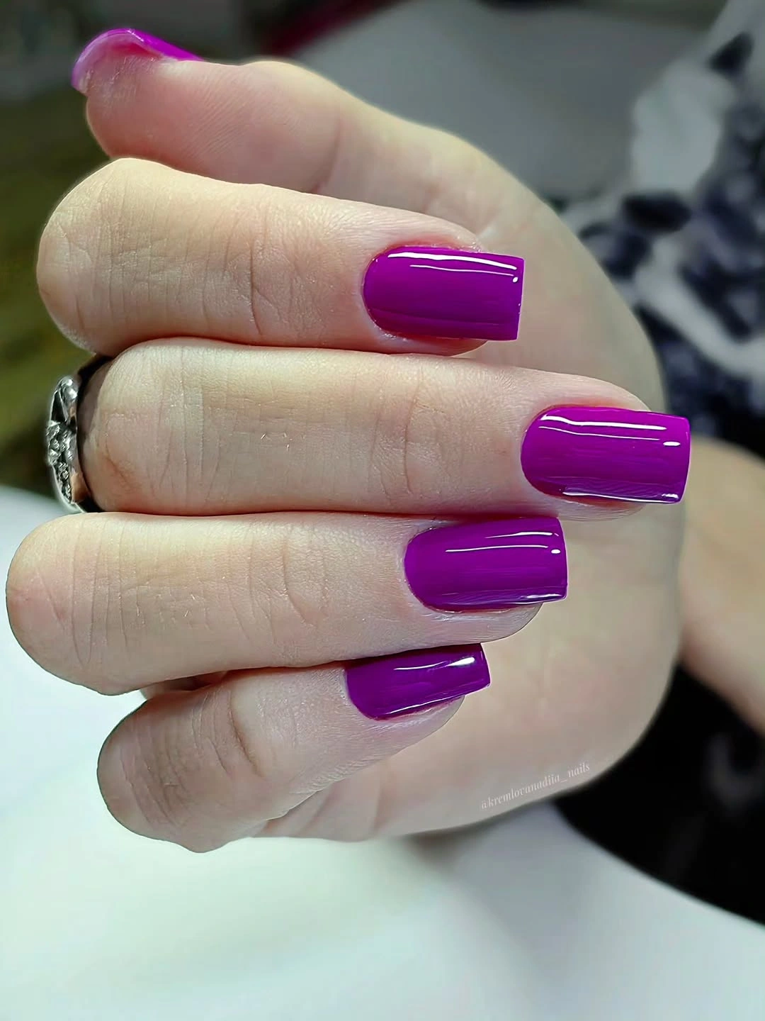
A softer way to wear the color is to choose a shorter square and reserve fuchsia for a narrow French band over a nude base. That keeps the energetic tone while reducing the amount of saturation near the cuticle. If the full-color approach is the goal, keep every nail in the same finish; mixing sparkle-like and cream surfaces would make the statement feel less focused than the clear gloss visible here.
The best feature is the lack of hesitation. Fuchsia does not need a black outline, a contrasting stone, or a patterned accent to establish its place on a long square silhouette. If the shade feels too bright beside your usual fall neutrals, shift toward magenta with a little more plum. The result will still feel expressive, but it will sit closer to burgundy and brown wardrobe pieces.
Silver Texture on Short Square Nails
Dense silver reflective-looking texture covers these short square nails from edge to edge, giving a compact shape a bright, light-catching surface. The finish is glamorous, yet the modest length keeps it from reading as too formal or overly dramatic. Because every nail carries the same texture, the set feels unified rather than like one isolated sparkle accent added to an unrelated palette.
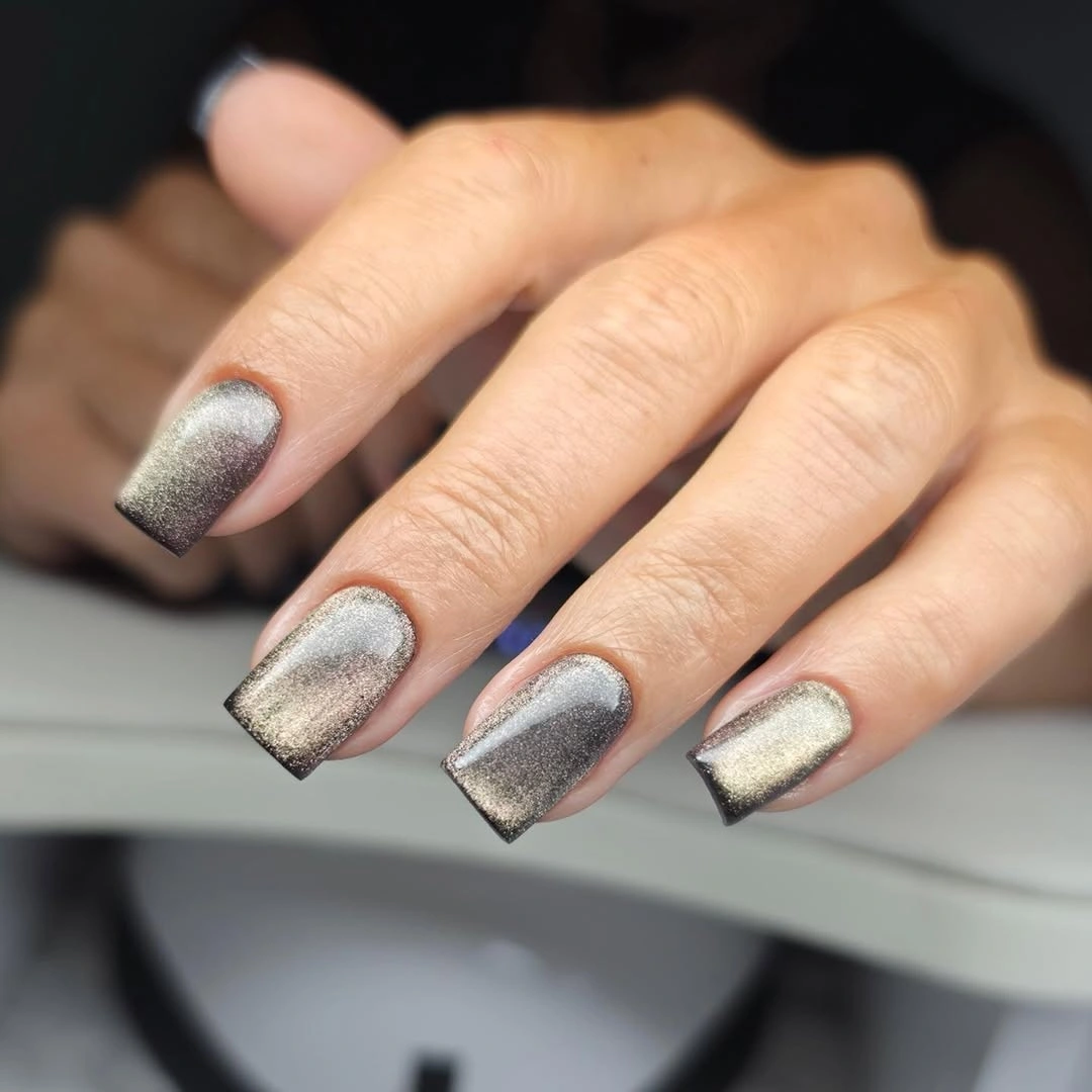
For a calmer take, use the silver-like finish on one or two nails and pair it with a cool gray or pale mushroom neutral on the others. That preserves the light effect while making the set easier to wear with daytime outfits. A shorter nail is helpful here because it limits the area of reflection; on long squares, the same all-over texture would feel much more assertive.
The light is the focal point, so surface order matters more than additional ornament. Adding bold black lines or a saturated color on top would interrupt the uniform shimmer and make the design visually busier than it needs to be. Let the straight edge remain visible beneath the reflective surface, and the finish will look polished rather than like a general layer of sparkle applied without direction.
Muted Color Curves with Gold-Toned Punctuation
Gray-mauve, soft blue, and warm orange move through these medium squares in curved fields, with small gold-toned dots or accents adding concentrated flashes. The palette is varied but not loud because every color is slightly softened, and the tiny warm details are used like punctuation rather than a second full pattern. That restraint keeps the result expressive without losing the clean geometry of the square tips.
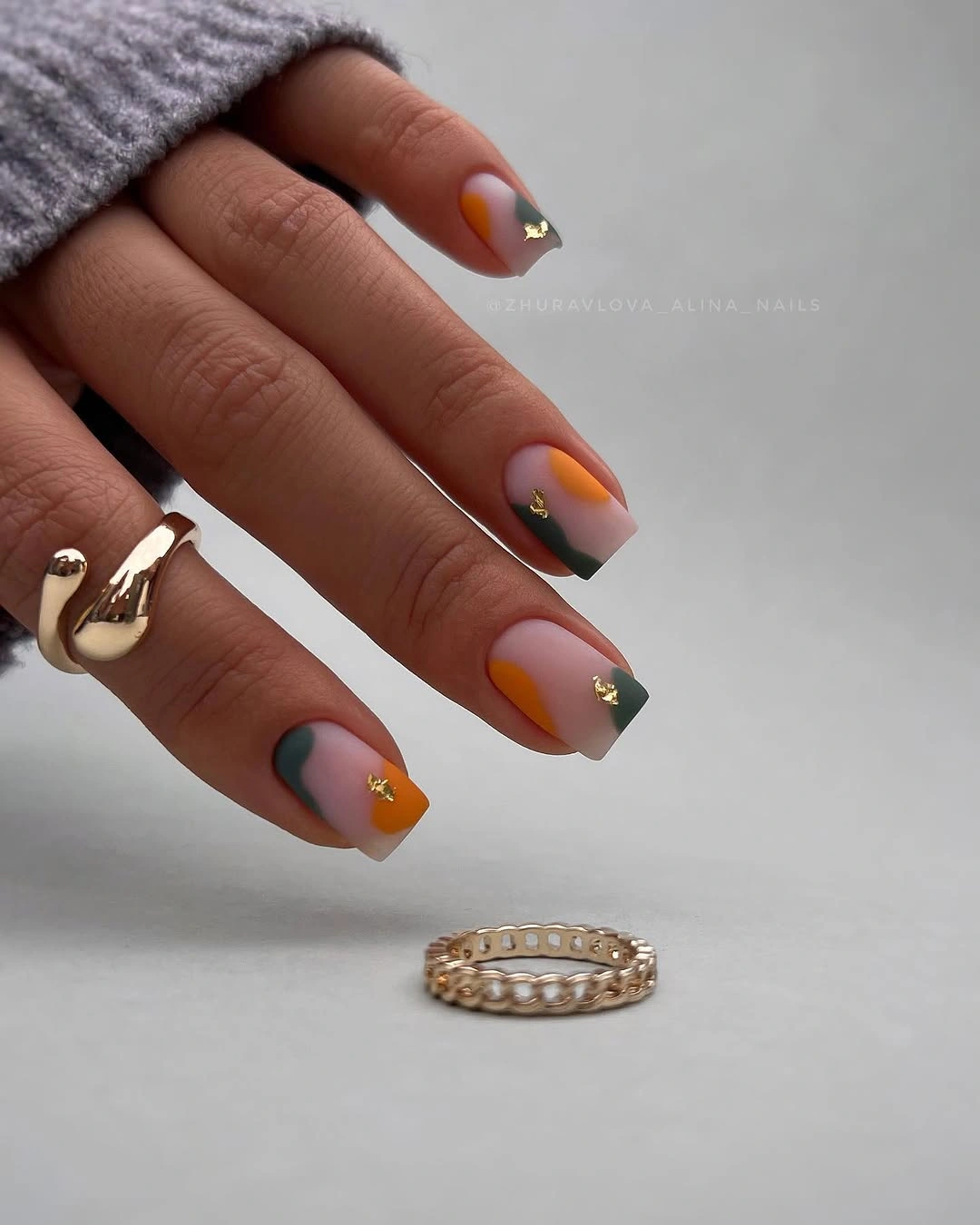
To refine the idea for daily wear, choose one cool shade and one warm shade, then place the gold-toned detail on only a single nail per hand. The colors will still feel layered, but the eye will have a clearer route through the design. On a shorter square, make the orange curve a narrow side accent so it brightens the palette without taking over the broad tip.
The small warm accents work because they are surrounded by muted color rather than competing with another bright element. A larger gold-toned block would quickly become the focal point and could make the blue and mauve feel incidental. Keep the dots or tiny marks sparse, and the color curves remain the main conversation while the warm flash gives the design a polished finishing note.
Creamy Yellow on Elongated Squares
Uniform creamy pale yellow covers these long square nails, giving the extended tips a warm, gentle presence that does not rely on nail art. The color sits somewhere between neutral and statement, which is why it works so well with the sharp geometry of the silhouette. Its glossy surface helps the pale tone look intentional rather than faded, especially across such a large uninterrupted area.
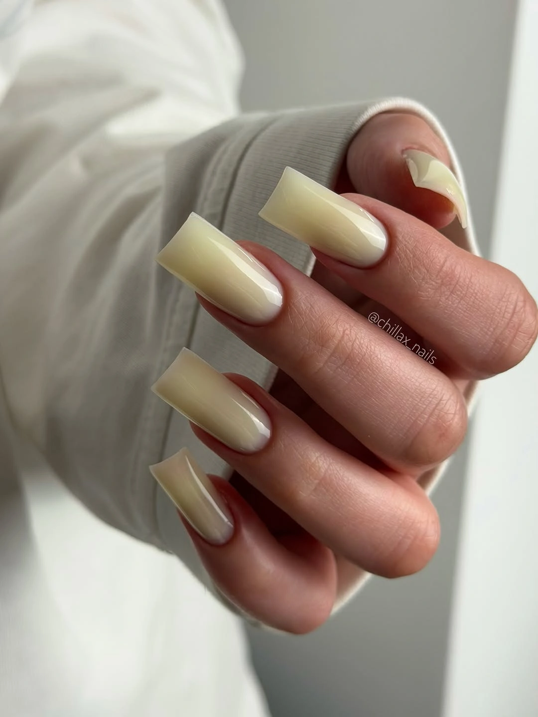
A medium-length version could use the same creamy yellow with one narrow ivory tip or a single muted brown accent to deepen the fall connection. Avoid adding several competing colors, though; the softness of the yellow is the reason the long square edge remains balanced. If the undertone leans too bright for your skin tone, move toward buttercream or a pale beige-yellow while keeping the same clean full coverage.
The most striking decision is how little is added to the color. A thin black contour would make it graphic, and gold-toned detail would make it more decorative, but neither is necessary for the warmth to register. The pale shade benefits from a glossy, even surface because uneven coverage would be more visible than it would be in a deeper brown or burgundy manicure.
Minimal Marks over a Neutral Square Base
Off-white, blush, black, and brown appear in sparse grids, tiny lines, and curved tip details across these medium square nails. Each mark has room around it, so the palette feels graphic without becoming dense or overly serious. The neutral colors are doing more than keeping the design wearable; they let the small line changes become the visible source of interest.
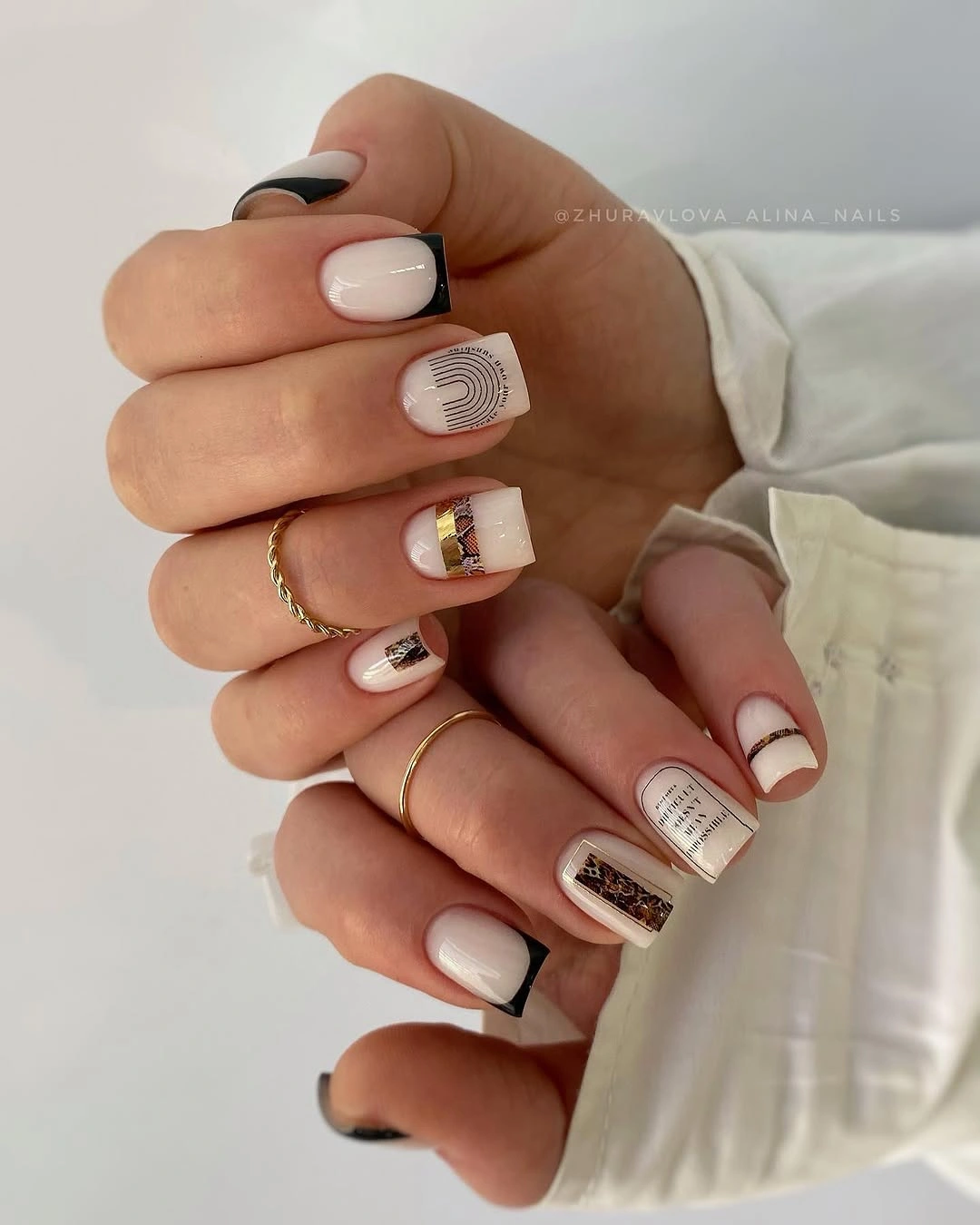
For an even simpler approach, use one black line on two nails and one warm brown mark on another, leaving the rest in a pale neutral. That layout has the same editorial energy but makes the individual details easier to notice, especially when adapting ideas from medium-length fall nail proportions. If you want a more decorative variation, choose one small grid or curve and repeat it at different angles rather than adding a new motif to every nail.
The square shape is a natural partner for this style because it turns a tiny line into an intentional graphic element. Still, open space is nonnegotiable; if the tips become crowded with marks, the calm balance disappears quickly. Let one color take the role of outline and one take the role of warm interruption. The remaining neutrals can then act as the quiet field that keeps the set polished.
Wine Burgundy on Short Rounded Nails
Deep wine-burgundy covers these short rounded nails in a glossy, even finish that feels rich without needing a contrast accent. The compact silhouette keeps the shade grounded, while the curved edge makes the dark color appear softer than it would on a sharp long square. It is a reminder that saturated fall color can feel quietly polished when the proportions are controlled.
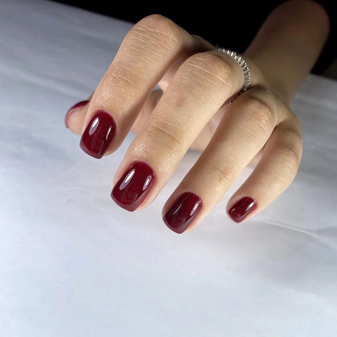
To translate the mood back to a square shape, keep the length short and soften the corners slightly so the dark burgundy does not look too blocky. A single nude or mauve accent could lighten the hand, but it is not required if the goal is a confident solid color. The glossy finish matters because it gives the wine tone visible depth; a flatter surface would make it feel more severe.
The visual appeal is in the uninterrupted color, which reads as deliberate and seasonal without any literal reference. A bright red would be more immediate, while this darker burgundy settles into the silhouette with less noise. The tradeoff is similar to any full opaque shade: the cuticle area becomes part of the design. Keeping that lower edge tidy is what lets the simplicity look refined rather than merely plain.
Teal and Dusty Pink with Gold Flecks
Deep teal, dusty pink, and pale sections alternate across these long square nails, with small gold-toned flecks and fine botanical-like details placed on selected fingers. The teal anchors the palette with depth, while the pink lightens the mood and gives the tiny warm accents a calmer background. It is decorative, but the colors stay organized because each has a distinct visual role.
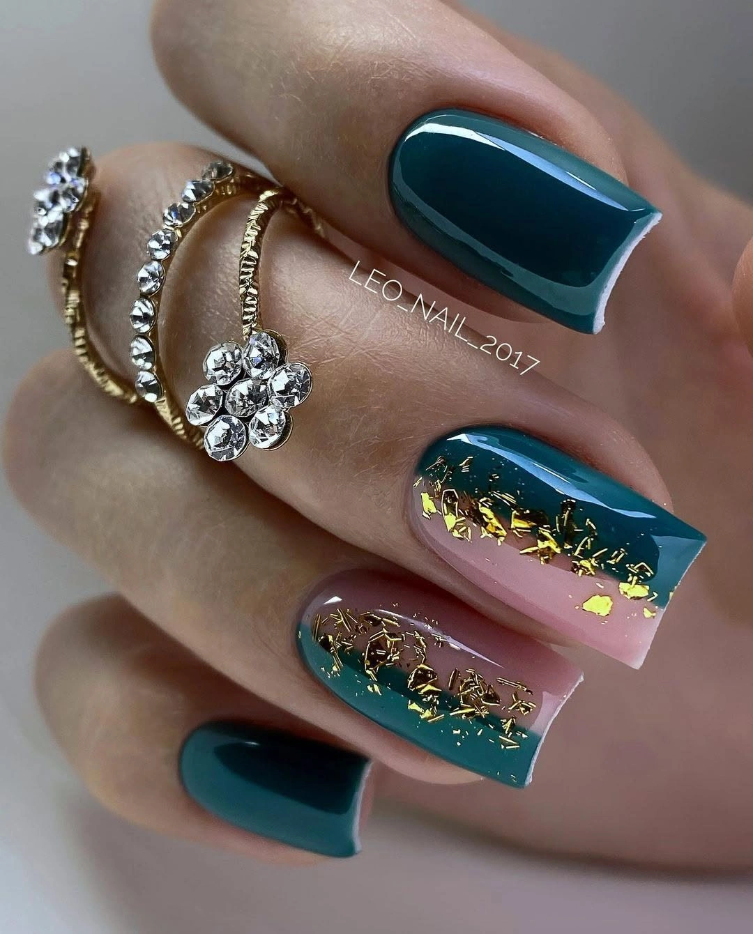
A more wearable edit would use teal as a solid on two nails, dusty pink on two, and reserve one pale nail for the flecks or fine detail. That reduction keeps the full color story while preventing the long squares from carrying too many focal points. The gold-toned marks need to remain small; broader reflective pieces could overtake the teal and shift the balance away from the elegant dark anchor.
The contrast succeeds because the pink is dusty rather than bright, which allows it to sit beside teal without looking sugary. If you want to move the set toward a cooler mood, replace the pink with a soft gray-lilac and keep the same gold-toned punctuation. The fine detailing should stay concentrated on one or two nails, where it can act as a highlight instead of becoming visual wallpaper.
Cobalt Blue with an Unbroken Gloss
Vivid cobalt blue covers these long square nails in a glossy, uninterrupted finish that makes the straight tips look even more graphic. The color has enough intensity to be its own focal point, so the absence of an accent design feels like a deliberate choice rather than a missing step. On a long square silhouette, blue becomes clean, modern, and noticeably more assertive than a softer pastel version.
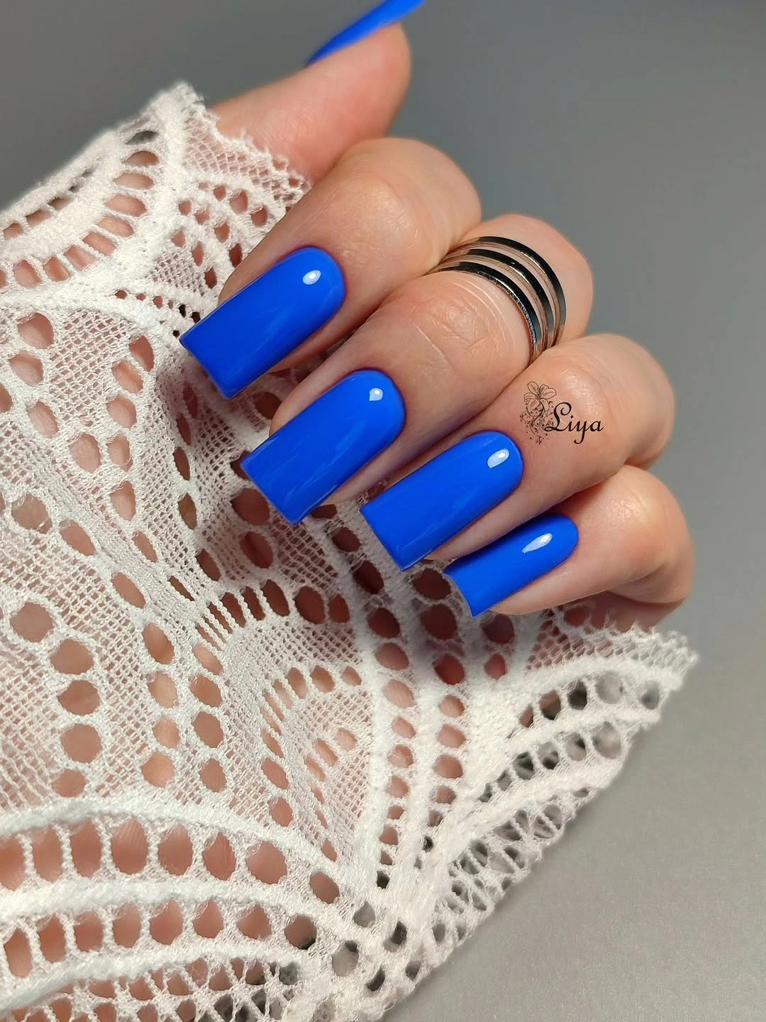
If cobalt is outside your usual comfort zone, use it as a narrow tip on nude squares or choose a medium length where less surface area carries the color. The important thing is to keep the blue clear and unbroken, because a busy pattern would compete with the strength of the shade. A slightly inkier navy would connect more easily to a fall wardrobe, while the bright cobalt keeps the look energetic and high-contrast.
Full color works here because the finish gives the blue depth as the hand moves. Tiny reflective accents or a single silver nail could be added, but they would change the focus from pure color payoff to mixed decoration. The better question is whether the square length suits the level of attention the color receives. If it does, nothing else is needed to make the manicure feel polished.
Fine Botanical Lines on Nude Squares
Fine black botanical-style lines travel over a pale nude-pink base on these medium square nails, giving the light surface a delicate drawn quality. The artwork stays readable because the background is mostly open, and the thin dark marks contrast cleanly with the square edges. It feels decorative without being dense, which is often the hardest balance to strike with linework on a flat tip.
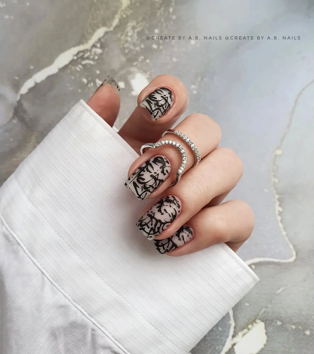
For a simplified version, choose one small botanical-like mark on each hand and leave the remaining nails in the same nude base. That will keep the idea graceful while lowering the density of visible detail. The line should be fine but not overly intricate; a larger simple leaf-like or floral-like curve often reads better at normal viewing distance than many tiny marks clustered together.
The nude base is the visual support system for the black drawing. A deep color beneath it would turn the lines into a stronger graphic statement, whereas the pale pink makes them feel more like a quiet accent. Be careful not to place every detail at the tip. Spreading a few marks slightly lower gives the square silhouette more balance and stops the free edge from looking weighed down.
Negative-Space Curves on Pale Pink Squares
Pale pink squares are shaped by slender dark brown-black curves and V-like negative-space sections that hover near the tips. The dark marks trace the edge without closing it off, so the short nails retain a lot of visible lightness. This is a clever way to use contrast on a compact square shape because the open gaps do as much work as the lines themselves.
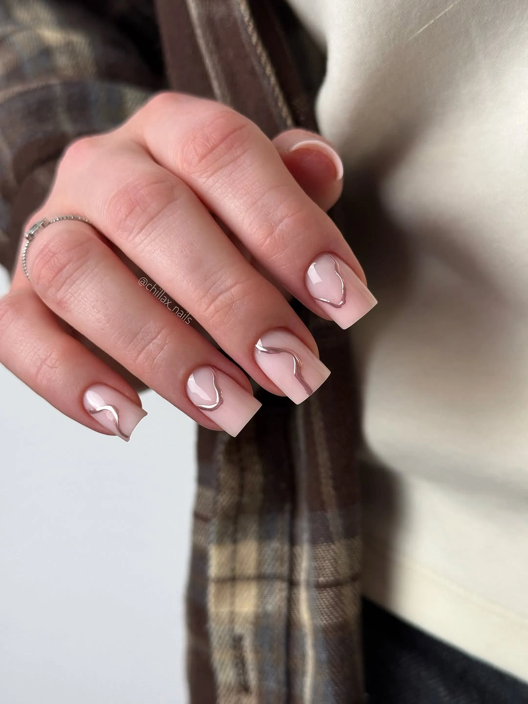
To make the effect more forgiving, keep the curves slightly away from the cuticle and repeat the same dark tone on only two or three nails. That gives the pale pink room to show through as the manicure grows and prevents the compact shape from looking overoutlined. A warm espresso line will feel softer than black, while a charcoal line will make the geometry a little cooler and sharper.
The negative space is what stops the dark color from becoming heavy. If the V-shaped forms were filled completely, the set would look more like a traditional dark French tip and lose the airy precision that makes it special. Keep the line thickness varied in small ways, and the design will feel more fluid. Uniformly thick borders can make short square nails look boxed in rather than intentionally framed.
Cream and Espresso with Irregular Accents
Creamy white and deep espresso brown are mixed across these long square nails with irregular spotted details and small gold-toned flecks on selected fingers. The dark-and-light contrast is strong, but it stays stylish because the more decorative pattern is confined instead of repeated everywhere. A few pale nails give the eye space to reset before the irregular accents appear again.
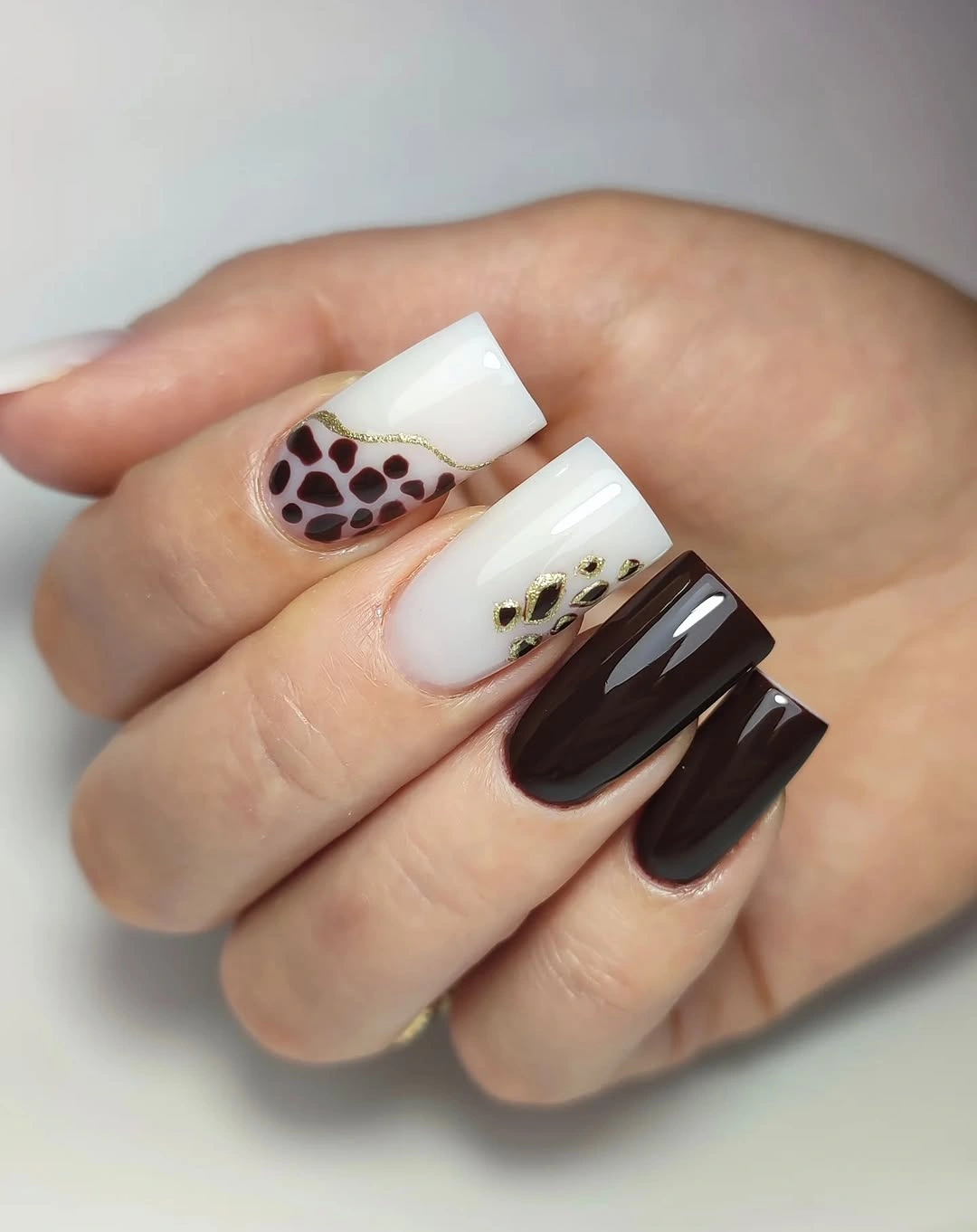
A more restrained translation would keep two nails in espresso brown, two in cream, and add the irregular spotted detail to only the ring finger. That structure maintains the full glamour of the palette while making the pattern feel like a deliberate focal point. The small gold-toned flecks should remain occasional; too many would compete with the high-contrast brown-and-white relationship that is already doing most of the work.
What makes the finish feel polished is the spacing between the darkest areas and the cream surfaces. The irregular marks have a place to stand out, while the solid nails keep the design from becoming visually restless. If the look needs to feel less dramatic, soften the espresso toward cocoa brown and make the spotted accent smaller. The square outline will still keep the palette graphic, but the contrast will become easier to wear.