Matte fall nails design 2026 does not have to rely on the same brown polish and one tiny leaf. The most convincing darker looks use finish, outline, and empty space as part of the color story, so a deep shade can stay readable instead of turning into one flat block. The site’s fall matte nails ideas show why that balance matters when you want a manicure to feel seasonal without looking like a costume.
A useful way to choose a dramatic manicure is to notice where the visual weight sits before choosing every detail. A dark tip, a sparse accent, or a muted solid can carry the mood on its own, while the rest of the nail gives the color room to breathe. Looking for that distribution makes it easier to adapt a long statement set into something that still works with your usual nail length.
Olive Edges on a Quiet Nude Base
Long square nails pair a soft nude center with opaque olive-green tips that are edged in a fine gold-toned line. The color sits at the far end rather than swallowing the whole length, which gives the muted green a polished after-dark energy without making the hand look heavy. It is a smart route for anyone who likes a fall matte nails design with a clear shape but little surface decoration.
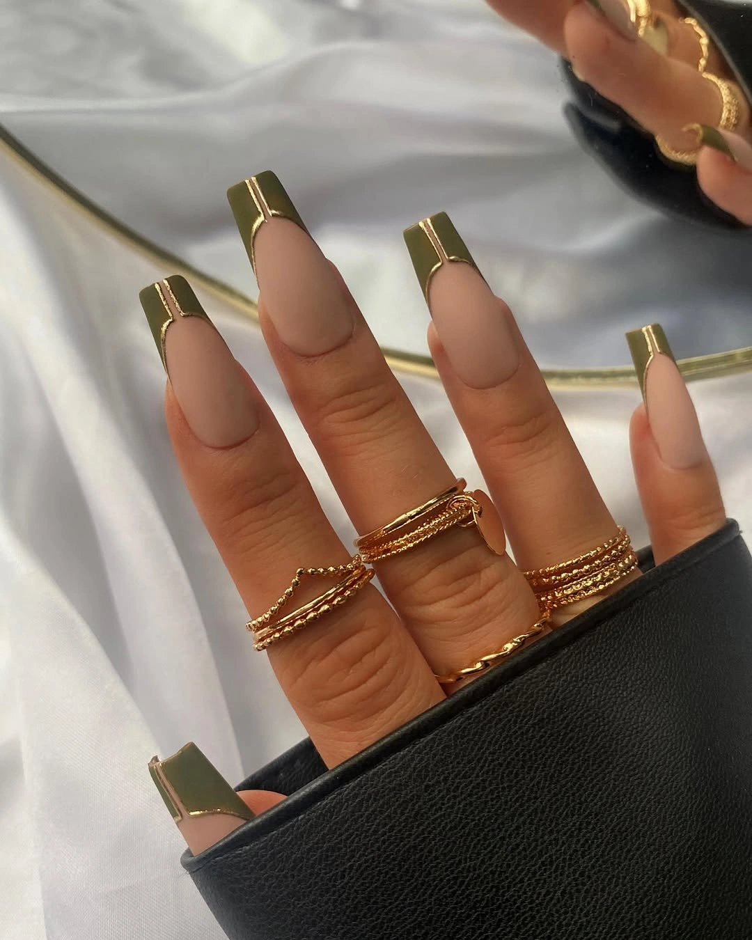
Because the green is concentrated in a narrow band, the squared silhouette remains the main event instead of disappearing under dark polish. A shorter version could keep the same idea by making the olive strip slimmer and skipping the metallic-looking edge on every nail. That adjustment keeps the design intentional when there is less length available for the contrast to show.
The clean border is also the detail most likely to reveal uneven growth first, especially against a pale base. Choosing an olive that is close to black in low light will make the look moodier, while a softer moss tone keeps it gentler with knitwear and neutral jewelry. Either choice works best when the tip depth stays consistent from nail to nail.
Fuchsia Curves Breaking Through Soft Nude
Medium almond nails use a pale nude ground with bright fuchsia swirls that curve across selected nails instead of covering each one. The vivid lines feel energetic because the background stays open, and the tapered almond shape gives every bend a graceful direction. Pink details like these can make matte fall nails designs feel less predictable without leaning on obvious seasonal symbols.
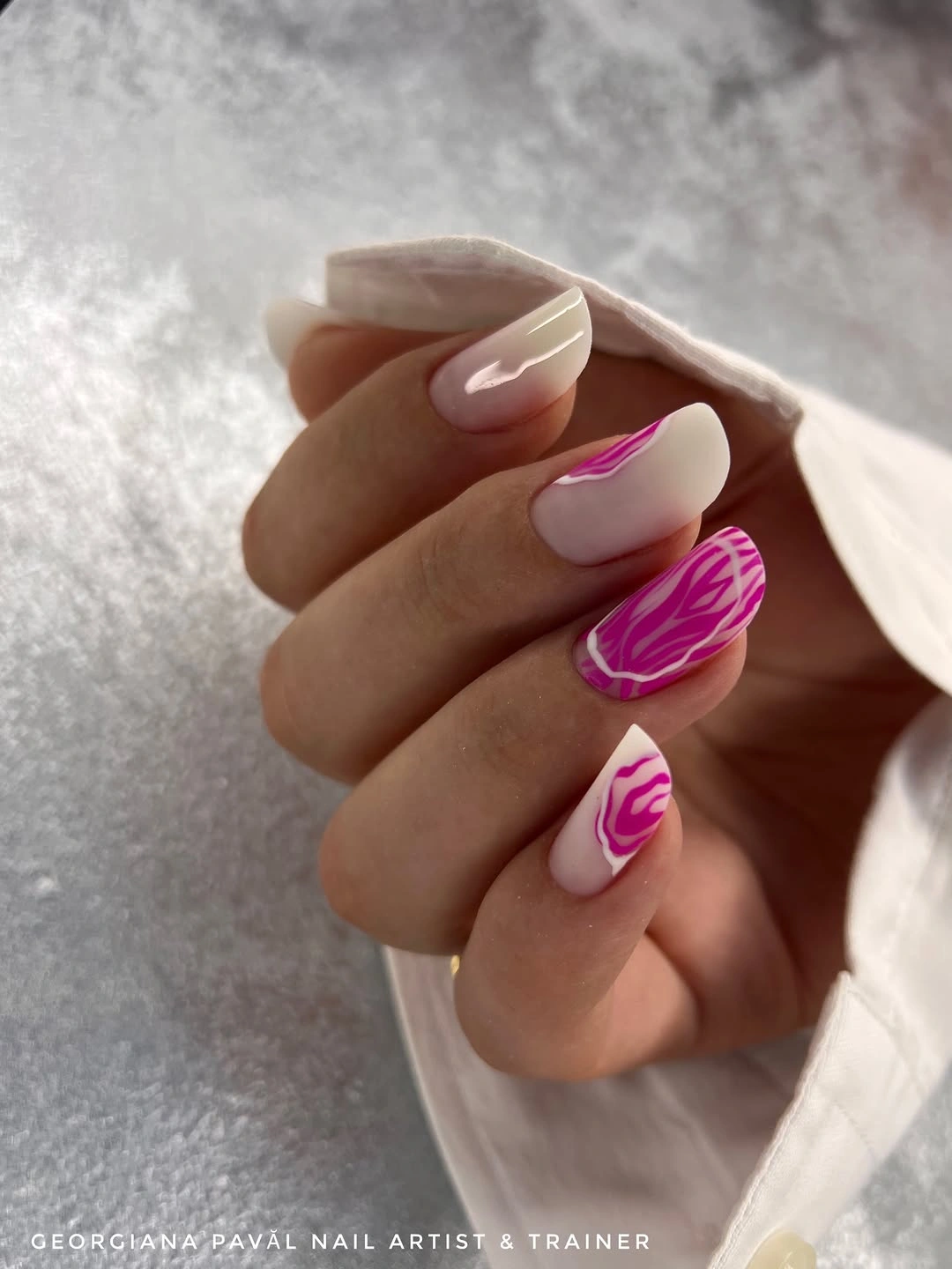
A similar idea works on short nails when the curved marks are limited to one or two broad strokes rather than several thin loops. Keeping the pink away from the cuticle creates a calmer focal point and avoids the cramped effect that can happen when high-saturation color is placed everywhere. The nude negative space is doing real visual work here, not just filling a gap.
Fuchsia brings more contrast than a berry shade, so it will read brighter against dark fall clothing rather than quietly blending in. If that feels too sharp, a muted raspberry can preserve the flowing movement with less intensity. The important part is the curve direction: varied enough to feel drawn by hand, yet not so tangled that the almond outline is lost.
Deep Green and Blush Botanical Contrast
Matte dark green and nearly black solids sit beside blush accent nails marked with fine black leaf-like branches and small gold-toned touches. That division gives the botanical detail a strong shadowy frame, while the lighter nails stop the palette from becoming a wall of darkness. The manicure feels grounded because every element has a separate role rather than competing for the same surface.
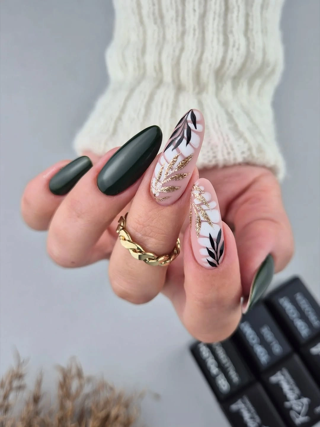
For a more wearable version, keep the leaf work on one accent nail per hand and repeat the deep green on the rest. The two dark solids already provide enough fall character, so multiplying the branches would dilute the strong contrast that makes the set recognizable. The site’s fall nails with accent nail guide is useful when choosing how much detail one finger should carry.
The pale accent nails create the highest-maintenance area visually, since a fine black line can look less crisp as it grows out. Choosing a blush base close to your preferred neutral will make that transition less noticeable than using a stark white. The gold-toned marks are best treated as a quiet glint, not a reason to add shine to every dark nail.
Muted Florals for a Short Matte Set
Short rounded-square nails combine matte mauve with small leafy green and muted purple floral-style accents. The compact length keeps the design close to the hand, which makes the tiny motifs feel like part of the color field rather than a large illustrated scene. This is one of the easiest ways to bring fall matte nail design ideas into a routine that favors shorter nails.
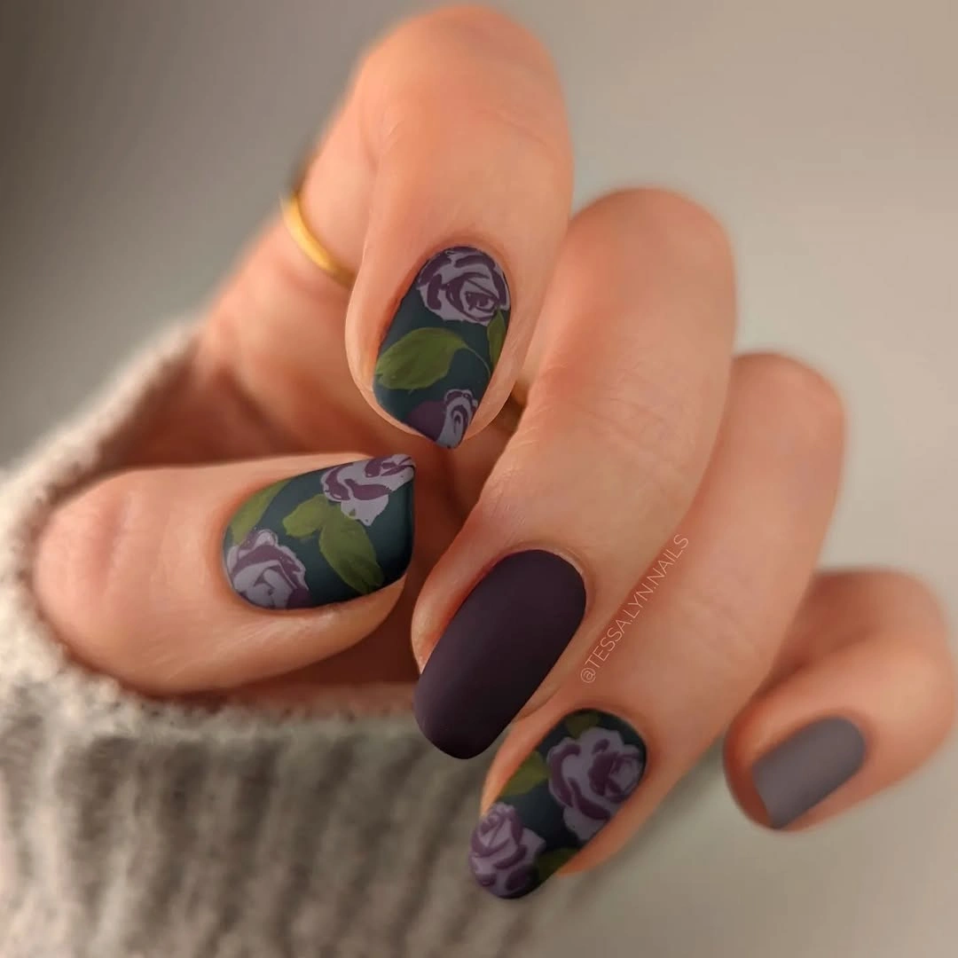
The detail is most successful because it appears in spaced pockets instead of forming one dense strip around every nail. Anyone adapting it can choose a single flower color and one leaf color, then leave at least two nails as plain mauve anchors. That restraint makes the pattern look considered even when the individual shapes are small.
Mauve has enough gray in it to calm the purple and green, so the set can sit comfortably beside soft brown, charcoal, or cream outfits. A very dark floral outline would push the mood more graphic, while a softer outline keeps the impression gentle. On a short shape, clarity of each small petal matters more than adding another motif.
Wine Lines Across a Deep Red Ground
Long pointed nails move through dark red and warm brown tones with translucent-looking curved lines layered over the surface. Those internal marks give the wine palette movement, especially where the color lightens toward a curve, but the base still reads as one coherent dark family. The result is dramatic without needing a separate accent color to create interest.
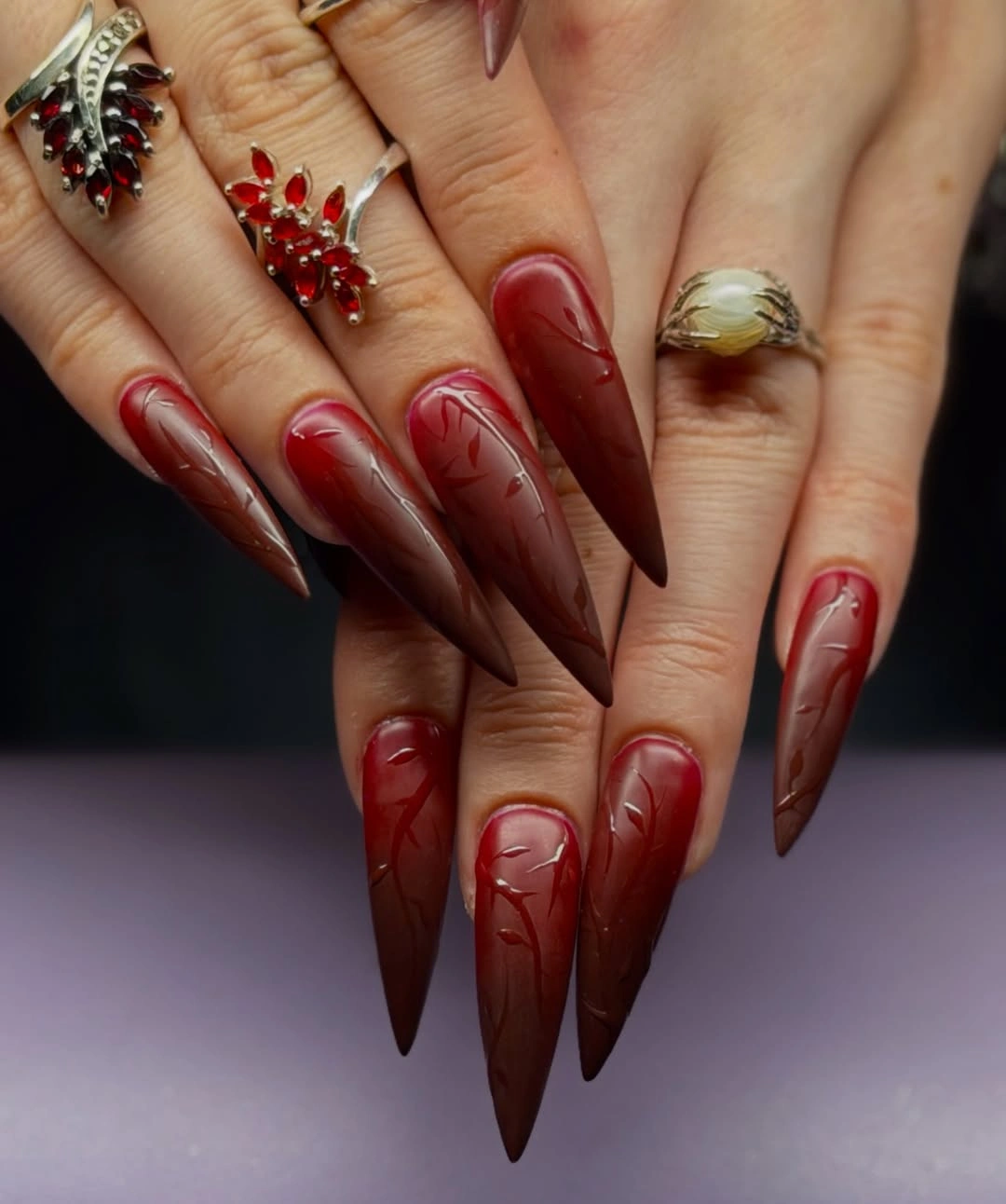
A smaller take could use the line work only on the middle and ring nails, leaving the rest a single dark red. That approach retains the flowing effect while making the set easier to read at a shorter length. It also gives the eye a resting place, which is useful whenever a rich color and a pointed silhouette are already doing a lot.
Fine curves over a deep base look best when their spacing changes naturally rather than repeating like stripes. Brown can soften the red direction, whereas a more purple wine will make the look cooler and sharper. Since the design relies on subtle tonal shifts, it may be less visible in low light than a high-contrast outline, and that is part of its appeal.
Violet Zebra Stripes with Matte Weight
Long purple pointed nails carry black wavy zebra-like stripes over a matte-looking surface, creating a strong graphic rhythm from cuticle to tip. The limited two-color palette keeps the pattern from becoming chaotic even though the stripes vary in width and bend. It is a bold option for dark fall nails designs matte fans who want a recognizable motif instead of a quiet color blend.
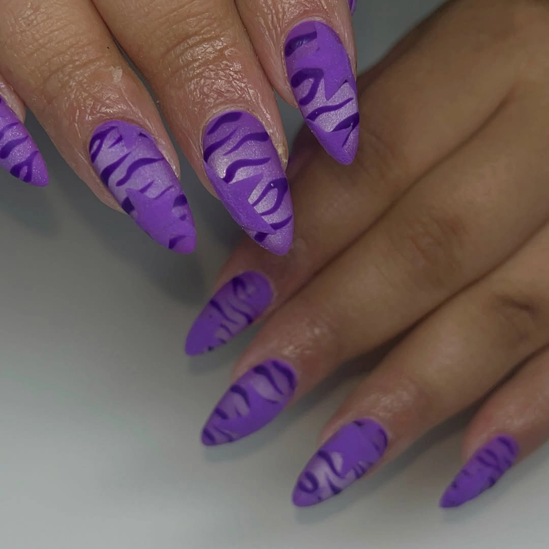
The easiest way to soften this on a practical length is to place the stripe pattern on two nails and let the remaining nails stay solid violet. Repeating the motif across every nail works because the current canvas is long and pointed; a shorter square could feel much busier with the same coverage. Keeping the black lines broad and few is more readable than trying to add many narrow ones.
Violet changes character quickly depending on the surrounding clothes, appearing more playful beside denim and more intense beside black. A muted eggplant base would make the black stripes less stark, while a brighter purple keeps their contrast immediate. The matte surface helps the graphic pattern look velvety rather than glossy, so adding glitter would weaken the clean visual message.
Tonal Pink Waves on a Matte Square
Medium square nails use hot pink with slightly darker flowing wave patterns, so the design reads as texture before it reads as a second color. The near-monochrome approach gives the bright base a sculptural quality and lets the squared tips stay visibly sharp. It proves that a matte finish can support a vivid palette when the decoration remains inside one color family.
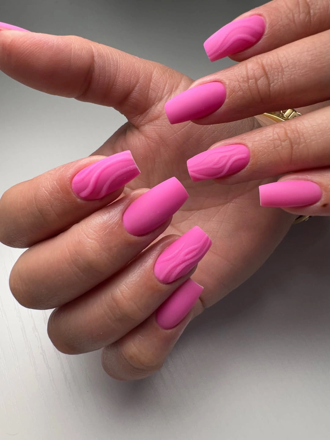
For someone who prefers a muted palette, the same tonal logic would work with dusty rose and berry or taupe and cocoa. The key is preserving enough separation between the two shades that the wave does not disappear completely under indoor light. One or two larger curves per nail will look more deliberate than a mass of narrow lines.
The squared outline makes the pattern feel modern and contained, while an almond shape would make it softer and more fluid. Strong pink is not automatically a summer-only choice when the finish is matte and the undertone leans berry instead of coral. Keeping accessories simple lets the textured surface remain the focal point rather than competing with rings or sleeves.
Speckles and Mustard on Short Neutrals
Short pale nails mix soft pink solids, scattered black speckles, and a mustard-yellow diagonal detail across the rounded-square shape. Each mark is small, but the set has enough contrast to feel playful because the yellow slice interrupts the otherwise quiet neutrals. The overall effect is closer to a tiny graphic composition than a full printed manicure.
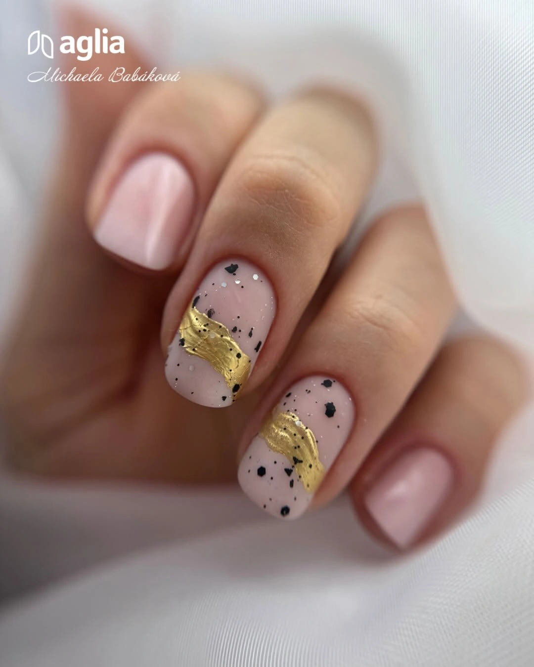
On short nails, a diagonal accent can add direction without taking away the practical feeling of the shape. The speckles should stay irregular and sparse, especially if the yellow is saturated, because too many dots would make the pale base look visually dirty instead of intentionally textured. One accent nail with the strongest color is often enough for an everyday adaptation.
Mustard is useful here because it connects easily to warm brown and olive clothing without requiring a full brown manicure. A creamier yellow would lower the contrast, while a darker ochre would bring more fall depth. The small black marks need a steady scale so they look like punctuation around the color rather than an accidental scattering.
Orange and Blue Flames Over Nude Coffins
Long nude coffin nails are outlined with bright blue and orange flame-like curves that rise around the tips. The two strong colors remain separated by the nude center, allowing the shape and the drawing to stay distinct even across a substantial length. These matte nails fall design ideas show how a neutral base can make an otherwise loud combination feel more edited.
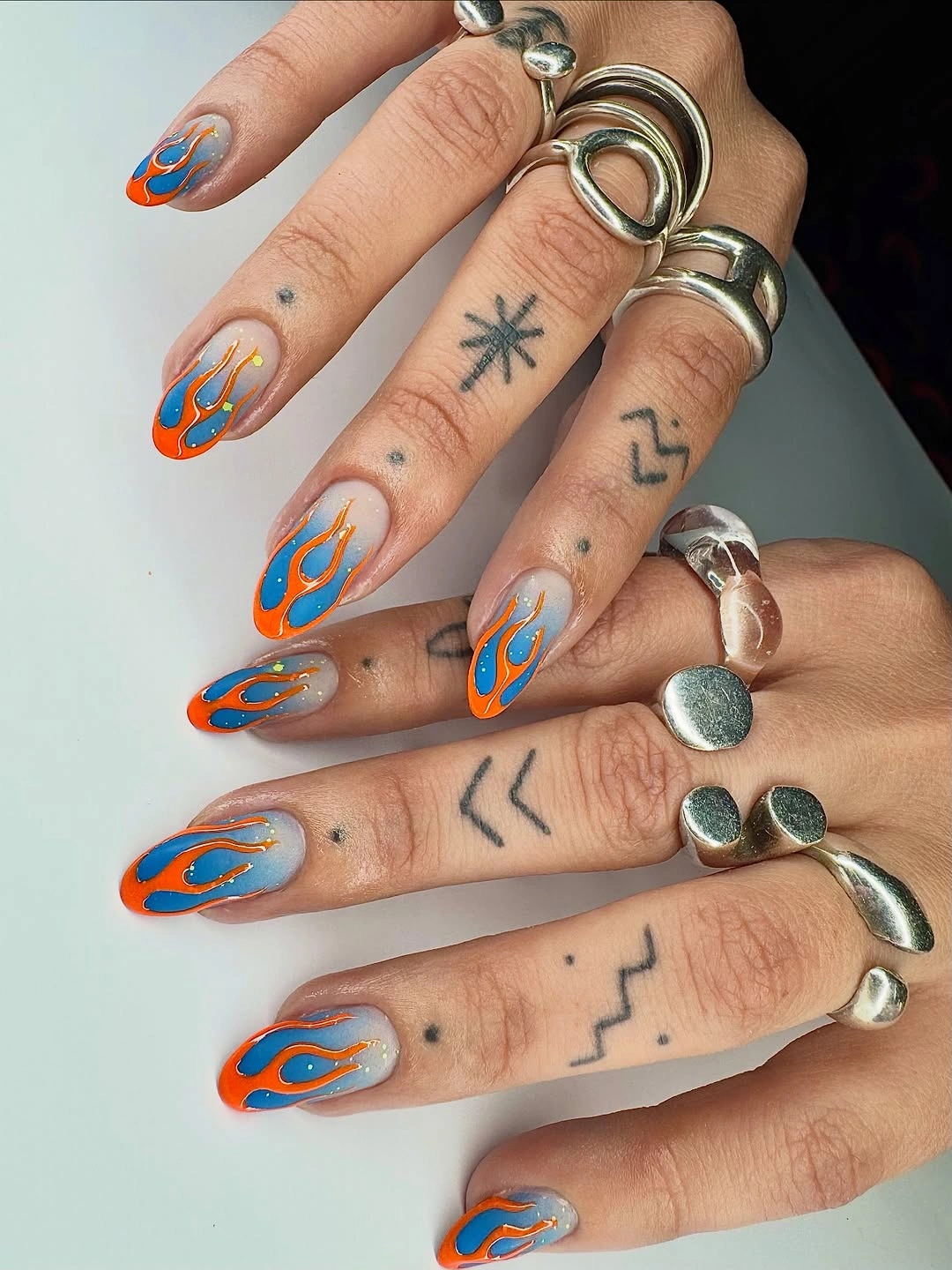
A short version benefits from using the flames on only the tip half of the nail and choosing either orange or blue as the dominant outline. That keeps the design legible when there is less open nude space between the curves. The coffin silhouette gives the lines a flat ending, so an almond adaptation would need the curves to taper more gently toward the point.
The cool blue prevents the orange from becoming too autumnal in an obvious way, which is why the pairing feels more graphic than seasonal-themed. If you want a quieter set, use rust in place of orange and a smoky slate instead of bright blue. Whatever the palette, the outline needs room around it; crowding the base with extra dots would erase the airy quality.
Black Frames Around Baby Pink Squares
Baby pink long square nails get their impact from black French-style perimeter tips that trace the flat edge with unusual precision. The dark frame makes the pink center look even softer while emphasizing the crisp geometry of the silhouette. It is a high-contrast choice, but the limited colors stop it from drifting into an overdecorated look.
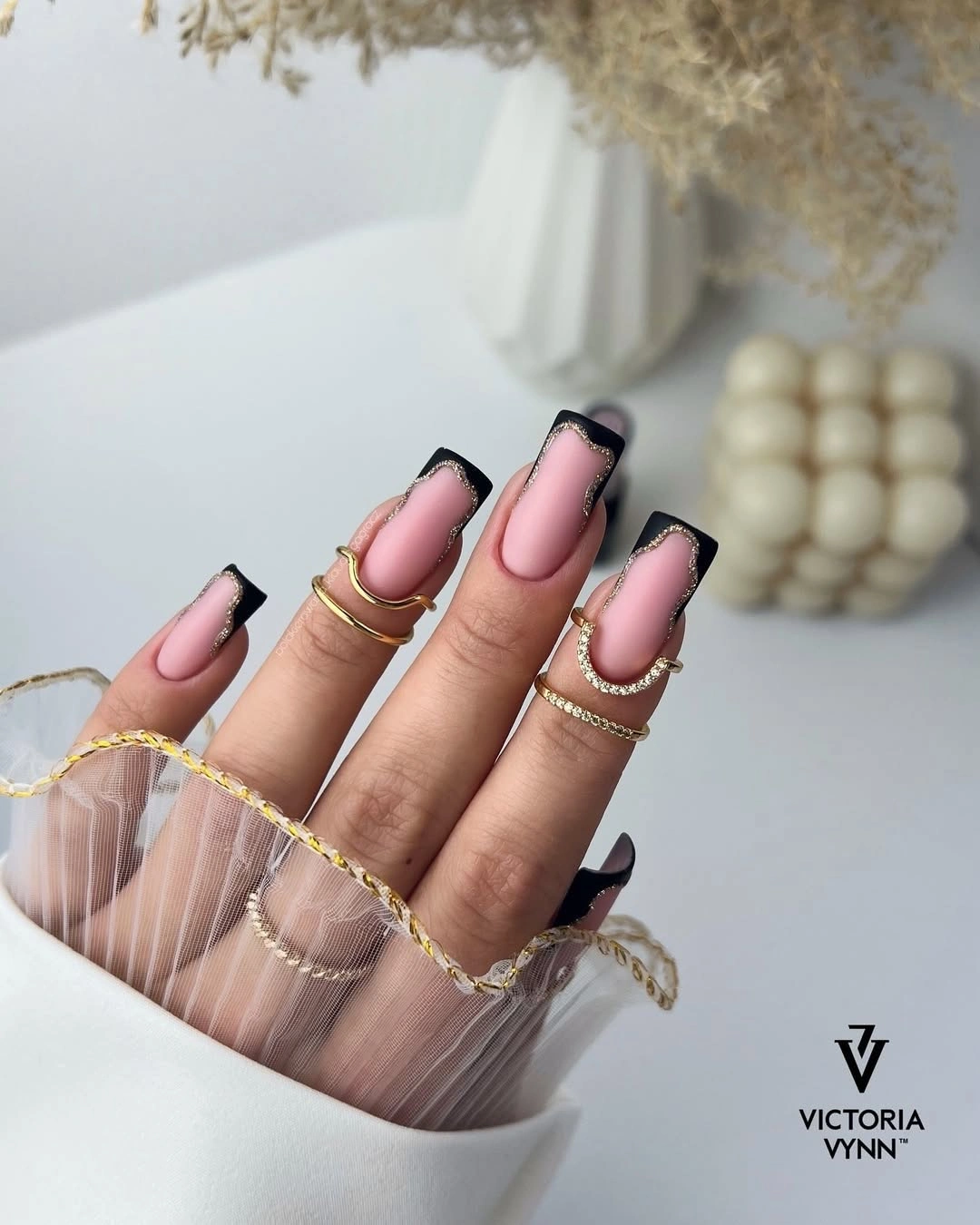
Anyone considering this design should decide whether they want the black line to feel like a narrow outline or a deeper French panel. A slim border keeps the effect lighter and works better on medium length, whereas a broader dark tip demands the long square canvas seen here. The rest of the nails should follow the same depth so the framing does not appear accidental.
Because black defines every edge, chips and uneven tip placement will show sooner than they would on a softer contrast. Switching black to espresso or dark plum gives a similar autumn mood with less severity. The pink base remains essential: replacing it with a dark neutral would remove the visual pause that makes the frame look so intentional.
Burgundy Contours on Sheer Pink Almonds
Soft pink almond nails are bordered at the tips with a narrow burgundy contour that follows the natural taper. Rather than filling the entire end in red, the outline lets the pale center remain visible and gives the deep shade a lighter, more refined job. That restrained construction makes the look appropriate for someone who likes dark polish but not a fully dark manicure.
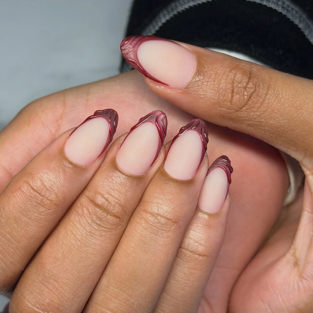
The contour can be adapted to a shorter oval by keeping the burgundy closest to the outer edge and leaving a clear gap near the center. A thicker red tip would change the mood from outlined to classic French, which is a valid option but loses the delicate sense of shape. The almond form is especially helpful because the line has a natural direction to follow.
Burgundy brings warmth that black would not, so it pairs easily with brown leather, soft gray, and cream layers. A cooler plum version would sharpen the contrast against a pink base, while a brown-red would make it quieter. The beauty of the look is its negative space, so extra rhinestones or printed accents would be unnecessary.
Matte White with Inky Abstract Swirls
Matte white long square nails carry black flowing swirls and a small reflective accent, making the contrast feel graphic rather than delicate. The broad pale surface gives the dark lines enough room to curve and cross without losing their separate shapes. A black-and-white manicure like this has an inky, controlled mood that does not depend on a conventional fall color.
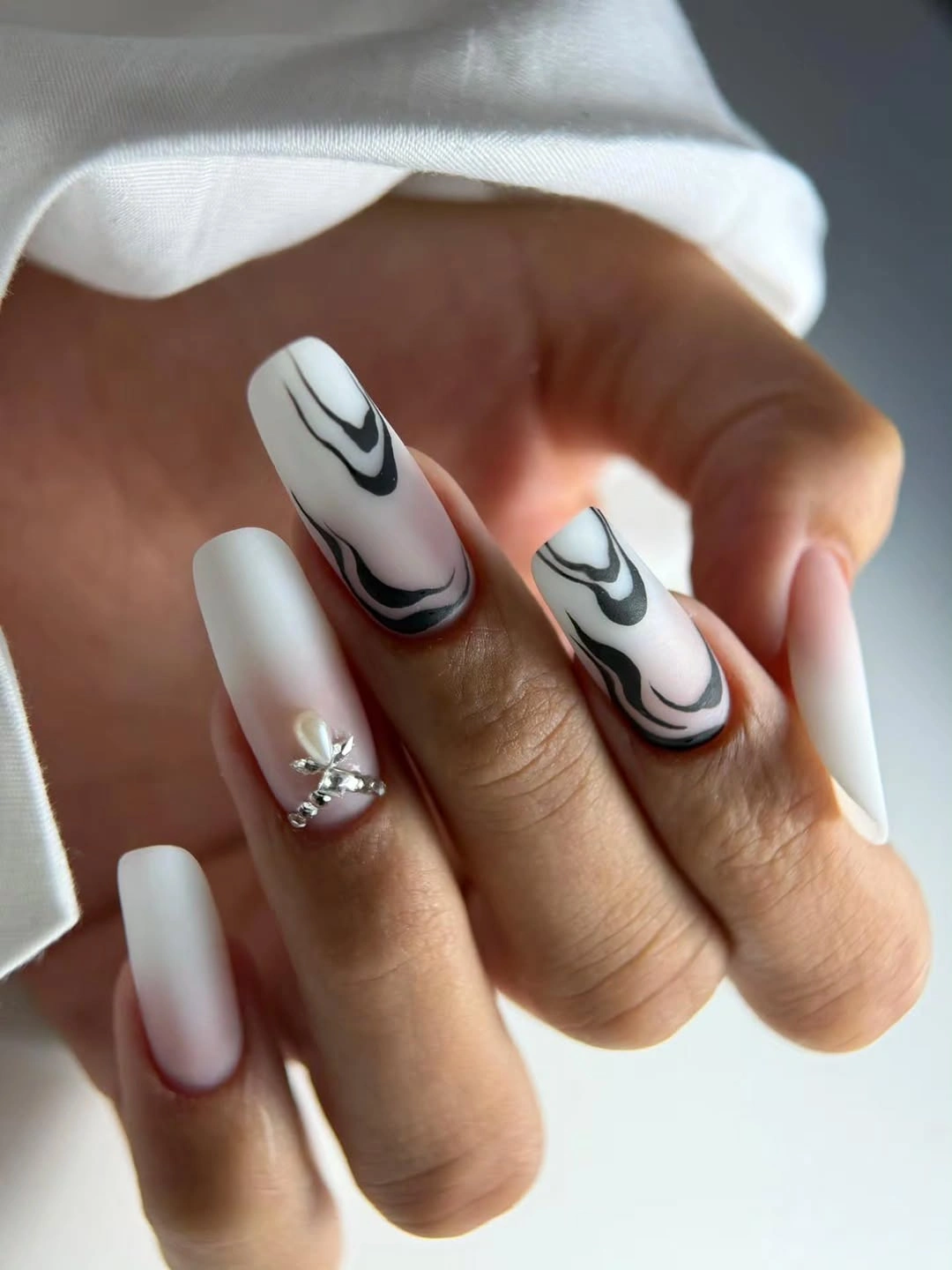
To bring the idea down to medium length, reduce the composition to one swirl per accent nail and leave two nails solid white. That creates the same visual tension while avoiding the crowded look that can happen when intricate black lines are squeezed onto a short tip. The reflective detail is most effective as a single interruption in an otherwise non-shiny design.
White will make every black edge appear crisp, which means the flow of the swirls matters more than adding extra shapes. A soft ivory base would make the set warmer with autumn clothing, while a true bright white pushes it toward sharper contrast. The matte surface keeps the result quiet enough to support the strong drawing without introducing another finish.
Cocoa and Taupe in a Minimal Matte Pair
Medium almond nails alternate between matte taupe and cocoa-brown solids, proving that a fall manicure can feel dimensional without a printed motif. The related browns give the hand depth as the fingers move, yet the color range remains narrow enough to look calm. This is a useful answer when elaborate matte brown nails design fall searches lead to options that feel too busy for daily wear.
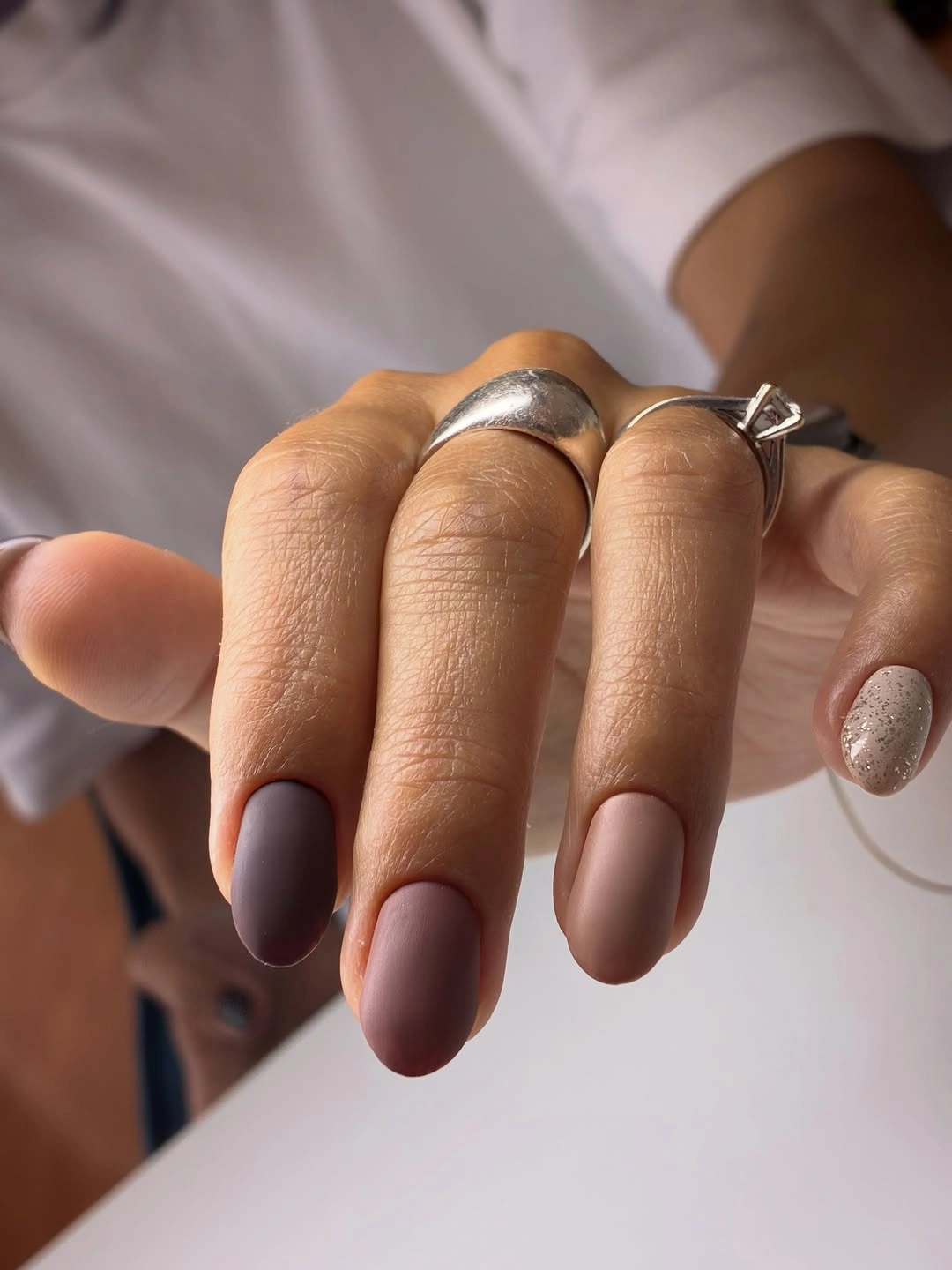
The pairing is easy to translate to any shape because the design depends on color placement rather than a long canvas. On short nails, alternating shades by finger will still create a rhythm, while a longer almond can use one deeper accent nail to exaggerate the taper. Keeping both browns similar in intensity is more cohesive than adding a random light beige.
Matte cocoa can look nearly black in evening light, so taupe prevents the set from losing its variation altogether. A warmer brown will lean more autumnal, while gray-based taupe makes the combination feel quieter and more modern. The simplicity also gives you room to change jewelry or clothing colors without needing to coordinate around a specific pattern.
Layered Warm Waves on Long Squares
Long square nails layer pink bases with orange and yellow curving waves, then add dark burgundy edges that make the warm colors feel anchored. The separate bands remain readable because the hues do not blend into one another, and the flat tips provide a strong edge for the composition. It is a lively choice that still has a clear structure beneath its color.
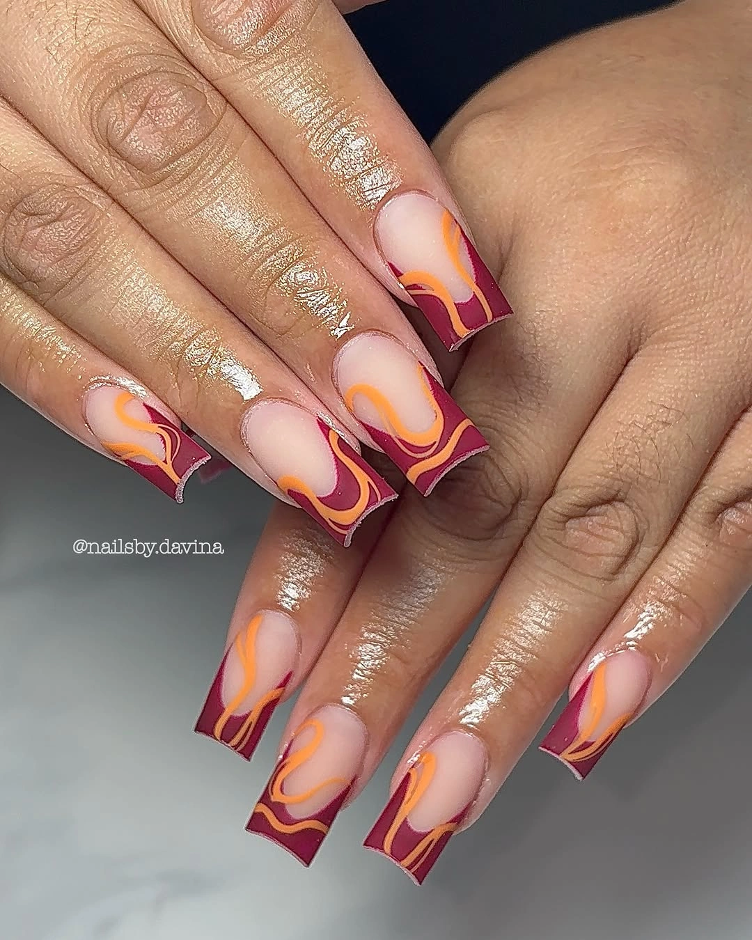
A toned-down version can keep the pink and burgundy while dropping either orange or yellow, which lets the remaining curve become the focus. This design needs a little length because several bands occupy each nail; on a shorter square, two colors and one wave will look more polished. The burgundy edge is the stabilizing detail, so it should not be replaced with another bright color.
Warm waves can feel rich beside tan, brown, or deep denim, but they can compete with a patterned sleeve. If the base pink shifts cooler, choose a red-brown border instead of true burgundy to keep the palette connected. The most convincing application leaves each curve with a visible start and finish instead of crowding the nail with endless loops.
Dotted Tip Panels with a Coral Base
Long coral-pink square nails use white and black dotted tip panels, with a tiny red fruit-like accent adding one playful surprise. Repetition in the dotted blocks connects the varied nails, while the coral base keeps the mix from becoming a strict black-and-white graphic. The longer shape gives each panel its own space, which is why the design stays readable.
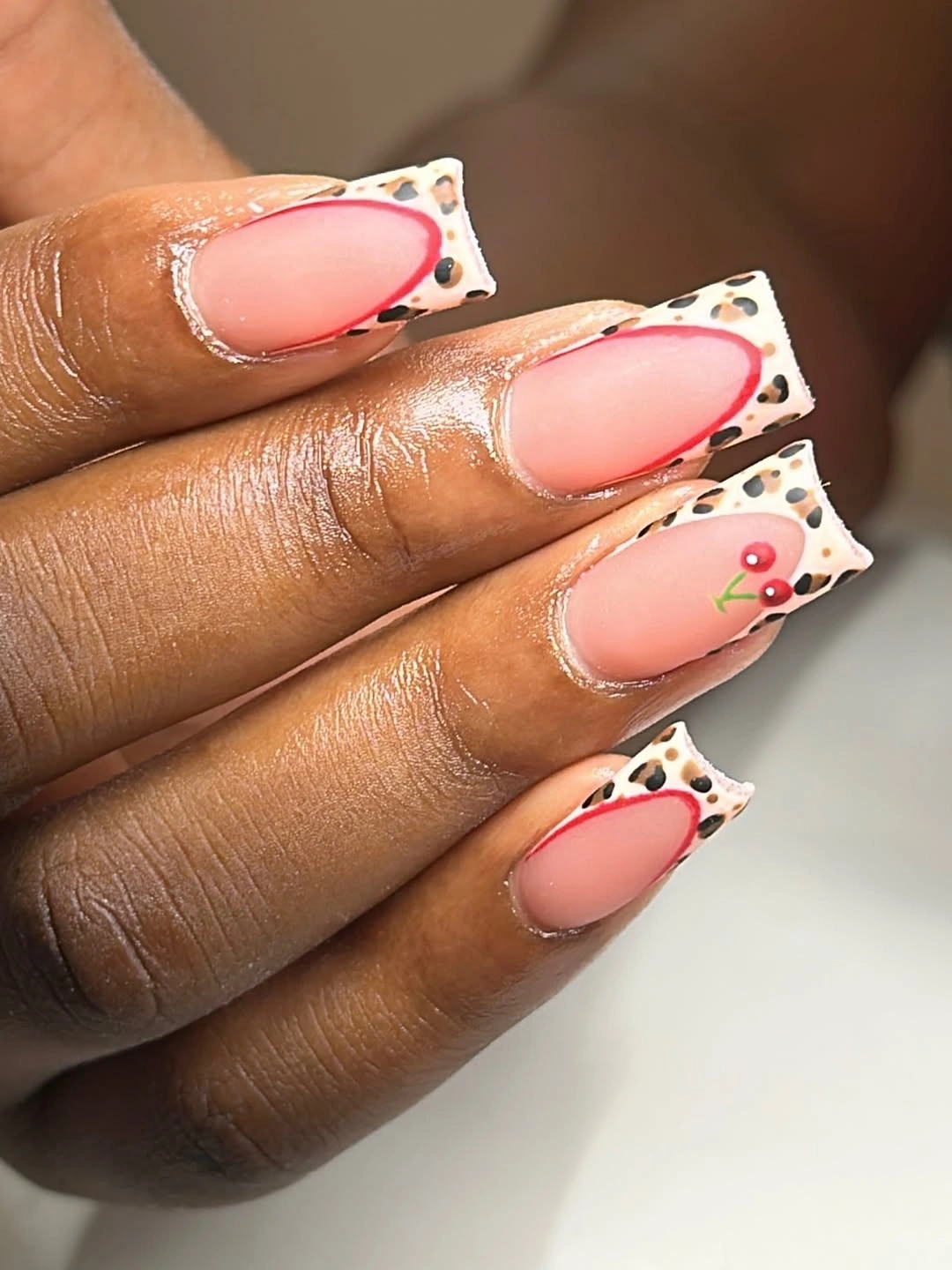
For a less decorative approach, choose either the dotted panels or the small accent motif rather than trying to fit both onto every nail. The repeated white sections already create enough rhythm, especially when the black dots stay in a consistent size range. A medium square can carry this idea if the panels are shallower and the number of dots is reduced.
Coral brings a bright note, so it may feel more transitional than a traditional dark fall shade, yet the black outlines pull it into a deeper direction. Swapping coral for dusty rose would make the set quieter without changing the composition. The panel edges need to remain clean because that geometry is what separates playful detail from visual clutter.
Mixed Graphic Patterns on Long Points
Very long pointed nails mix green swirls, black-and-white stripes, yellow lines, and teal patterning across individual nails. The set works because black outlines recur as a visual thread, giving the many colors and motifs a common structure. Each nail receives a different role, which creates a maximal look without making every surface repeat the same busy arrangement.
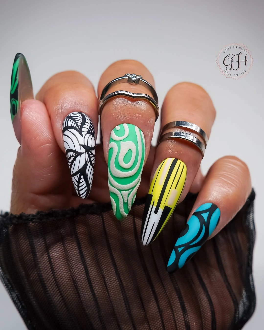
The practical lesson is to reduce the number of pattern families before shortening the nails. On a medium almond, one striped accent, one swirl accent, and several color-matched solids would preserve the spirit without asking the smaller canvas to carry a full mix. Repeating one outline color is more effective than adding another decorative finish to force unity.
Because the pointed length already creates drama, the design needs open areas within the patterns to remain readable. The site’s fall long nails ideas can help when deciding how much room a mixed graphic set needs. Dark clothing will let the brighter green and yellow details show most clearly, while a printed outfit could compete with the many nail motifs.
Coral and Green Color Blocks with Dots
Long square nails combine coral, dusty rose, and dark green panels, with a few circular accents breaking up the straight color blocks. The geometry keeps the palette steady, so the small dots feel like deliberate punctuation instead of a separate theme. Warm and cool colors can share a manicure when their boundaries are clear and one darker shade holds the composition down.
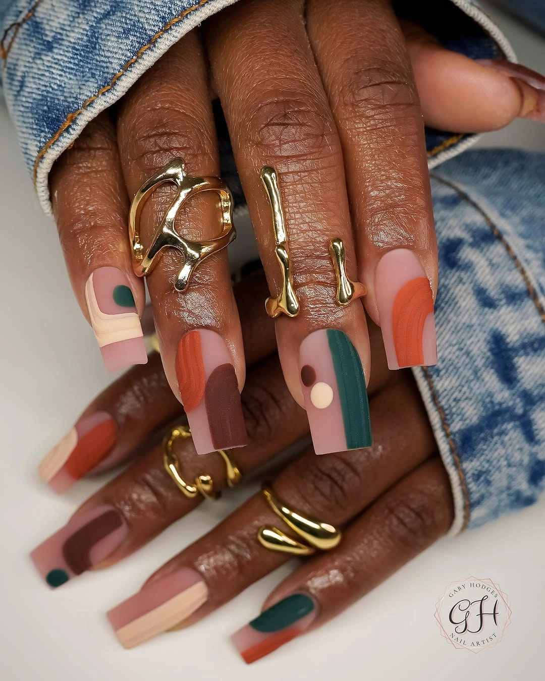
A simplified version could use coral and dark green on alternating nails, then reserve the dots for one dusty-rose accent. That keeps the structured feeling while reducing the number of transitions each nail needs to carry. Squared tips suit this idea particularly well because the panels echo the flat edges rather than fighting the nail shape.
The dark green is what gives the cheerful coral a fall-ready counterpoint, so replacing it with another pastel would flatten the contrast. Dusty rose works as a bridge between the two stronger colors and can be repeated more often if you want less visual intensity. Straight edges need consistent placement to avoid making the long nails look uneven from hand to hand.
Purple Coffins with a Lime Center Glow
Long coffin nails shift from purple into a yellow-green glow through the center, creating a soft luminous effect against the darker outer color. The unexpected lime note makes the design feel more experimental than a standard purple gradient, while the coffin shape provides enough surface for the transition to be noticed. It is a moody color story with a flash of brightness rather than a conventional neutral set.
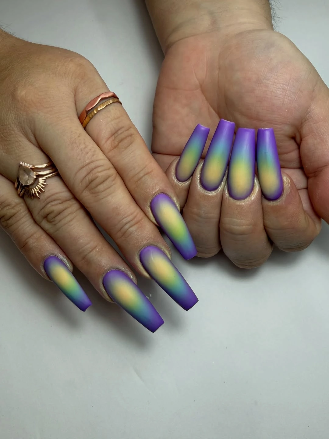
On a shorter nail, the glow should occupy a smaller central area and the purple should remain dominant around it. Too much yellow-green at the edge could make the gradient look abrupt, whereas a narrow hazy center gives the color change a more intentional depth. Keeping the rest of the hand free of competing bright accents lets the unusual pairing remain the focus.
Purple can move cool or warm depending on its undertone, so a warmer violet will connect more easily to the lime than a blue-based plum. The design is most expressive in direct light, where the center contrast becomes visible; in low light it reads as a much deeper purple. That shifting appearance is a feature, not a flaw, for someone drawn to a darker palette.
Mauve Solids with Soft Leopard Accents
Medium pale nails pair dusty mauve solids with a few black-and-pink leopard-print accents, using the animal pattern as contrast rather than covering every finger. The muted mauve keeps the spots from feeling overly loud, and the almond shape softens the edges of the small irregular marks. It is a good example of how a familiar print can look more fall-focused when the base colors are restrained.
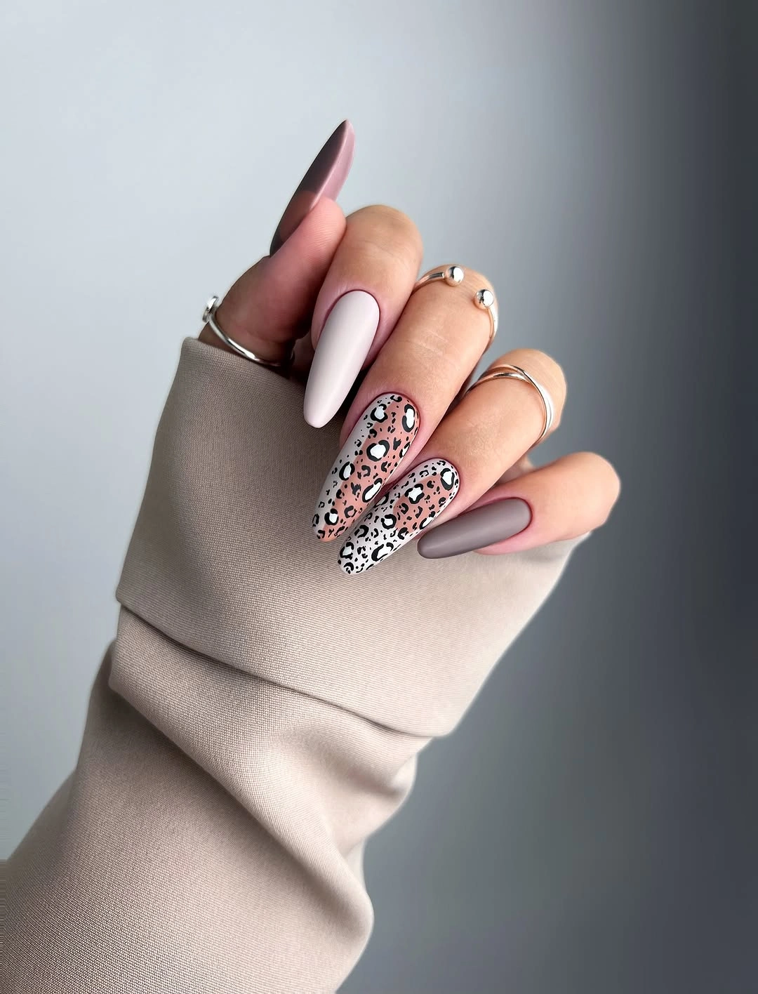
Limiting the print to one or two nails is the easiest way to preserve that balance on a shorter length. The patterned nails already contain several colors and dark outlines, so the solid mauve nails act as necessary breathing room. A deeper burgundy solid could make the set more dramatic, but it would also shift the design away from its soft muted mood.
Leopard spots look best when their sizes are uneven but their outlines stay distinct, otherwise they can blur together as the nail grows out. Pairing the set with simple rings lets the dark marks remain visible without turning the hand into a cluster of small details. The pale base is important here because it offers contrast to both the mauve and the spotted accents.
Forest Green Fading into Black Matte
Long pointed nails move from nearly black at the base into deep forest green, with a matte surface that makes the color shift feel shadowy rather than reflective. The green is subtle enough to appear almost hidden until the nail catches stronger light, which gives the gradient an atmospheric quality. For dark fall nail designs matte fans, this is proof that a simple two-color transition can carry plenty of mood.
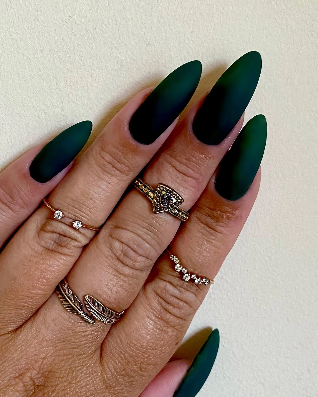
The effect can be translated to an almond or coffin shape by keeping the darkest section near the cuticle and allowing only a small amount of green at the end. A short nail will need a more obvious color separation if the goal is to make the gradient visible at all. Adding a pattern would distract from the quiet reveal that makes this particular fade convincing.
Forest green pairs naturally with gold-toned jewelry and brown outerwear, but it remains cooler and less expected than a full burgundy set. A glossy finish would make the transition brighter and more reflective, while matte keeps it velvety and controlled. The pointed silhouette enhances the darkness, so a rounded shape would make the same colors feel noticeably softer.
Mint and White Short Mixed Prints
Short square nails mix refreshing mint, white, brown spotted accents, and a small leaf-like detail without losing their practical outline. The solid mint nails keep the small printed areas from taking over, while the white background makes the darker marks easy to distinguish. Several motifs can work on a short set when the color palette remains tightly edited.
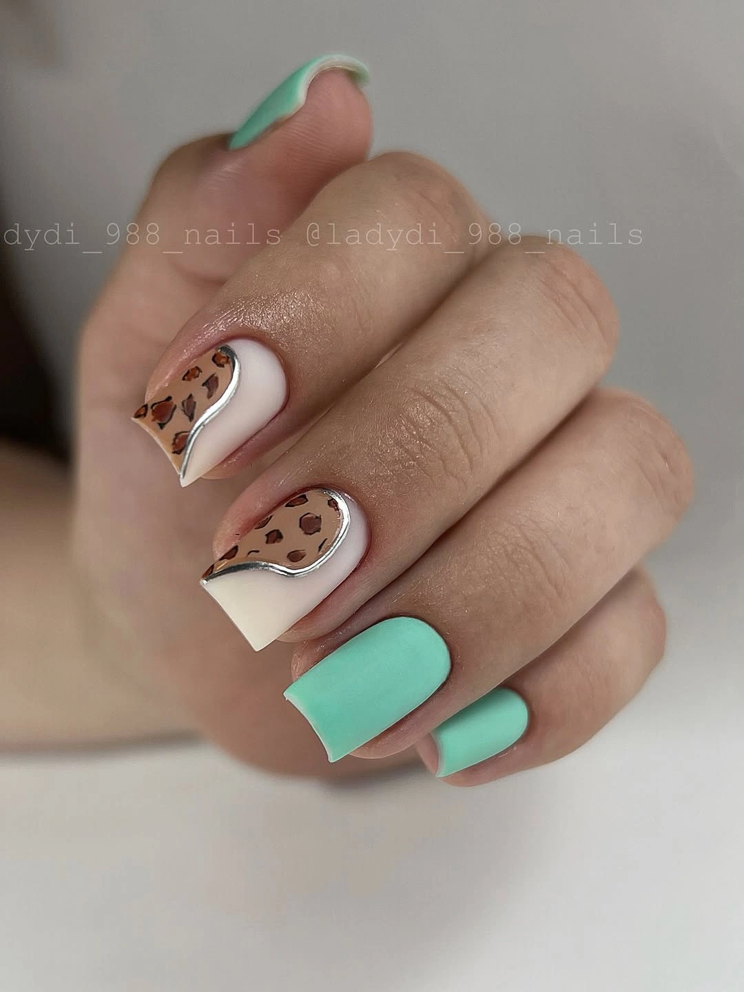
A lower-key adaptation would use mint on most nails and reserve the brown spot pattern for a single white accent. That keeps the playful contrast but leaves more solid color visible, which makes the design easier to maintain visually as the nail grows out. The short square shape is a strength here because it gives the mix a clean, grounded edge.
Mint is lighter than many fall colors, yet the brown details stop it from feeling disconnected from a seasonal wardrobe. Switching the white to a soft cream would make the palette warmer, while keeping true white preserves the crispest graphic contrast. The tiny leaf-like element should stay secondary to the manicure’s main color and print balance.
Pink Animal Prints Across Long Squares
Long pink square nails combine black-and-white zebra stripes with pink-and-black leopard spots, using the shared pink base to unite two different animal-print directions. The patterns remain distinct because each occupies its own nail space instead of being layered together. That separation makes the design feel lively and graphic rather than like a random collection of marks.
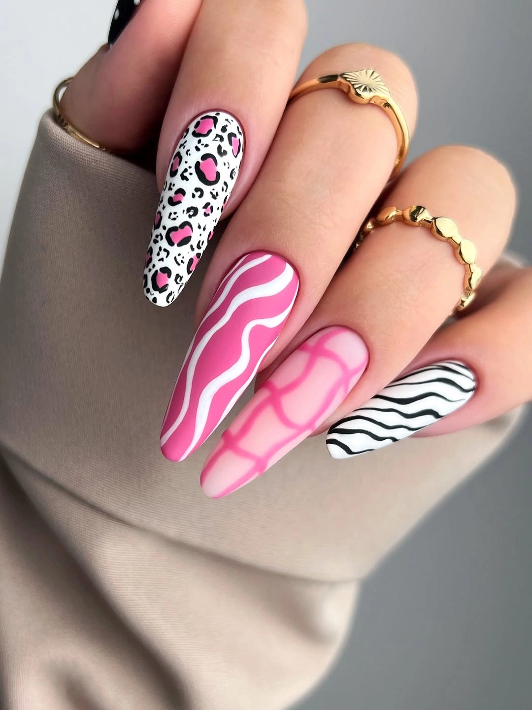
For a more wearable version, choose one animal pattern and keep the rest of the nails solid pink with perhaps one narrow black French edge. Two patterns can work at this length, but a medium shape will look more polished when the visual vocabulary is reduced. The pink base is the bridge, so changing it from nail to nail would weaken the whole idea.
Zebra stripes bring a sharper black-and-white contrast, while leopard spots make the set feel softer and more irregular. Choosing just one of those directions can help the manicure suit a more minimal personal style without losing its playful energy. The long square tips give every pattern a generous surface, which is why careful spacing matters more than adding yet another accent.