Could a dotted manicure feel playful without becoming visually noisy? Polka dot fall nails 2026 get more interesting when the dots have a clear relationship to the base color, the nail shape, and the open space around them. A dark dot can sharpen a soft nude, while tiny pale dots can give a deep shade a quieter texture instead of repeating the same pattern like wallpaper.
Inside a well-balanced dotted design, placement matters as much as color. A tip outline, a softened solid, or one small accent among other shapes immediately tells you how much length and contrast the pattern needs. That decision preserves the light-hearted quality of polka dots without turning a manicure into a crowded collection of unrelated details.
Earthy Tortoiseshell and Dots on Short Nails
Short rounded-square nails mix tortoiseshell-style brown patches, a white nail with black dots, and a deep glossy-looking green solid. The dark green repeats the depth already present in the brown pattern, giving the three-part combination a grounded connection. It is an earthy way to use a dotted accent without making every nail carry the same black-and-white contrast.
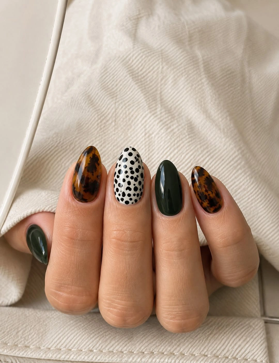
The easiest edit is to choose one patterned tortoiseshell nail, one dotted white nail, and keep the remaining nails green or warm brown. That leaves plenty of solid color around the irregular patches, which matters on a short shape. Adding dots to the tortoiseshell as well would make the small canvas feel visually busy and reduce the clarity of both patterns.
Deep green helps the brown patches read more autumnal than a black solid would, while white keeps the dotted nail crisp and easy to notice. A creamy off-white would make the palette warmer if bright white feels too sharp. The set works because each nail has a distinct job, not because every one of them repeats the same detail.
Cobalt Blue Covered in Tiny White Dots
Long cobalt-blue almond nails are covered with small white dots and a few gold-toned accents, turning a saturated color into a dense patterned field. The close dot scale creates texture before it creates a single obvious focal point, while the elongated nails provide enough space for the repetition. This is a bold polka dot fall nails almond option for someone who likes a full print rather than a restrained French tip.
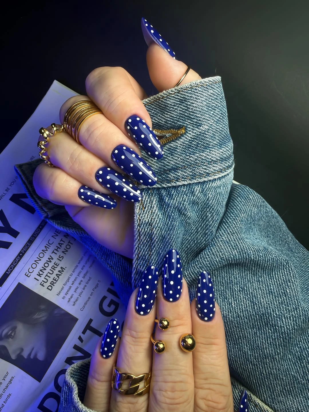
To make the idea easier for everyday wear, use the dots on two cobalt nails and leave the rest solid blue. A shorter nail should use fewer dots with more breathing room, otherwise the white marks can merge into a pale haze from a distance. Keeping all dots near the same size is what makes the dense surface look ordered instead of accidental.
Cobalt brings a cool intensity that works well with gray, black, and denim, even though it is not the most traditional autumn color. The small gold-toned touch adds warmth without needing another full-color nail. If the blue feels too bright, navy can preserve the dotted field with a calmer, more evening-like mood.
Mint Microdots over a Bare-Looking Nude
Short nude rounded-square nails hold evenly spaced tiny mint-green dots across a soft neutral ground. The low contrast makes the pattern feel delicate rather than loud, and the practical shape keeps the design close to everyday wear. The site’s simple fall short nails ideas reinforce why small dots can stay subtle when their color sits near the softness of the base.
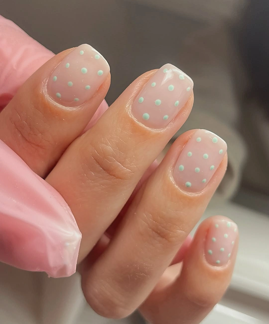
Regular spacing is especially helpful for small dots, because it makes the design appear intentional without adding another outline or tip. On a very short nail, reducing the number of circles is better than forcing a full grid across the surface. A single slightly larger dot near the center could add character, but the calm repetition is the main appeal here.
Mint may seem unexpected in a fall manicure, yet its softened tone reads gently beside cream, taupe, and denim rather than screaming spring. An olive-leaning green would make the same design earthier, while a cooler mint keeps it airy. The nude background should remain visible between dots, since that negative space gives the miniature pattern its refined feel.
Soft Tortoiseshell Edges with Pale Dots
Short pale-pink almond nails pair brown tortoiseshell-style sections with one white accent and small dotted marks. The irregular brown pattern is used in partial areas rather than across the whole set, allowing the pink base to soften its contrast. That controlled placement keeps the manicure from becoming too dark while still giving it a warm, seasonal direction.
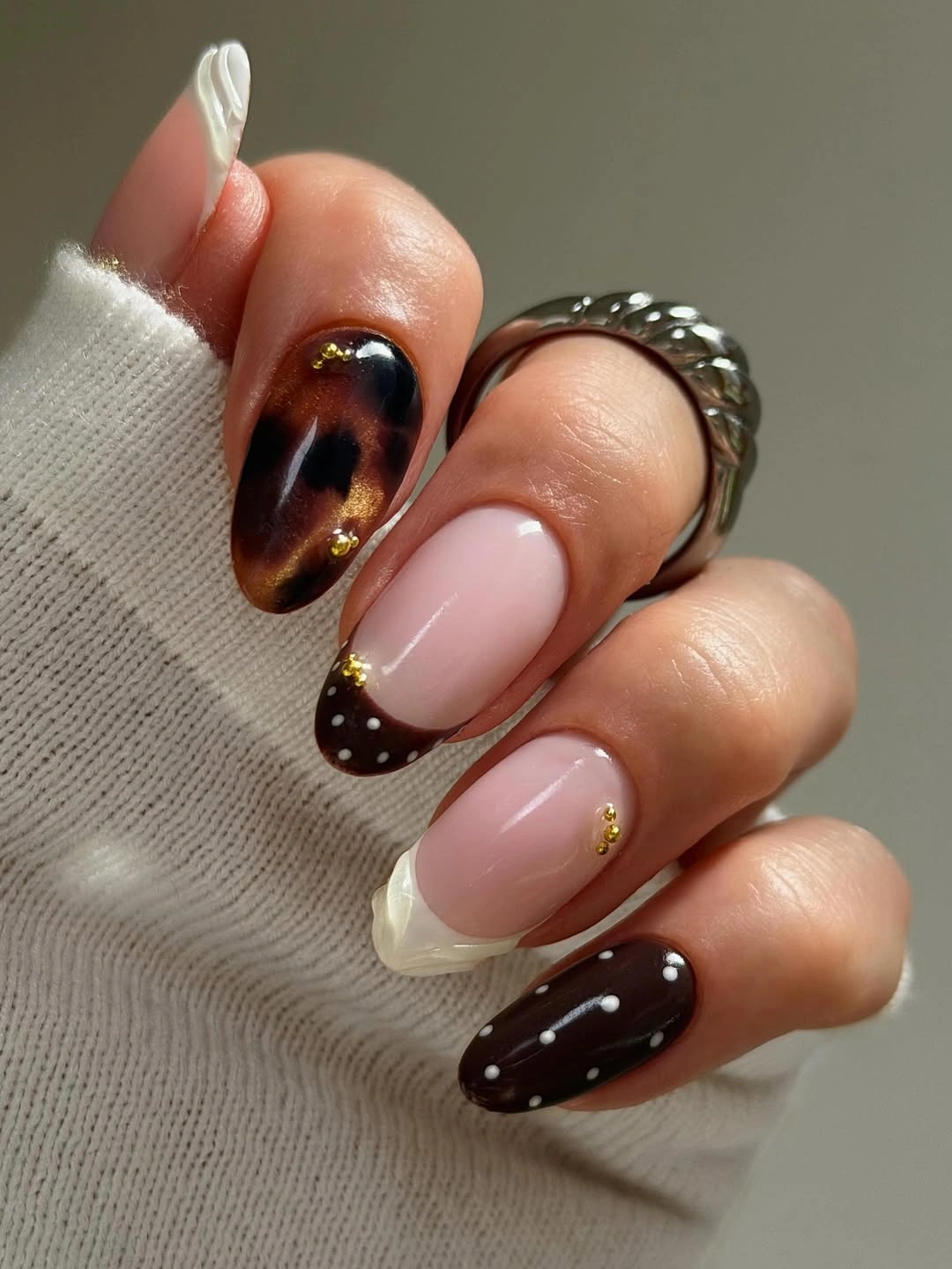
For a simpler version, keep the tortoiseshell effect on one accent nail and use a dotted pale-pink companion nail on the other hand. The two patterns do not need to appear in equal amounts to feel related; their warm brown and dark marks already create the connection. A medium almond could carry a little more patchwork, but short nails benefit from fewer irregular shapes.
Pink gives tortoiseshell a softer mood than a beige or black background would, making the pattern feel more personal and less literal. If you prefer a deeper fall palette, replace the pink with dusty mauve and retain the white dotted accent. The spacing around each brown patch is important, because it lets the shape read as an intentional mark rather than a blurred stain.
Monochrome Polka Tips on Long Points
Long pale-pink pointed nails use black-and-white dotted French-style tips that create a crisp contrast against the open center. The pointed silhouette directs attention outward, and the polka pattern stays controlled because it is contained at the end of each nail. The result proves that polka dot fall nails french ideas can feel graphic and polished when the base remains almost bare.
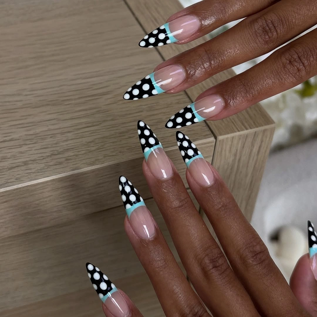
A medium almond can borrow the same structure by making the dotted tip shallower and choosing one dominant dot color. Black dots on a white tip will look sharper, while white dots on black feel more dramatic and can make the tip appear deeper. The exposed pink center needs to stay generous, otherwise the French boundary loses its lightness.
High contrast suits a long point because there is space for both the pattern and the outline of the nail to remain visible. On a short square, a small dotted corner or a single accent tip would be more balanced than a full covered edge. The beauty of this design is the disciplined placement, so extra stripes or gems would only interrupt the clean rhythm.
Diagonal Spotted Panels with Dark Contrast
Long pale-pink pointed nails carry black dots on white diagonal sections, with one darker patterned accent adding another layer of texture. The diagonal placement creates movement that a straight French would not, while the shared dot scale keeps the varied sections connected. Each nail has room to hold a different part of the composition without losing the pale base as a unifying field.
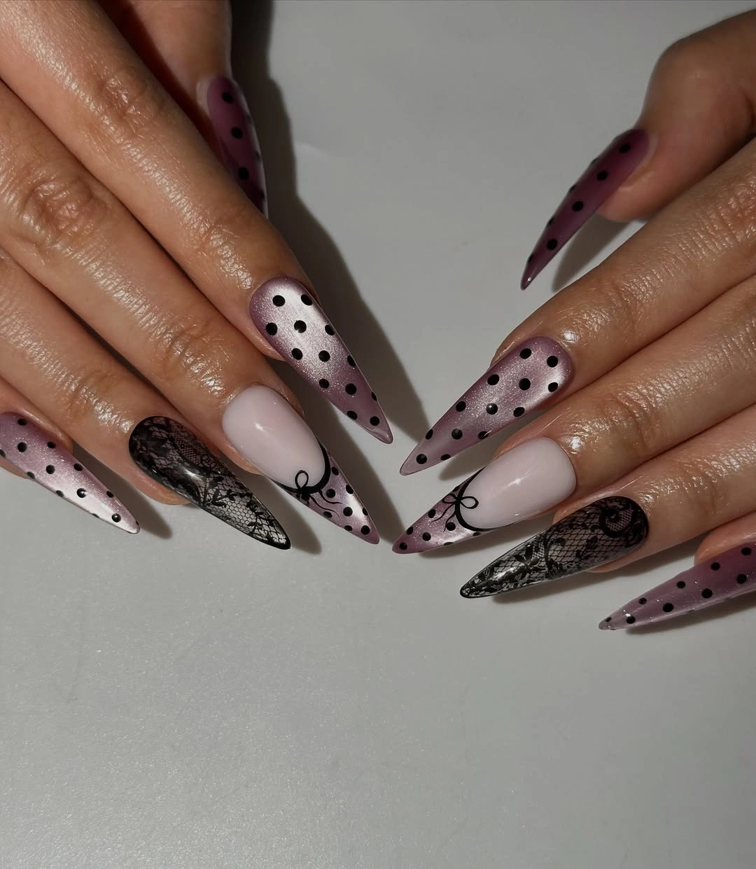
When reducing the look for a shorter length, choose one diagonal dotted panel and skip the additional dark pattern. The angled line alone gives enough direction, especially on an almond or oval shape. Matching the dot size across the accents matters more than repeating every color, because size is what makes the design read as one deliberate pattern language.
The contrast between black, white, and pale pink is strong enough to remain interesting without a bright seasonal shade. A soft brown in place of black would warm the effect and make it less stark for fall. The diagonal panels should not all start at exactly the same height, but they do need a similar overall depth to avoid a visually uneven hand.
Mustard Blocks with Small Black Punctuation
Short rounded-square nails use mustard yellow, white, and black abstract blocks, then add tiny black dots as punctuation between the larger color areas. The circles are not carrying the full manicure; they simply give the graphic sections a lighter, more playful pause. That distinction keeps the short design organized even though several colors are visible at once.
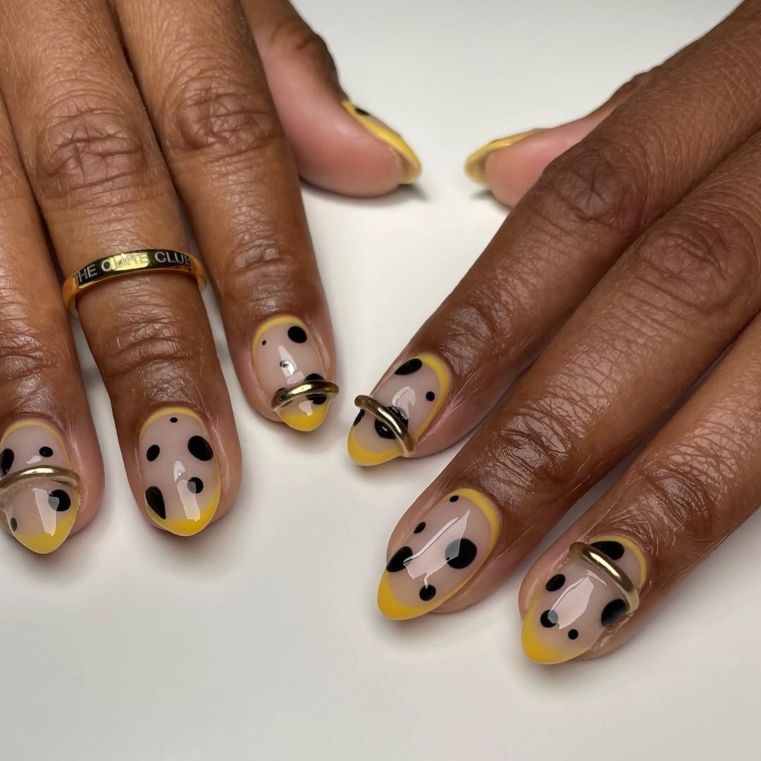
A practical adaptation could keep mustard on two nails, use one white dotted accent, and let the remaining nails stay a warm neutral. Short nails do not need the same amount of block work as a long set to feel designed. The dots should sit near empty areas rather than cover the borders, which helps the larger shapes retain their clean geometry.
Mustard is especially effective beside black because it has enough depth to hold its own without becoming neon. Cream would soften the white portion, while a darker ochre would make the palette more autumnal and less bright. The abstract layout works best when one color is clearly dominant and the others act as smaller structural notes.
Pastel Dotted Bands Across Extra-Long Squares
Very long square nails combine pastel green, pink, blue, and yellow panels with several black dotted bands across the length. The generous canvas gives the colors room to sit separately, which is why the multiple sections remain readable rather than merging together. The pattern feels playful, but the straight square tips give it a firm graphic structure.
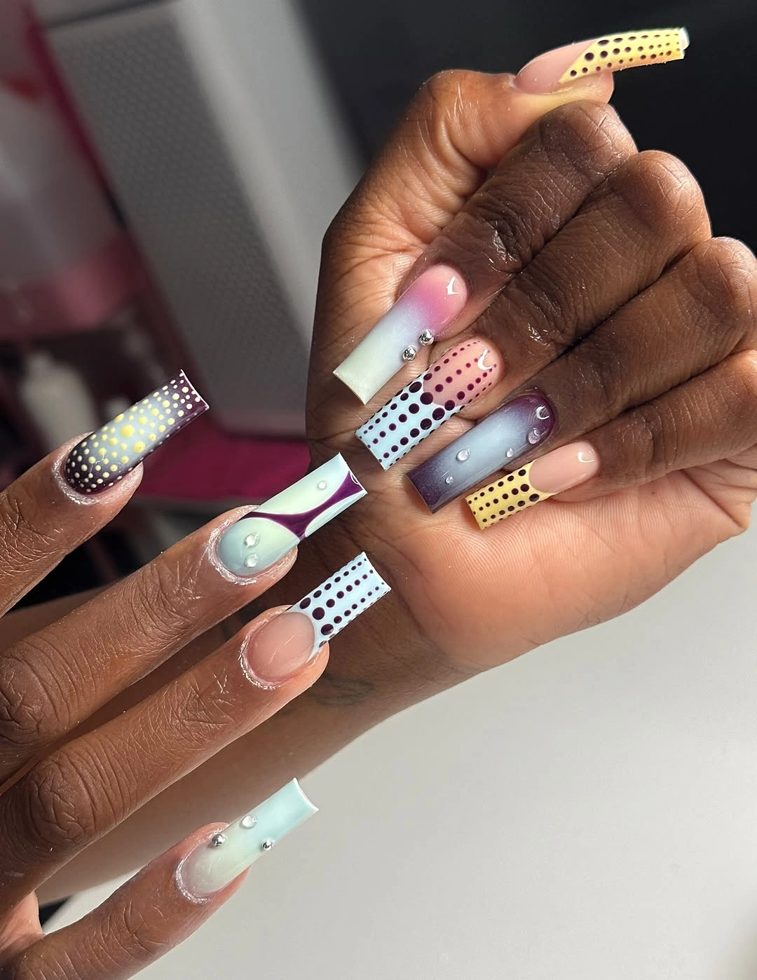
Shortening this idea calls for a much stricter edit: one pastel band, one dotted strip, and a neutral base will usually be enough. The full arrangement depends on length, because each color needs its own visible interval before the next one begins. Keeping the dots in a straight band is what stops the composition from becoming a scattered mix of small marks.
Pastels can still work with fall wardrobes when black dots create a deeper outline and the colors are not all equally bright. A dusty rose and muted blue version would feel quieter than the current mix, while preserving the banded concept. The design rewards clean spacing more than intricate detail, so a crowded extra accent would only blur the visual structure.
White-Tipped Black Dots on Pink Squares
Medium pale-pink square nails place black dots over white French-style tips, giving the pattern a bright, clearly defined foundation. The white strip separates the dots from the pink base and helps every circle stay recognizable at a medium length. The site’s fall square nails guide shows why this straightforward dotted French can stay cheerful without losing its crisp line.
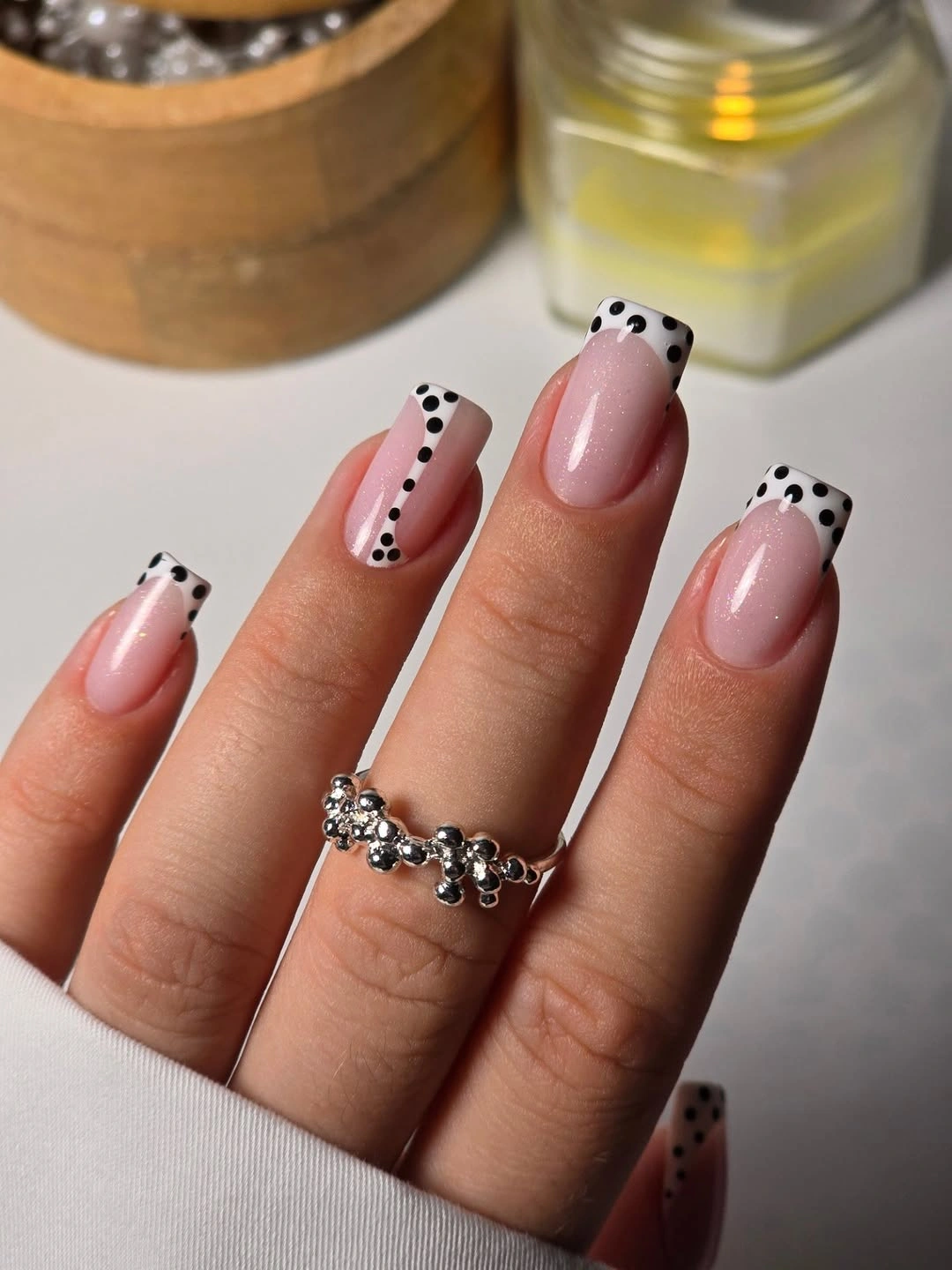
For a calmer version, make the white tip narrow and use fewer black dots so the pink remains the visual majority. The square shape supports a straight French boundary, but a soft square will make the contrast less severe than a flat, sharply filed tip. Dot placement can vary slightly, yet the outer edge should still look balanced across the hand.
Black dots are a strong choice because they keep their definition over white even from a distance. Brown or burgundy dots would bring the same construction into a warmer fall palette with less starkness. The clean white tip is doing important work, so adding another color between it and the pink base would make the simple idea harder to read.
Cream Dots with One Gold-Toned Accent
Long nude almond nails carry cream tips with black dots, while one nail includes a small clustered gold-toned accent. The neutral base softens the black contrast and lets the one textured detail become a focal point rather than a repeated surface treatment. It is a dressed-up version of polka dots that remains grounded because the palette stays mostly cream, nude, and black.
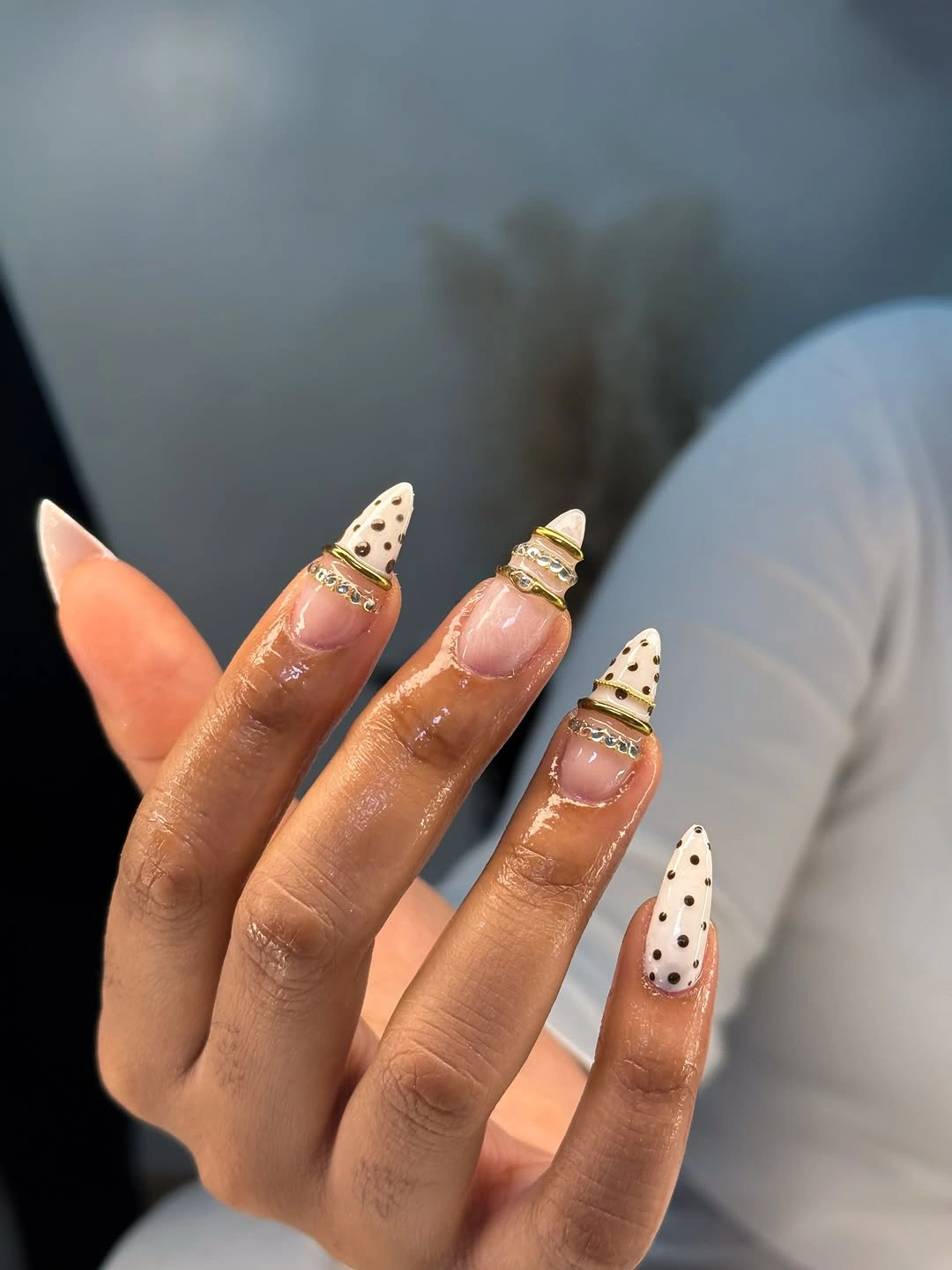
The clustered accent should stay on one nail if you want the dotted tips to remain the recognizable part of the set. On a medium length, a small metallic-looking line can replace the cluster and still provide a point of light. The cream tip needs enough depth for the dots to be visible, but not so much that it turns the whole nail into a white panel.
Nude and cream make black dots feel softer than they would over bright white, which helps the design sit easily beside warm fall clothing. Gold-toned detail adds warmth without introducing a new polish color. If you prefer no reflective accent, the same look can work beautifully with one plain cream nail that gives the patterned tips a visual break.
Periwinkle and Navy Dots in Alternation
Medium nails alternate between periwinkle and navy, then add small contrasting dots to create rhythm across the hand. The two blue shades establish a pattern before the circles are even noticed, so the dots become a secondary texture rather than a busy focal point. This color arrangement works because the light and dark grounds give the same small marks different visual weight.
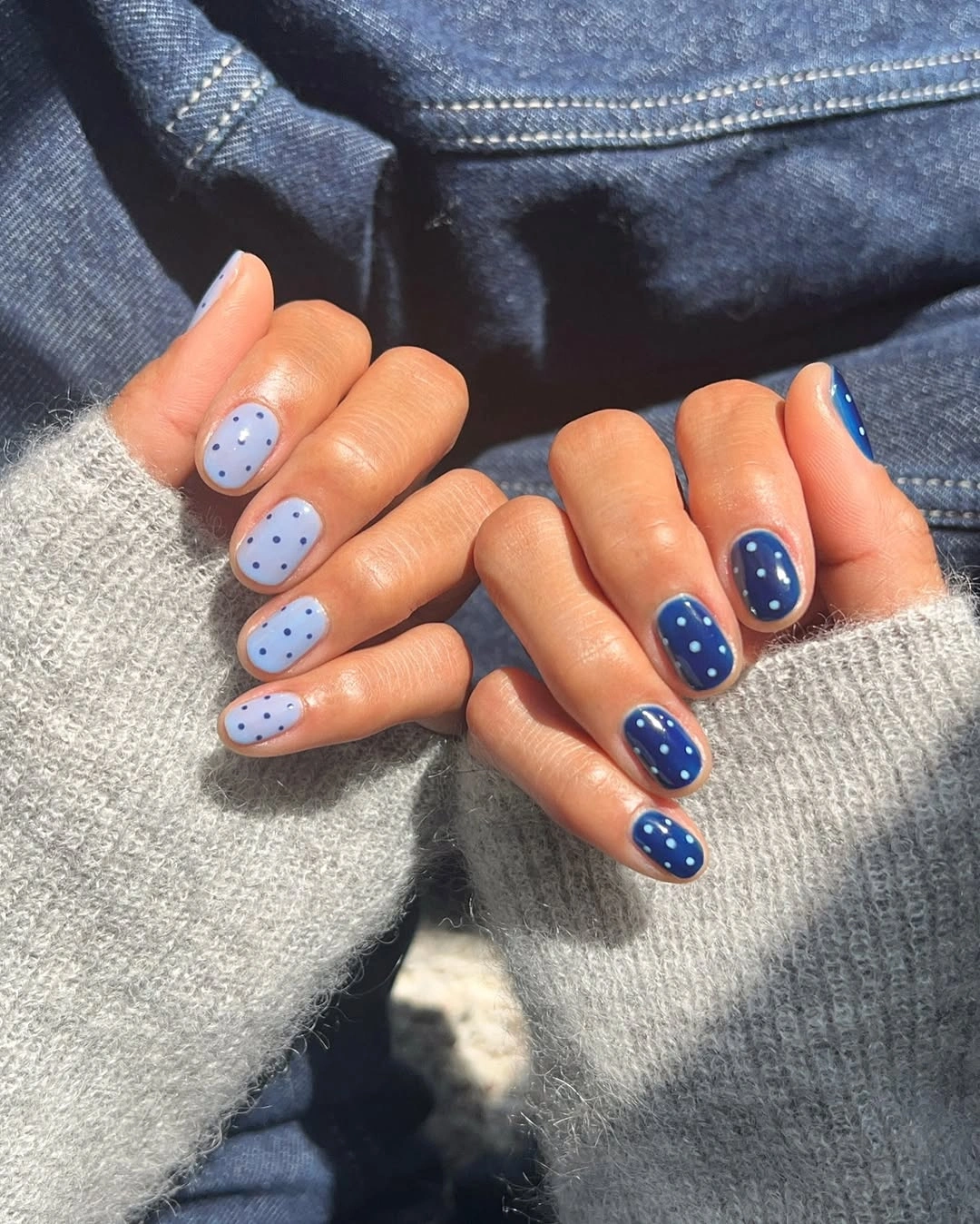
To keep the pattern clear, choose one dot color for each base and avoid adding a third blue. A medium almond or oval is enough space for the alternation to feel intentional without needing every nail to be fully dotted. The strongest contrast will happen where pale dots sit on navy, so those nails can be used sparingly if you want a quieter result.
Blue can enter a fall palette through depth rather than through obvious seasonal motifs, and navy gives the lighter periwinkle a useful anchor. A gray-blue substitute would make the combination more muted, while a brighter cobalt would raise the energy. The alternating layout is the main design decision, so the dot spacing should remain modest and not compete with that rhythm.
Classic Cream Nails with Scattered Black Spots
Medium cream almond nails wear sparse black polka dots over the whole surface, creating a familiar spotted effect with a soft neutral background. The dots vary slightly in position, which keeps the set from looking like a rigid printed grid. Because the base is warm rather than stark white, the contrast feels approachable and easy to style with autumn neutrals.
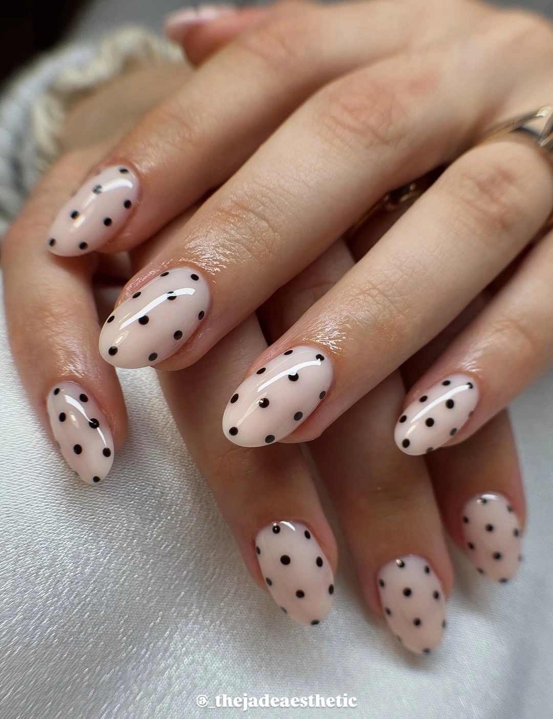
On a short nail, fewer dots with larger gaps will preserve the same classic look without making the surface feel crowded. The almond shape is helpful because it gives the eye a gentle path from base to tip even when the pattern is scattered. A thin black French edge could be added to one accent nail, but the current all-over dots already have enough presence.
Black spots look crispest when their edges remain clean and their sizes are not all perfectly identical. A chocolate brown version would make the design warmer and a little softer, while navy would make it cooler and more graphic. The cream base keeps the pattern from feeling seasonal in a literal way, which makes the look flexible across different outfits.
Maroon Microdots on a Deep Fall Base
Deep maroon almond nails are marked with tiny white dots concentrated near the upper area, adding a festive-looking texture without breaking the dark color into large panels. The small pale marks catch the eye only after the rich base has established the mood. This is an elegant route for polka dot fall nails red fans who prefer their pattern understated rather than loud.
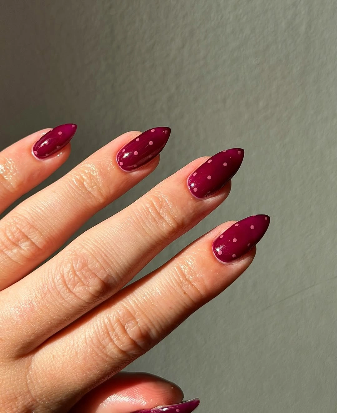
Keeping the dots close to one part of the nail gives the design a sense of direction and leaves broad areas of maroon untouched. A shorter shape could use just a few dots near the tip, where the contrast will still read clearly. The rich base needs to remain the main visual, so a full blanket of white dots would change the look into something much more playful.
Maroon and white create a high contrast, yet the micro scale keeps the effect refined and suitable for a darker fall palette. Replacing white with muted gold would make the detail warmer but less crisp. The most important choice is the spacing: allow enough dark red between each dot so the pattern stays a texture rather than a separate color field.
Hot Pink Dots with Sharp Dark Tips
Long hot-pink almond nails mix white dotted sections with dark pointed tip accents, giving the bright base a more graphic and tailored edge. The pink holds the playful parts together, while the dark tips sharpen the long silhouette and stop the dots from feeling overly sweet. Several elements appear here, but each one is placed in a separate zone rather than layered indiscriminately.
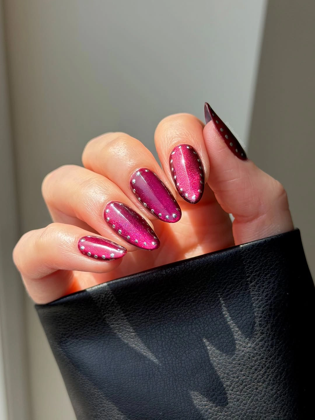
A more restrained adaptation can keep the hot pink base and choose either the dotted section or the pointed dark tip as the main accent. Combining both works best at this long length because the nail has space for clear boundaries. If you want a softer fall direction, substitute berry pink and espresso brown for the brighter contrast while maintaining the same divided layout.
The dark point adds structure that a round French edge would not, making the manicure feel less playful and more graphic. White dots should remain grouped rather than scattered across every section, so the eye can understand their role quickly. The base pink is the connection between the accents, which is why changing it across multiple nails would weaken the design.
Navy and Milky White Dots in Contrast
Medium nails alternate between deep navy and milky white, with small contrasting dots repeated over both color grounds. The reversal makes the same motif look different from finger to finger, creating a steady light-dark rhythm without any complicated drawing. It is a clean example of how opposites can make a dotted manicure feel more deliberate than one single repeated base.
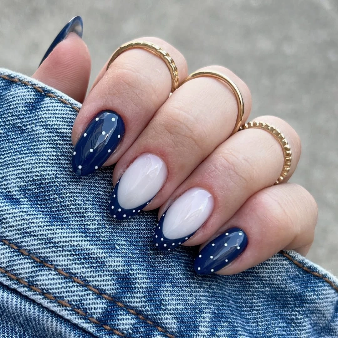
Use the alternation as the main decision and resist adding another accent color, since the navy-white contrast already provides strong movement. On a shorter nail, four or five carefully placed dots will be enough to show the pattern. A square shape would make the result crisper, while almond or oval keeps the dark-and-light pairing gentler around the edges.
Navy is a useful dark option when black feels too strict but you still want the dots to stand out. The milky white can be shifted toward cream for a warmer effect without changing the alternating logic. The strongest visual rhythm comes from keeping the nails in a clear sequence, so random color placement would make the design feel less intentional.
Red-Accented Dotted Panels on Nude Squares
Long nude square nails use white panels, black dots, and red dotted accent areas to create a layered but structured arrangement. The straight silhouette supports the panel layout, while the nude sections keep the individual colors from running together. Red appears as a controlled accent rather than a full base, which gives the overall design a warmer fall direction without making it visually heavy.
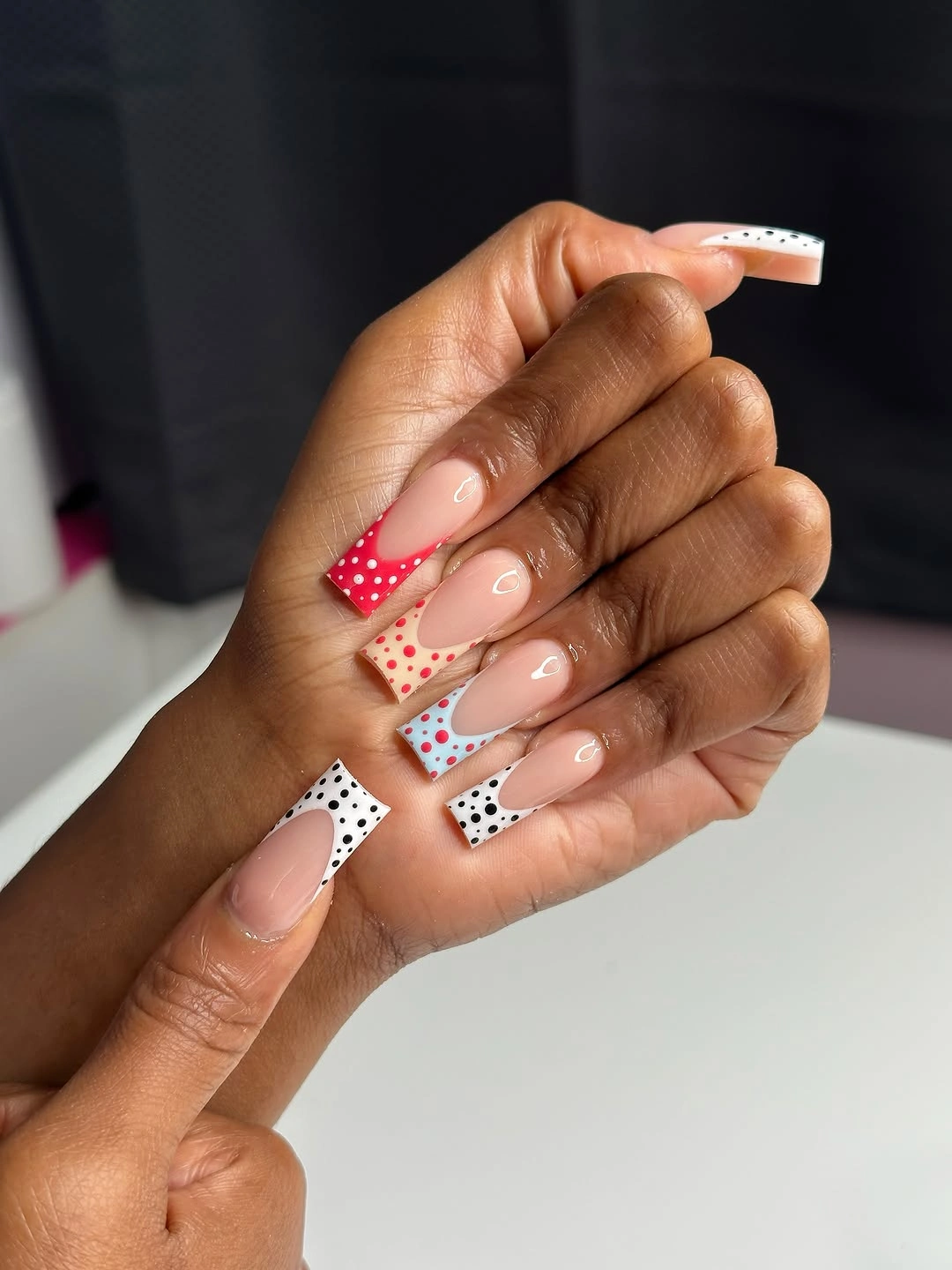
The cleanest way to adapt the idea is to assign one dominant dot color to each nail instead of mixing black and red everywhere. A medium square can handle a white dotted panel and one red accent, but it will look more polished when the remaining nails stay nude. The panel edges need to remain straight and separate so the design does not become a patchwork of tiny competing marks.
Red works as a bridge between the bright white and the neutral base, giving the set more warmth than a purely monochrome dotted look. Burgundy would deepen the same idea, while coral would make it brighter and more transitional. The design depends on open nude intervals, so filling every available space with dots would lose the calm structure that makes it successful.
Mixed Dotted Tips over a Shared Pink Base
Long pink nails use varied dotted tips, one blue accent, black stripes, and a small gold-toned detail while returning repeatedly to the same pale base color. That repeated pink acts as a bridge across the mixed patterns, making the different nail treatments feel connected rather than random. The long pointed shape gives every accent enough room to remain distinct from its neighbor.
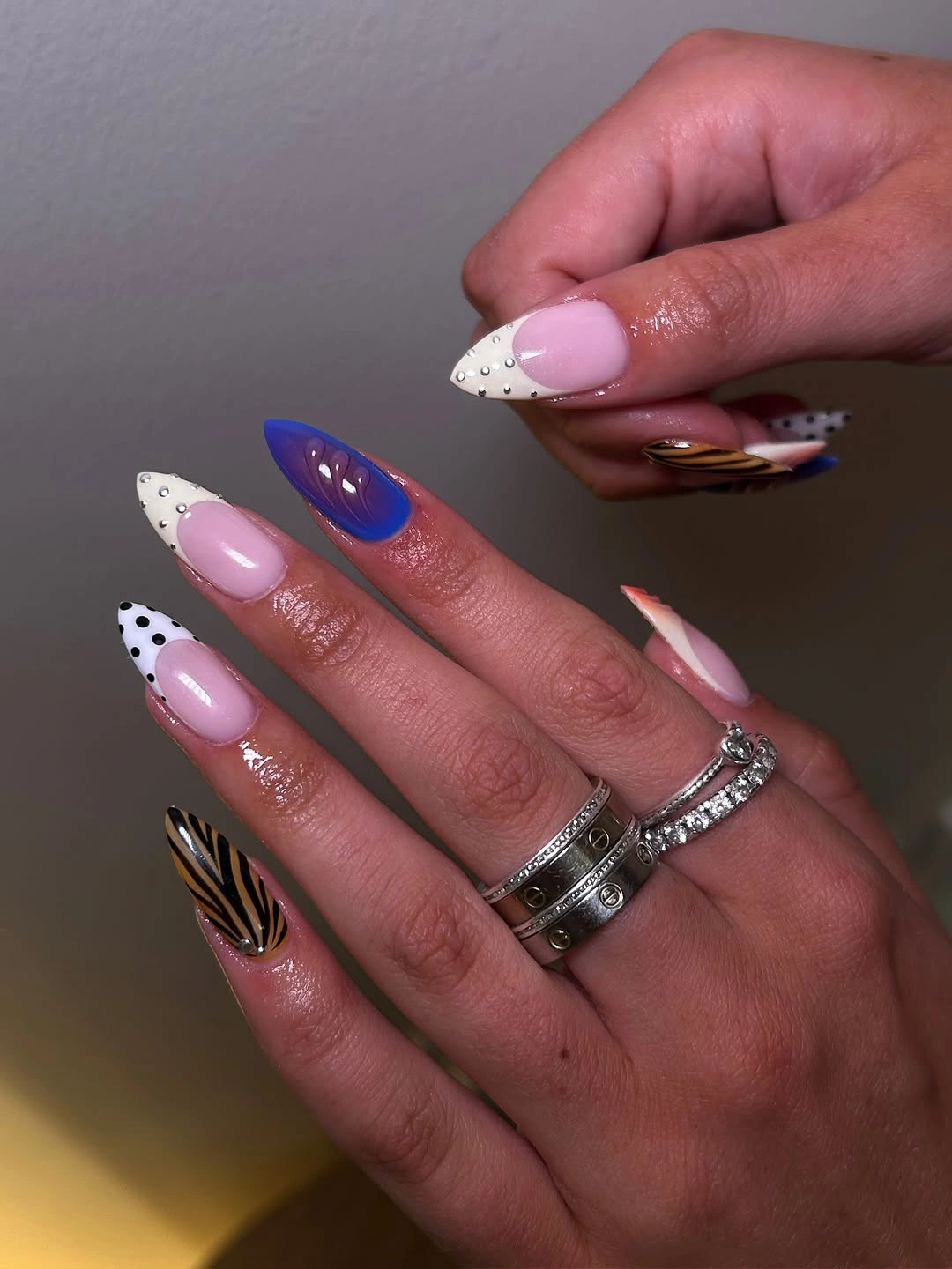
A simplified edit should choose two pattern types at most, such as dotted tips and one striped accent, then keep the rest of the nails pink. The blue and gold-toned details are best treated as optional focal moments, not required pieces of the whole formula. Reducing the variety is particularly important on medium length, where too many changes can overwhelm the outline.
Different accents can coexist when one base color appears often enough to establish a common ground. In this case, the pale pink also keeps the black stripes and dots from looking harsh. The practical tradeoff is that varied designs need thoughtful spacing, because every extra feature has to earn its place on the nail rather than simply filling an empty surface.
Tip-Focused Black Dots on Cream Almonds
Medium cream almond nails place black dots mostly toward the tips, leaving broad plain areas near the base. That placement gives the classic pattern a lighter direction and lets the taper of the nail remain visible. Rather than treating every surface as a full dotted field, the design uses the dots almost like a soft French boundary without drawing an actual line.
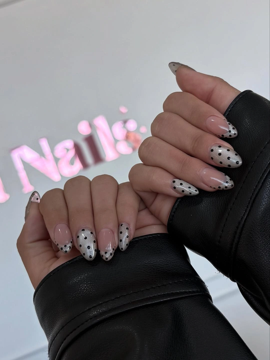
Keeping the dots near the tip is especially useful for a practical manicure because the plain base area stays visually calm as growth begins to show. A short oval can use only three or four dots at the edge and still capture the same idea. The dot cluster should fade naturally into the cream rather than end in a harsh horizontal row.
Black gives the cream a crisp contrast, but brown would make this direction warmer and more subtle for fall. The almond shape softens the spotted tips, while a square would make the composition more graphic and structured. The open base is what distinguishes this set from all-over polka dots, so it should remain free of extra accents.
Warm Brown Dots on a Blush Neutral
Medium blush nails pair dark brown dotted accents with pale neutral companion nails, creating a soft autumn palette without relying on an intense red or black base. The brown dots give the pink enough depth to feel seasonal, while the lighter nails stop the set from becoming too uniform. The mix is warm, grounded, and easy to imagine with denim, cream, or camel layers.
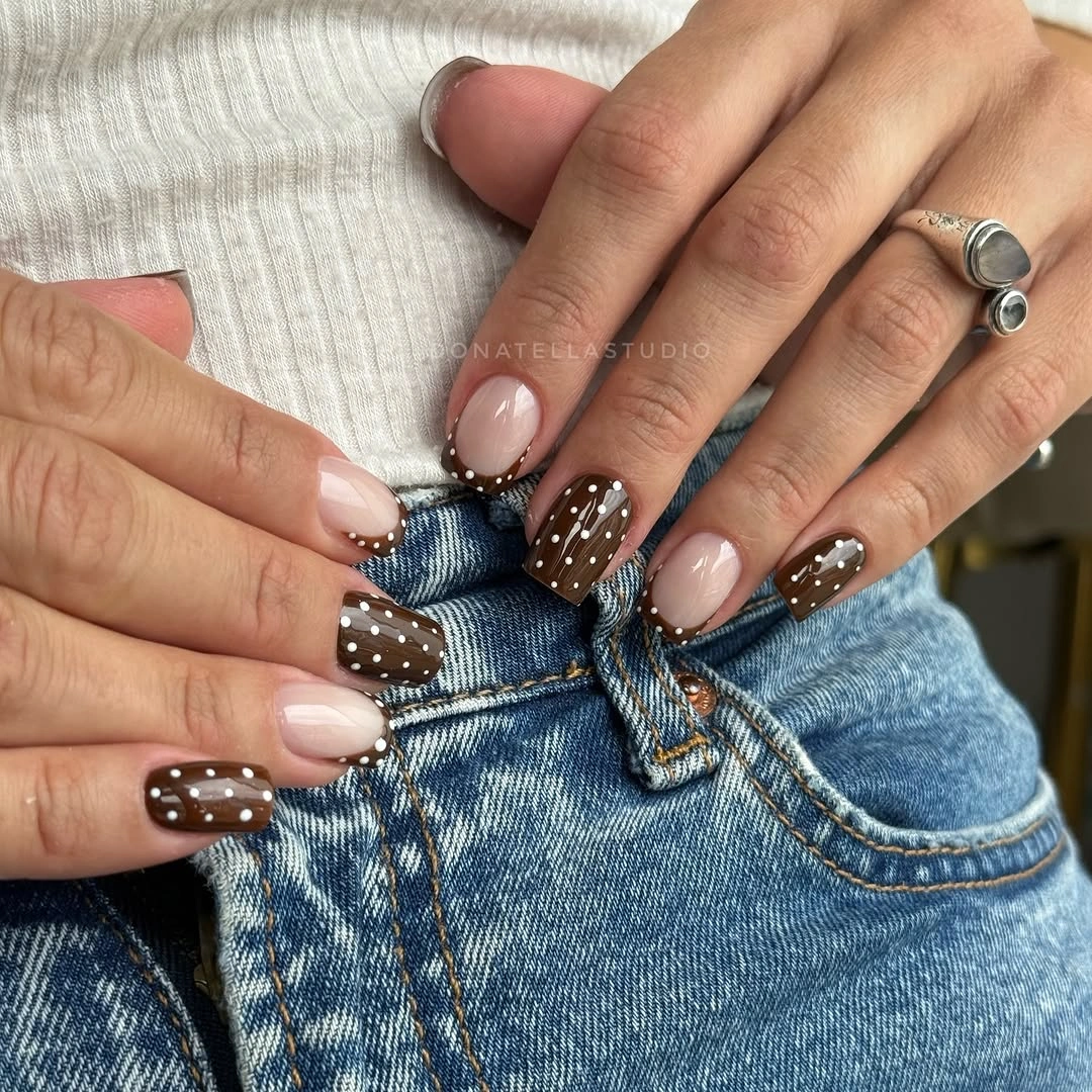
For a quieter version, use the brown dots on one blush accent nail and keep the other nails in a single warm nude. That lets the color relationship remain clear without multiplying small details across the hand. A slightly darker rose base would add more contrast, whereas a light beige would make the brown dots the strongest feature.
Brown is a gentler alternative to black when the goal is a soft dotted manicure, especially alongside blush and cream tones. The dots should still have distinct edges, because overly muted brown can disappear into the base instead of reading as a pattern. The companion neutral nails act as space for the eye to rest and should not be overloaded with a second motif.
Large Multicolor Dots over Soft Cream
Medium cream almond nails are covered with larger red, navy, pink, and yellow circular dots that are spaced far enough apart to remain separate. The pale ground gives each color a clean stage, making the design feel like a deliberate scattering of bold marks rather than a blurred confetti surface. This is the most playful direction in the group, but the controlled spacing keeps it readable.
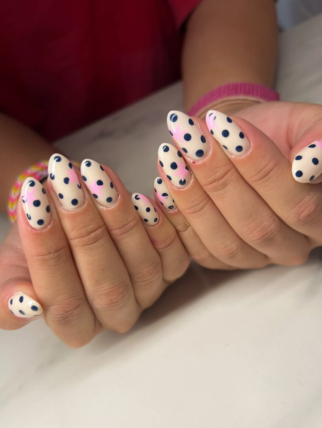
Large dots need generous empty space, so a shorter nail should use just one or two colors and fewer circles overall. The cream base is especially useful because it prevents the bright marks from visually merging into one another. If you prefer a deeper seasonal tone, replace yellow with ochre and pink with muted berry while preserving the same wide spacing.
The different colors work because they are all given separate areas rather than stacked or outlined together. Pairing the set with the site’s fall nail art ideas can help when deciding how much color variety fits your personal style. A simple outfit will let the dots feel like the playful focal point, while heavy patterns nearby could compete with their clear circular rhythm.